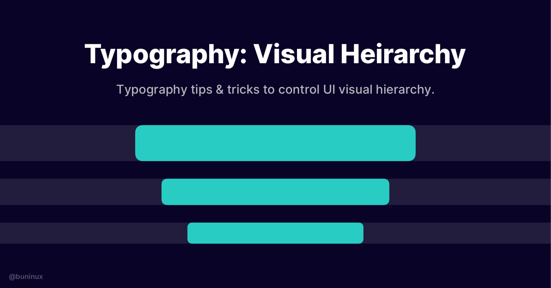
Typography: Visual Hierarchy
August 5, 2021 - Reading time: 4 minutes
Typography tips & tricks to help you better control UI visual hierarchy.
Visual hierarchy can help improve your UI/UX efficacy, conversion potential, and overall aesthetic. In other words, you can tell a whole story by solely tweaking page fonts, guiding the reader throughout your design.
To do so, you need to properly balance the visual weight of your page or a specific design area/element.
It would be best to start bold and intriguing and then proceed smoothly to an interacting CTA conclusion. So, let's find out how to properly distribute text hierarchy between size, weight, and color, so your UI stands out against the crowd.
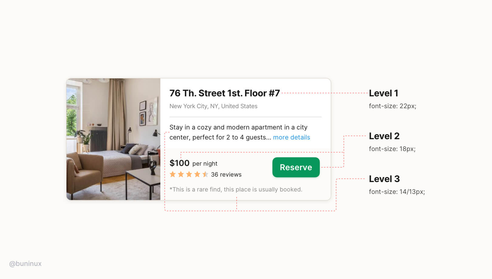
UI typography hierarchy goes into three levels:
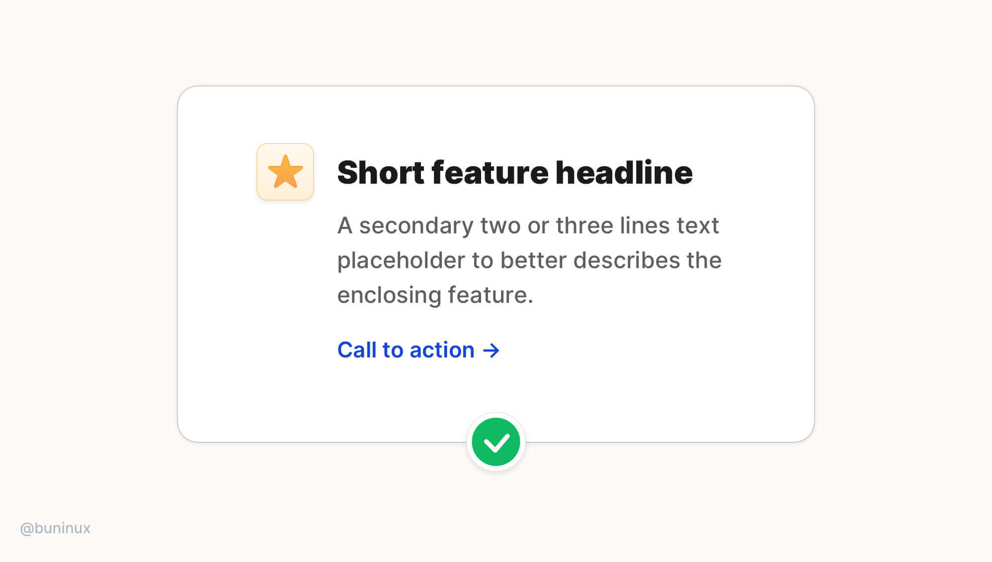
Level 1 — The first thing user sees on a screen or specific area. This level is usually reserved for bold headlines that introduce the reader to a topic or specific context. Consider this level always to be clickable!
Level 2 — Contains the second-biggest font size and is usually reserved for a call to action or other options that demand interaction. Buttons and form elements are the perfect examples.
Level 3 — Used to expand upon the topic and provide less important to the design goal information. Usually, this is the <body> text of your design.
The key to a successful type hierarchy is high contrast between levels. Consider these techniques when designing each of them:
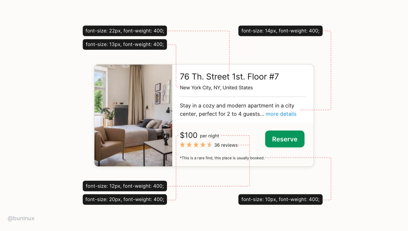
Don't rely solely on font size.
A common mistake is to rely solely on font size to settle all 3 levels. It often leads to primary content being too big and secondary content being unreadable.
Use fonts with multiple weights
Pick a font with 6+ different weights to have more options and control over your UI. Use both weight and color to build a high contrast pair within a consistent font size.
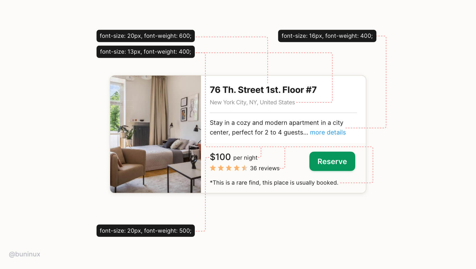
Multiple font-weight better communicates text importance rather than using only the font size.
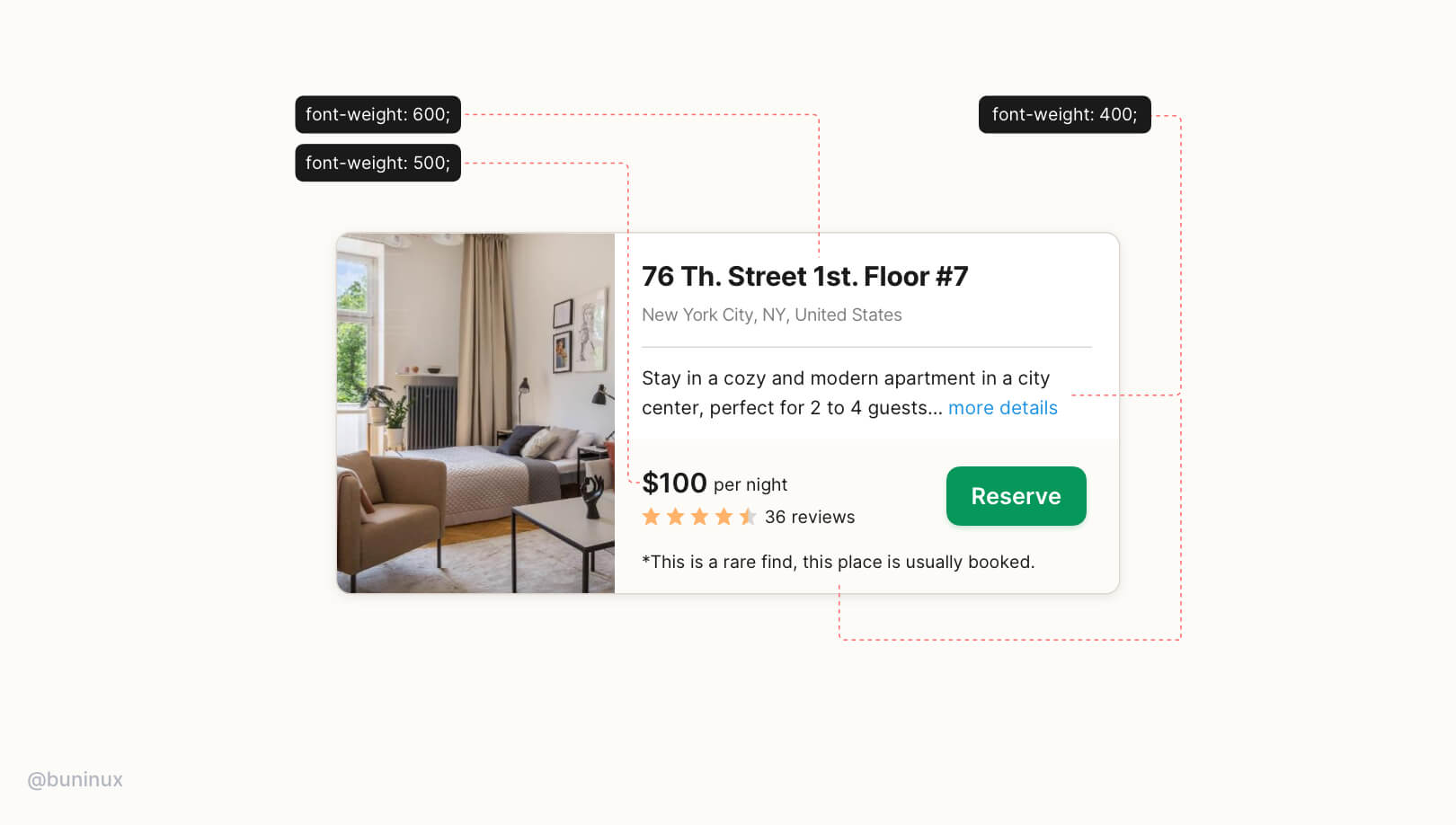
Stick to two to three font weights instead of multiple sizes:
- Font-weight: 400/500 — for regular text;
- Font-weight: 600/700 — for headlines and CTA's;
Use colors to convey the importance of text
Similarly, instead of a smaller font size, use softer colors for supporting text and clarify that the text is secondary without losing readability.
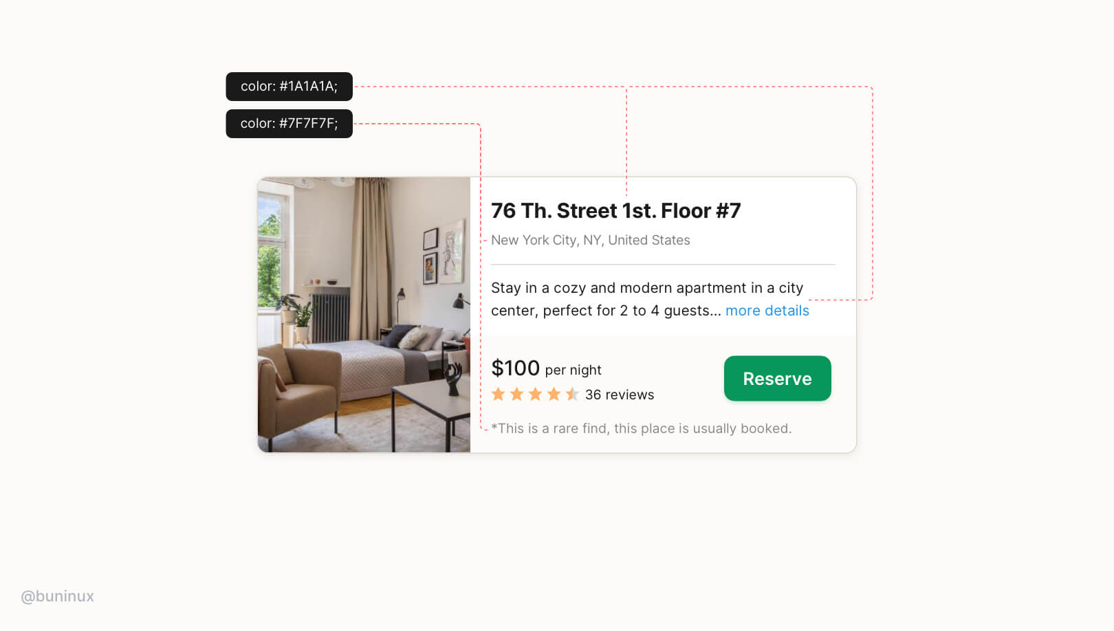
Stick to two to three colors:
- Primary dark color for important content (e.g., headline and pricing tag, number of reviews);
- A grey for secondary content (less important text);
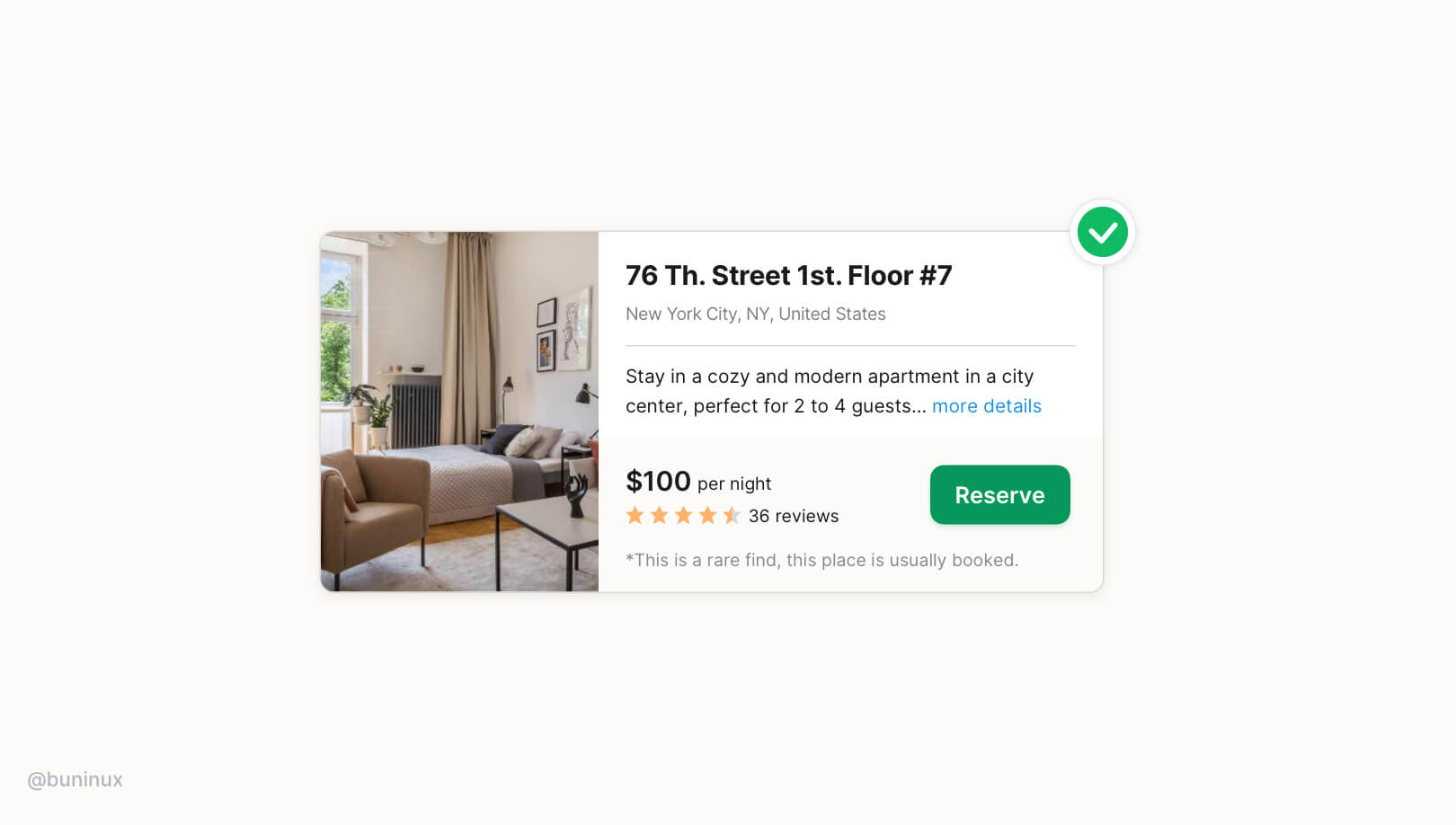
That's it. As you see, the results are always worth the hustle. So play it statigically and use this typography technique to design how users interact with your UI. Consider this technique as a tool to tell an eye-pleasant story and guide to your advantage.
.jpg)
Typography: Alignment
July 27, 2021 - Reading time: 5 minutes
Make your UI more effective and easy to read with text alignment.
Text alignment is a small but significant part of the interface. Alignment affects how our brain scans the content on a screen. A proper text alignment is one of the most distinct indicators of a professionally crafted digital product.
Any interface is 90% text. So that's why when you see a duly aligned typography, you get the impression that you're using a more thoughtful interface. And when something is not in its place, it hurts our perception immediately.
In this episode, I want to share practical tips to help you create a neatly aligned interface typography.
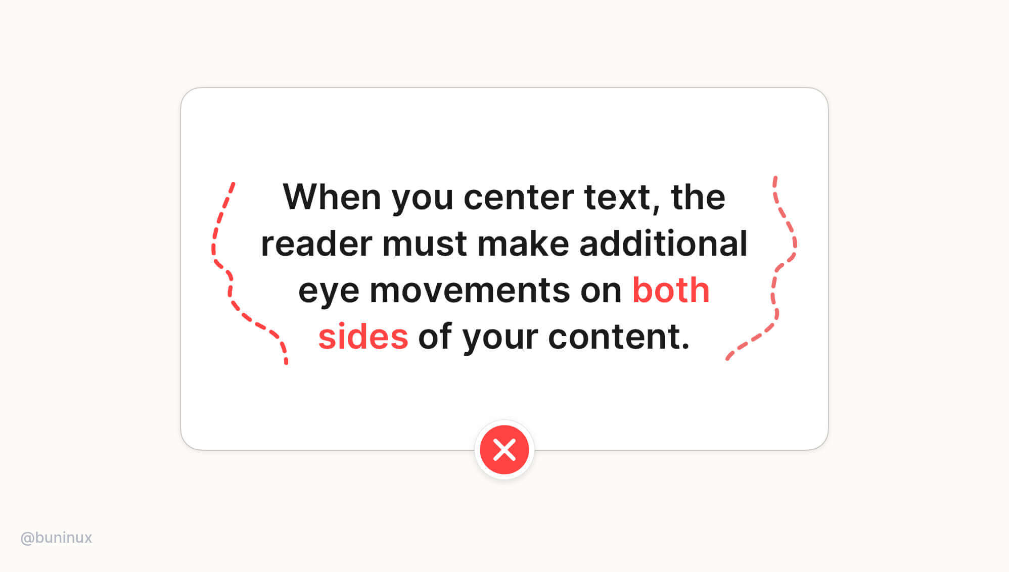
Tip 1—Avoid center alignment for long text
When text is longer than two or three lines, it is always recommended to ignore center alignment.
When you center-align a longer text, you will force the reader to make additional eye movements on both sides of the content. This causes unnecessary eye fatigue and results in lower reading focus.
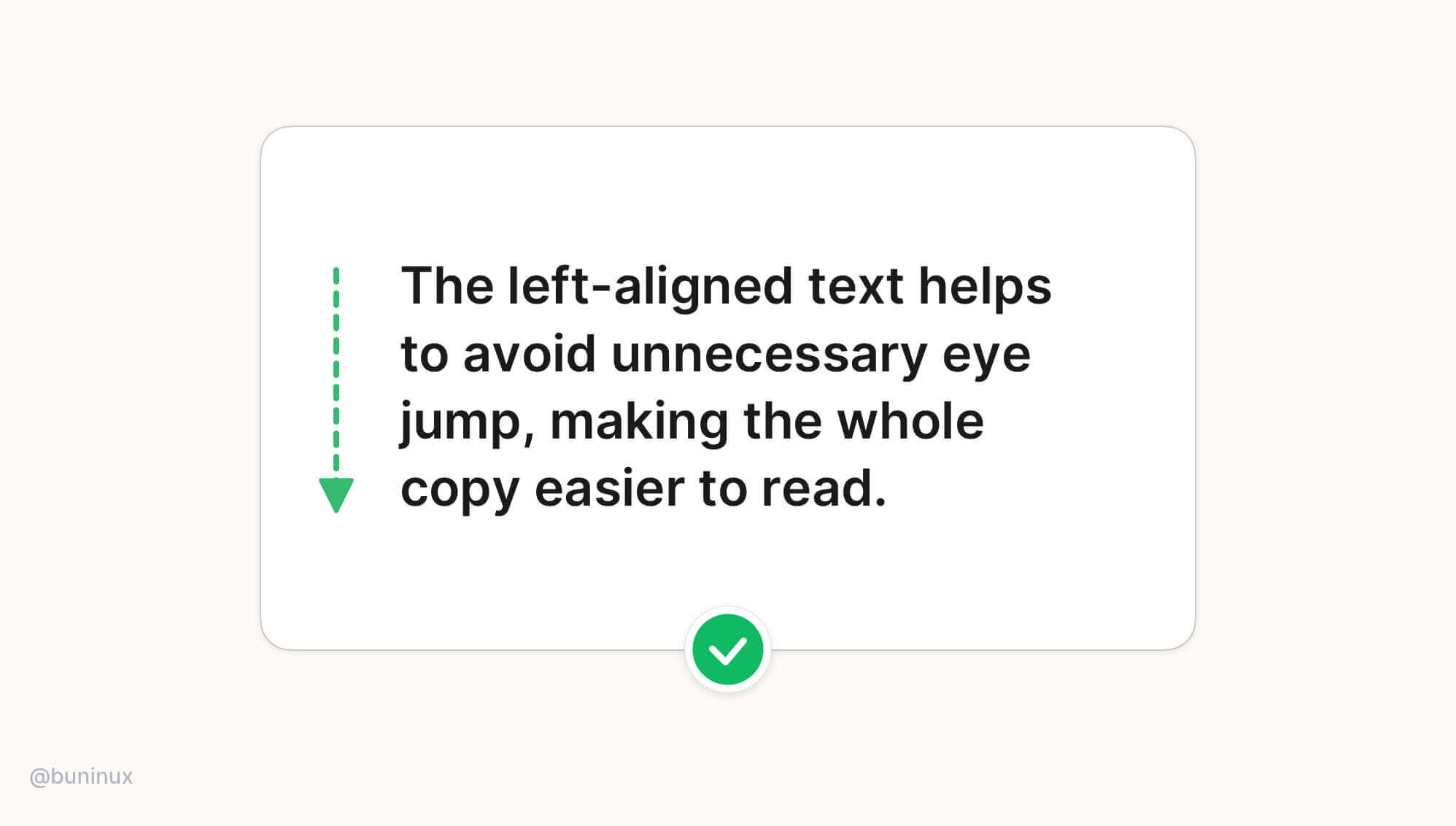
Tip 2—Always left-align long text
The left-aligned text results in much better content readability, so all books, articles & newspapers are written this way. The left-aligned text helps to avoid unnecessary eye jumps, making the whole copy much easier to follow.
Note: When localizing UI for right-left languages such as Arabic, Hebrew, or Persian, use the right-alignment instead of the left one.
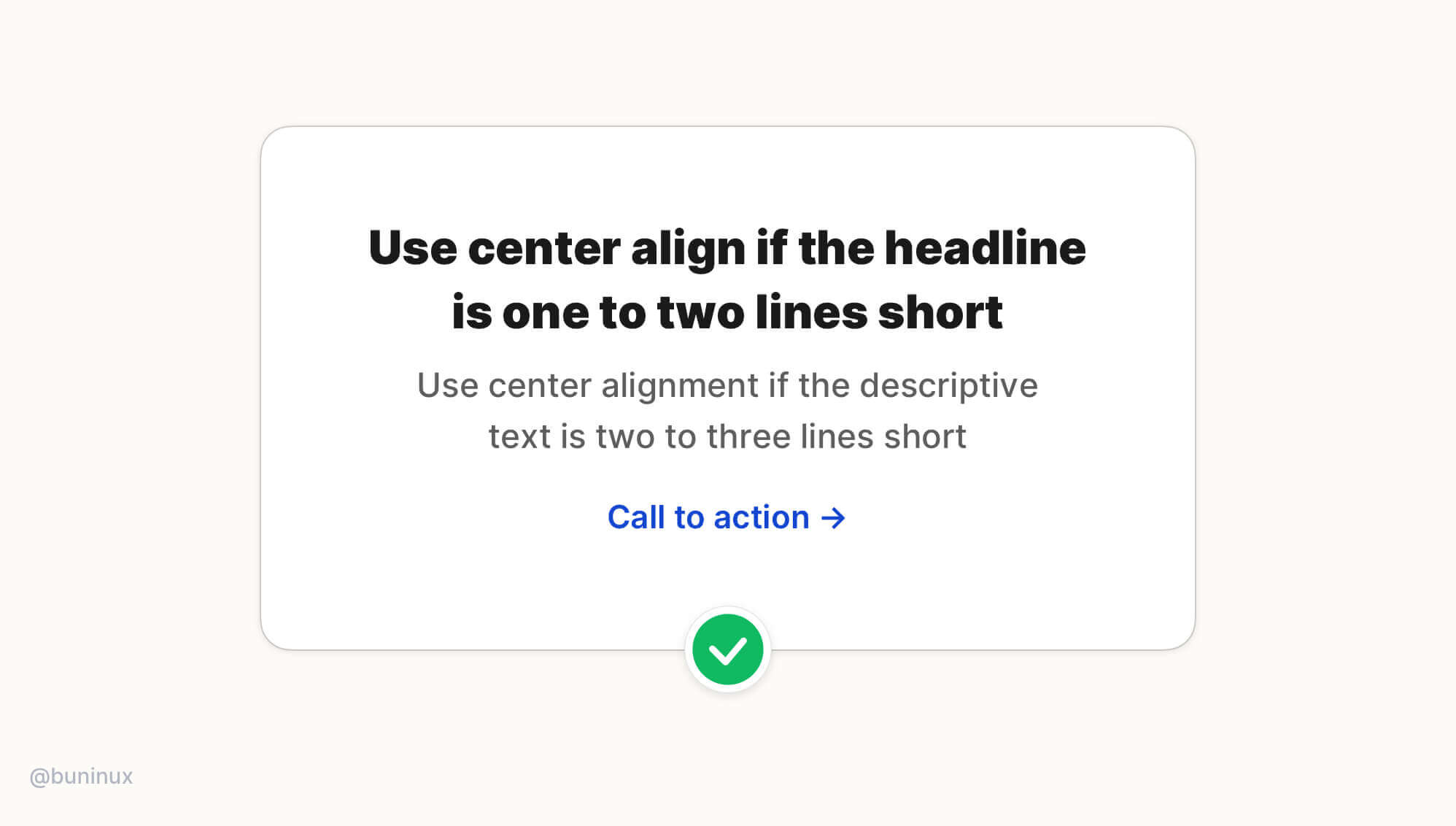
Tip 3—Use center alignment for headlines or small blocks of text only
Use center alignment if the headline is one to two lines short. If the text block is longer than two to three lines, it will always look better left-aligned.
If you need to center more than one block of text, one of them is a little longer. The best solution is to modify/rewrite the content to make it shorter:
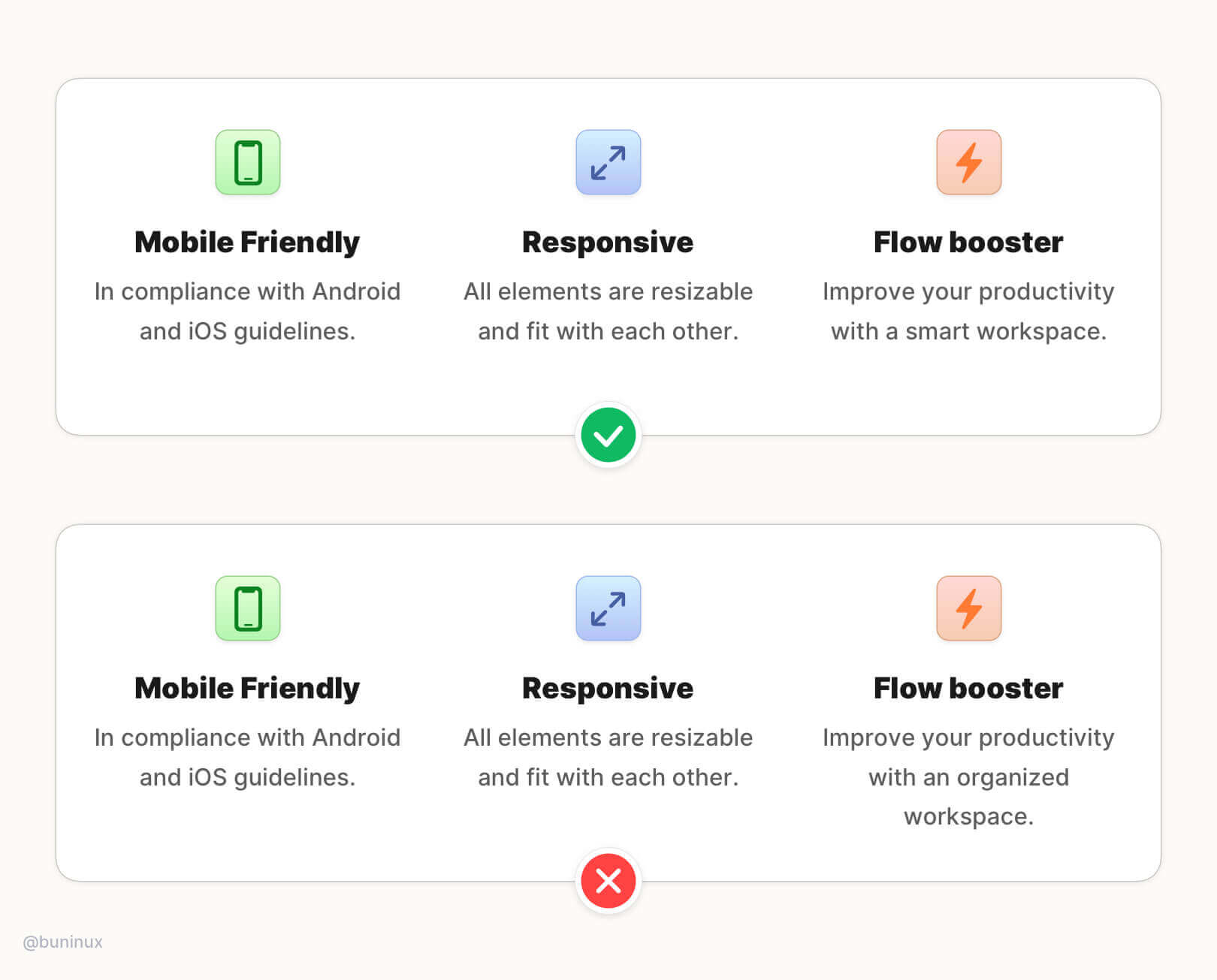
Tip 4—Use the hanging alignment to connect with UI elements
Use the hanging alignment to establish a clear visual hierarchy for UI elements that don't have the same visual weight as the text, such as icons, bullets, or quote commas.
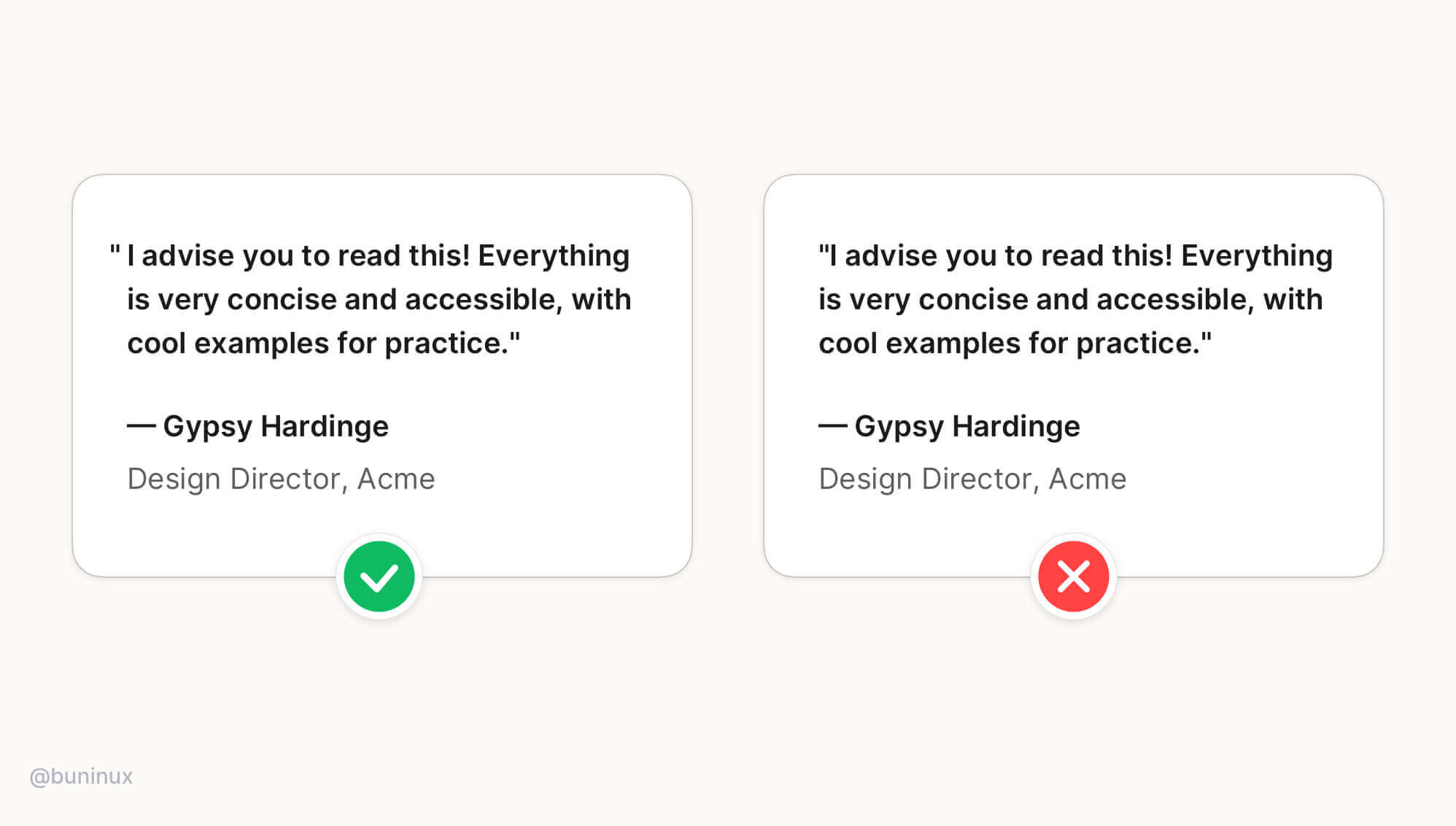
Hanging alignment helps to create a clear eye path for the text, eliminating zig-zag eye jumps.
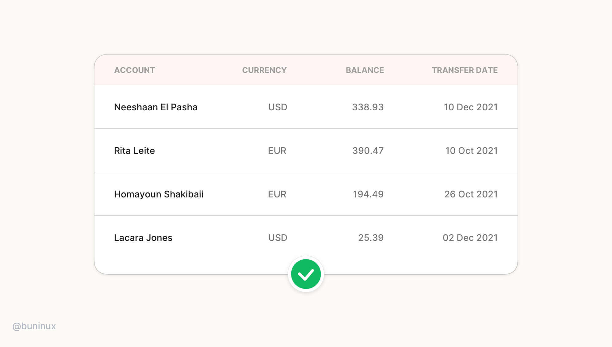
Tip 5—Right-align data & numbers
Right-align numbers and timestamps when designing tables, cards, or dashboards. The numbers are easier to compare at a glance with corresponding left-aligned information when they are placed right opposite it.
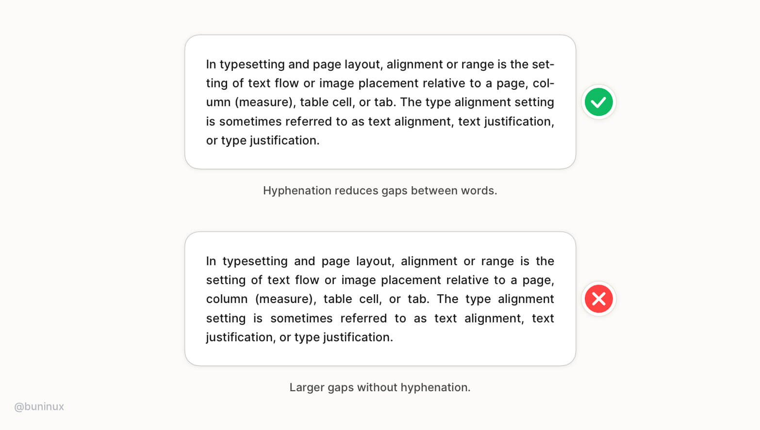
Tip 6—Balance whitespace for justified text
Justified text works great in print, but for the web, when you want to have a more formal vibe, it may leave many uncomfortable spaces between words. To avoid these gaps, consider enabling hyphenation.
The hyphens property controls the hyphenation of text in block-level elements. Note that <hyphens> class is language-sensitive. It helps to find break opportunities depends on the language defined in the font attribute of a parent element. Not all languages are supported, and support depends on the specific browser.
Note: If the hyphenation is not an option, please ignore the justified text and stick to left-aligned text.
Typography: Headings
July 6, 2021 - Reading time: 7 minutes
Actionable UI tips to improve your headings UX.
Headings are one of the most crucial parts of typography. We read and perceive headlines first, among other information on the screen.
The purpose of any heading & headline is to grab our attention, set the story's right tone, and intrigue the brain with value.
In this episode, I want to share my practical tips to help you make effective typography decisions and improve the overall impact of your typography and call to action.
Tip 1—Make your hierarchy dead obvious
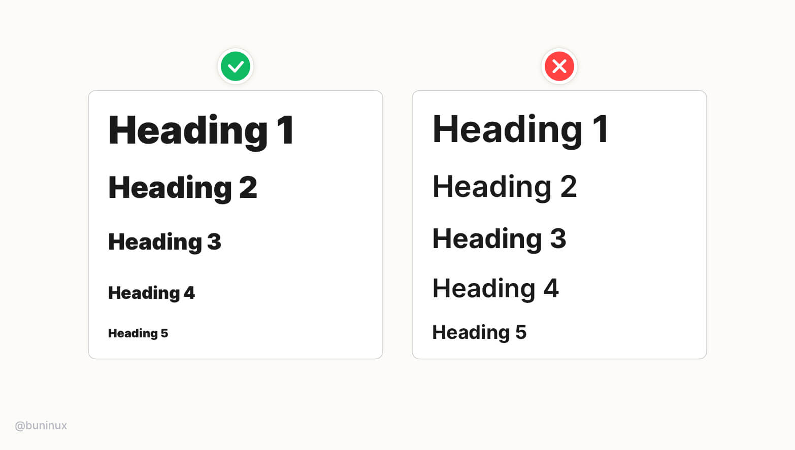
For most UI projects, you'll need to create a set of headings to use around the project (h1,h2,h3, etc.). You can use tools like type-scale.com to do it for you. Or do it manually, relying solely on your perception 👁️, math 🔢, or sense of style 💅.
Any way you do—make it obvious to the reader!
- Increase contrast between headings to improve their readability and recognition.
- Larger size/weight contrast will help readers to understand the importance of each piece of your text faster. And as results improve the reading flow for each paragraph.
Tip 2—Don't over-style your headings
Stay consistent with chosen style. Don't over-style your headings.
- Build a strong hierarchy with a predictable heading sequence for users to read without breaking the rythm.
- Don't sacrifice your paragraph contrast. Make the main content as easy to read as the headings.
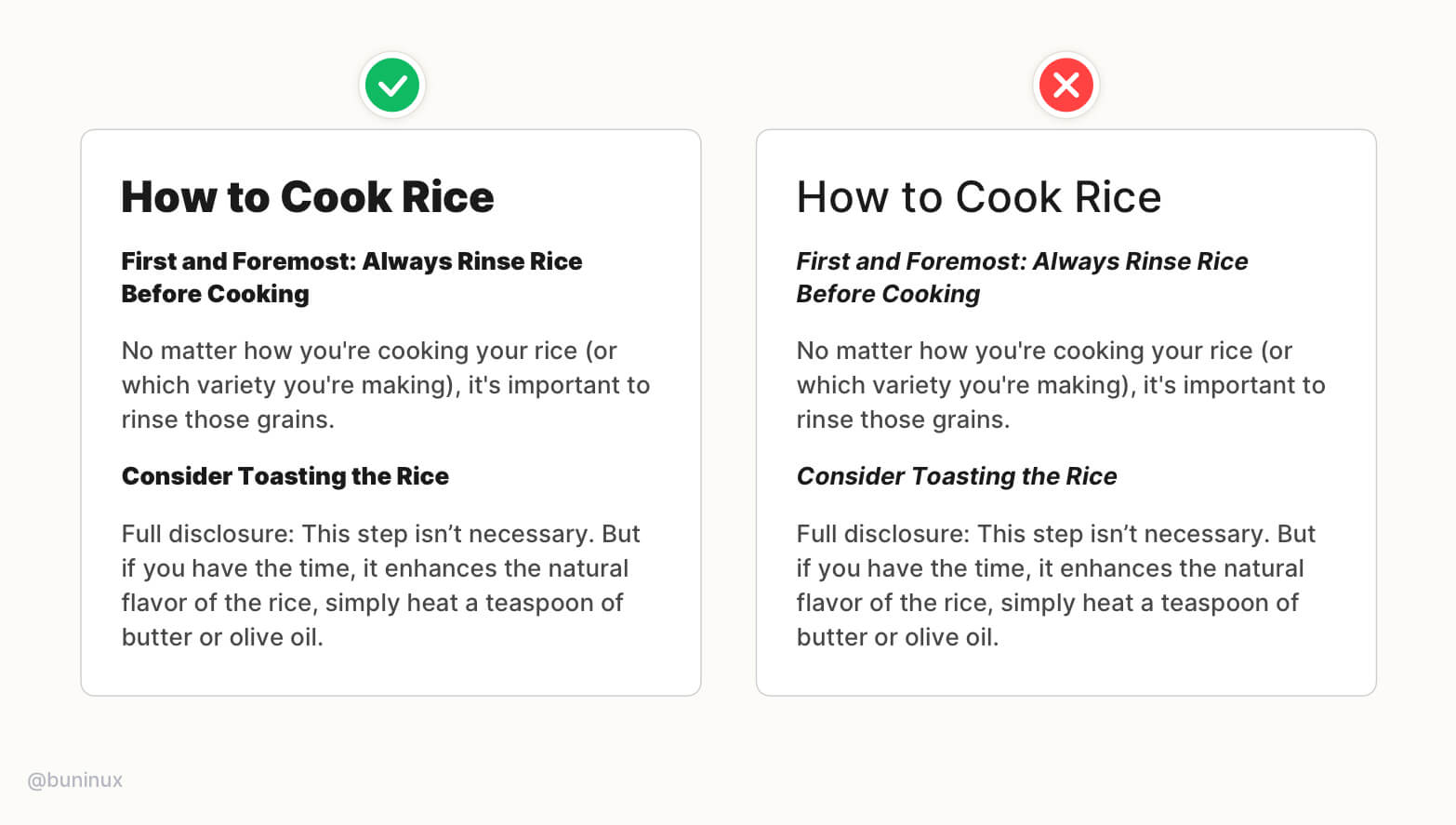
Tip 3—Use unique line-height for headings
Don't rely on the baseline grid when setting up your headings line-height.
Visual-heavy fonts require an individual approach on line-height to help them have a better vertical balance.
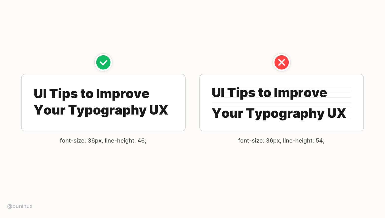
Tip 4—Balance headings with negative letter spacing
To better balance wider headings— play around with the negative letter-spacing.
Adjusting the letter-spacing is like adding extra spice. This can make your headings feel more balanced by taking less horizontal space and, as a result, less time for eyes to jump from one text line to another.
Tip 5—Balance all caps headings with letter spacing
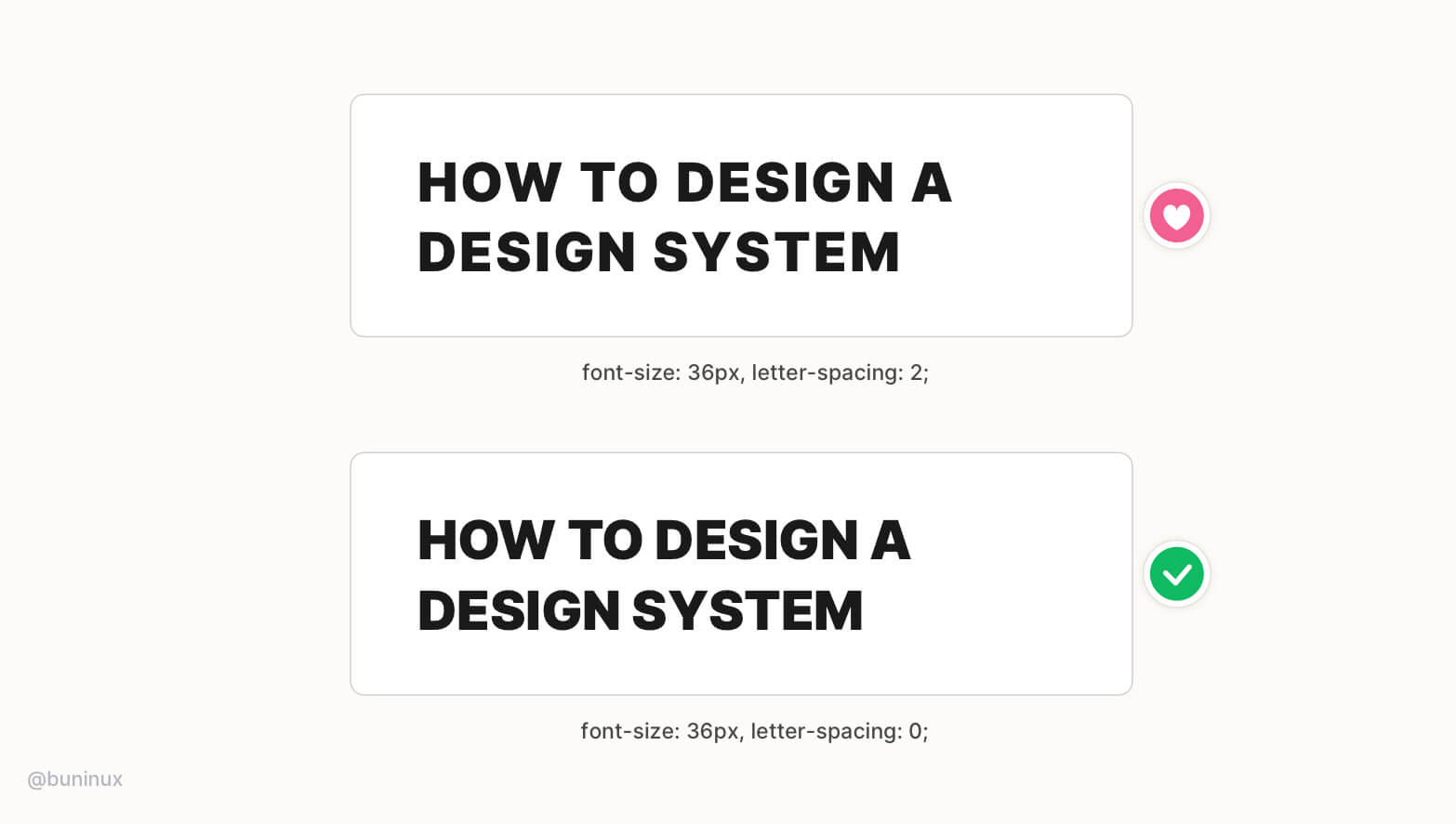
You can add extra space between characters for all caps headings to make them more impactful and noticeable. But be sure not to overdo it.
Tip 6—Place line breaks above the headings
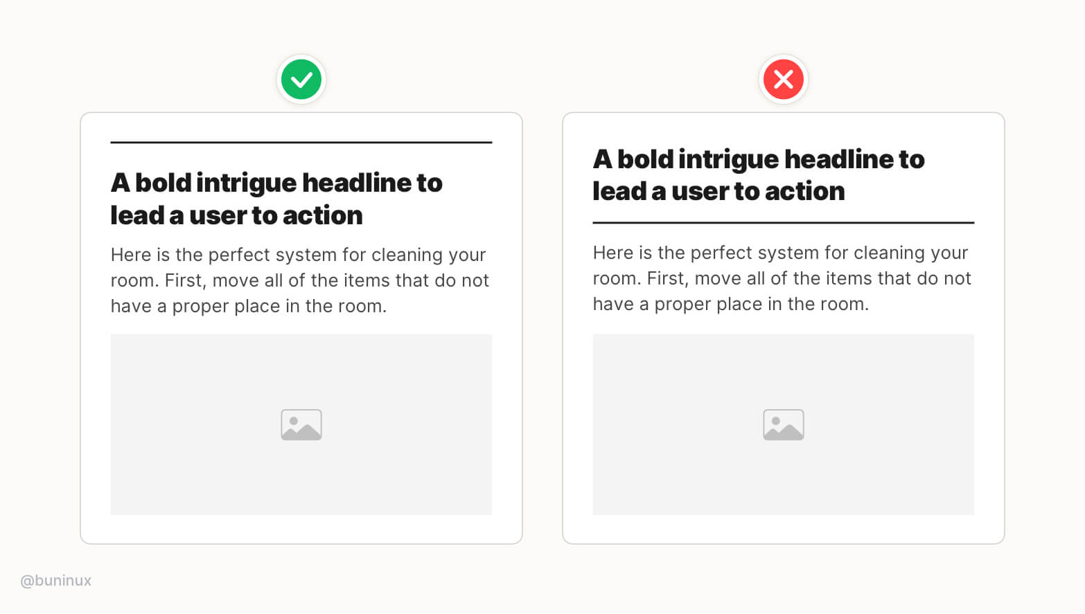
The purpose of a line break or hr tag is to separate one piece of information from another.
Place separators above the headings to better structurize the reading sequence. Use decorative elements to highlight a certain part of your content.
Tip 7—Not all headings should be bold
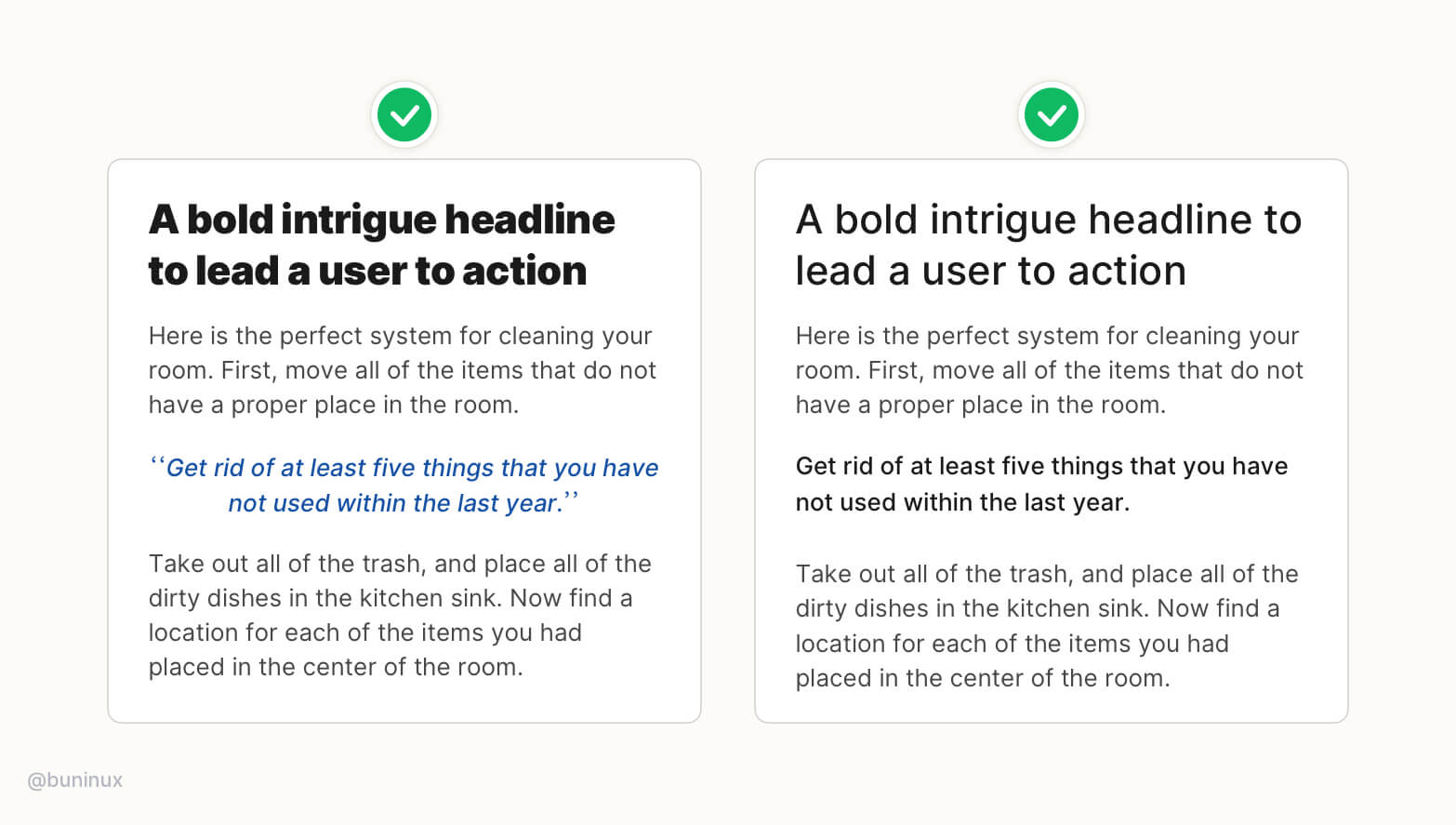
It's okay to lower the font-weight for h1, h2 headings and make them more delicate in style.
Experiment with color & style for secondary headings. Use these types of headings to highlight a piece of crucial information or quotes.
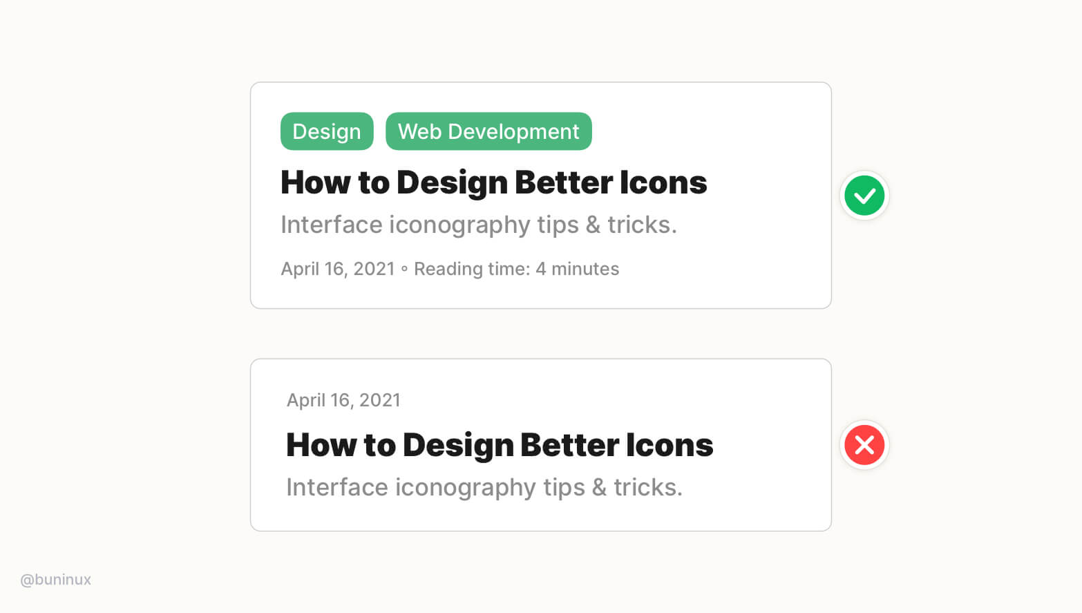
Tip 8—Make sure headings works out of context
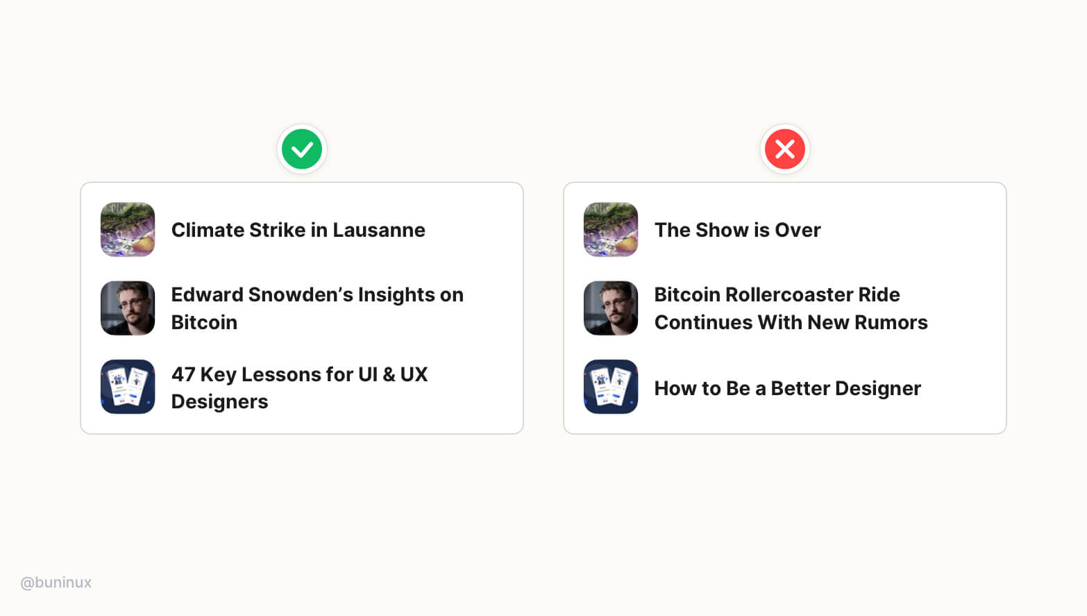
In UI, headlines are regularly shown out of context.
Design your headline to stand alone and still make sense even without a remainder of the content around. This will help users to perceive the value without additional clicking.
Tip 9—The heading should always match the content
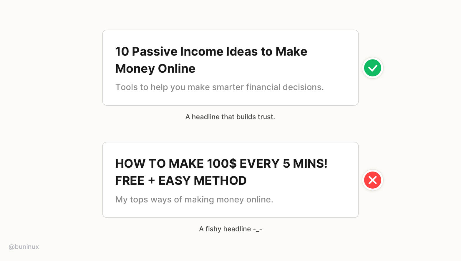
Don't promise something your content can't provide.
Headlines fail when they don’t match the content or can't keep their promises during the read—resulting in a higher bounce rate.
Good headlines always deliver the promised value of content from start to the end, building trust towards the author in the long run.
Tip 10—Headings should not be too long
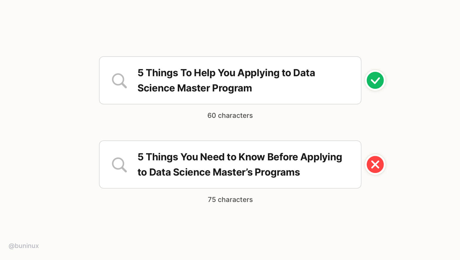
Do not exceed over 62 characters!
Search engines tend to ignore links that are over exceed 62 characters. This could decrease the conversion rate in the long run and lower the search engine appeal for your page content.
Tip 11—Use descriptive taglines
A good tagline can increase site visitors' retention, ensuring they are in the right place by providing context for headlines and overall copy.
Use relative tags and helpful information to guide users, save their time and build interest before reading.
 Updates
 FAQ
FAQ