How to Design Striking CTA
September 21, 2021 - Reading time: 5 minutes
Actionable do’s and don’ts to help improve your call to action.
First of all, what is a CTA Button? Call-to-action (CTA) are the buttons that are meant to guide users towards your goal conversion. It’s a fundamental part of your interface that users need to press to make the action you want them to take.
CTA buttons can vary in style and size depending on your goal. Some common examples of call-to-action buttons are:
- Add to cart button
- Sign in/Register button
- Download button
All CTA buttons have a goal: to get your app or page visitor to click and convert.
So here is my set of tips to help you create better call-to-actions and increase your design conversion rate.
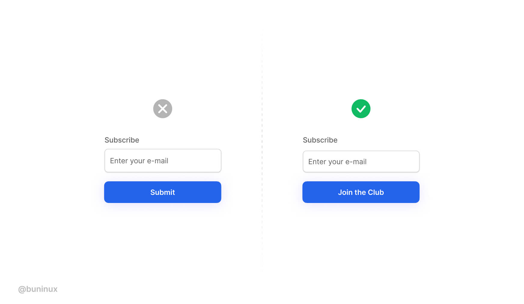
Use valuable and actionable copy
Don’t use “submit” or “send” on your form buttons. Instead, provide a copy that speaks the same language as the user does.
Instantly show users what they will achieve by pressing your button.
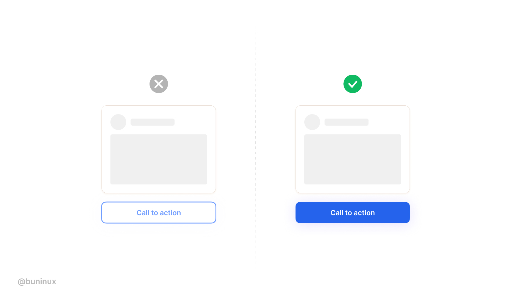
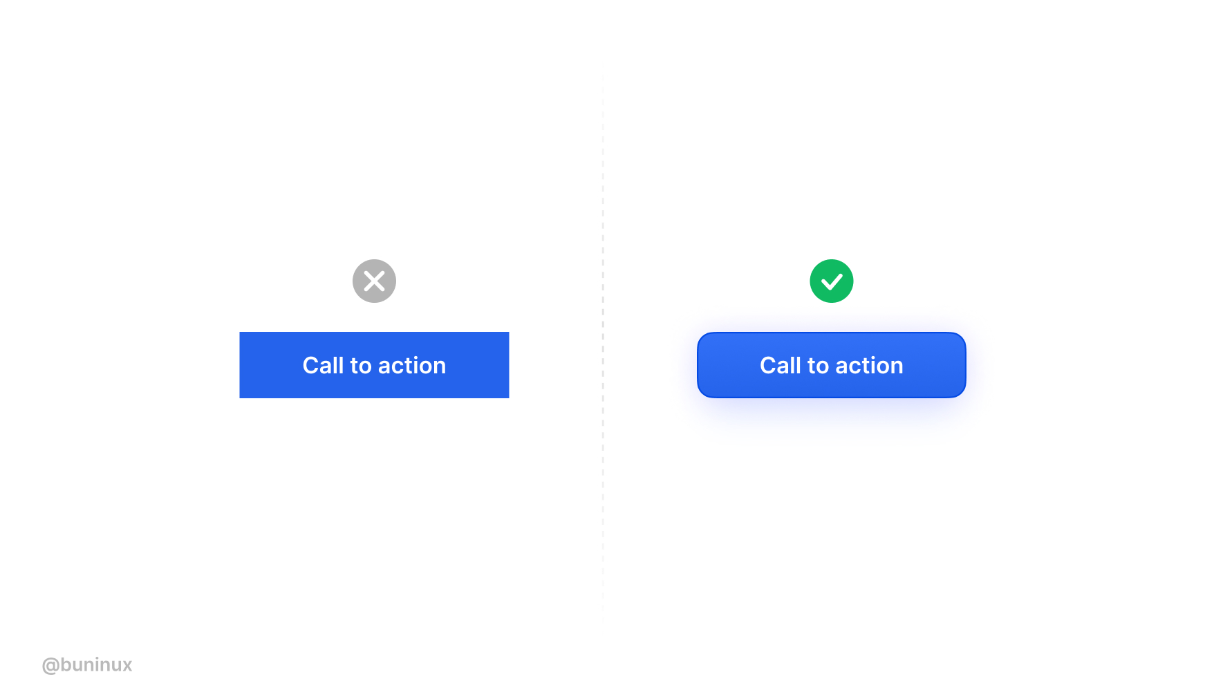
Make your CTA’s dead obvious
Use bold, highly contrasting colors for your CTA’s.
Don’t try to blend/mix your primary converting buttons alongside other UI elements or backgrounds.
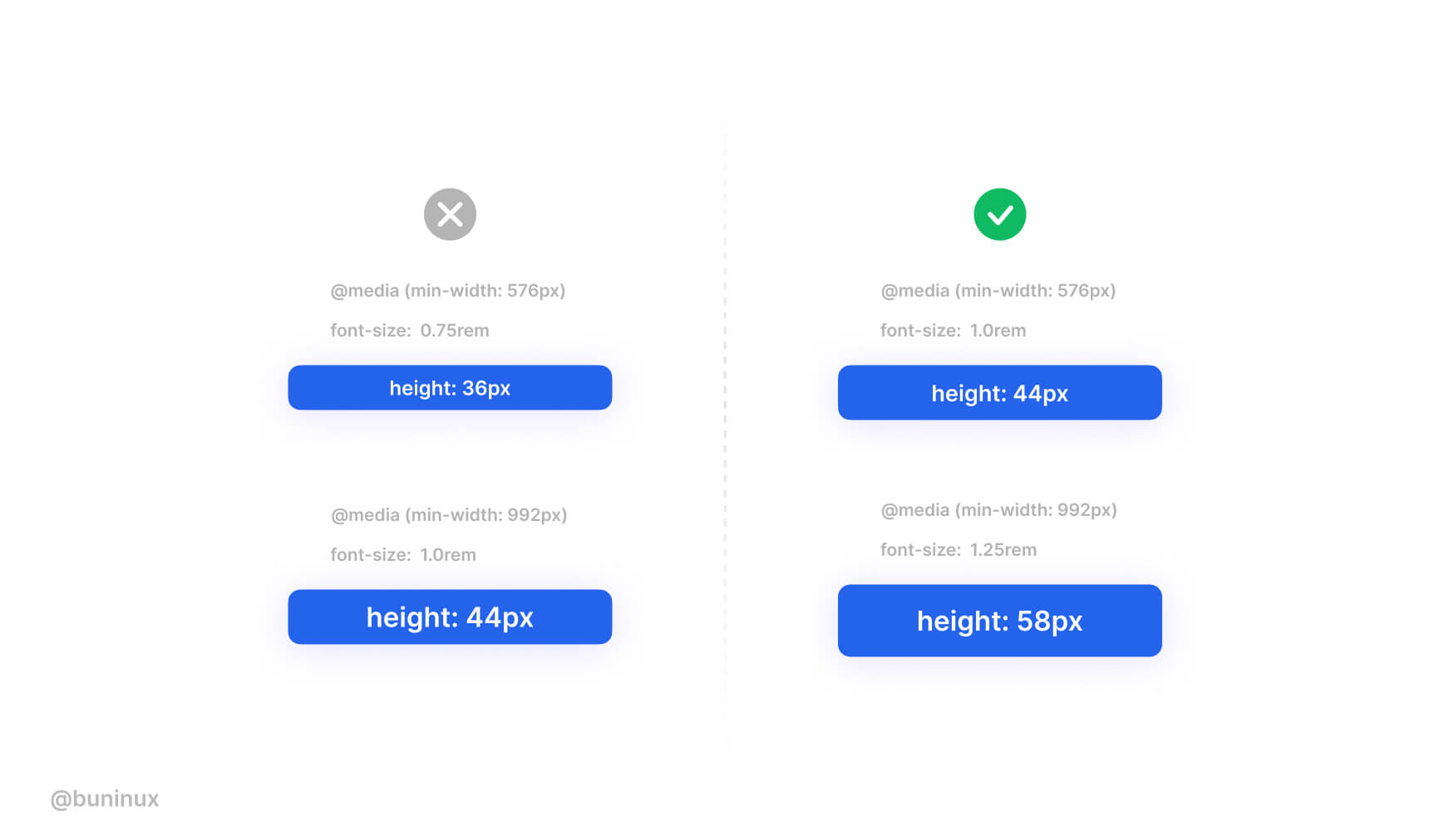
Ensure your CTA’s have a large tap zone
Don’t make your conversion buttons too small. Do make them prominent and bold.
When working on a web project, it’s a must to use a set of buttons for different resolution breakpoints.
Don’t be afraid to add some spice
Don’t make your buttons look boring. Instead, use both style and interaction to build the urge to smash that pretty & fun thing.
Make your vocabulary dead clear
Ensure your CTA’s vocabulary is clear and actionable.
User attention is precious, so use the momentum to quickly get to the main point with a short but striking copy.
Therefore, it’s crucial to be open to longer text variations when designing your buttons. Just make sure the action behind the text is 100% predictable.
Add keywords to CTA’s
Images that act as buttons, like product cards or galleries, must have “alt” tags.
The attached information helps to rank your page higher and provides helpful context to people with visual disabilities.
Make sure that all clickable elements have <alt> tags included.
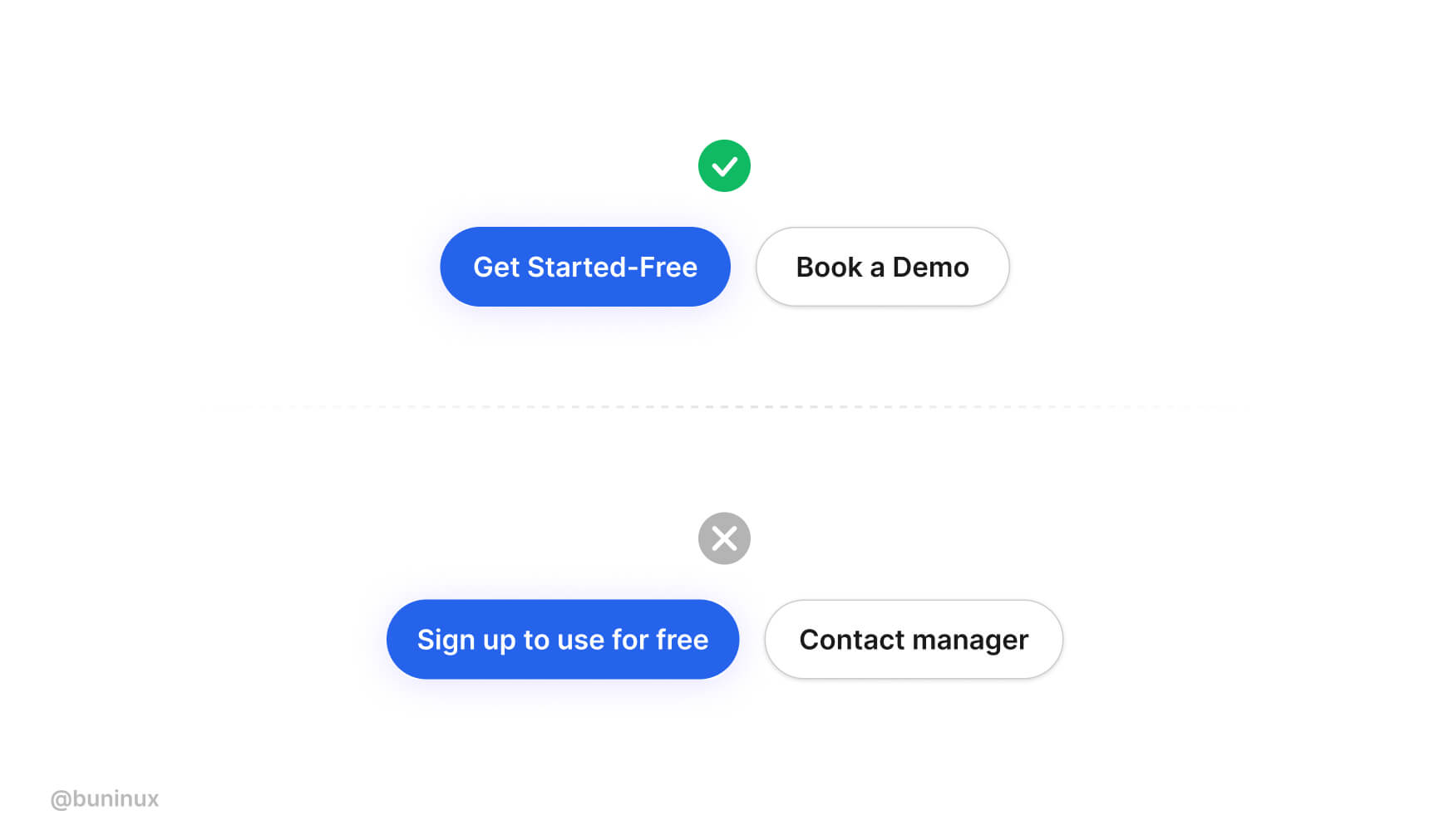
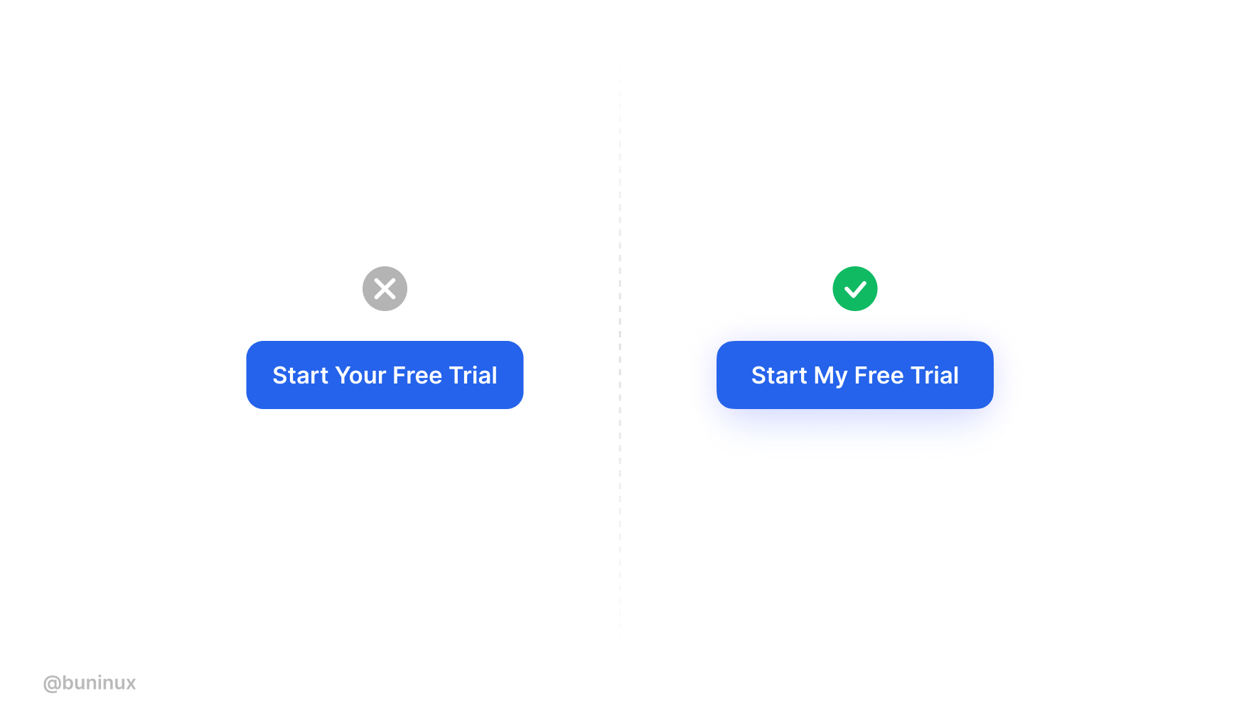
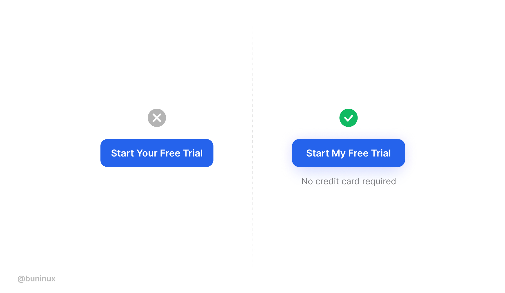
Use Me instead of You
Based on the research by Unbounce, a first-person copy like “I” and “my” is more effective than using “you” and “your,” resulting in higher conversion.
Since the primary driver for buying and clicking things our own emotions. Using the first-person pronouns in your CTA’s increases emotional impact by associating a personal benefit with action.
Based on my experience, using this trick and a friendlier tone results in a better response from visitors. ❤
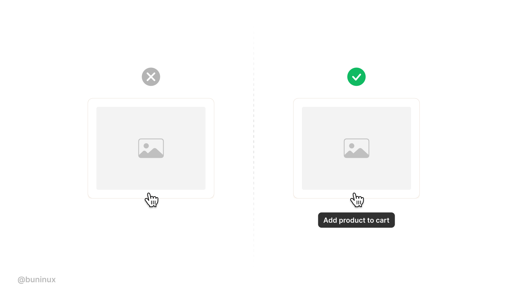
Use descriptive buttons
Add descriptions to promote the idea of pressing your button.
Put extra proof, rating, or your product best feature to create anticipation towards clicking and achieving something.
---
That’s all. Thanks for the read! 🙌
Use these tips and your surveillance to come with new cool buttons ideas.
To help you quickly design & test your CTA, you can use tools like buttonoptimizer.com.
If you enjoyed this article, feel free to subscribe and share these tips with others!
 Updates
 FAQ
FAQ