.jpg)
How to Design Sexy Gradients
August 17, 2021 - Reading time: 5 minutes
Actionable UI tips to help you design better gradients.
Gradients are everywhere. It's no longer a trend from the '90s, and designers tend to employ gradients all over modern minimalistic UI. Backgrounds, buttons, toggles, cards, even shadows, you name it. Gradients have taken over digital products and Dribbble/Behance.
So what are gradients?
The gradient is a transition from one color to another. A gradient is a procedural blending made from multiple colors (a single gradient can have unlimited shades).
We can use gradients in many ways. We can make subtle or extremely bold color combinations that can be used for both backgrounds and foreground interface elements.
Because gradients are that versatile, we use them to communicate a unique design or brand vibe.
In this article, I want to share practical tips & tricks on making gradients that stand out.
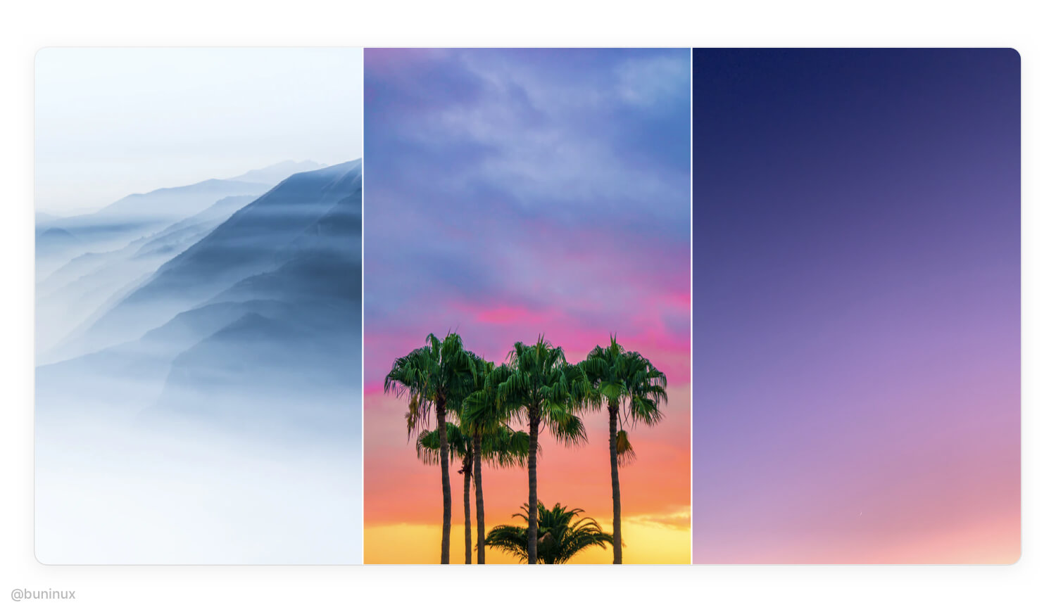
Find the right inspiration
First, we need to find the source.
The best inspiration for gradients is nature. So, start the design process by taking your time and observing the real world. Find photos of landscapes, environment, or plants as your source of colors to associate your project with.
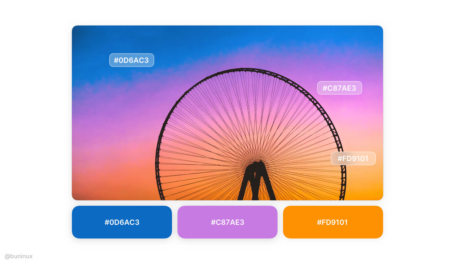
Create your palette
Use the "Color Picker" to find the right mood. Build your palette by extracting 2 to 3 primary striking colors from a photo/picture.
It's recommended to start with only a few colors. Since the RGB color model has only 3 variables, this means you can make any gradient by solely mixing Red, Green, and Blue. RGB values are usually given in the 0–255 range;
So for making soft-looking gradients, consider using the range of 50-150 when building your palette.
Blend palette colors
Create a new layer above the chosen color palette, and make a smooth transition by adding a background blur effect.
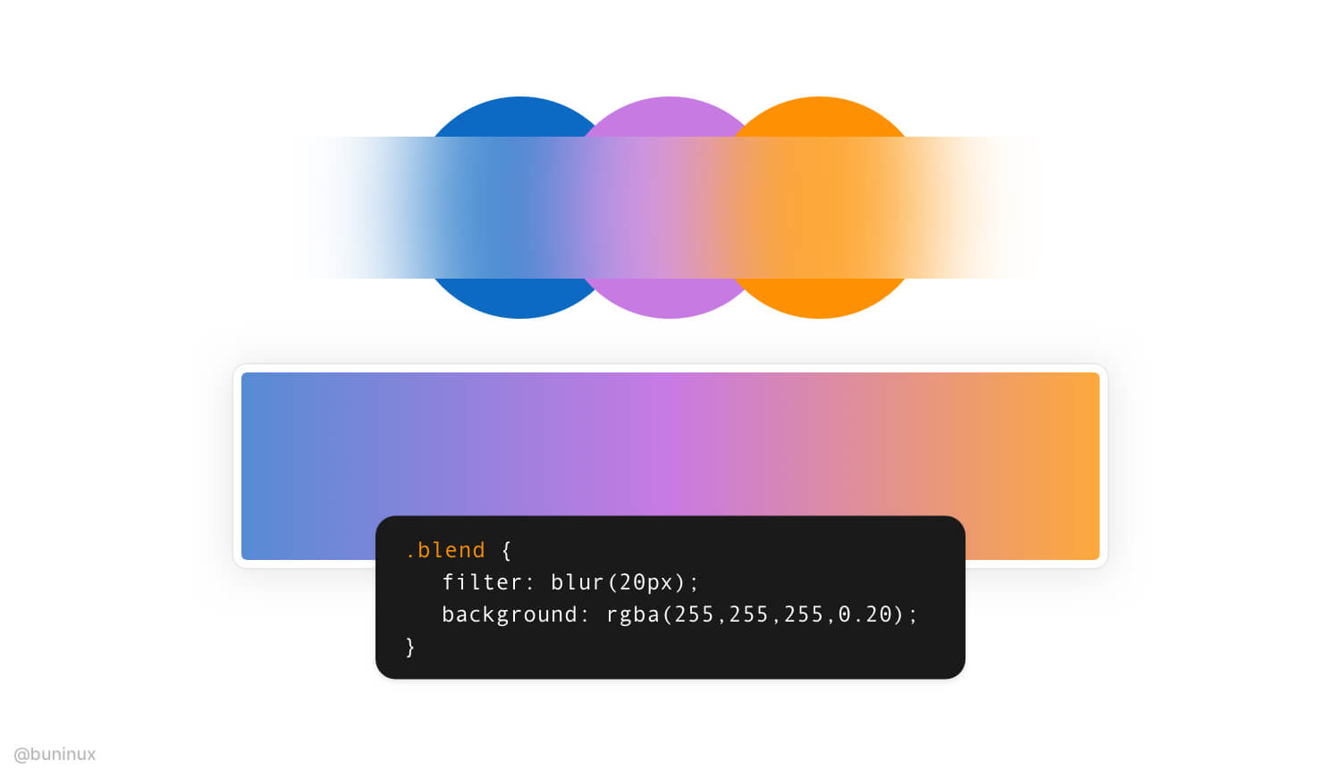
Now create a new layer and use the resulted blurred path to recreate your linear gradient.
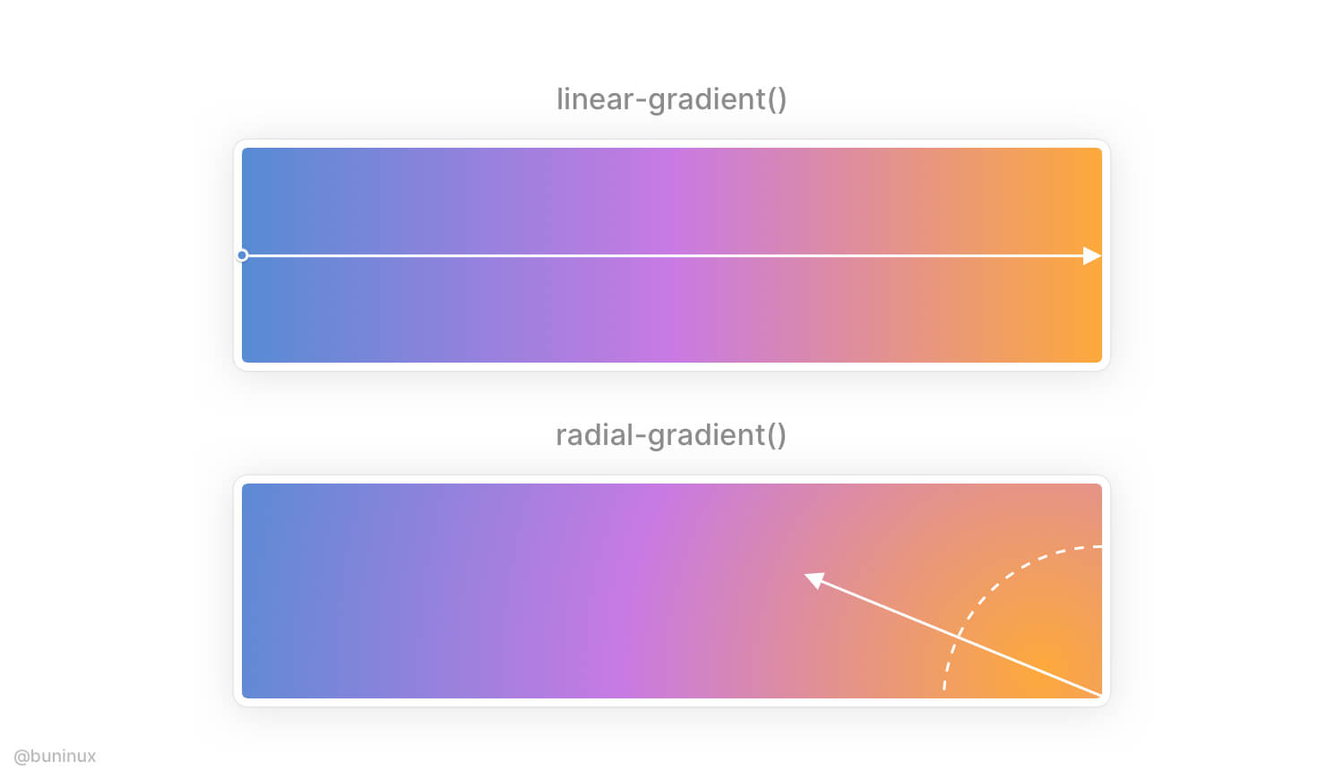
Use radial gradient to add depth to a linear scale
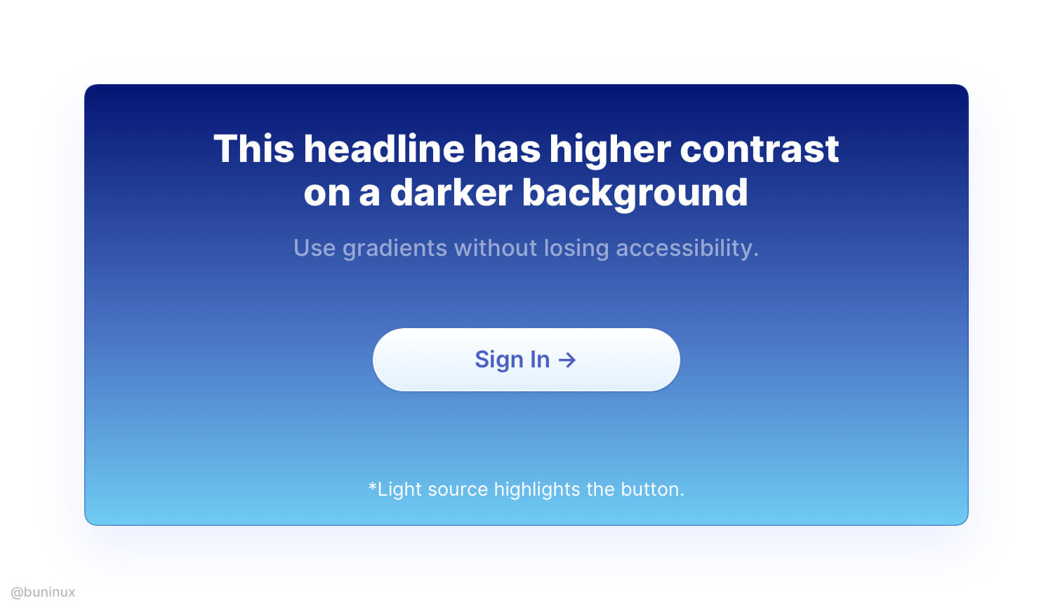
Radial gradients are used to simulate lighting, which isn’t always linear. You can apply a radial gradient to a predesigned linear gradient and configure the light source direction to make it look even better.
Use gradient direction that makes sense
Employ the gradient direction where it's needed.
For example, emit the light source to highlight a certain element, make the text more readable by placing it over colored areas, or direct the user through UI with a smooth gradient path.
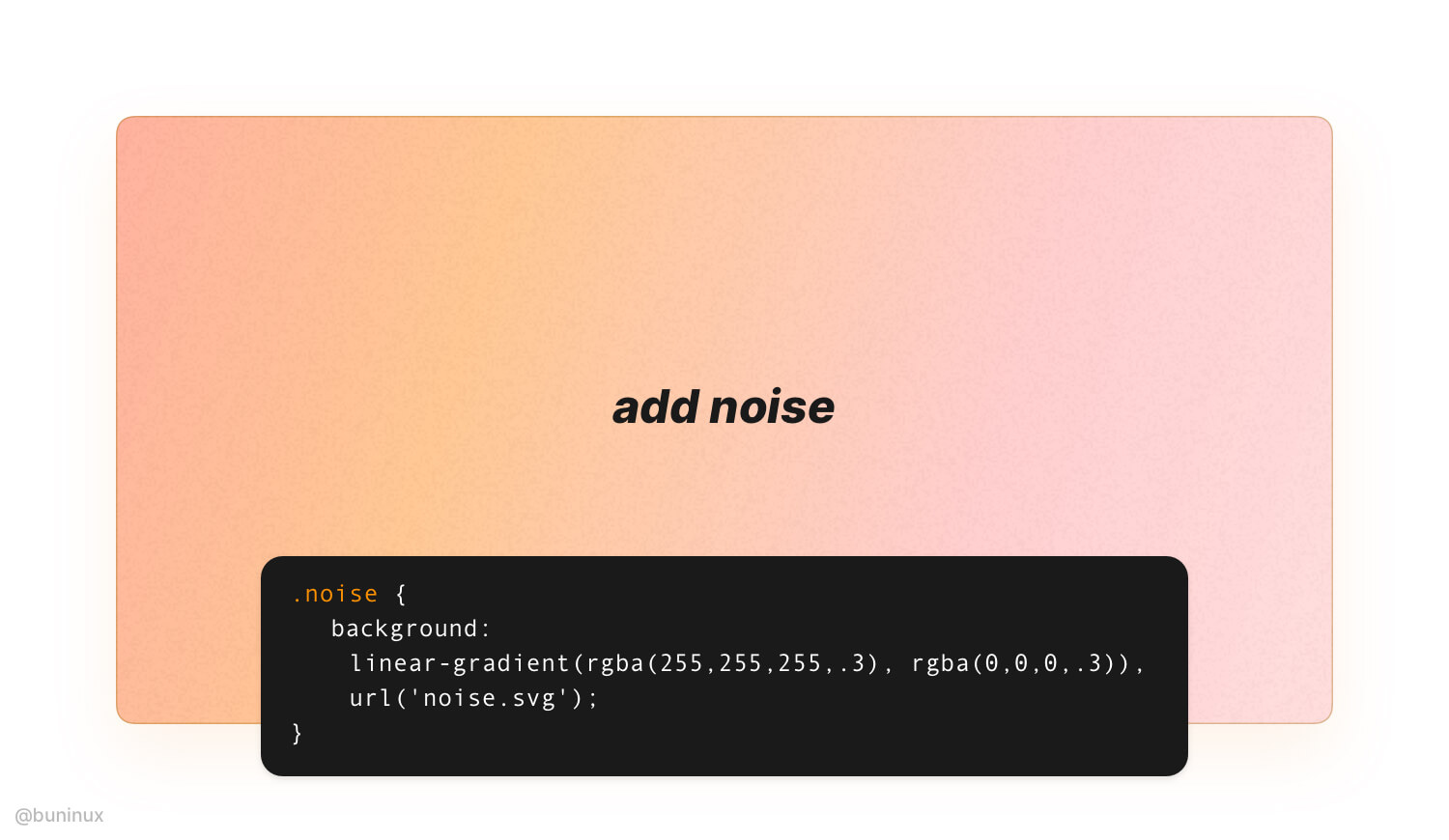
Add noise to make it strike
In Figma or Sketch, apply an additional layer of grain over your gradient to make it look vintage. You can apply noise effect on the web by placing an image over your gradient.
Learn how to add noise with CSS here.
Note: Usually, you only need 0.1% to 0.5% of noise image transparency.
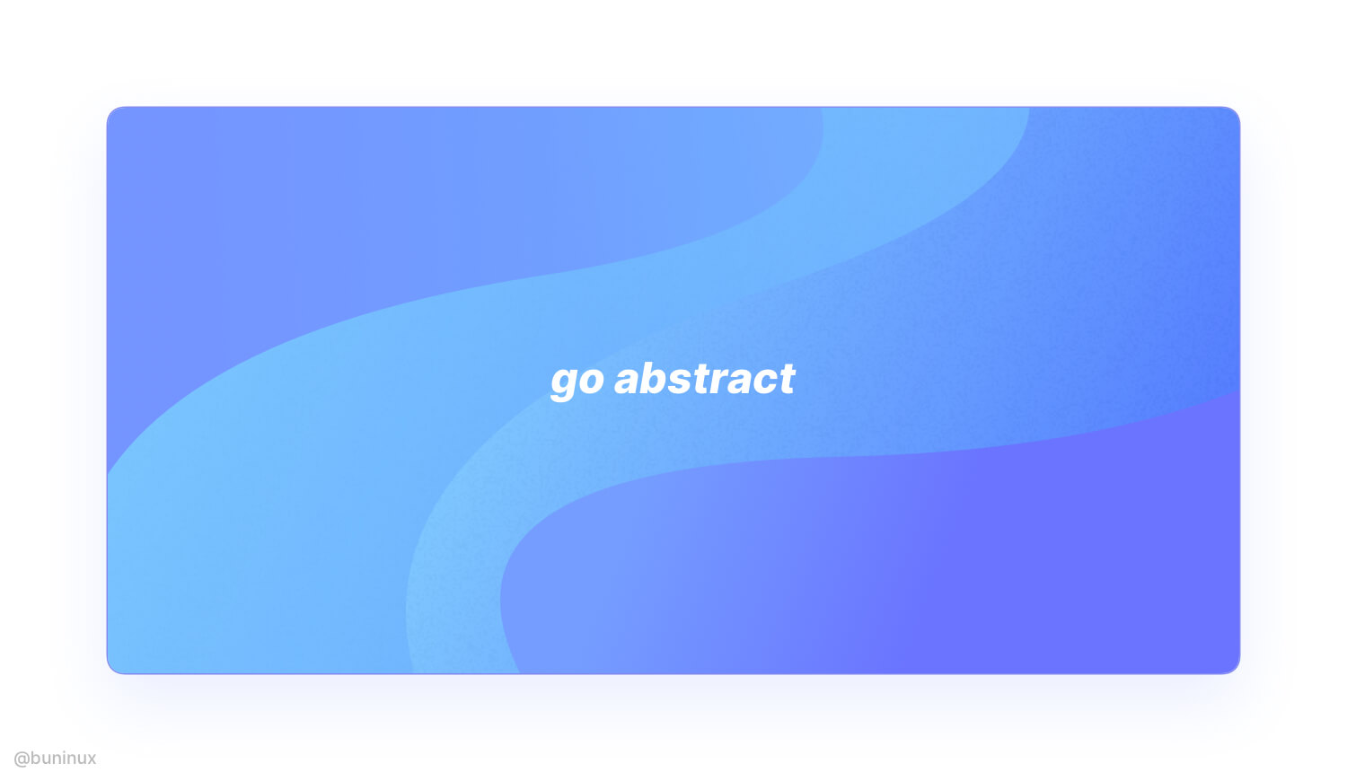
Combine gradients with abstract shapes
To make your gradient, even fancier employ abstract semi-transparent shapes. Use the "Mask" tool for nesting blobby or wavy shapes beyond or above your gradient layers.
---
Thanks for the read! 🙌
If you enjoyed this article, feel free to subscribe and share these tips with others!