.jpg)
UI Colors Tips for Figma
May 17, 2022 - Reading time: 35 minutes
Intro
When designing systems in Figma, reshaping and recycling your previous ideas is always a necessary and ongoing process. So various scenarios are encountered around working with project colors. These include: updating your colors globally, sorting, naming your brand assets, using styles in multiple files, and sharing design props with your team.
How you communicate your color decisions and translate them into development will affect your projects. Beneficial or sometimes maybe not. So being flexible and continually attempting to uncover a "better" approach is rewarding. And I appreciate that a design tool like Figma allows us to do it.
Figma has a few approaches that are beneficial to these scenarios. Let's look at them and methods to better operate your project colors with the help of the Frames X — A headless design system for Figma.
Use colors from a library
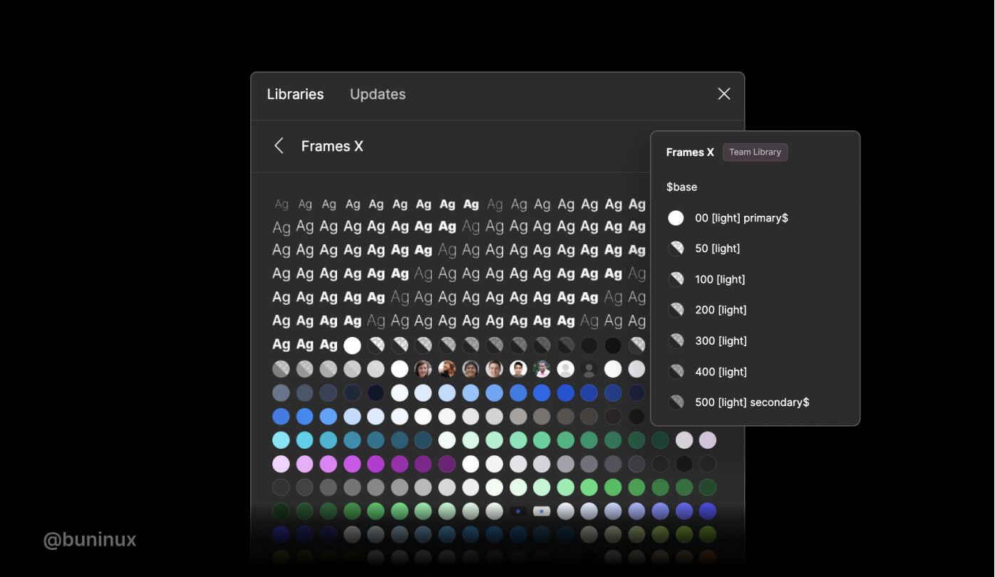
When starting a new project, you could add Frames X or any other UI kit as your Team library and save yourself colossal time manually adding colors or using any third-party tools to generate them. Using an extant color palette will allow you to quickly populate your new project with a broad and thoughtful range of colors.
Note that the team library feature will require you to have a proffesional Figma plan.
Is it worth it? Absolutely. A color library will help you communicate your stylistic decisions while staying consistent across more significant projects and teams. Colors and typography could be partitioned into separate libraries your team access without cracking your ongoing work, letting everyone be on the same page regarding the project/file they are currently working on.
Tag styles to find them faster
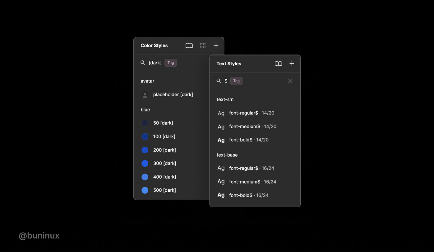
Tagging styles is a great practice to speed up your overall workflow in Figma. Not only when working with styles, but this also applies to components. Tagging your styles will allow you to quickly find the needed text, color, or component through Figma menus by typing a name containing a symbol or an included "tag" name.
Frames X, by default, uses the following tags:
$ — Is used throughout the system to prioritize some styles with a primary, secondary, or tertiary role. $ helps to prioritize some style groups, such as the "$Base" palette, marked because it is a system's primary palette.
[light], [dark] — Used throughout the system to describe if a color has an alternative color convertible from light to dark mode. Also, enclosing brackets tags ensure styles name identification in plugins, such as the Appearance plugin, which helps to generate a light/dark theme from your selection.
Update colors globally (Batch replace colors)
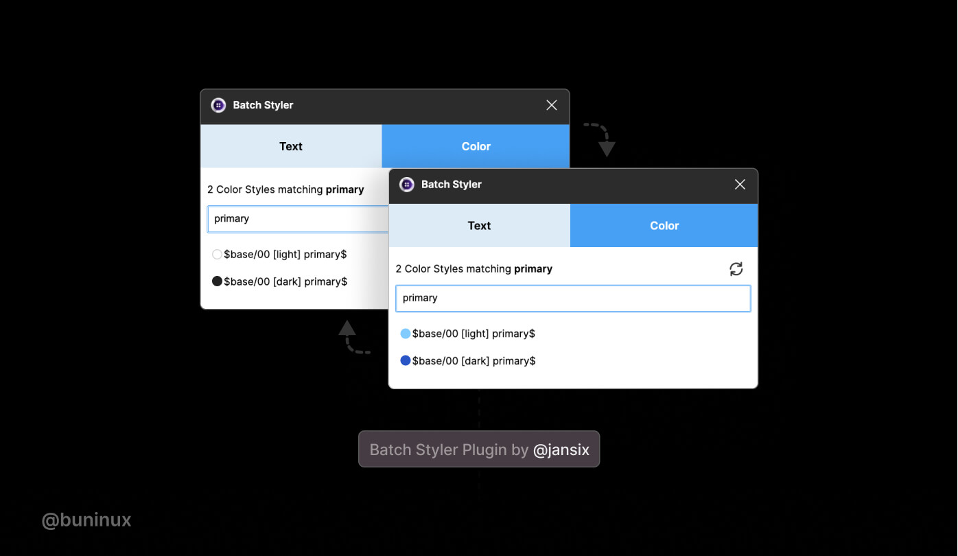
Global color replacement could help you achieve the needed contrast and unique visual style. You could create an entirely new UI color theme by tweaking global primary, secondary, and tertiary color values. Figma allows you to edit styles and propagate multiple color changes throughout your file. Global color replacement could also help you achieve the proper contrast ratio when working in a more detailed-component level (aka zoom 200%).
You could use Batch Styler Plugin or Figma Tokens plugin to speed up the global color replacement process. You could start tweaking your design system files by selecting multiple color or text values and then batch replace them with new ones without breaking any connections between styles.
Use a proper naming convention
Frames X uses literal or definitive color naming (like red, blue, etc.) and a numeric scale (where 50 is light and 900 is dark) by default. While this is reasonably functional for most tasks, there are good reasons to use other naming conventions to better communicate on different projects and teams. You could also use semantic or contextual naming conventions instead.
A semantic naming convention uses names that describe the intent of the color ("Primary," "Secondary, "Danger," "Background," etc.). Semantic naming allows underlining the value of the color rather than using a combination of name and numeric scale, making it easy to modify the whole theme to any combination of colors we need. Other examples of Semantic names are Brand, Accent, Warning, Alert, and Success, to name a few more.
A contextual naming instead uses names that define a color for an exact type or category of component ("color-primary-button," "color-default-icon-small," "color-error-modal," etc.)
Contextual naming is good when you have your design system in a final state, at that point where you don't add new things or components to the system. With contextual naming, you'll have your project at your fingertips, with every string responding to a particularly assigned color or group of colors.
But using contextual naming from the start could quickly overwhelm and mess up your design process with hundreds of definitions to keep in mind, making it challenging to find and use colors appropriately. And, because it is challenging to resist the urge to define every color, naming things from a contextual perspective will always grow exponentially. So apply it only if needed (usually for more minor projects from personal experience).
Understanding color models
We tend to feel comfortable with the HEX color model as designers. But HEX values are tough to read. It's unlikely you would be able to imagine the color of an element by reading the hex value, except if you are an expert designer.
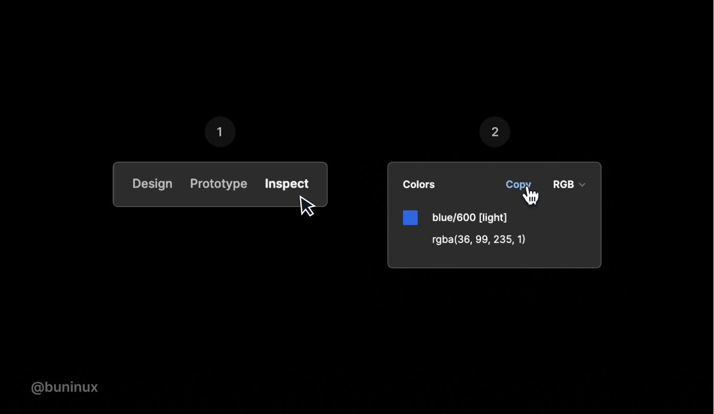
RGB (red, green, blue) notation is a better alternative to writing and sharing colors, giving us access to the exact scope of colors as hex values in a much more readable format. Colors on the web are made of three values, meaning the higher the proportion of red, green, and blue, the more saturated the resulting color will be.
RGB is well known and tends to have a better reputation among developers than HEX. So it may be a good idea to explain how to copy a CSS-friendly color code to your fellow developer friend.
In Figma, you can access the color code on the inspect tab. You could select the RGB color model from the Colors section dropdown. This will let you copy/paste this directly into a stylesheet or code editor without additional formatting hassle.
HSL is another helpful and less known color model (hue, saturation, lightness). This model seems to be the far more intuitive way to adjust color values and is easier to understand, even from a non-tech perspective. HSL can be easily explained thoroughly. For example, we can get darker and lighter variants of the same color by adjusting the lightness parameter or a saturated color with saturation value, etc., which is a convenient way to interpret how our eyes perceive colors.
The advantage of HSL over RGB is that it is far more intuitive: you can guess at the colors you want and then tweak them. It is also easier to create pallets of matching colors by keeping their hue values the same and varying the lightness/darkness and saturation.
Adjust nested or mixed colors
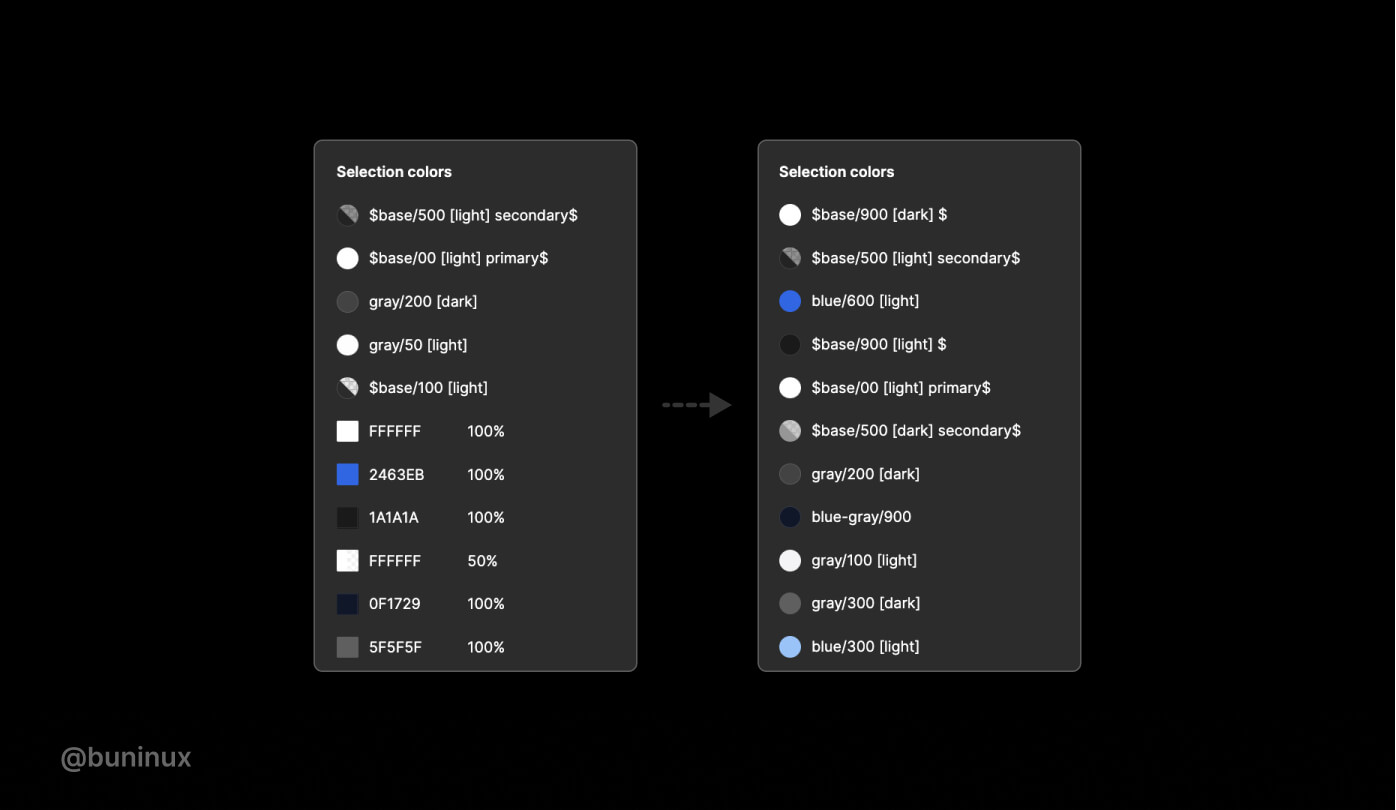
Figma has a helpful tool you could spot on the right pane under the Selection colors name. Selection Colors allow you to change the appearance of your design without selecting each layer individually and then applying colors to the selected layer. This comes in handy when creating many color variations for your UI. It'st'svealed when you have more than one style in your selection.
You could view, select and alter the Fill/Stroke color if all layers have the same fill or stroke. And you may inspect and alter colors in the Selection colors section if the layers in your selection have different colors applied.
Use the selection colors feature to tidy up styles within a frame or components. Merge duplicated Fill or Stroke and improve the overall consistency of your designs before making the presentation.
Utilize color tokens
Color tokens are a core element of Figma Tokens plugins. A community plugin by @jansix. Color tokens are atoms discreetly connected with styles while also providing choices that Styles don't provide in Figma.
Utilizing Color Tokens will let you access various workflows for updating, creating, and changing Fill/Stroke color globally. You could get more information on using Color Tokens on the official plugin website.
Bonus Tip: Change colors in Figma with keys
You could change the Fill/Stroke colors with the Up/Down on your keyboard and the Shift key for bigger steps between colors. Quite handy when you're looking king for that one color or a particular match for the existing palette.
---
