UI Grid Best Practices
May 20, 2021 - Reading time: 6 minutes
Make better designs with layout grid tips & tricks.
Space and grid make the foundation of any design. Once mastered and used correctly, the grid helps you to create solid and visually appealing solutions for your designs.
Therefore, I would like to share my tips for mastering the grid in UI design. In this episode, we talk about layout grids. Let's start ✌️
What is a Grid?
The grid helps establish the foundation of any interface. You can think of it as a framework for your layout. The framework helps to organize your UI elements, guide the reader and identify individual parts of your design.
Terminology
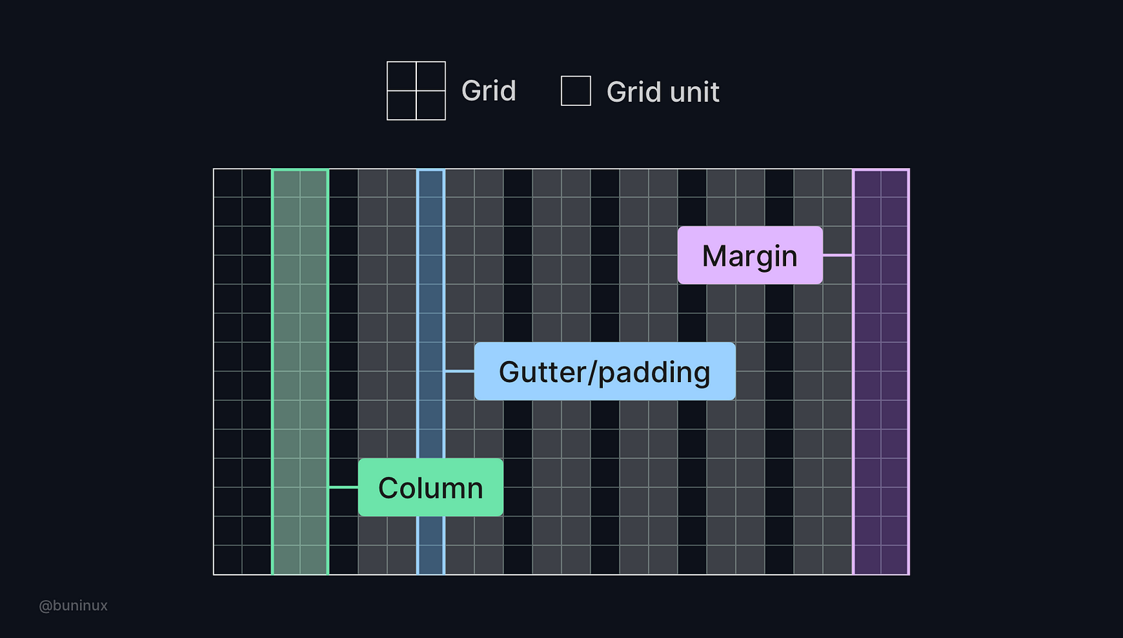 The grid consists of grid units. The layout is placed upon the grid and has a certain amount of columns. Columns have margins on the left and right, as well as paddings between each column.
Tip 1—Choose numbers wisely
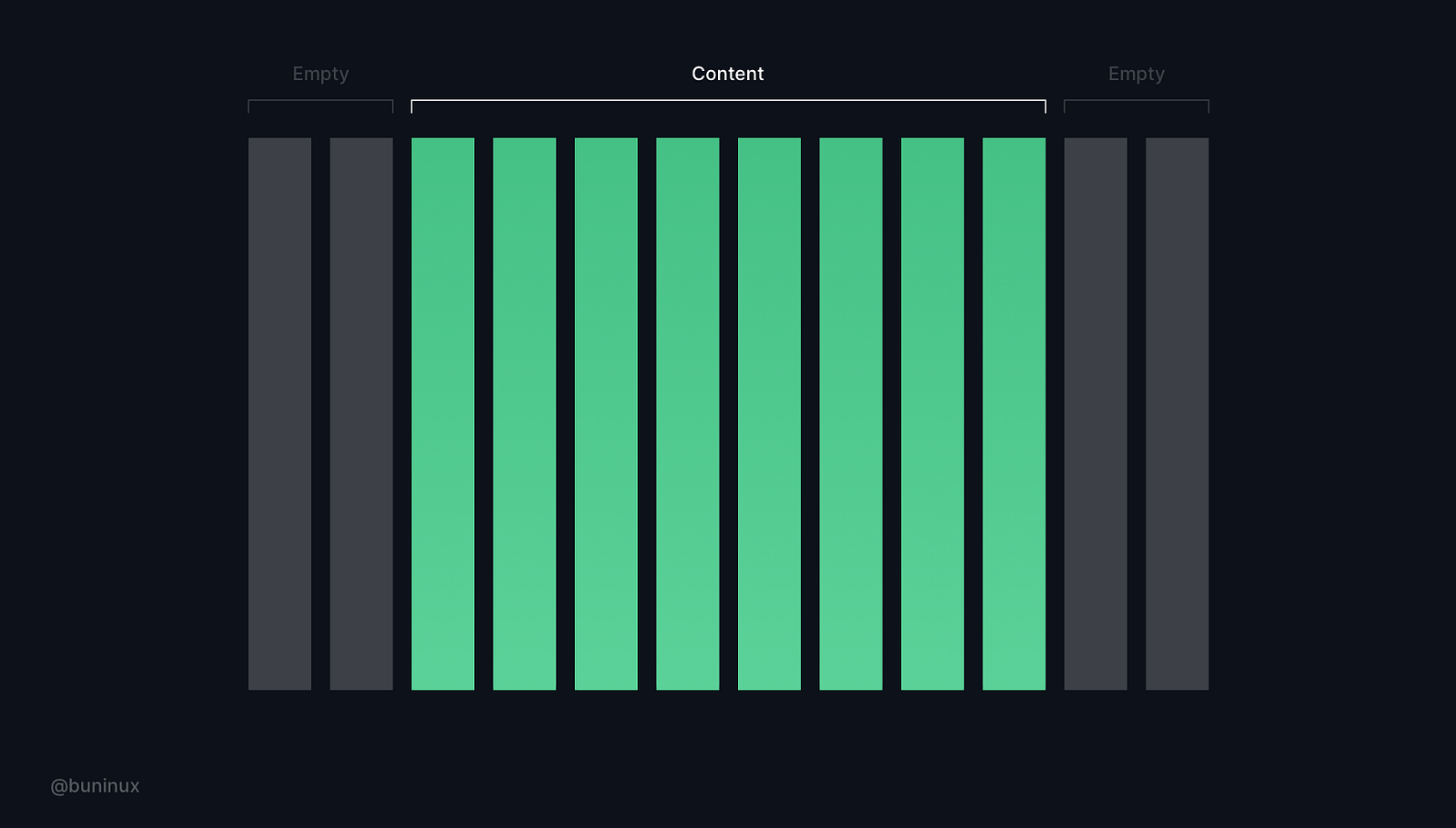 While the 12-column Bootstrap like-grid is the most popular choice, it's not mandatory. When choosing a grid, select the one with a number of columns your design truly needs, no less, no more.
Tip 2—Know your constraints
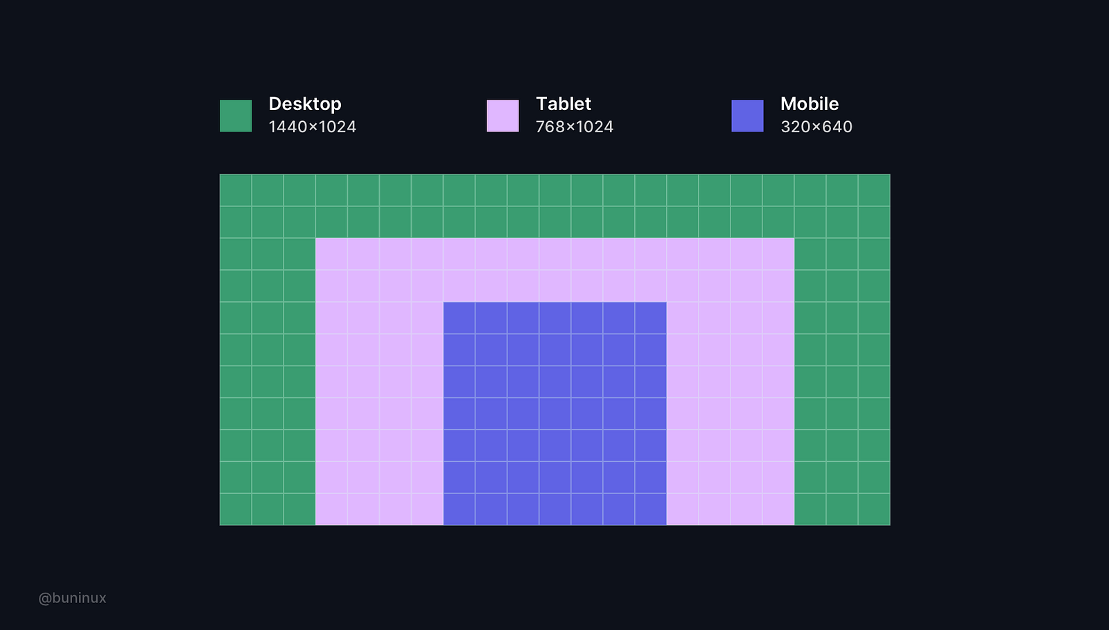 Always consider the screen you are designing for. Know how it is handled and operated by others. Use these limitations to your advantage and learn to design with them.
Most common screen resolutions (px)
- Desktop: 1440x1024
- Tablet: 768x1024
- Mobile: 320x640
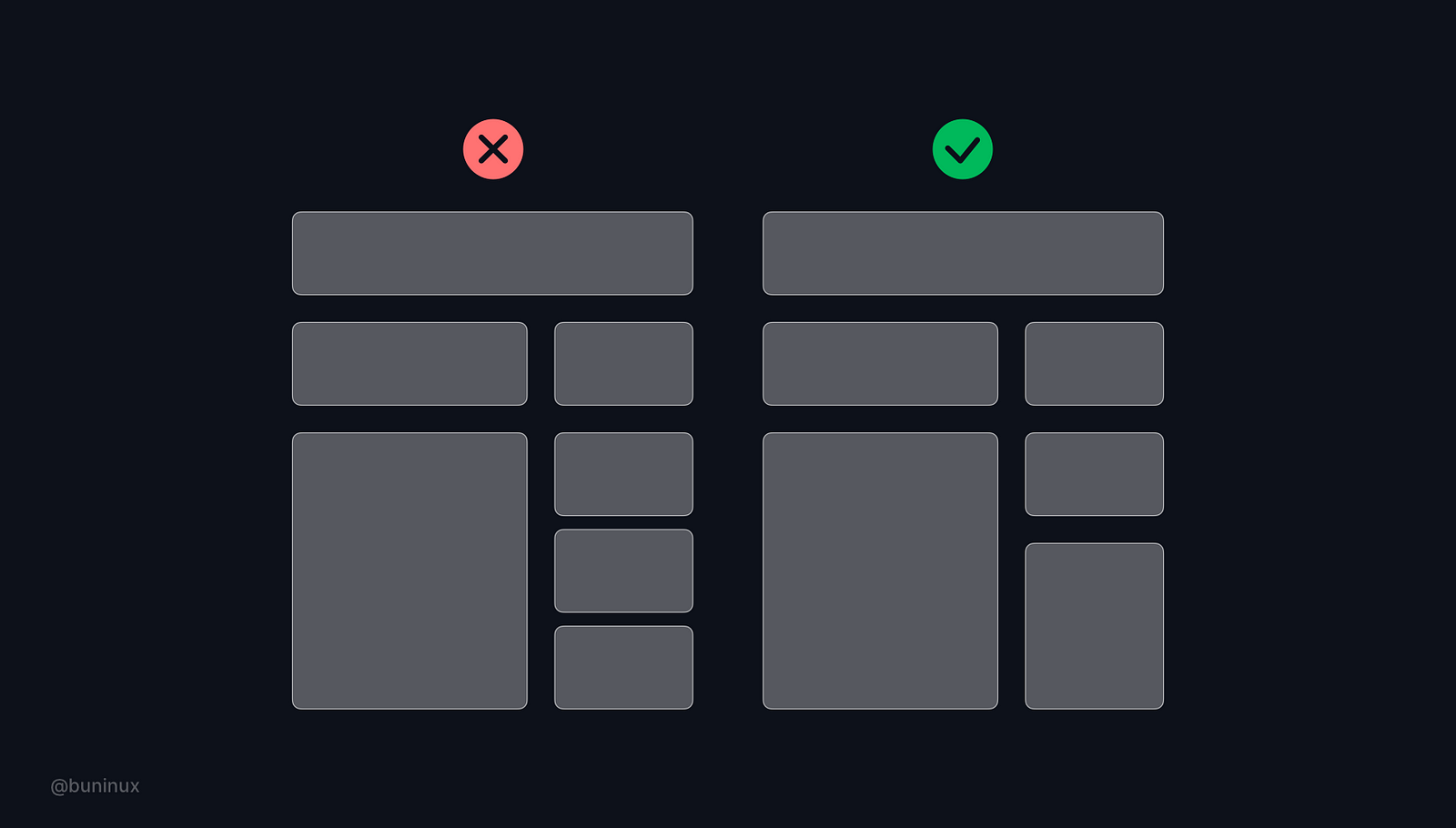 Tip 3— Horizontal and vertical spacing
Consider both vertical and horizontal spacing to make your layout more appealing and consistent.
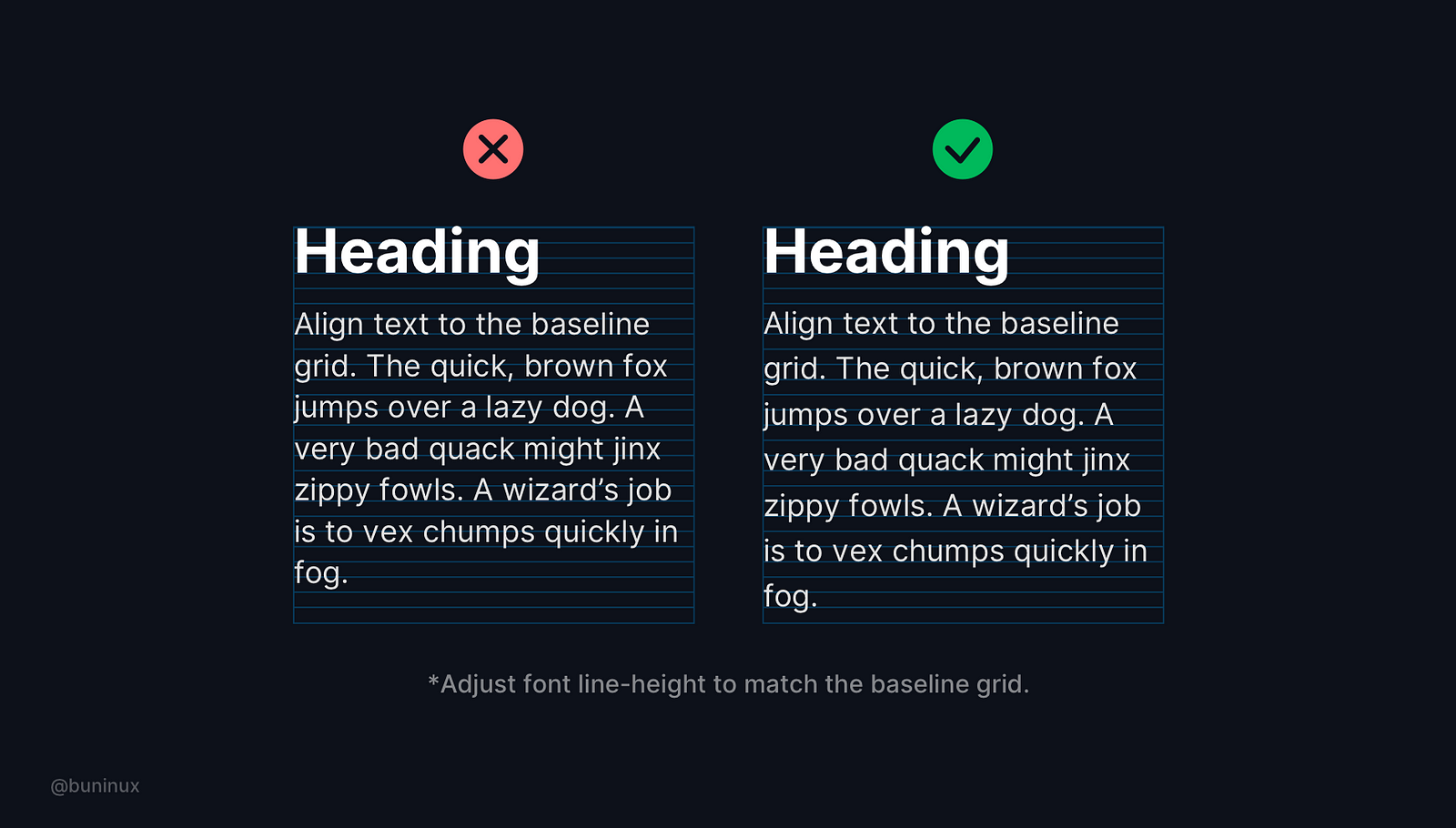 Tip 4—Shape vertical rhythm
Use the baseline grid to arrange the content and bring visual consistency to your text and layout elements.
Bonus tip—Adjust font line-height to match the baseline grid.
For example: If you choose 4px as a baseline/grid unit, to align text, you will need to set the line-height of the font to a multiple of the unit, which means the line height should be 4, 12, 32, 64, etc.
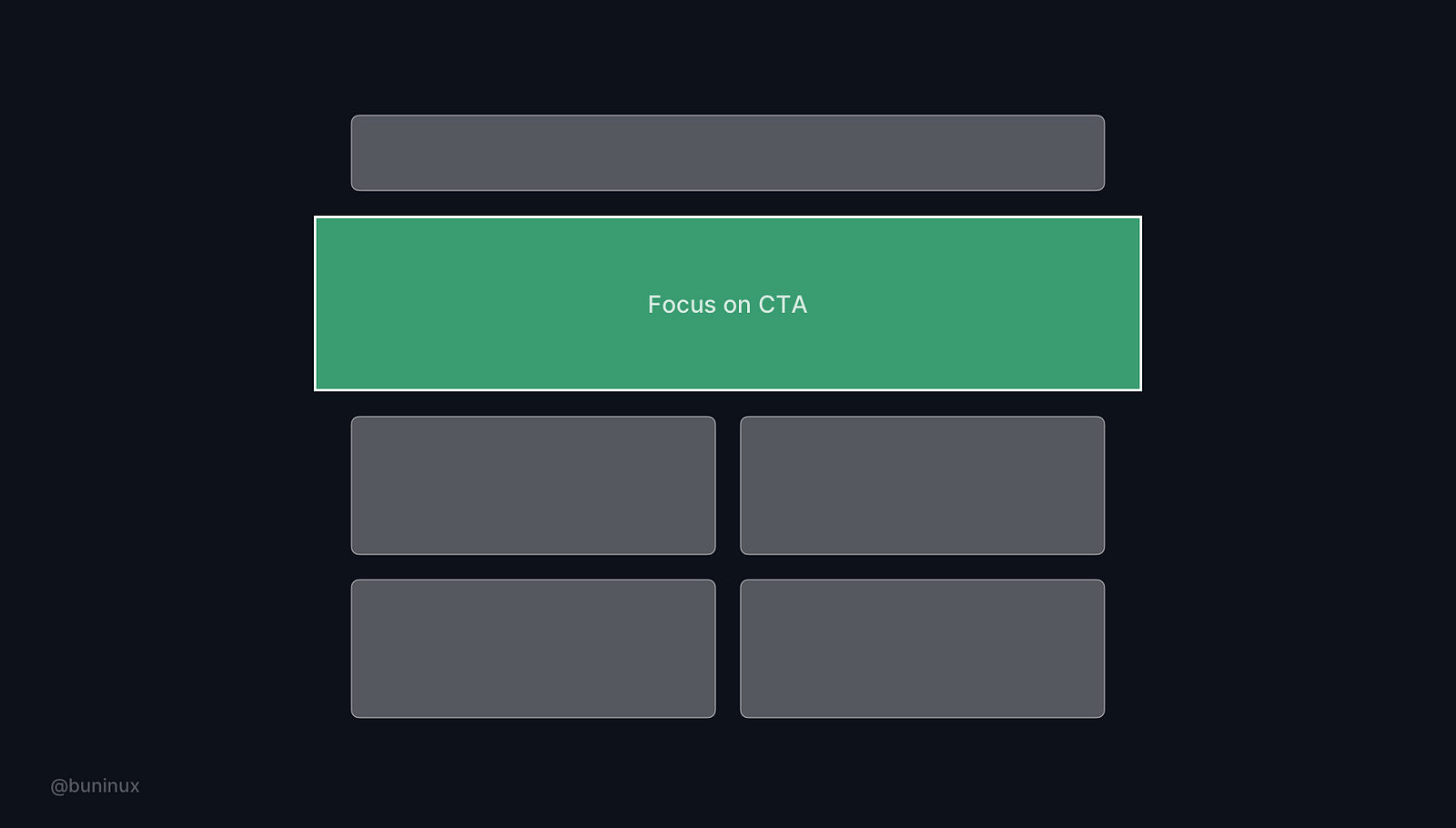
Tip 5—Use power of the frame & color
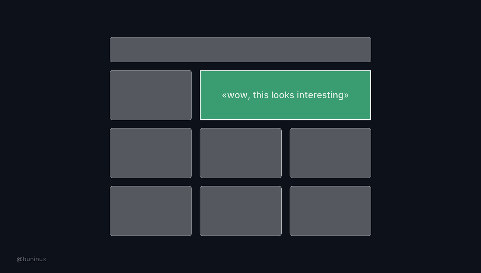 Use framing as a tool to focus your user's attention on a certain layout part. Add additional visual weight in the place where it is needed.
Tip 6—Step out of the grid
 Put certain elements off the grid. Use this breakdown trick to add value and make certain parts of your design stand out.
Tip 7—Adapt your grid
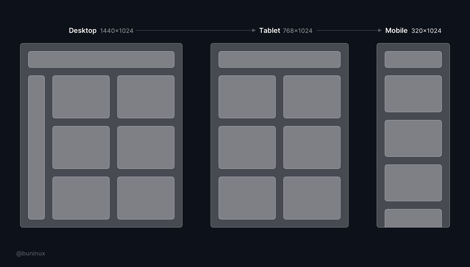 Ensure your layout is adaptable to common screen sizes, breakpoints and provides a good mobile user experience. Make sure to always check your designs on different screens.
Tip 8—Learn to design without a grid
Designing without the grid is okay for a small project indeed, but for scaling projects, it's mandatory.
Learn to design with a grid and without actually bringing it to your canvas. Observe your layout without the "grid glasses" from time to time to find the most creative solutions for your tasks.
Useful resources
Resources
Plugins
- Layout grid vizualizer —Better layout visualization (Figma);
- Grid generator — Generate grids in seconds (Figma);
- Guides—Quickly generate guides for a selected element (Sketch);
- Copy/Paste—Copy-paste layout grids (Sketch).
 Updates
 FAQ
FAQ