.jpg)
Typography: Alignment
July 27, 2021 - Reading time: 5 minutes
Make your UI more effective and easy to read with text alignment.
Text alignment is a small but significant part of the interface. Alignment affects how our brain scans the content on a screen. A proper text alignment is one of the most distinct indicators of a professionally crafted digital product.
Any interface is 90% text. So that's why when you see a duly aligned typography, you get the impression that you're using a more thoughtful interface. And when something is not in its place, it hurts our perception immediately.
In this episode, I want to share practical tips to help you create a neatly aligned interface typography.
Tip 1—Avoid center alignment for long text
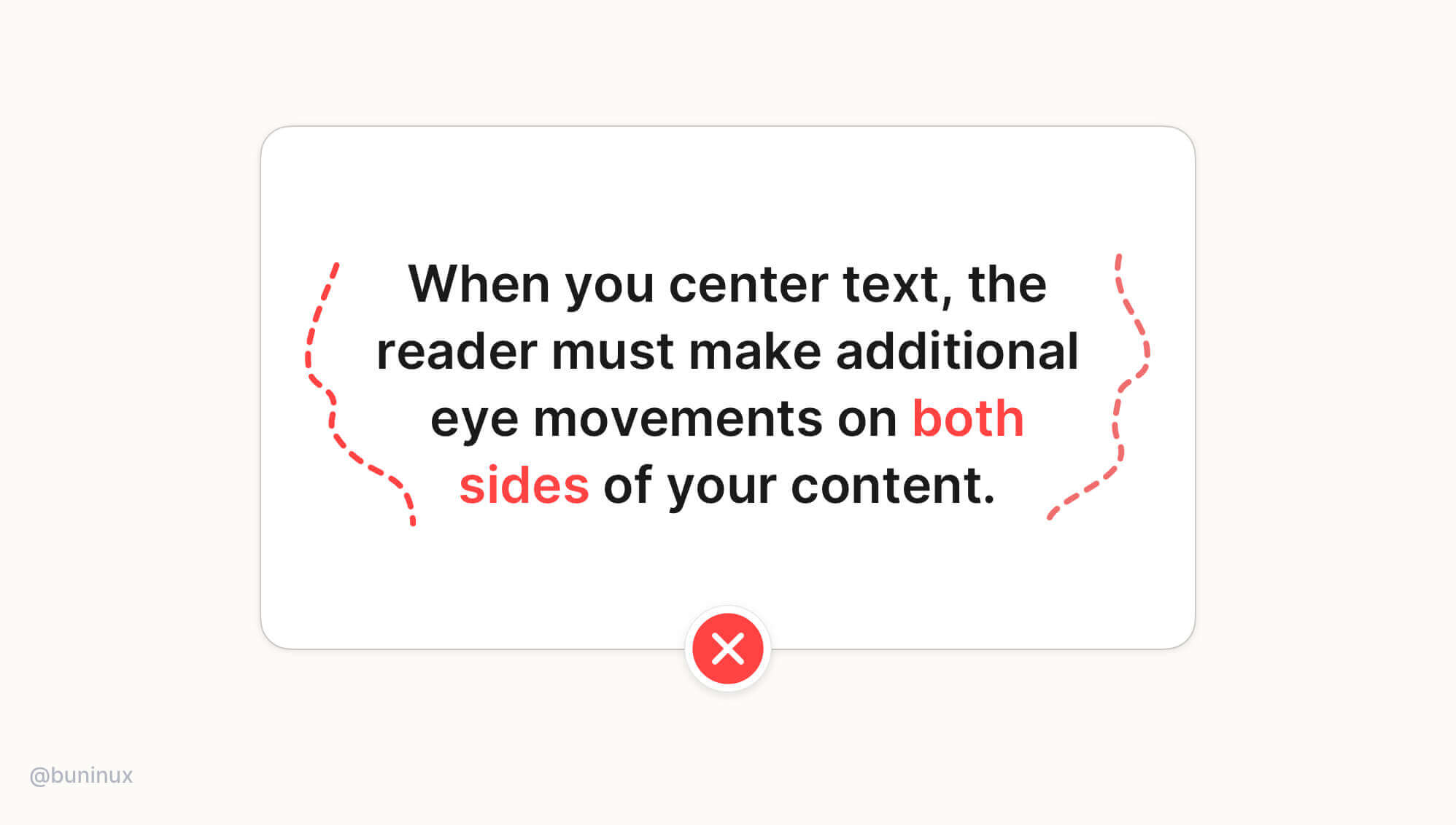
When text is longer than two or three lines, it is always recommended to ignore center alignment.
When you center-align a longer text, you will force the reader to make additional eye movements on both sides of the content. This causes unnecessary eye fatigue and results in lower reading focus.
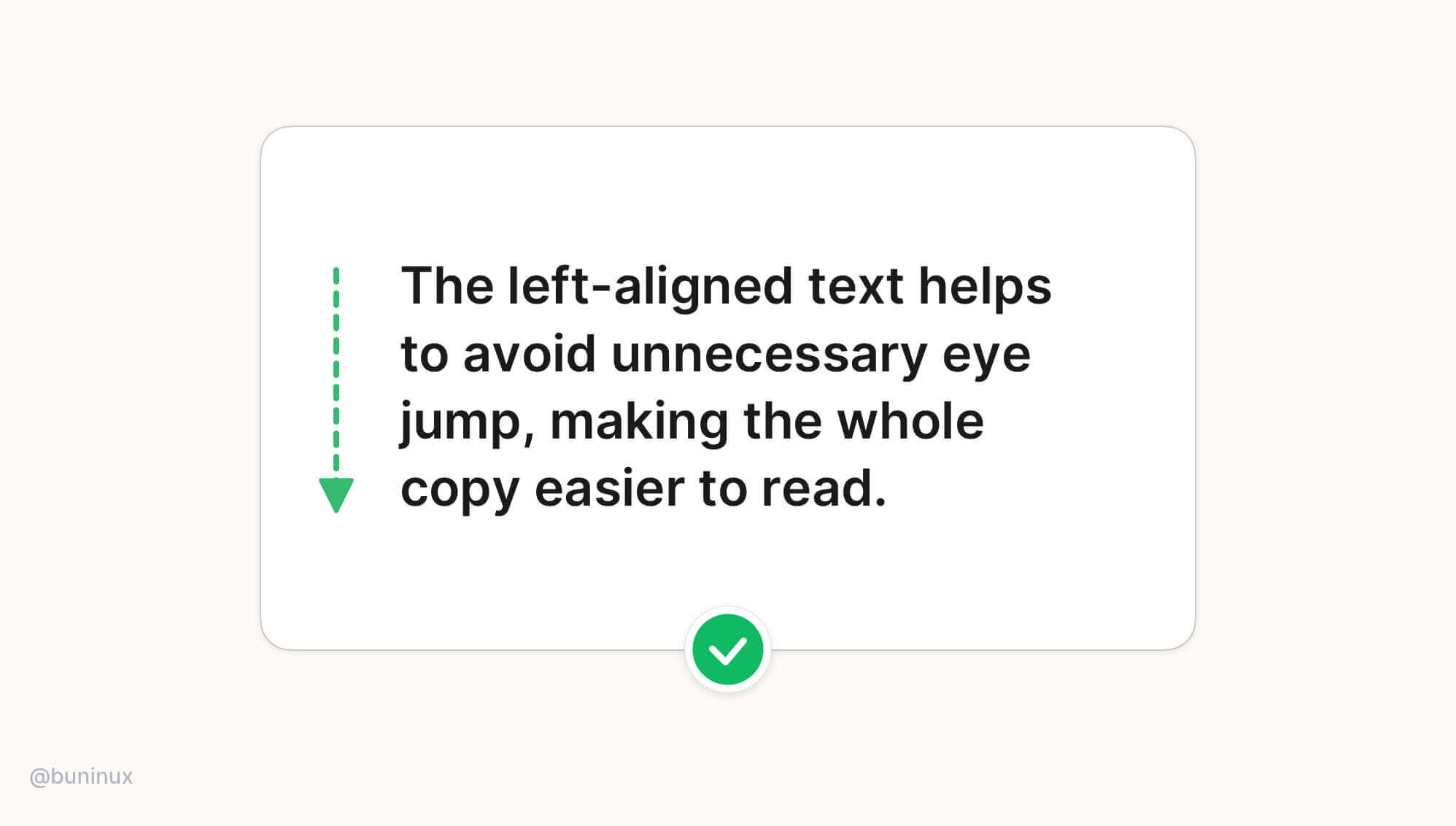
Tip 2—Always left-align long text
The left-aligned text results in much better content readability, so all books, articles & newspapers are written this way. The left-aligned text helps to avoid unnecessary eye jumps, making the whole copy much easier to follow.
Note: When localizing UI for right-left languages such as Arabic, Hebrew, or Persian, use the right-alignment instead of the left one.
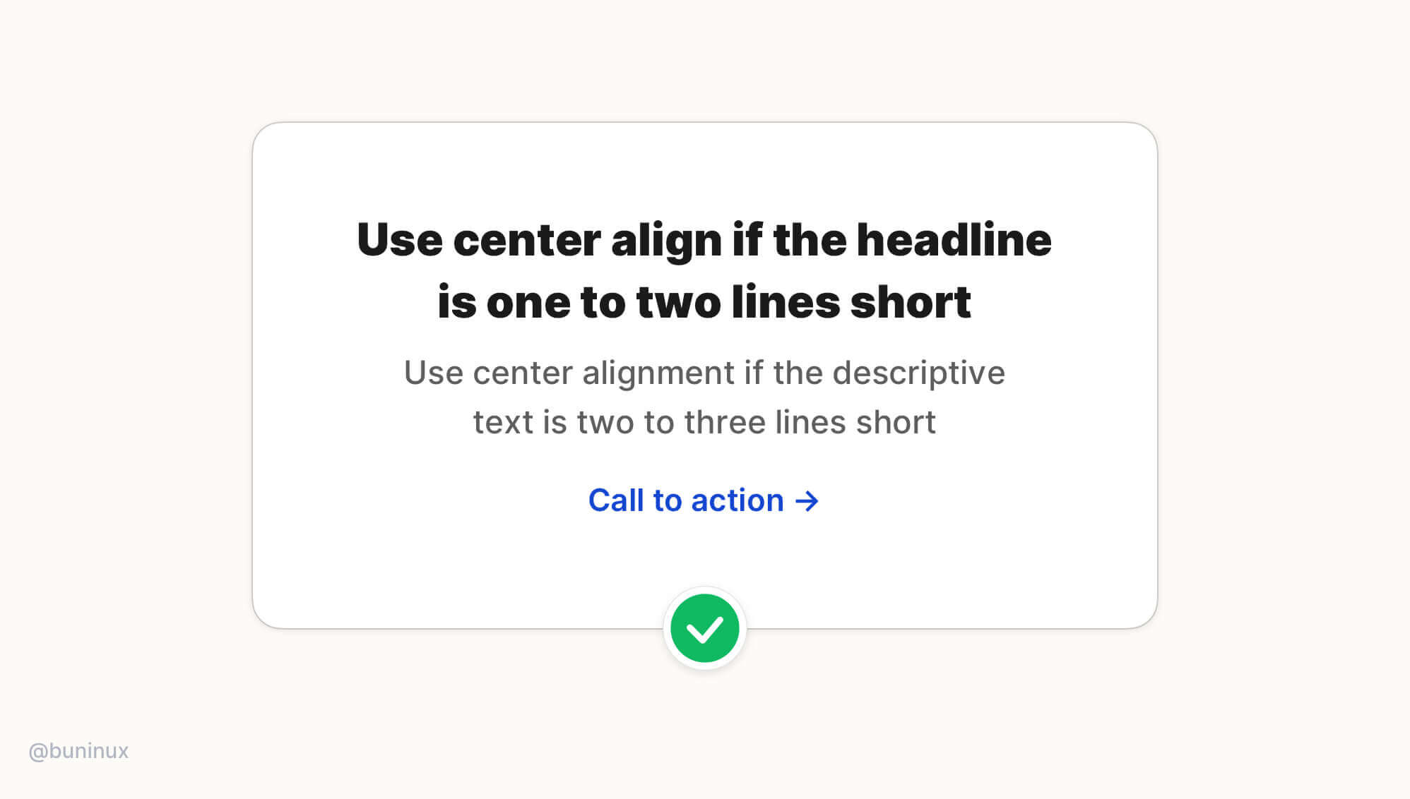
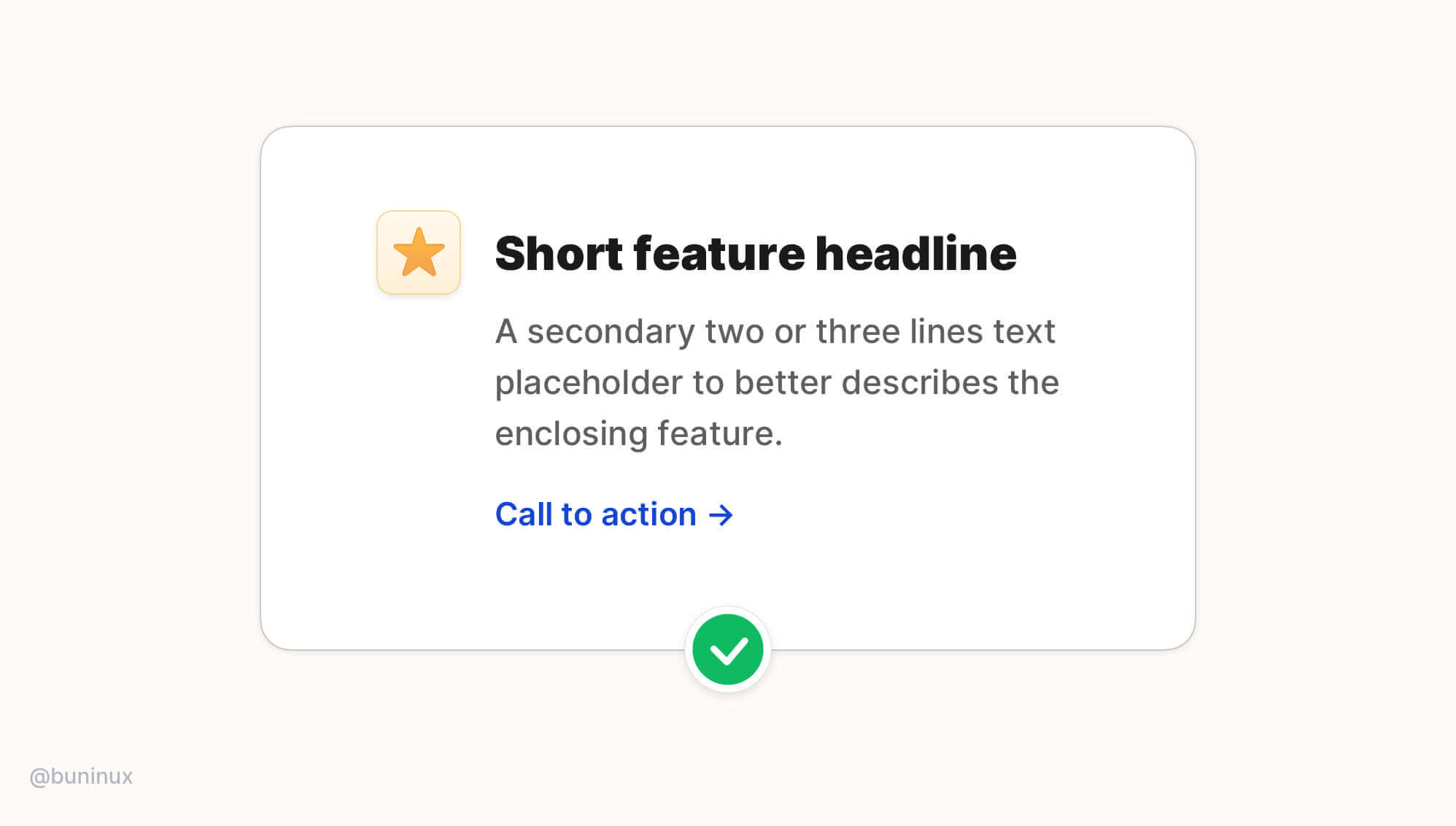
Tip 3—Use center alignment for headlines or small blocks of text only
Use center alignment if the headline is one to two lines short. If the text block is longer than two to three lines, it will always look better left-aligned.
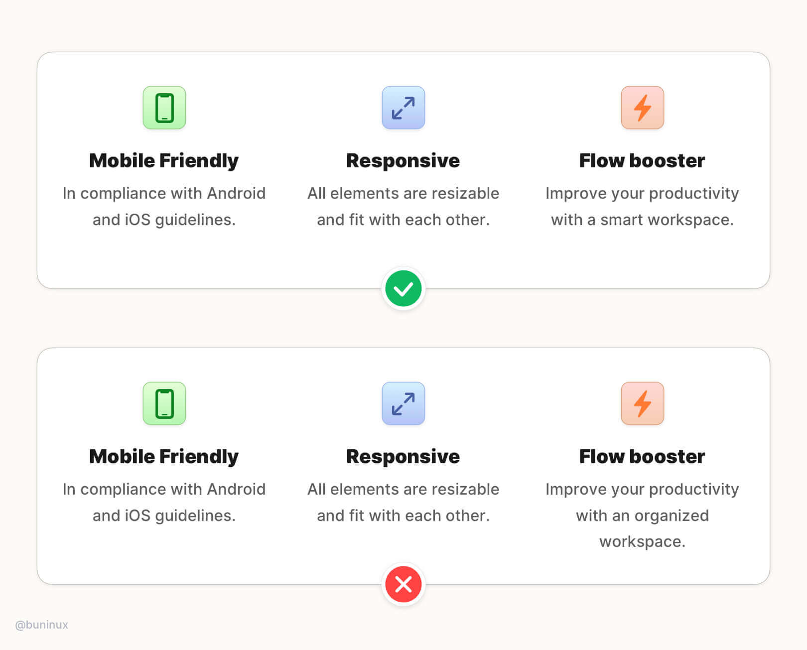
If you need to center more than one block of text, one of them is a little longer. The best solution is to modify/rewrite the content to make it shorter:
Tip 4—Use the hanging alignment to connect with UI elements
Use the hanging alignment to establish a clear visual hierarchy for UI elements that don't have the same visual weight as the text, such as icons, bullets, or quote commas.
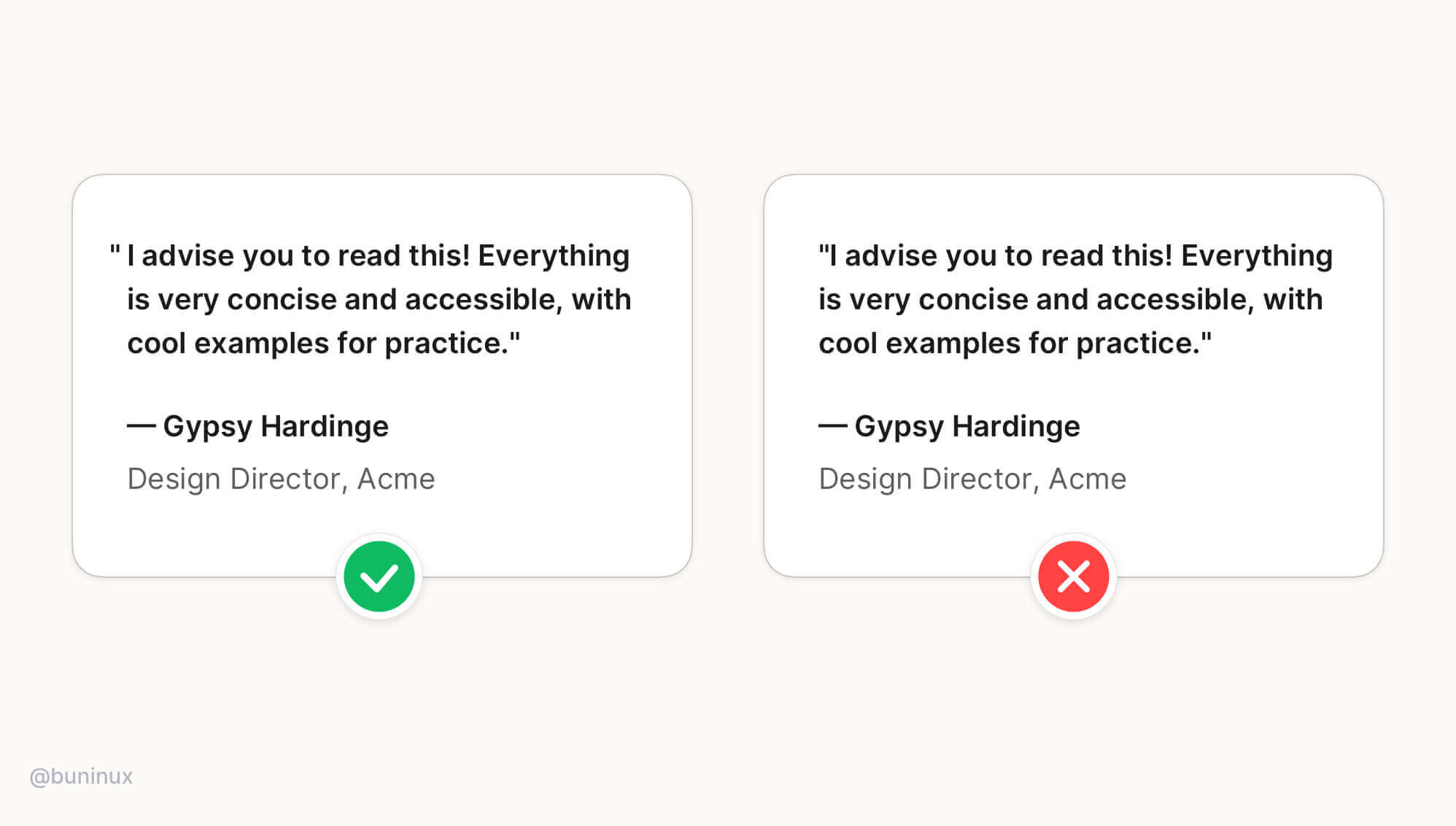
Hanging alignment helps to create a clear eye path for the text, eliminating zig-zag eye jumps.
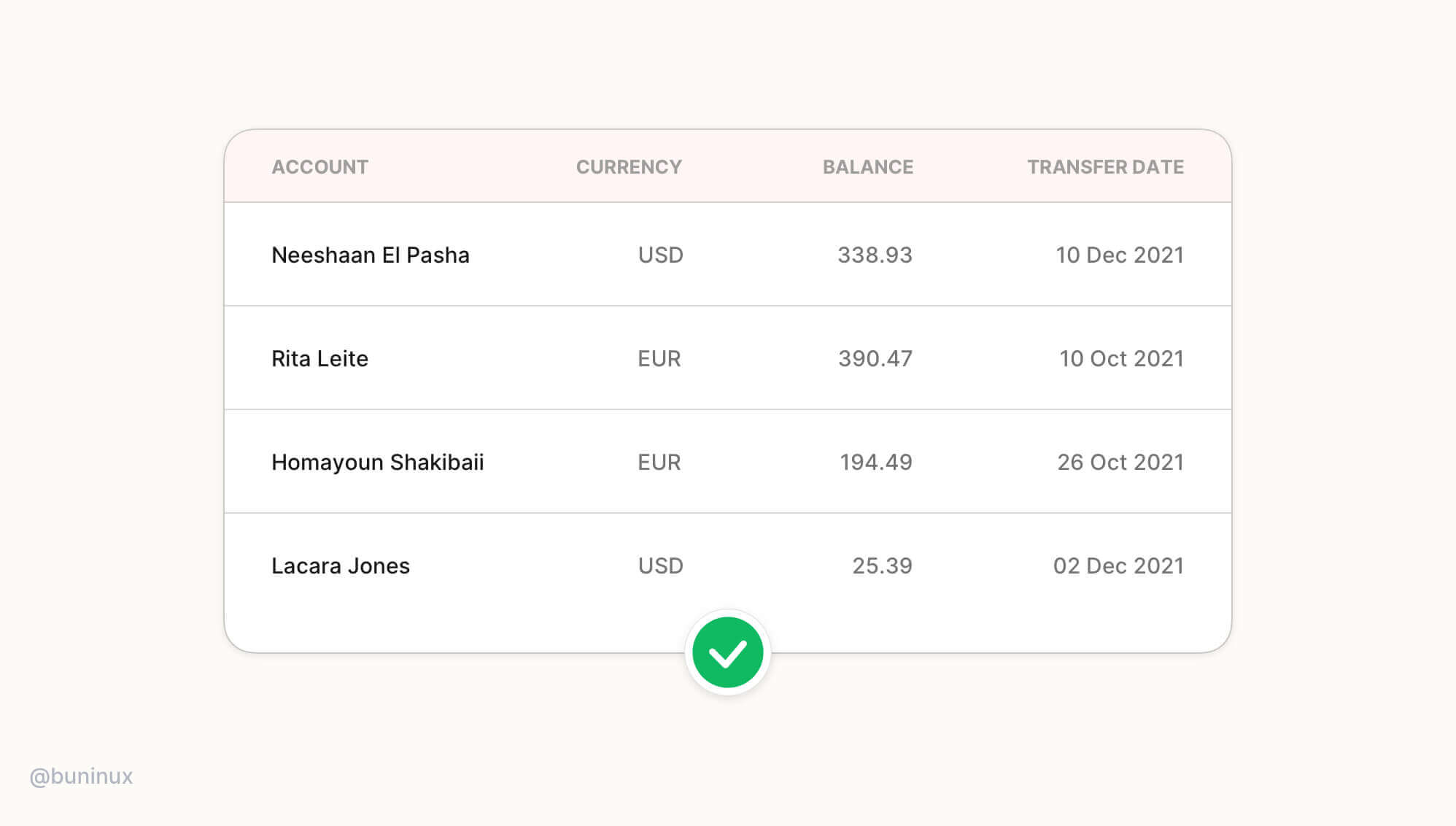
Tip 5—Right-align data & numbers
Right-align numbers and timestamps when designing tables, cards, or dashboards. The numbers are easier to compare at a glance with corresponding left-aligned information when they are placed right opposite it.
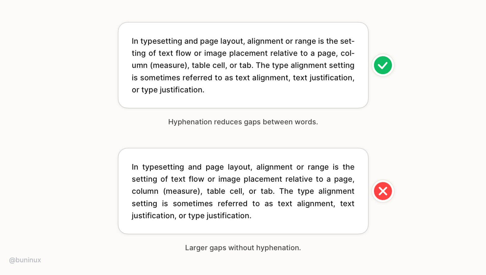
Tip 6—Balance whitespace for justified text
Justified text works great in print, but for the web, when you want to have a more formal vibe, it may leave many uncomfortable spaces between words. To avoid these gaps, consider enabling hyphenation.
The hyphens property controls the hyphenation of text in block-level elements. Note that <hyphens> class is language-sensitive. It helps to find break opportunities depends on the language defined in the font attribute of a parent element. Not all languages are supported, and support depends on the specific browser.
Note: If the hyphenation is not an option, please ignore the justified text and stick to left-aligned text.
 Updates
 FAQ
FAQ