How to Make Badass Shadows
April 16, 2021 - Reading time: 3 minutes
Tips to help create better UI shadows.
Shadows play a huge role in modern user interfaces. They bring depth and hierarchy to organized rectangles.
Based on how you use them, they can bring joy and a feel of elevation to your interface. Here are my tips to help create better shadows with such design tools as Sketch, Figma, or XD.
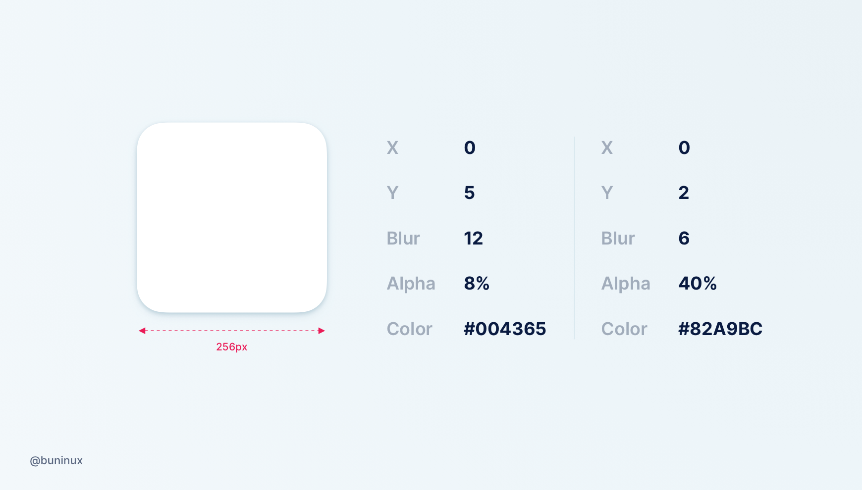
Tip 1 — Make it Soft
Don’t use default application shadows. Instead, adjust the shadow opacity around 5–25%, and set a higher level of blur.
Bonus Tip:
You can also perform this trick with CSS. Here is a great material showcasing many use cases of applying multiple shadows within a single property.
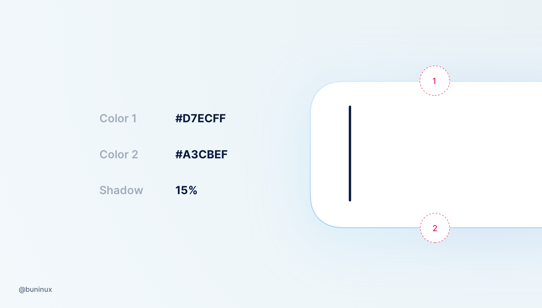
Tip 3—Don’t use pure black
Avoid using #000 for shadows. To make the shadow look more realistic — pick a color based on the element background or its surroundings.

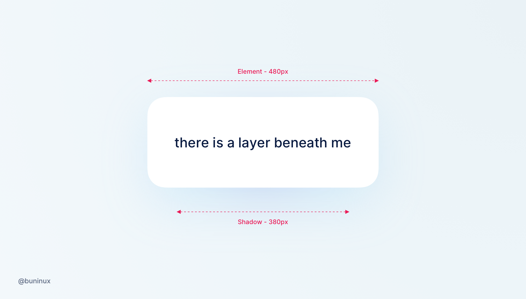
Tip 4—Use a separate layer as a shadow
For a more decorative purpose. You can duplicate the layer and put it beneath the original to emit a more natural-looking shadow.
Add a smaller layer with a maxed blur behind your fore element.
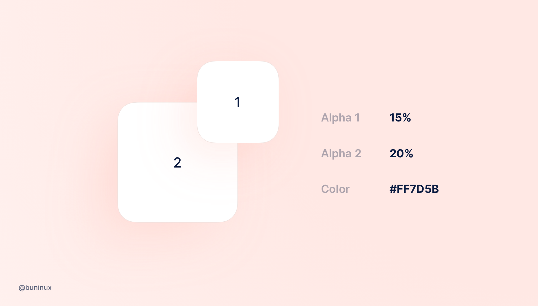
Tip 5— Add depth
Position your shadows based on the light source to emit their direction. Lower the fore layer’s opacity and add a slight border for more depth vibes.
Tip 6— Make it crisp
Add a 2-step gradient stroke/border to highlight the shadow and make it crispy.
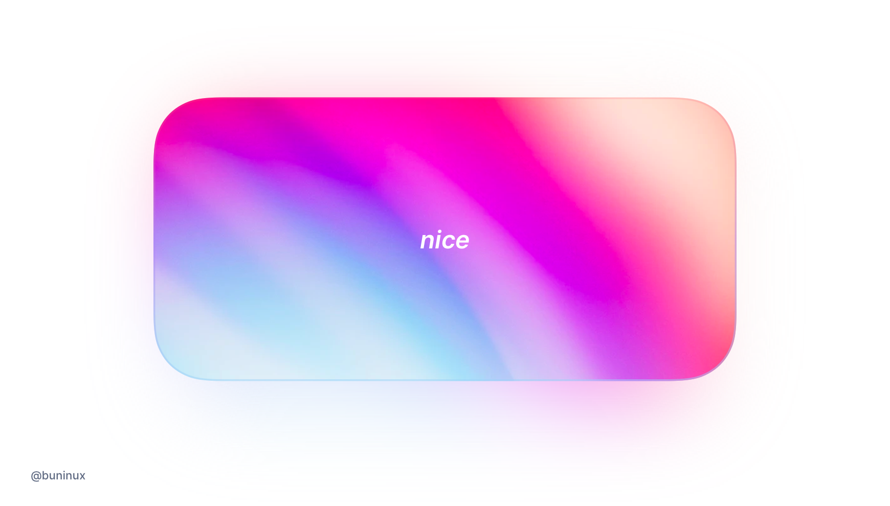
Tip 7 — Blur images background
Put a blurred image behind another to radiate a more natural colored shadow and match it with the image.
Tip 8—Handy tools
Tools
- neumorphism.io — Generate Soft-UI CSS code
- brumm.af/shadows—Make a smooth shadow visually and copy the code
- softui.io—Generate neumorphic styles
- neumorphic.design—Neumorphic playground
Resources