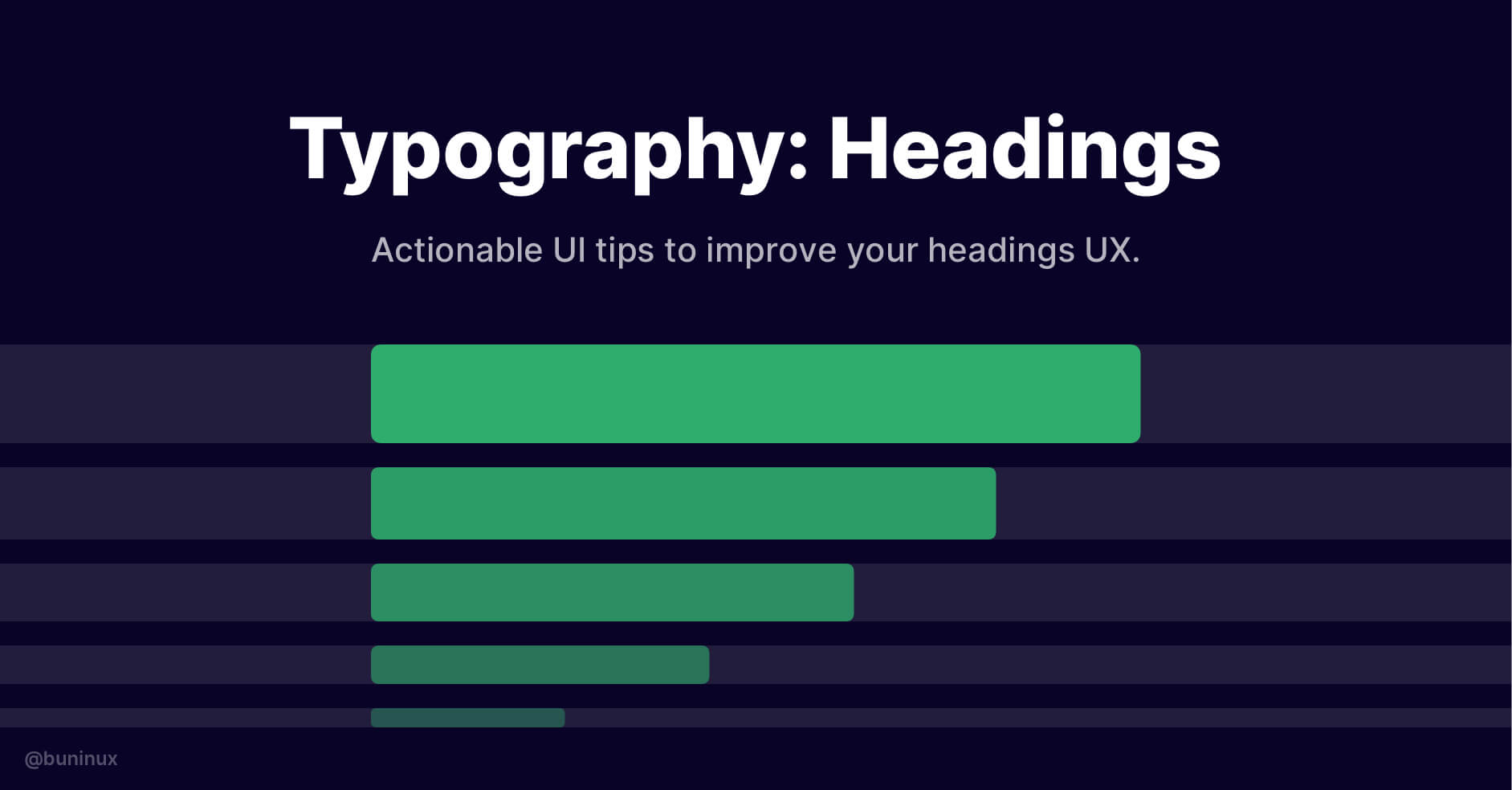
Typography: Headings
July 6, 2021 - Reading time: 7 minutes
Actionable UI tips to improve your headings UX.
Headings are one of the most crucial parts of typography. We read and perceive headlines first, among other information on the screen.
The purpose of any heading & headline is to grab our attention, set the story's right tone, and intrigue the brain with value.
In this episode, I want to share my practical tips to help you make effective typography decisions and improve the overall impact of your typography and call to action.
Tip 1—Make your hierarchy dead obvious
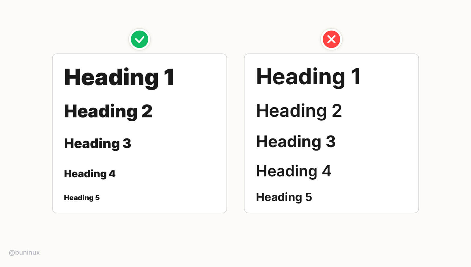
For most UI projects, you'll need to create a set of headings to use around the project (h1,h2,h3, etc.). You can use tools like type-scale.com to do it for you. Or do it manually, relying solely on your perception 👁️, math 🔢, or sense of style 💅.
Any way you do—make it obvious to the reader!
- Increase contrast between headings to improve their readability and recognition.
- Larger size/weight contrast will help readers to understand the importance of each piece of your text faster. And as results improve the reading flow for each paragraph.
Tip 2—Don't over-style your headings
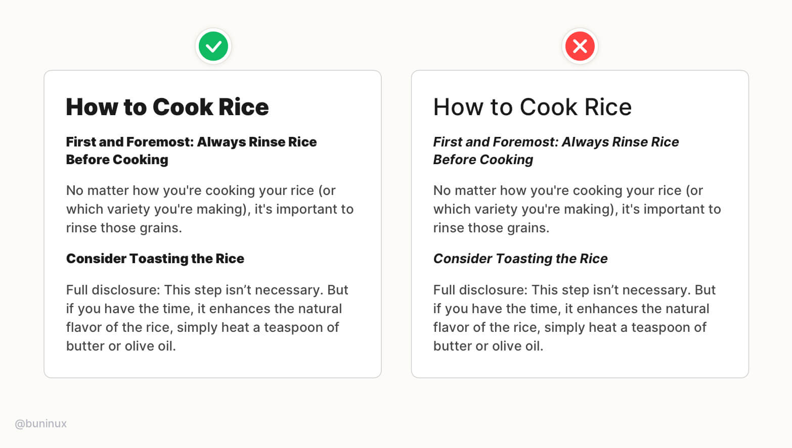
Stay consistent with chosen style. Don't over-style your headings.
- Build a strong hierarchy with a predictable heading sequence for users to read without breaking the rythm.
- Don't sacrifice your paragraph contrast. Make the main content as easy to read as the headings.
Tip 3—Use unique line-height for headings
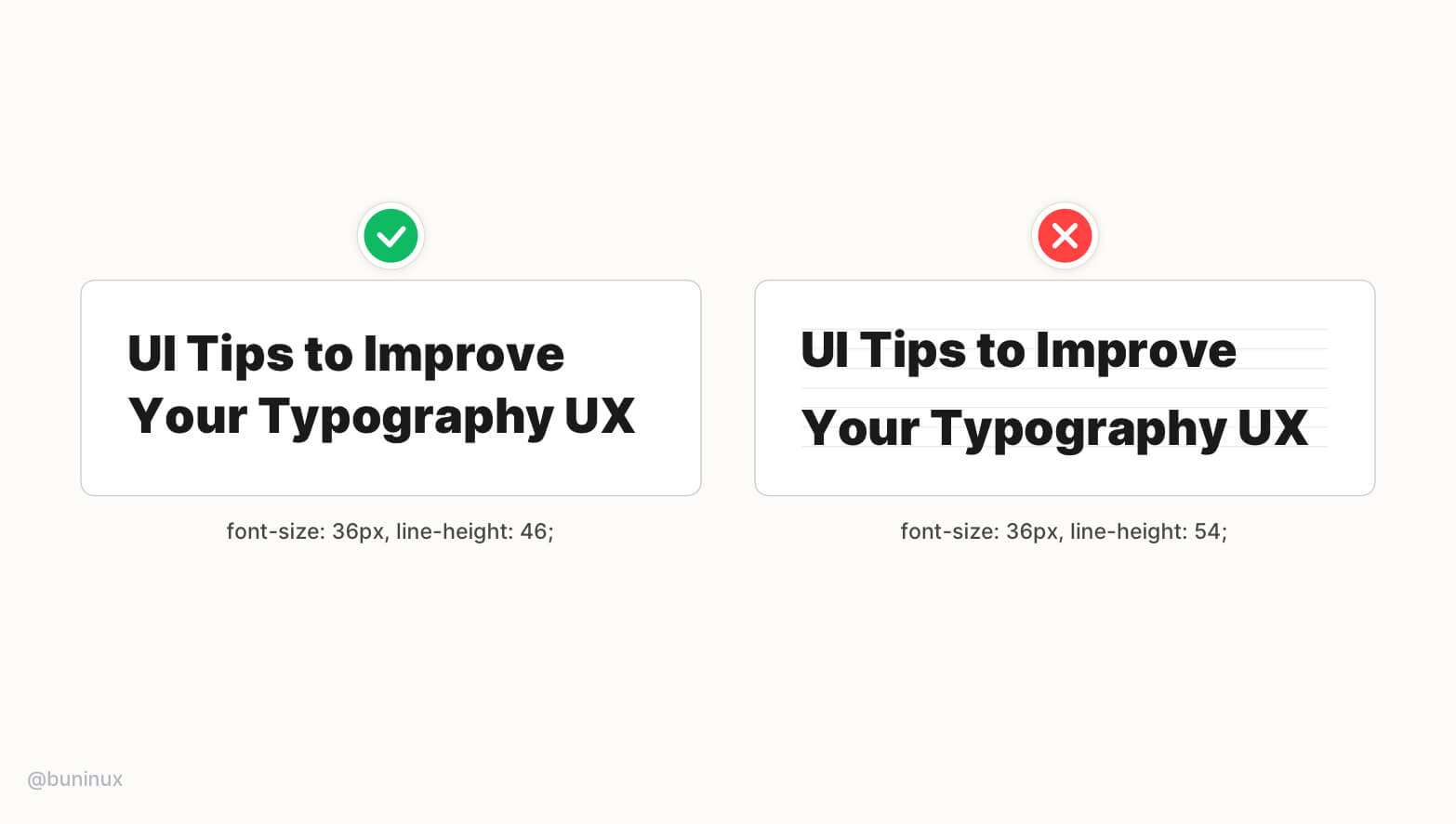
Don't rely on the baseline grid when setting up your headings line-height.
Visual-heavy fonts require an individual approach on line-height to help them have a better vertical balance.
Tip 4—Balance headings with negative letter spacing
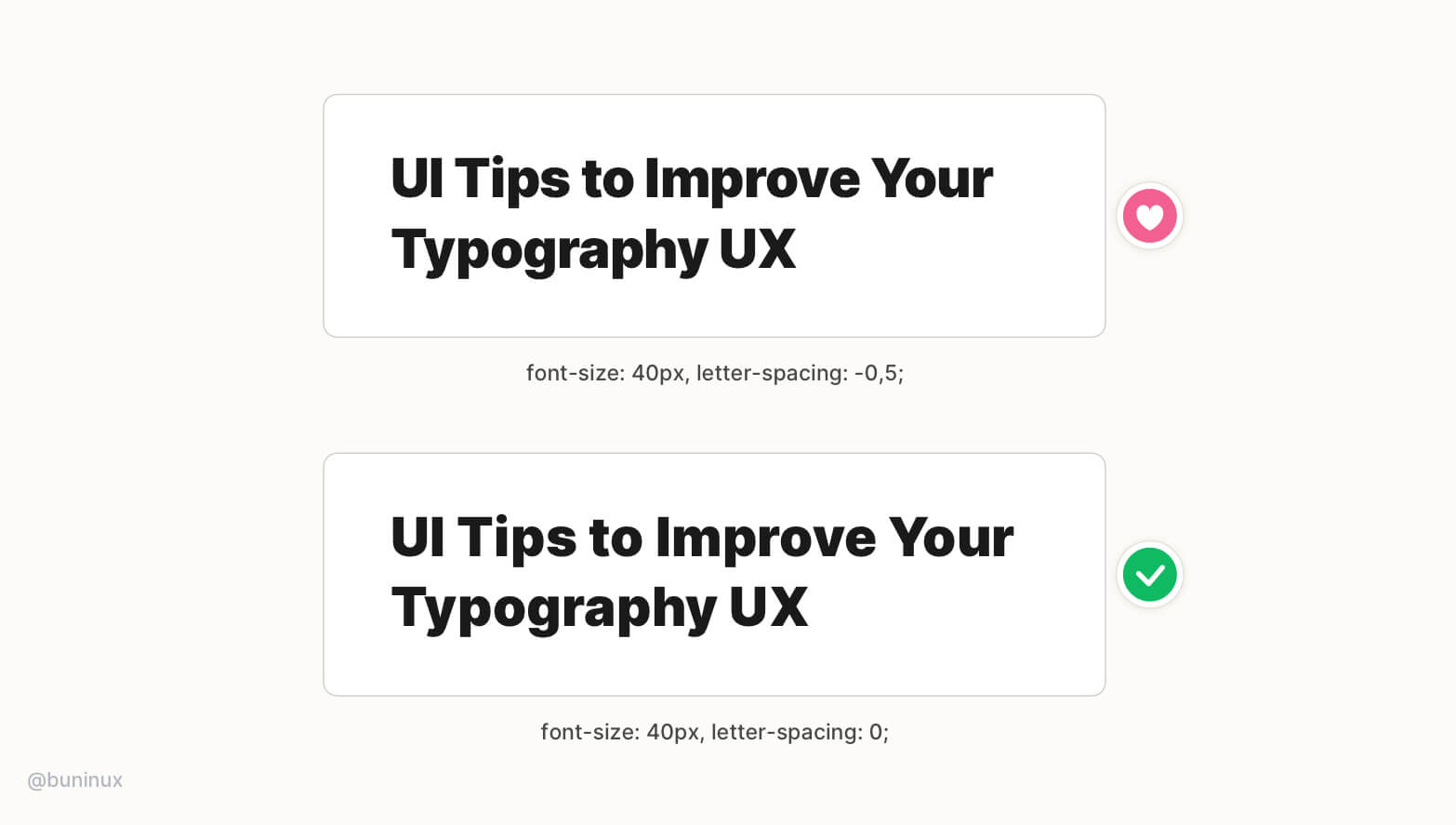
To better balance wider headings— play around with the negative letter-spacing.
Adjusting the letter-spacing is like adding extra spice. This can make your headings feel more balanced by taking less horizontal space and, as a result, less time for eyes to jump from one text line to another.
Tip 5—Balance all caps headings with letter spacing
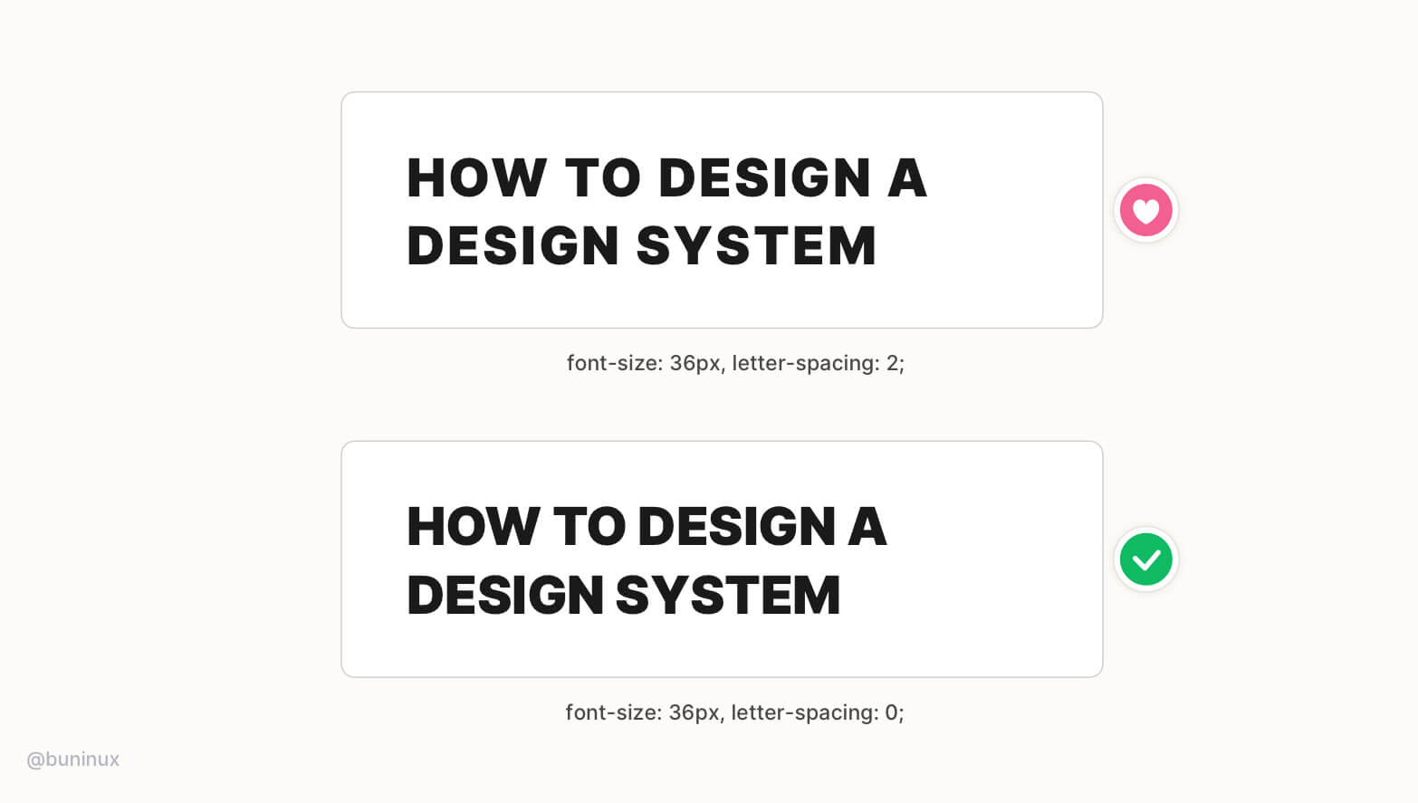
You can add extra space between characters for all caps headings to make them more impactful and noticeable. But be sure not to overdo it.
Tip 6—Place line breaks above the headings
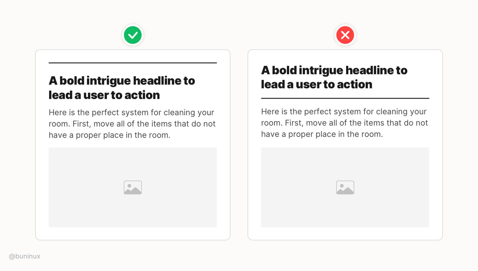
The purpose of a line break or hr tag is to separate one piece of information from another.
Place separators above the headings to better structurize the reading sequence. Use decorative elements to highlight a certain part of your content.
Tip 7—Not all headings should be bold
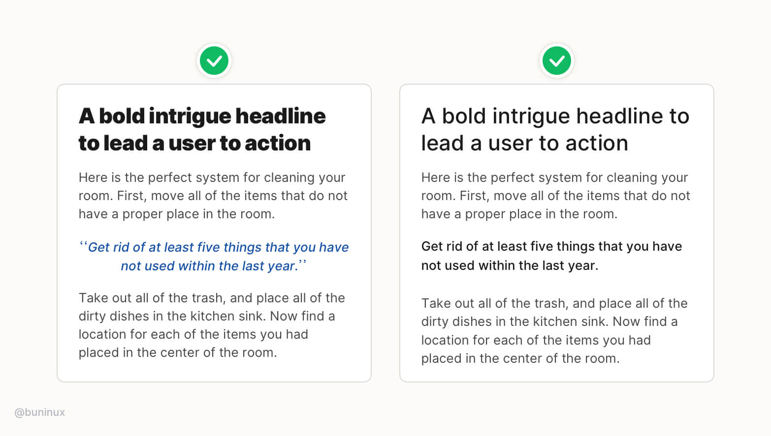
It's okay to lower the font-weight for h1, h2 headings and make them more delicate in style.
Experiment with color & style for secondary headings. Use these types of headings to highlight a piece of crucial information or quotes.
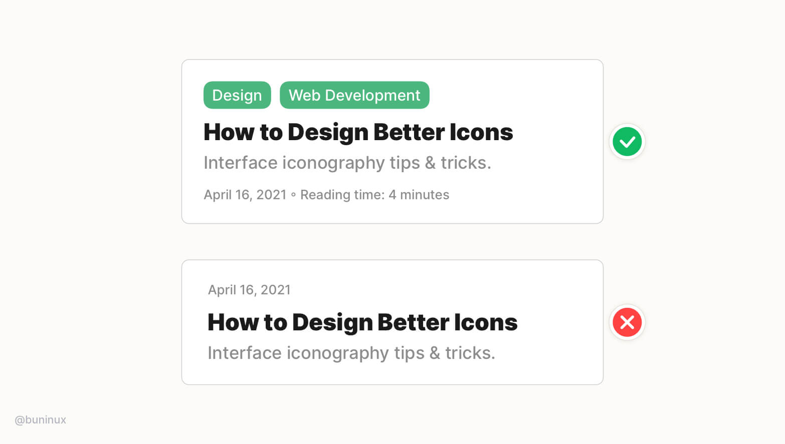
Tip 8—Make sure headings works out of context
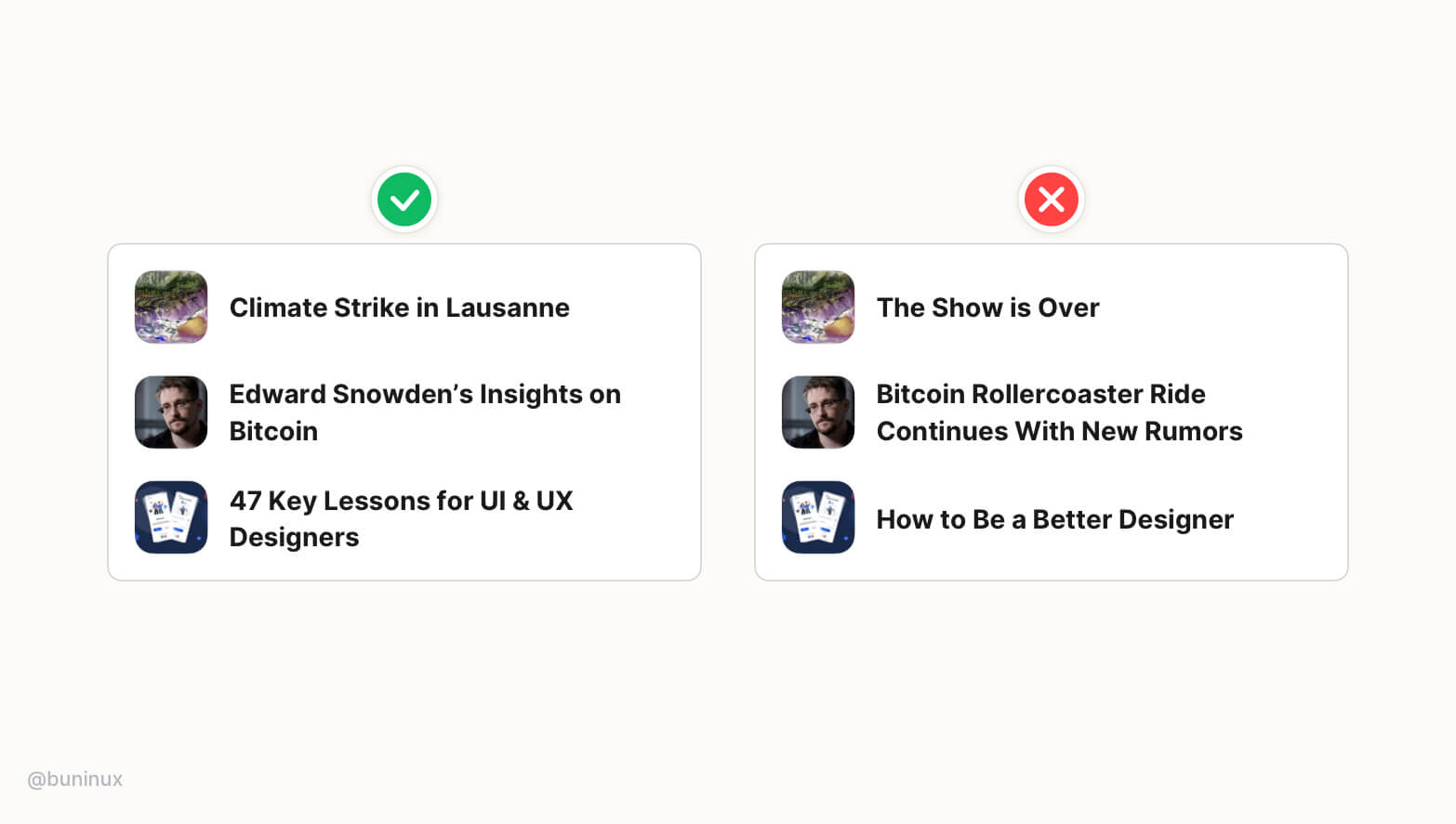
In UI, headlines are regularly shown out of context.
Design your headline to stand alone and still make sense even without a remainder of the content around. This will help users to perceive the value without additional clicking.
Tip 9—The heading should always match the content
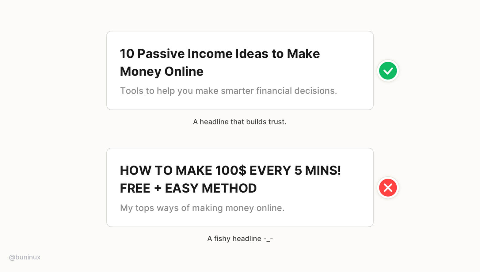
Don't promise something your content can't provide.
Headlines fail when they don’t match the content or can't keep their promises during the read—resulting in a higher bounce rate.
Good headlines always deliver the promised value of content from start to the end, building trust towards the author in the long run.
Tip 10—Headings should not be too long
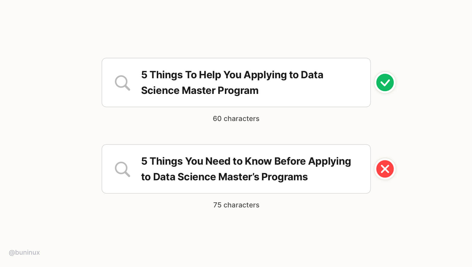
Do not exceed over 62 characters!
Search engines tend to ignore links that are over exceed 62 characters. This could decrease the conversion rate in the long run and lower the search engine appeal for your page content.
Tip 11—Use descriptive taglines
A good tagline can increase site visitors' retention, ensuring they are in the right place by providing context for headlines and overall copy.
Use relative tags and helpful information to guide users, save their time and build interest before reading.