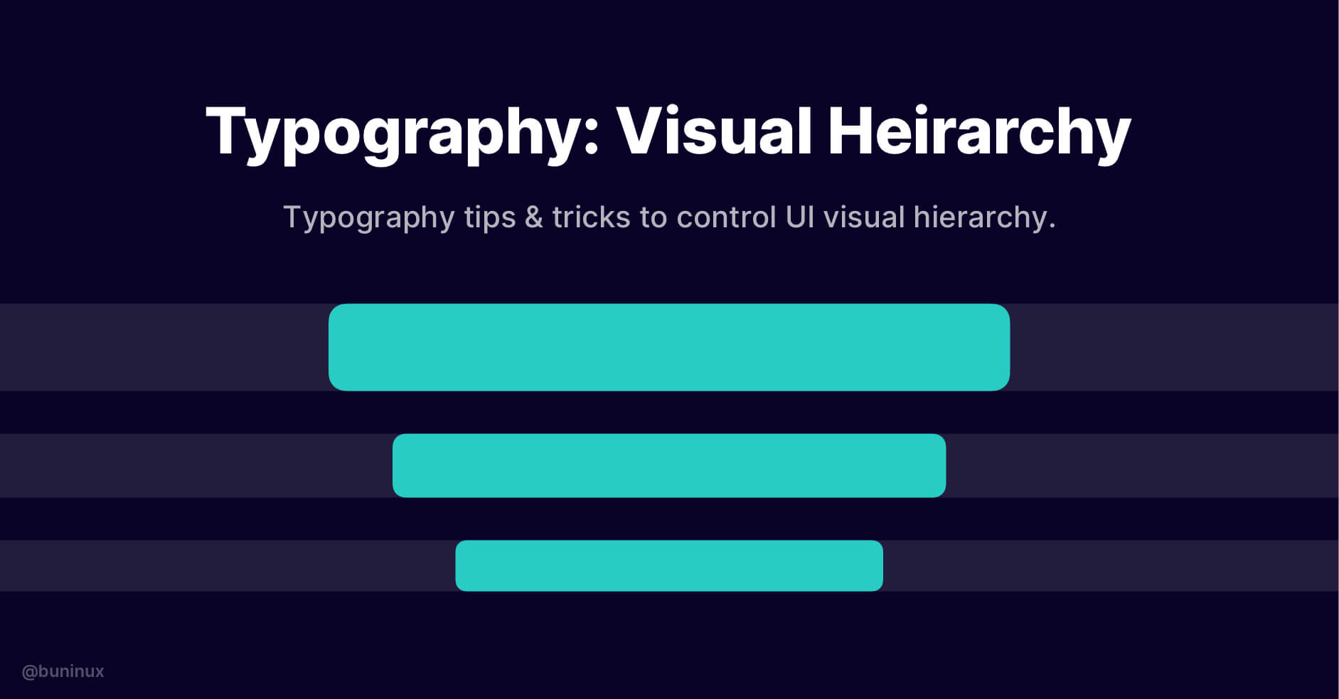
Typography: Visual Hierarchy
August 5, 2021 - Reading time: 4 minutes
Typography tips & tricks to help you better control UI visual hierarchy.
Visual hierarchy can help improve your UI/UX efficacy, conversion potential, and overall aesthetic. In other words, you can tell a whole story by solely tweaking page fonts, guiding the reader throughout your design.
To do so, you need to properly balance the visual weight of your page or a specific design area/element.
It would be best to start bold and intriguing and then proceed smoothly to an interacting CTA conclusion. So, let's find out how to properly distribute text hierarchy between size, weight, and color, so your UI stands out against the crowd.
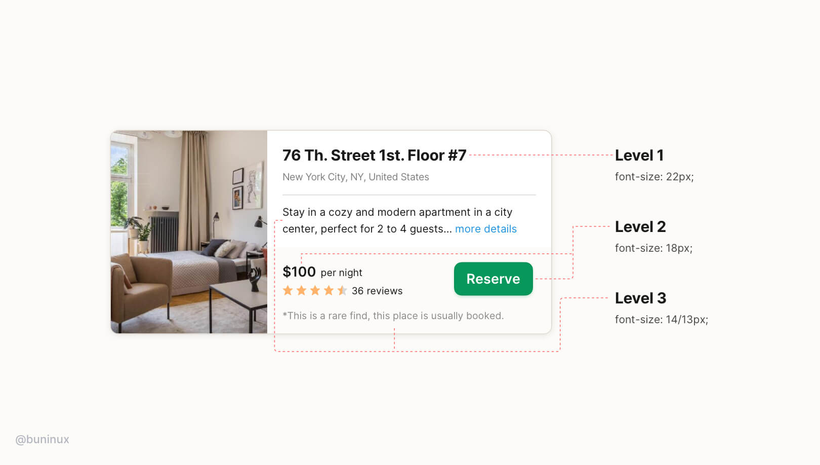
UI typography hierarchy goes into three levels:
Level 1 — The first thing user sees on a screen or specific area. This level is usually reserved for bold headlines that introduce the reader to a topic or specific context. Consider this level always to be clickable!
Level 2 — Contains the second-biggest font size and is usually reserved for a call to action or other options that demand interaction. Buttons and form elements are the perfect examples.
Level 3 — Used to expand upon the topic and provide less important to the design goal information. Usually, this is the <body> text of your design.
The key to a successful type hierarchy is high contrast between levels. Consider these techniques when designing each of them:
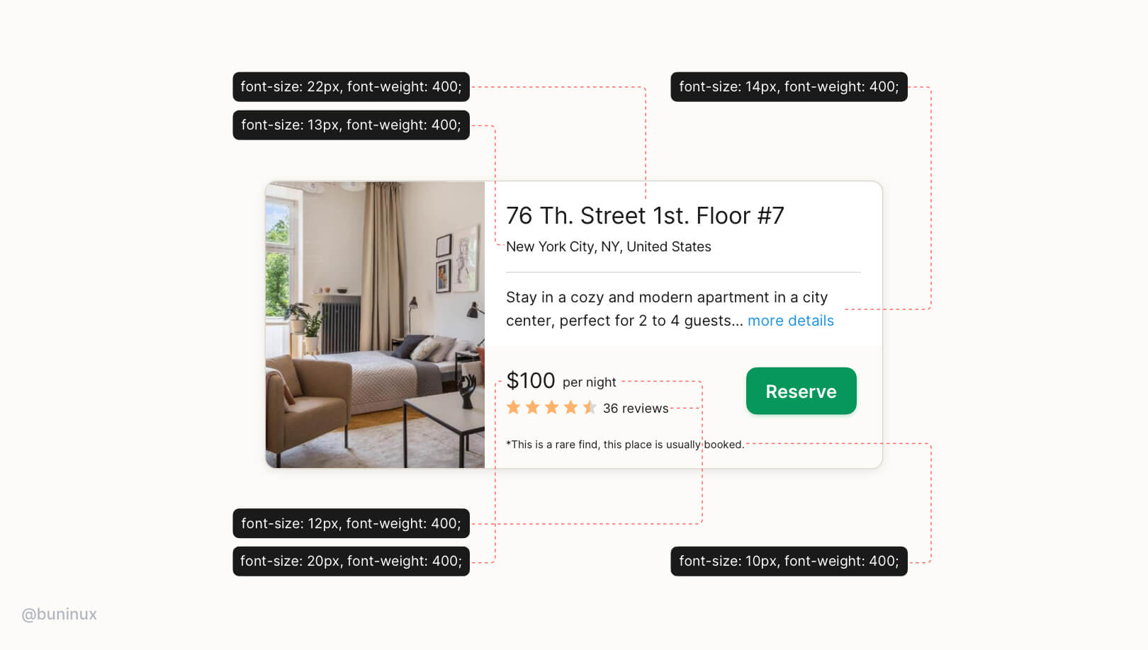
Don't rely solely on font size.
A common mistake is to rely solely on font size to settle all 3 levels. It often leads to primary content being too big and secondary content being unreadable.
Use fonts with multiple weights
Pick a font with 6+ different weights to have more options and control over your UI. Use both weight and color to build a high contrast pair within a consistent font size.
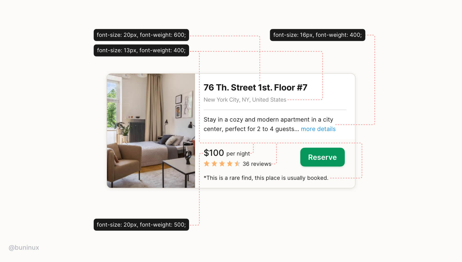
Multiple font-weight better communicates text importance rather than using only the font size.
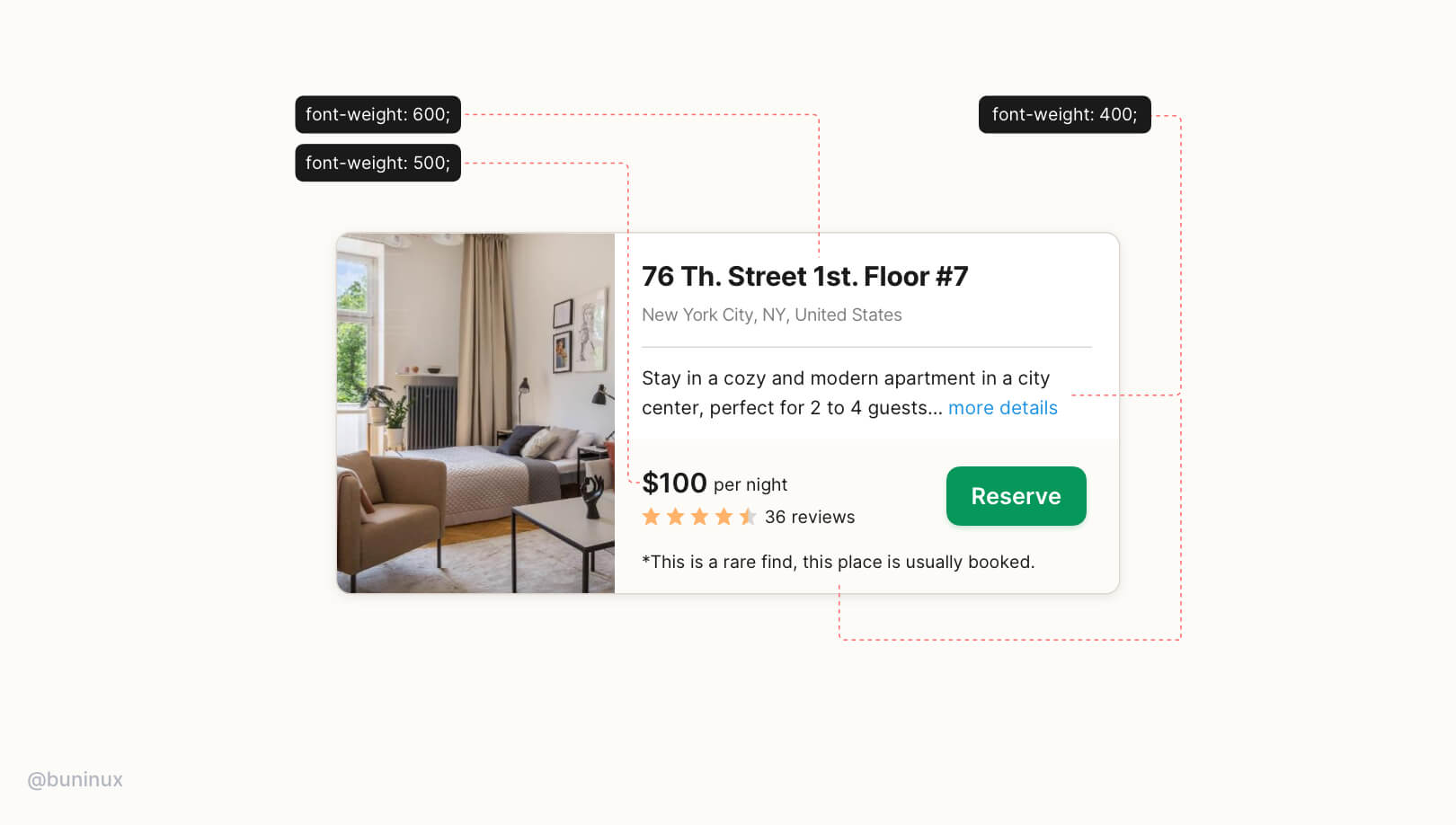
Stick to two to three font weights instead of multiple sizes:
- Font-weight: 400/500 — for regular text;
- Font-weight: 600/700 — for headlines and CTA's;
Use colors to convey the importance of text
Similarly, instead of a smaller font size, use softer colors for supporting text and clarify that the text is secondary without losing readability.
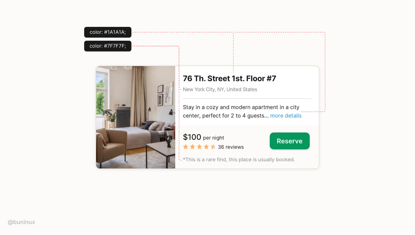
Stick to two to three colors:
- Primary dark color for important content (e.g., headline and pricing tag, number of reviews);
- A grey for secondary content (less important text);
That's it. As you see, the results are always worth the hustle. So play it statigically and use this typography technique to design how users interact with your UI. Consider this technique as a tool to tell an eye-pleasant story and guide to your advantage.

 Updates
 FAQ
FAQ