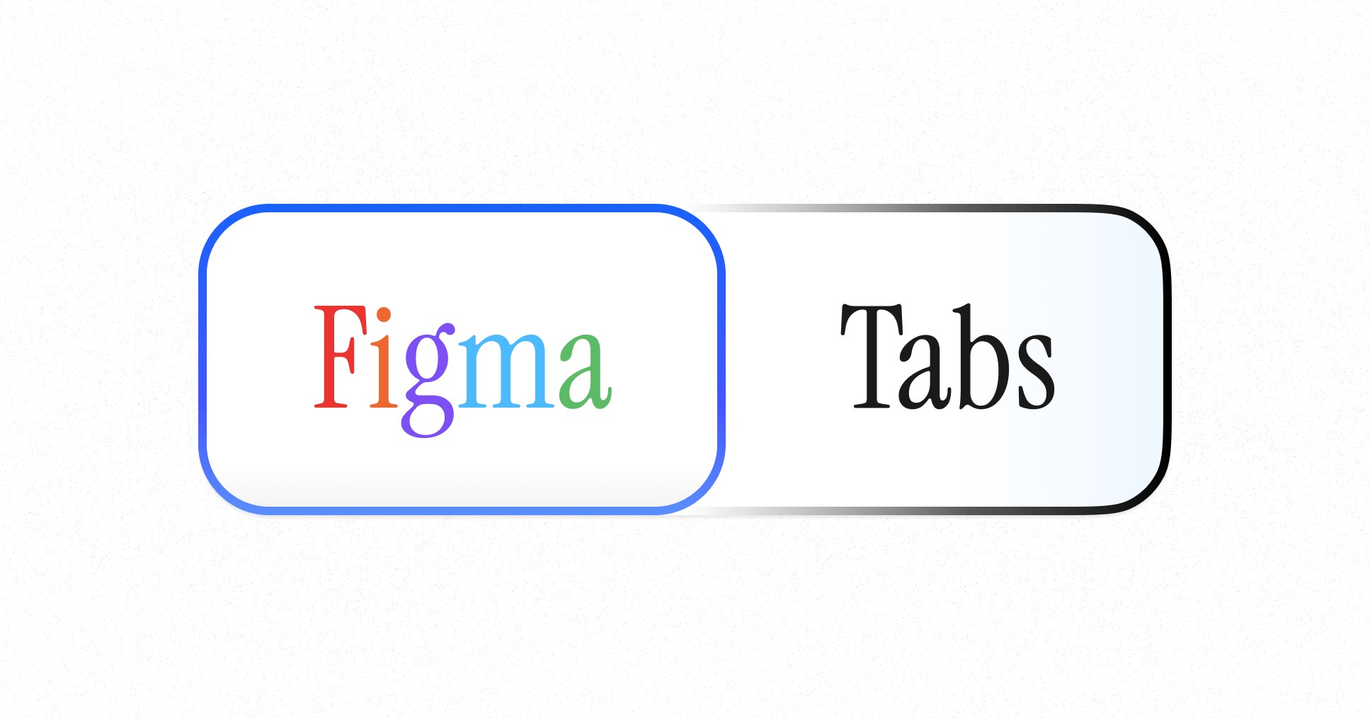
The Perfect Figma Tabs Component
September 30, 2024 - Reading time: 5 minutes
FREE Figma Tabs Component
If you have ever worked in UI design, you would definitely design Tabs. Tabs are a universal term for attached buttons. They organize content, save space, and guide users. But designing them in Figma? That's where things get interesting.
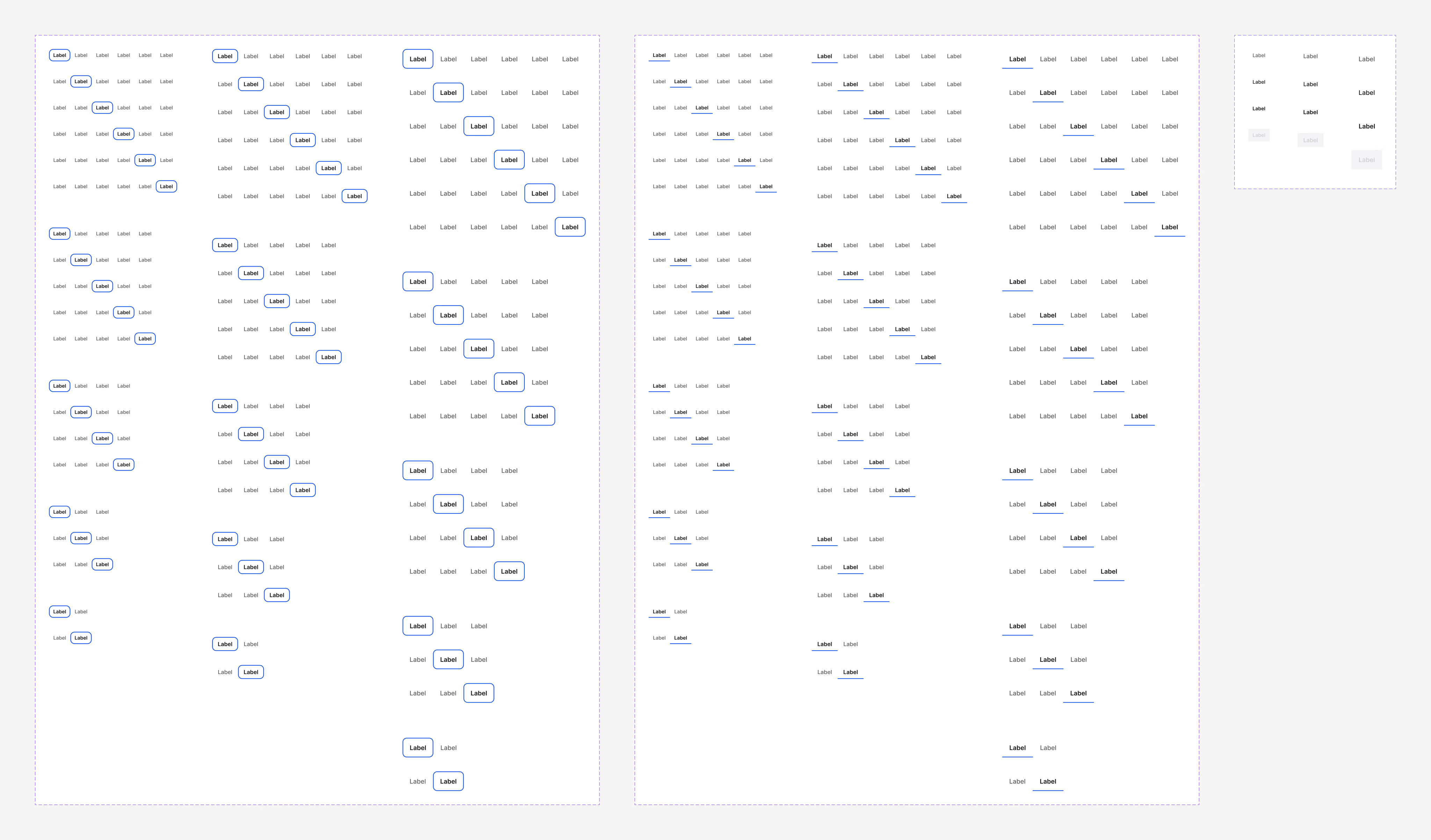
Figma allows you to create flexible components that display different tab states, sizes, and compositions. You can also create variant sets and reuse them as you design your project.
However, tabs are always animated in design and do not exist in a static state. So, you want to animate those Figma tabs you reuse in your projects.
Figma's Power Features:
- Component variants? Check ✓
- Component properties? Check ✓
- Responsive UI? Absolutely ✓
- Animation? Maybe…
The catch? Animation. Figma's prototyping tools are still limited in terms of combining power features with animation. You'll get the job done, but it won't be reusable. And as design engineers and geeks in general, we want our components to reflect actual usage.
You can find examples of animation-first approaches in the Figma community, like this one. However, all those tab examples will only include animation as a power feature.
We've been there — hours spent wrestling with Figma, trying to create the perfect tab component. The result? A choice between organized variants or smooth animations — never both…
But we cracked it ⚡︎ and are ready to present you our solution:
- Pill and line-shaped tab style variants
- Component properties and nested elements
- Animated. Includes interactive states for hover, active, and clicked
- Saves tab position between variants
Download Figma Tabs for Free. Grab it, use it, and thank us later.
▶ Watch Figma Tabs components in Action
The animation could be smoother, but it works like a clock, allowing for an accessible and prominent display of user action. With variants and component properties, you can scale and use these components for multiple screen resolutions and scenarios.
You can use this Tabs UI kit as the starting point for your tabs design, allowing you to have everything Figma has to offer in terms of responsive and interactive Figma Tabs.
Figma is a great tool, but it has limitations.
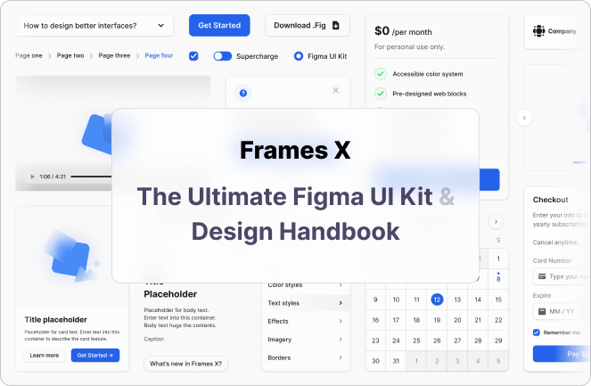
To overcome them and get the most out of it, check out Frames X — the largest Figma design system and UI kit in the world. It features thousands of functional and practical components to save your day.
Now, design some killer tabs.
▶ Download Figma Tabs UI Component
▶ Explore More Free UI Resources
 Updates
 FAQ
FAQ