How to Design Better Icons in 2025
April 16, 2021 - Reading time: 5 minutes
UI iconography tips & tricks
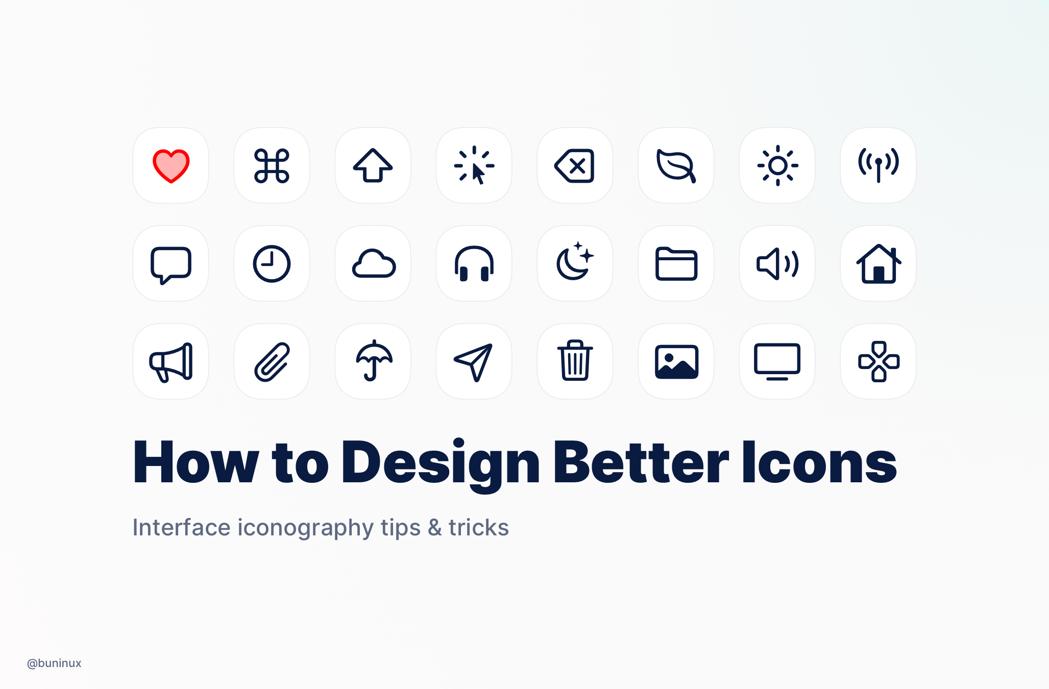
Iconography is one of the most crucial parts of the user interface. It's a visual language that represents commands and content and reveals the meaning behind functionality.
Your icons should always represent simple visual metaphors that users can understand and recognize instantly.
Based on how you design and use icons in your product, you can bring a feel of uniqueness to the brand. So here are my tips to help you design better icons.
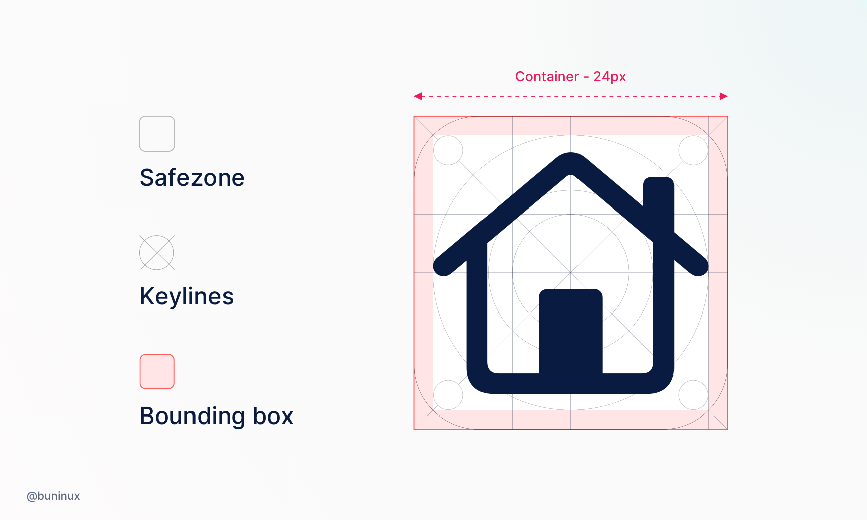
Tip 1 — Set up a grid for the icon set
You'll never create just a single icon. You always design a set. To make your set uniform, you will need a grid.
Define the safe zone and set keylines. Use the resulting grid as a template to solidify all your icons' proportions and sizes.
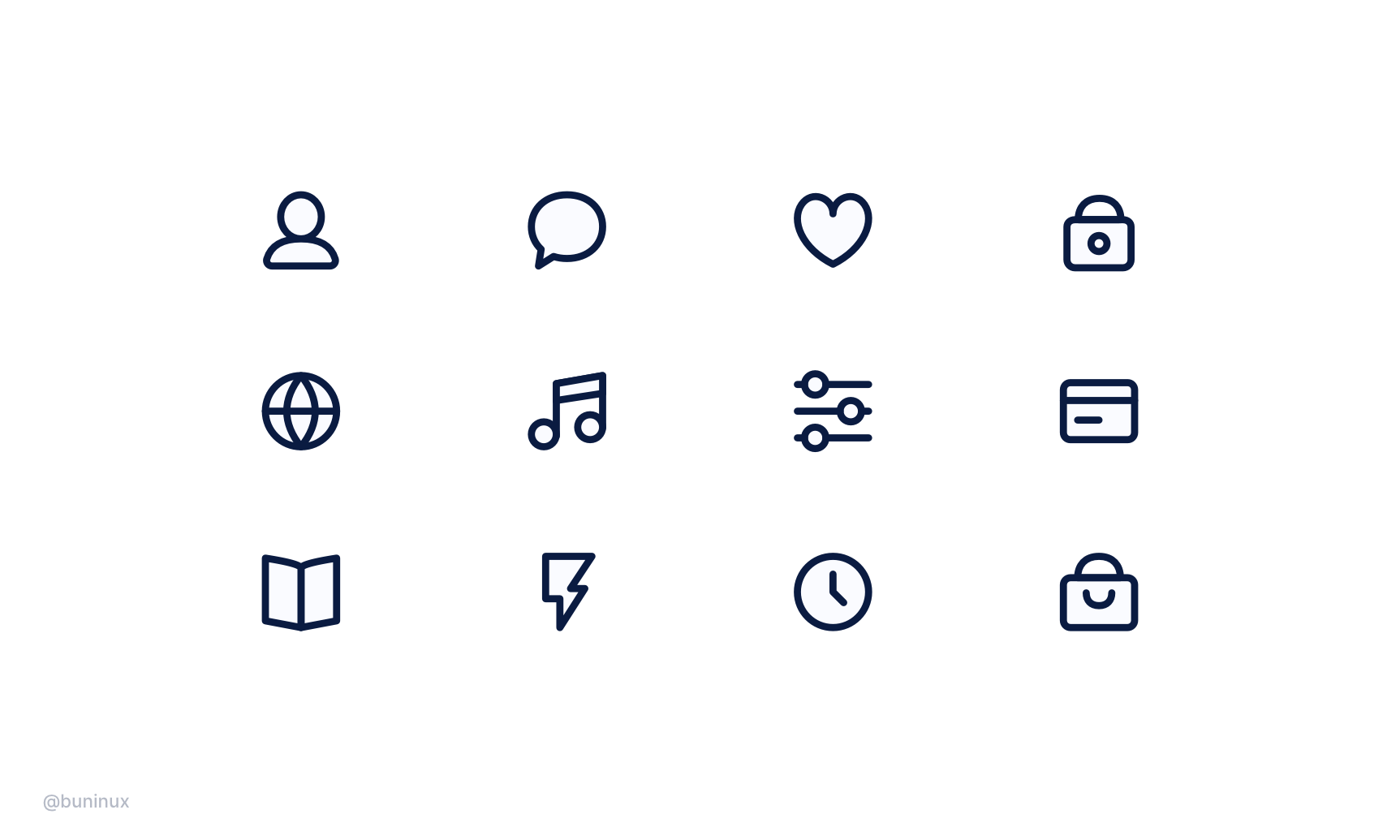
Tip 2 — Make Icons consistent
When designing your set, use the same line width, corner radius, and fill style. This will ensure your icons look brand-unified and more recognizable.
Exmaple: Line thickness - 2px, corner radius - 3px;
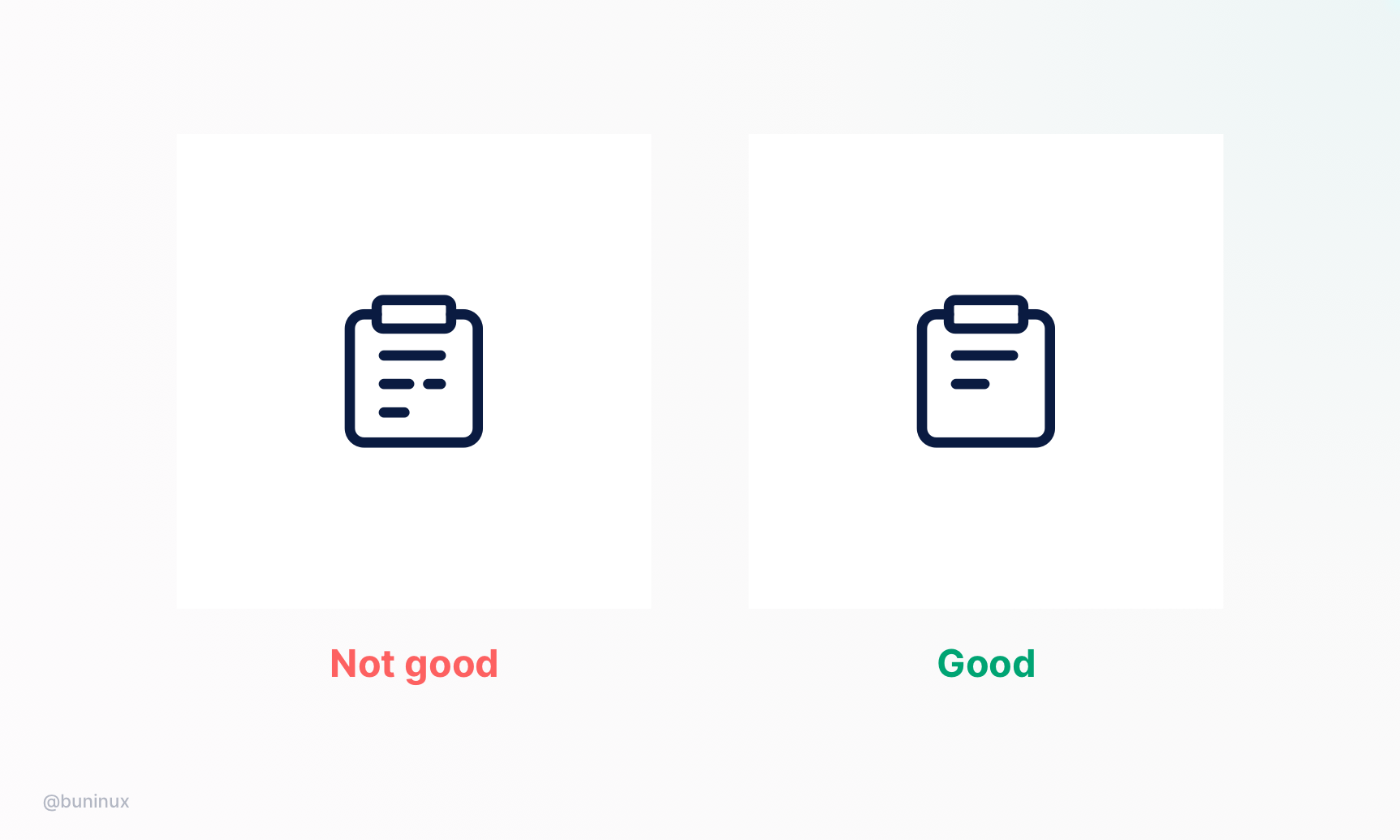
Tip 3 — Make it clear
In icon design, less is more. Use clear metaphors with the same amount of details to make each icon easy to recognize and understand.
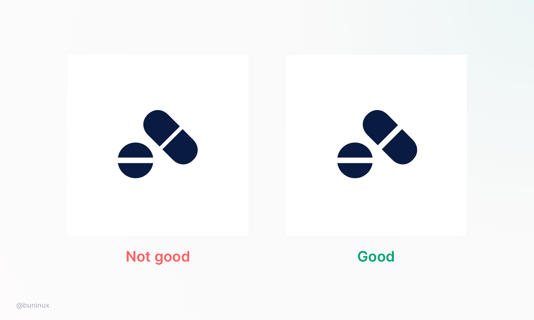
Tip 4 — Use equal spacing between icon elements
Use the same amount of space between your icon elements and details to make your set look harmonious.
You can count the distance between vector lines by holding the ALT key in Figma, Sketch, or XD.
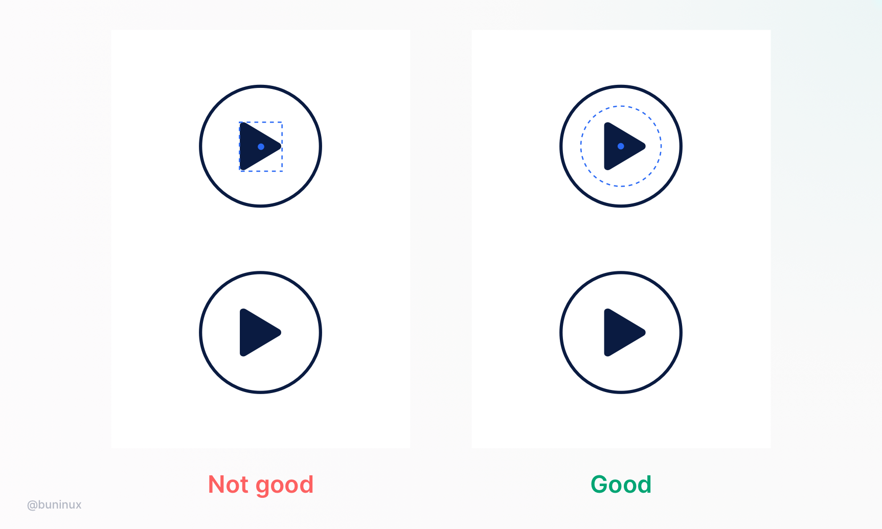
Tip 5 — Optical correction
Align your icon elements based on the optical center and balance the visual weight.
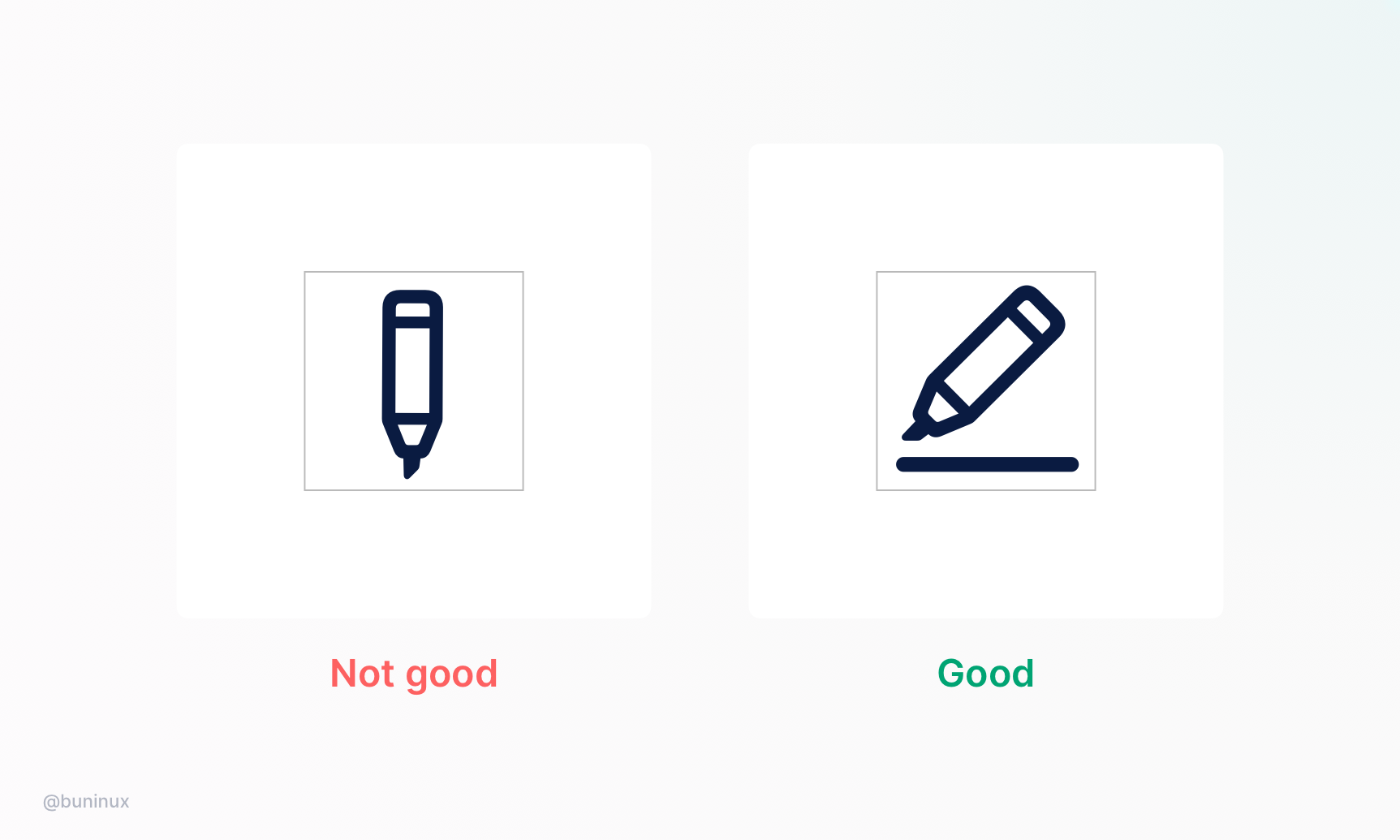
Tip 6 — Fill the container space
Rotate narrow icons and use the whole container space to improve the readability of your icons.
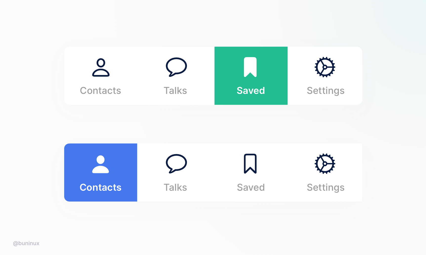
Tip 7— Use fill and outline styles together
Use fill and outline styles to describe the interface states and help the user spot the right icon or button—e.g., show a filled heart icon for "liked" and an outlined heart for "not liked."
Tip 8 — Handy tools
Tools
- Icons8.com
- iconfinder.com
- flaticon.com
- thenouproject.com
Resources
 Updates
 FAQ
FAQ