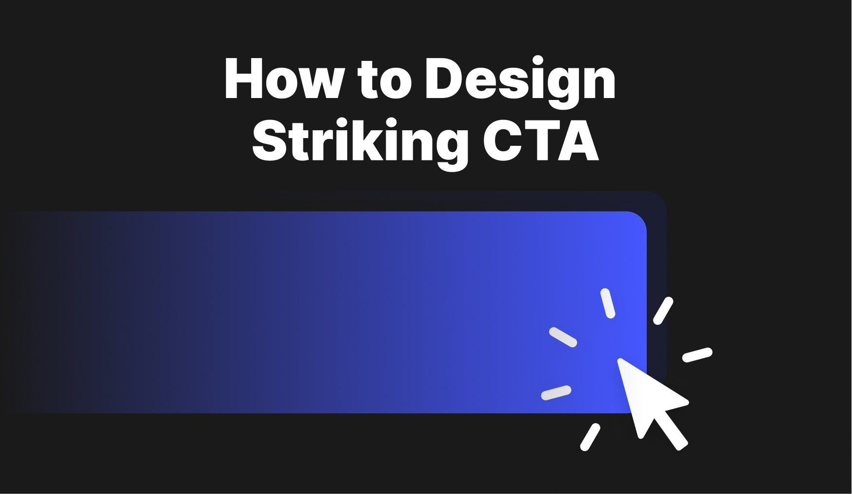
How to Design Striking CTA
September 21, 2021 - Reading time: 5 minutes
Actionable do’s and don’ts to help improve your call to action.
First of all, what is a CTA Button? Call-to-action (CTA) are the buttons that are meant to guide users towards your goal conversion. It’s a fundamental part of your interface that users need to press to make the action you want them to take.
CTA buttons can vary in style and size depending on your goal. Some common examples of call-to-action buttons are:
- Add to cart button
- Sign in/Register button
- Download button
All CTA buttons have a goal: to get your app or page visitor to click and convert.
So here is my set of tips to help you create better call-to-actions and increase your design conversion rate.
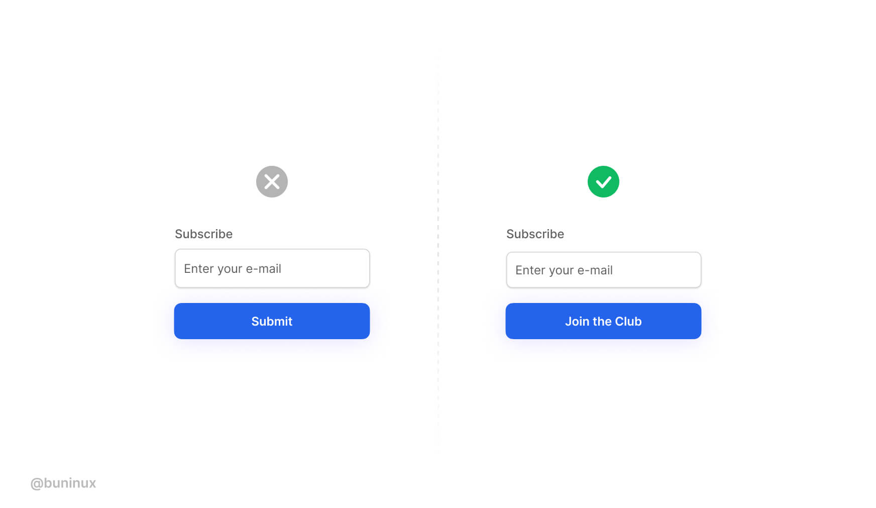
Use valuable and actionable copy
Don’t use “submit” or “send” on your form buttons. Instead, provide a copy that speaks the same language as the user does.
Instantly show users what they will achieve by pressing your button.
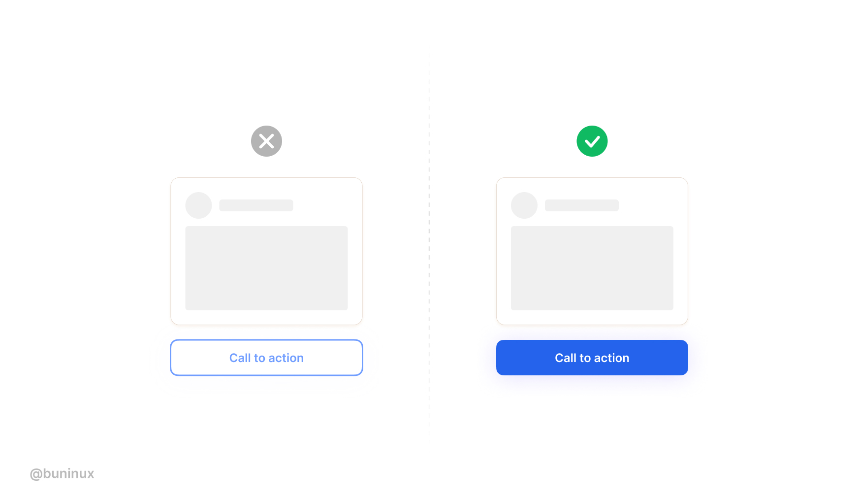
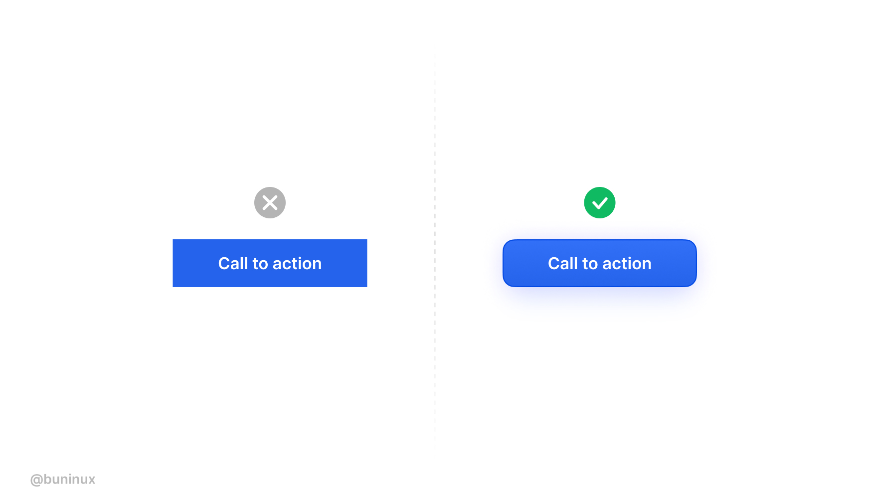
Make your CTA’s dead obvious
Use bold, highly contrasting colors for your CTA’s.
Don’t try to blend/mix your primary converting buttons alongside other UI elements or backgrounds.
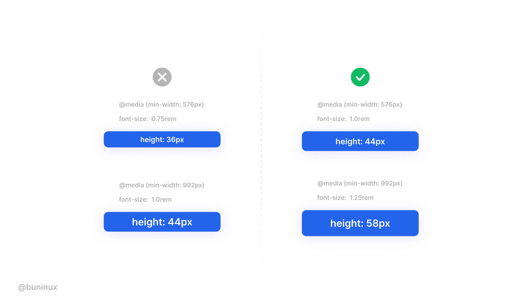
Ensure your CTA’s have a large tap zone
Don’t make your conversion buttons too small. Do make them prominent and bold.
When working on a web project, it’s a must to use a set of buttons for different resolution breakpoints.
Don’t be afraid to add some spice
Don’t make your buttons look boring. Instead, use both style and interaction to build the urge to smash that pretty & fun thing.
Make your vocabulary dead clear
Ensure your CTA’s vocabulary is clear and actionable.
User attention is precious, so use the momentum to quickly get to the main point with a short but striking copy.
Therefore, it’s crucial to be open to longer text variations when designing your buttons. Just make sure the action behind the text is 100% predictable.
Add keywords to CTA’s
Images that act as buttons, like product cards or galleries, must have “alt” tags.
The attached information helps to rank your page higher and provides helpful context to people with visual disabilities.
Make sure that all clickable elements have <alt> tags included.
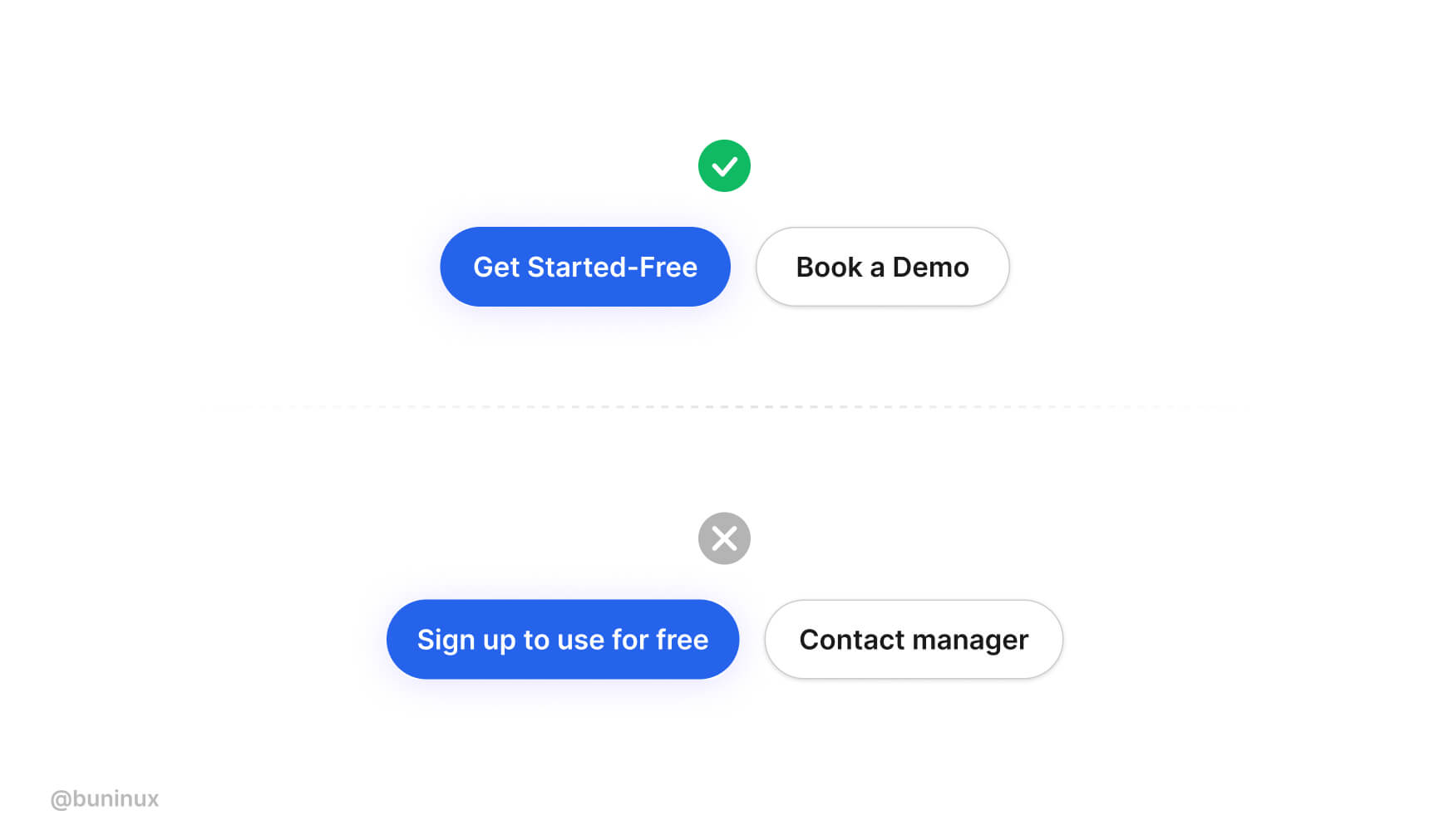
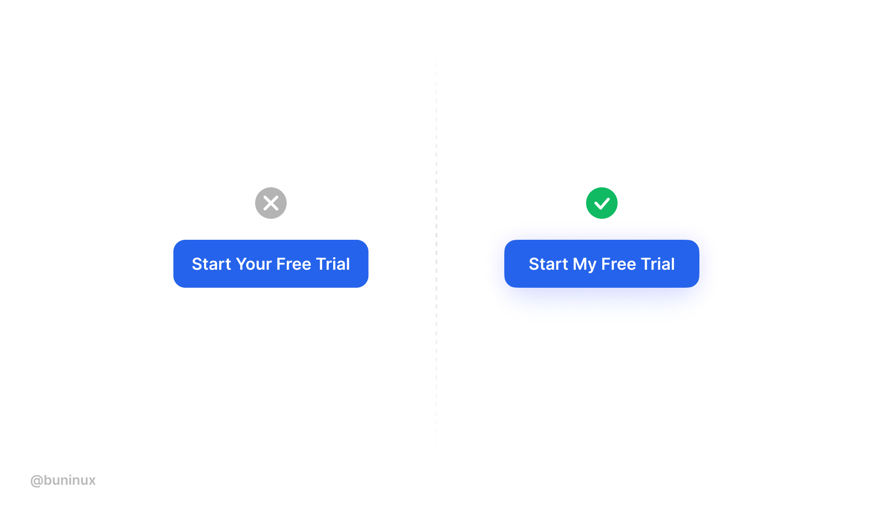
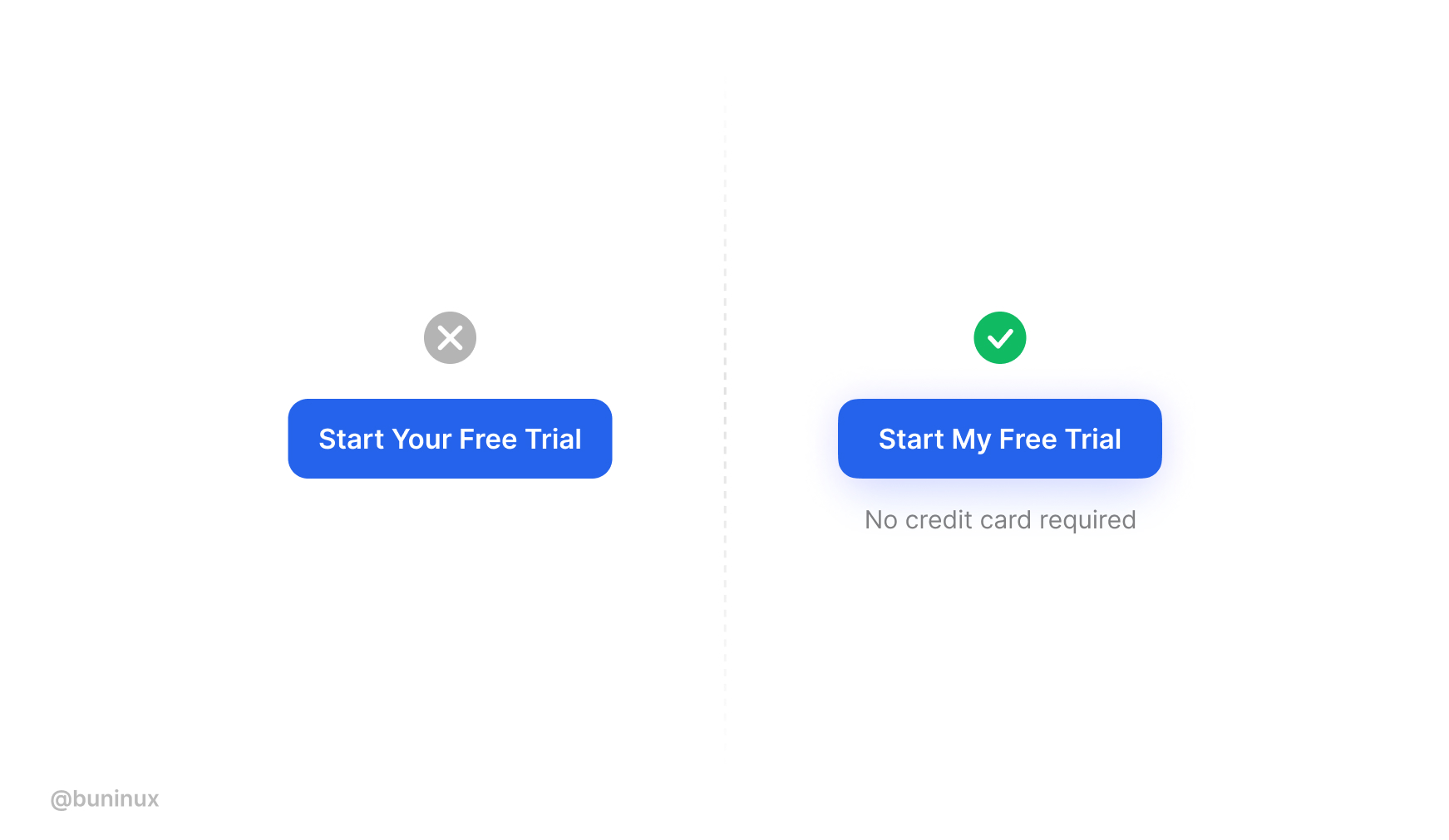
Use Me instead of You
Based on the research by Unbounce, a first-person copy like “I” and “my” is more effective than using “you” and “your,” resulting in higher conversion.
Since the primary driver for buying and clicking things our own emotions. Using the first-person pronouns in your CTA’s increases emotional impact by associating a personal benefit with action.
Based on my experience, using this trick and a friendlier tone results in a better response from visitors. ❤
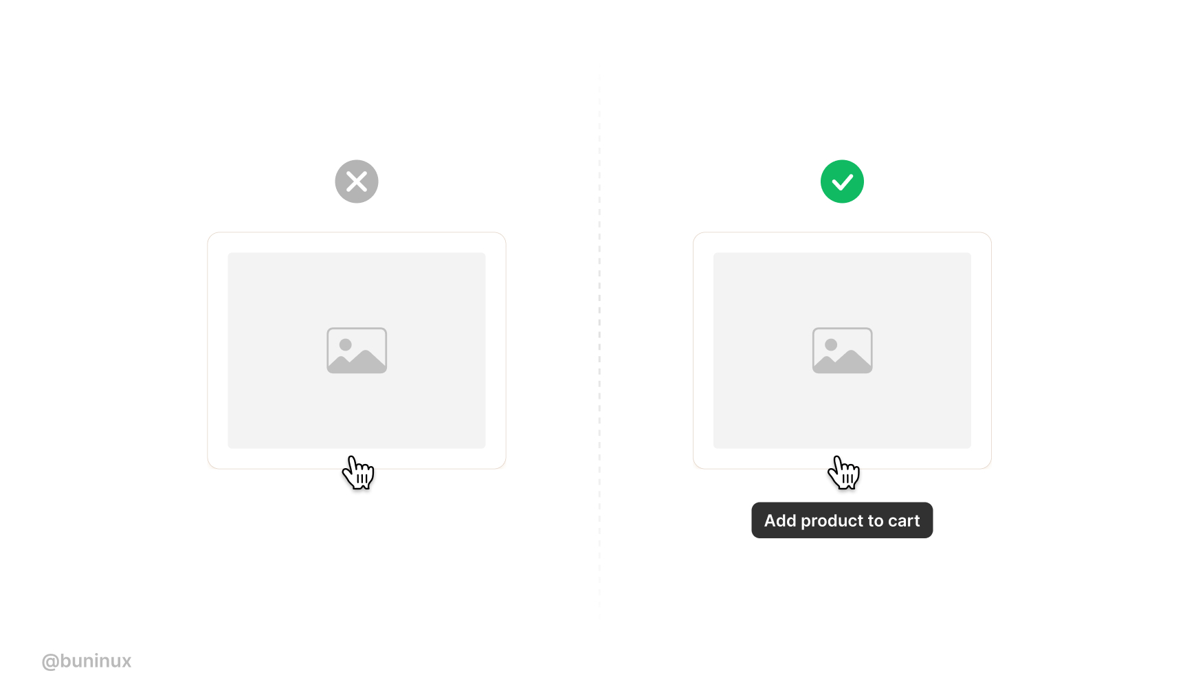
Use descriptive buttons
Add descriptions to promote the idea of pressing your button.
Put extra proof, rating, or your product best feature to create anticipation towards clicking and achieving something.
---
That’s all. Thanks for the read! 🙌
Use these tips and your surveillance to come with new cool buttons ideas.
To help you quickly design & test your CTA, you can use tools like buttonoptimizer.com.
If you enjoyed this article, feel free to subscribe and share these tips with others!
.jpg)
UI Images Best Practices
September 2, 2021 - Reading time: 172 minutes
10 best practices to help you master images in UI design.
Imagery is one of the most effective tools to grab the reader's attention.
Images are used for setting up the brand's voice and building its presence. A well-placed photo can tell about your business much more than hundreds of words on your landing page.
But searching and fitting images into your designs can be really challenging. Besides finding the right photo, you'll need to properly align it with other interface elements and your business goals.
So here are my best practices to keep in mind while working with interface images.
Be extremely picky when choosing photos
A bad photo can instantly ruin your design, even if the rest of the work is perfect.
When choosing photos, use only relevant, professional, and high-quality photos. Thanks to the internet, we have tons of resources and tools to provide us, both paid stock photos and royalty-free content.
Here is a handy list of resources to help you find the right photo right within your fingertips:
- Unsplash plugin for Figma — Quickly Insert images from Unsplash straight into your designs.
- Photos plugin for Figma — Search and insert photos and gifs from Unsplash, Google, Flickr, Pexels, Giphy, and other sources.
- Avatar plugin for Figma — Generate random avatars in Figma.
- Unsplash plugin for Sketch — Insert photos from Unsplash.
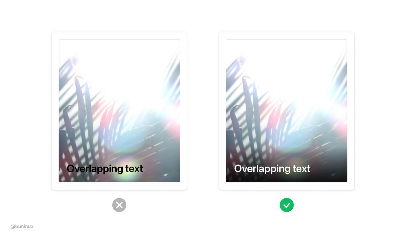
Ensure text has enough contrast
Bright and colorful photos can make text unreadable. When placing text above your images, make sure to emphasize the copy by adjusting image contrast or adding a darker color overlay.
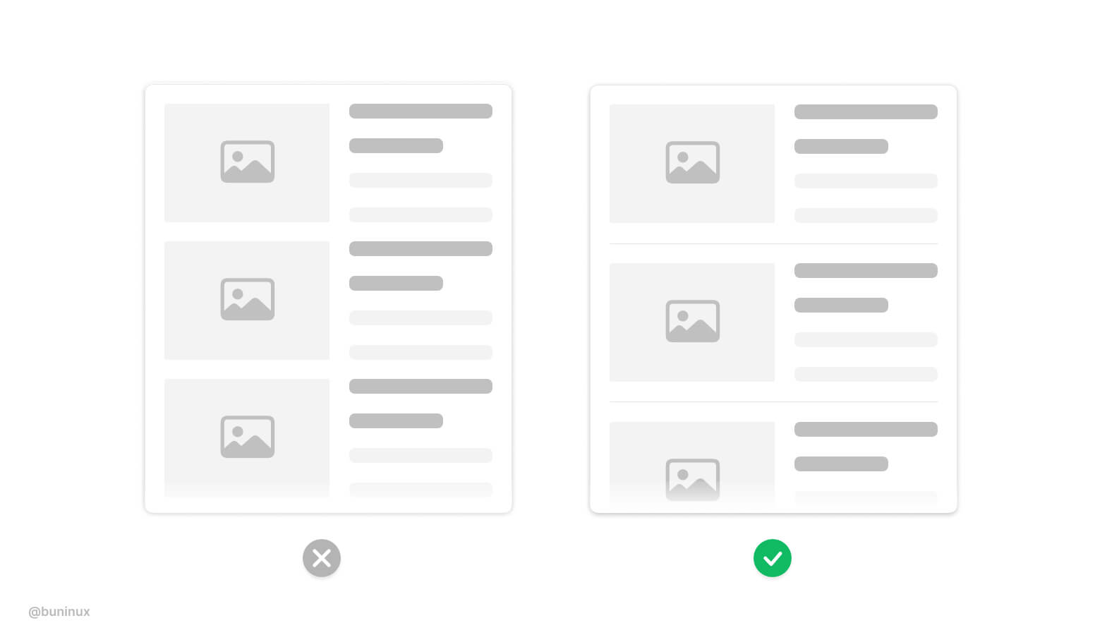
Make images stand out
With multiple images on a screen, make some to lead the pack.
Use images to articulate the importance of your layout elements. Attract users to certain areas or CTA by employing bolder/bigger images.
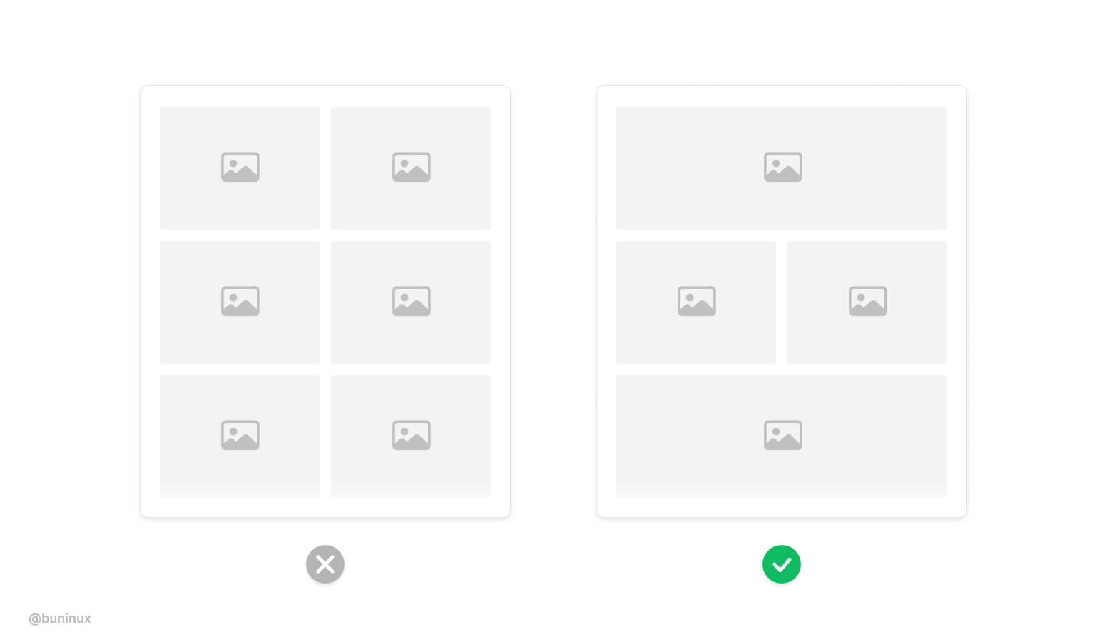
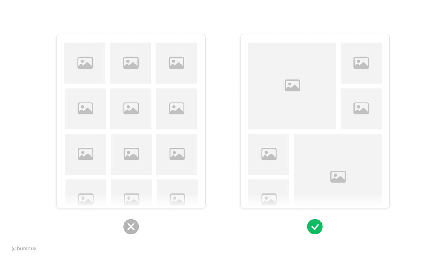
Add dynamic to the layout
When designing a large gallery, especially on mobile screens. Employ multiple columns and image sizes to make scrolling more fun and interactive.
Use text wrapping smartly
Avoid nesting images into paragraphs.
When an image interrupts the text, it causes the reader to make unnecessary eye jumps from side to side of your page. Avoid interrupting the reading flow. Align images inside a paragraph to the top or right.
Separate text and images into columns
Instead of wrapping text, sometimes it's a good idea to split the view into separate columns. Also, this duo column layout is a good way to demo vertical photos.
Put images outside the layout
Put images and multi-image galleries outside the grid.
Use this trick to employ a more immersive feel for your page or article. Placing full-size photos also make a clear visual pause for your readers.
Use captions for standalone images
When an image is placed without a proper caption, it makes no sense, and the overall UI accessibility suffers. Always provide <alt> tags and a proper description of images. Google ranks such behavior higher.
Separate visually heavy blocks
Heavy vertical blocks can blend. Consider adding a separator <hr> tag between such elements.
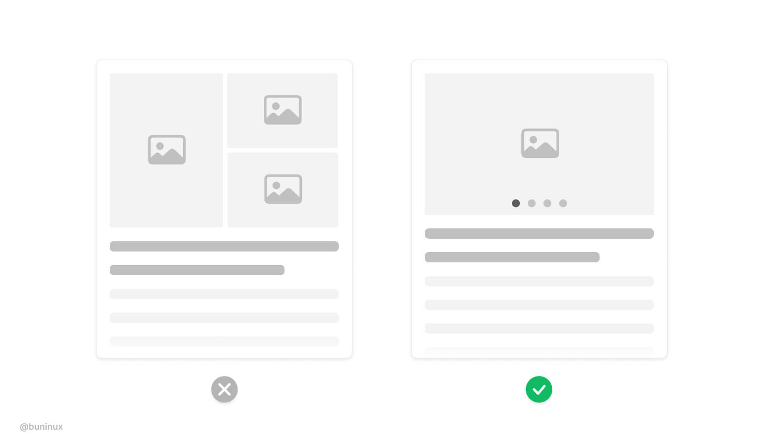
Use pagination to showcase multiple images
Consider employing mobile-friendly horizontal pagination to let users see your product or service with a swipe gesture. People love to swipe.
---
Thanks for the read! 🙌
If you enjoyed this article, feel free to subscribe and share these tips with others!
.jpg)
How to Design Sexy Gradients
August 17, 2021 - Reading time: 5 minutes
Actionable UI tips to help you design better gradients.
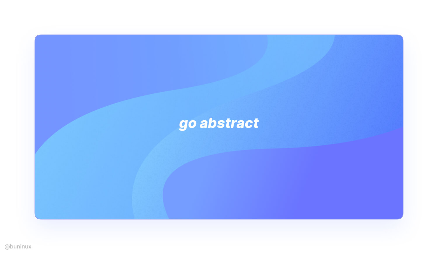
Gradients are everywhere. It's no longer a trend from the '90s, and designers tend to employ gradients all over modern minimalistic UI. Backgrounds, buttons, toggles, cards, even shadows, you name it. Gradients have taken over digital products and Dribbble/Behance.
So what are gradients?
The gradient is a transition from one color to another. A gradient is a procedural blending made from multiple colors (a single gradient can have unlimited shades).
We can use gradients in many ways. We can make subtle or extremely bold color combinations that can be used for both backgrounds and foreground interface elements.
Because gradients are that versatile, we use them to communicate a unique design or brand vibe.
In this article, I want to share practical tips & tricks on making gradients that stand out.
Find the right inspiration
First, we need to find the source.
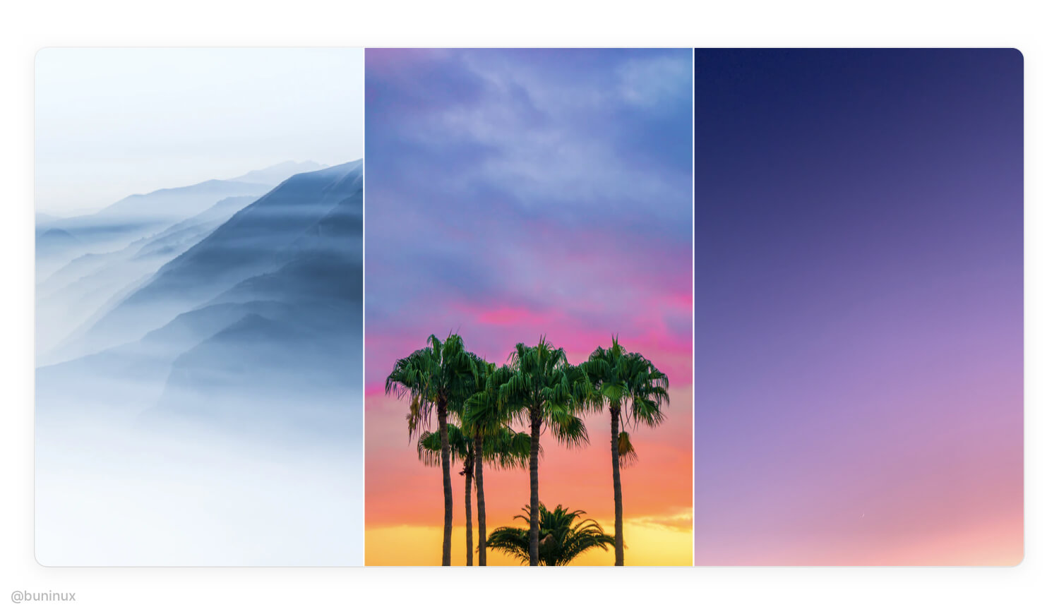
The best inspiration for gradients is nature. So, start the design process by taking your time and observing the real world. Find photos of landscapes, environment, or plants as your source of colors to associate your project with.
Create your palette
Use the "Color Picker" to find the right mood. Build your palette by extracting 2 to 3 primary striking colors from a photo/picture.
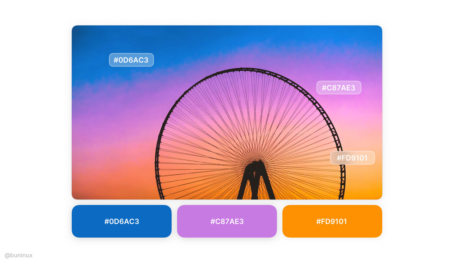
It's recommended to start with only a few colors. Since the RGB color model has only 3 variables, this means you can make any gradient by solely mixing Red, Green, and Blue. RGB values are usually given in the 0–255 range;
So for making soft-looking gradients, consider using the range of 50-150 when building your palette.
Blend palette colors
Create a new layer above the chosen color palette, and make a smooth transition by adding a background blur effect.
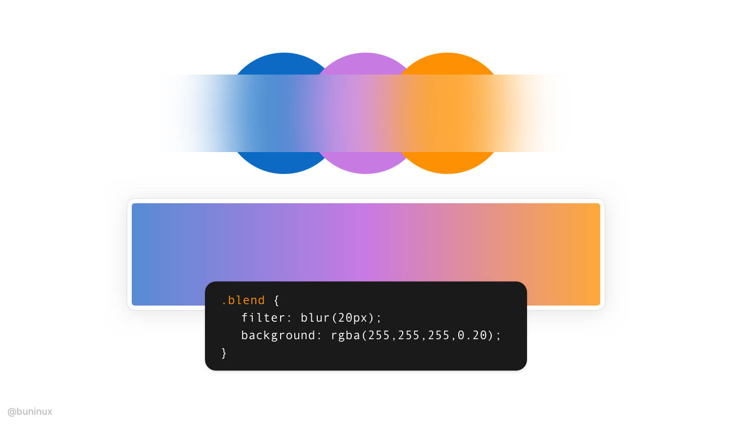
Now create a new layer and use the resulted blurred path to recreate your linear gradient.
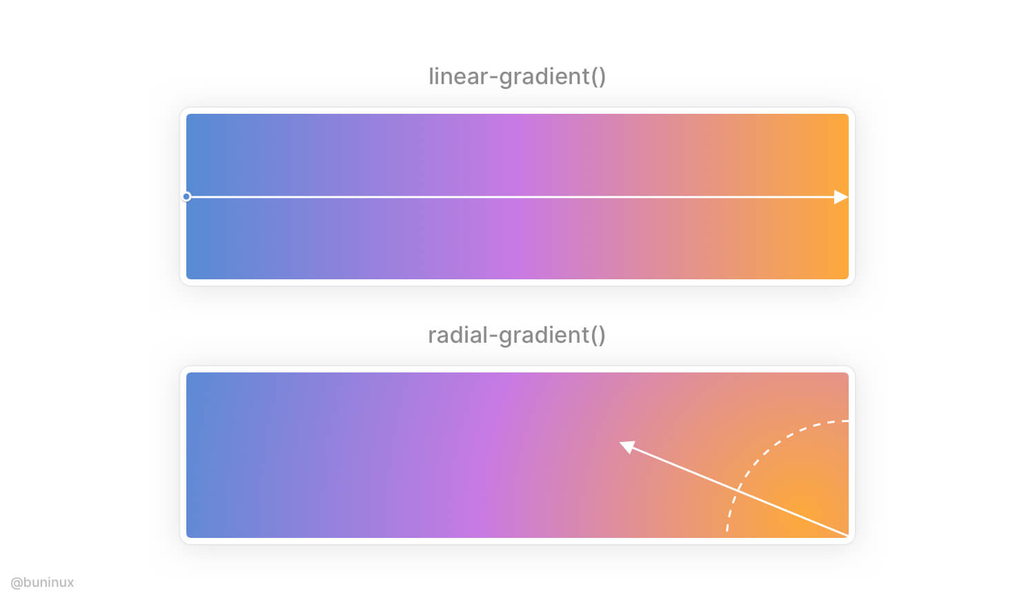
Use radial gradient to add depth to a linear scale
Radial gradients are used to simulate lighting, which isn’t always linear. You can apply a radial gradient to a predesigned linear gradient and configure the light source direction to make it look even better.
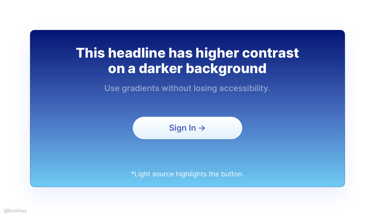
Use gradient direction that makes sense
Employ the gradient direction where it's needed.
For example, emit the light source to highlight a certain element, make the text more readable by placing it over colored areas, or direct the user through UI with a smooth gradient path.
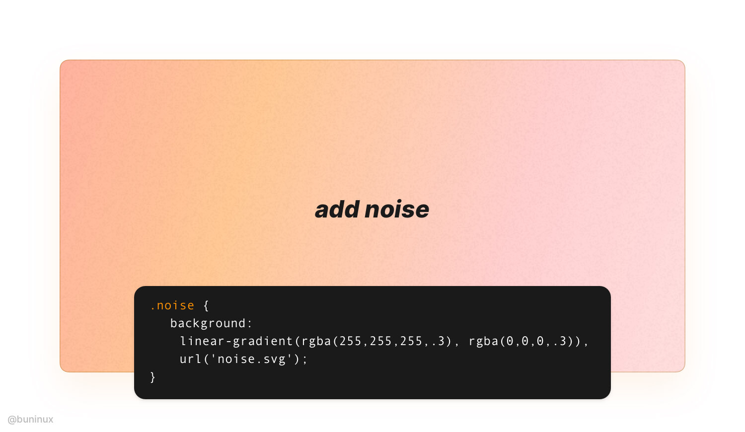
Add noise to make it strike
In Figma or Sketch, apply an additional layer of grain over your gradient to make it look vintage. You can apply noise effect on the web by placing an image over your gradient.
Learn how to add noise with CSS here.
Note: Usually, you only need 0.1% to 0.5% of noise image transparency.
Combine gradients with abstract shapes
To make your gradient, even fancier employ abstract semi-transparent shapes. Use the "Mask" tool for nesting blobby or wavy shapes beyond or above your gradient layers.
---
Thanks for the read! 🙌
If you enjoyed this article, feel free to subscribe and share these tips with others!

 Updates
 FAQ
FAQ