.jpg)
Figma Plugins for Design Systems in 2025
May 30, 2022 - Reading time: 22 minutes
Best Figma Plugins for Design and Development
Designing systems in Figma can be stressful and uncertain. Fortunately, a healthy plugin community can help us avoid numerous struggles.
Plugins are great tools to integrate into your design process. They can solve the project's particular pain points or automate tasks so you can spend less time on monotonous mouse clicking and dragging rectangles around.
Yet, not all plugins are equally good. Some could be outdated or not fit for scaling projects, but some could elevate and change the way you design. So here is my collection of the best plugins to help you design, manage, and operate systems in Figma.
Update: Explore our collection of handpicked plugins: Best Figma Plugins for Design and Development (2025).

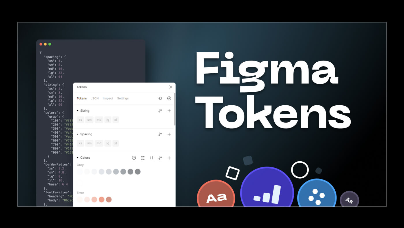
Figma Tokens
The Figma tokens plugin lets you create design tokens based on your project's color, typography, and global values, such as border-radius, spacing, etc. Tokens grant many levers of control over your design system. This includes the ability to theme your UI, update particular stylistic details, or modify the whole system with a few commands.
To get started, you can launch the plugin and generate tokens from your file or upload your JSON to bring existing tokens to a new project.
Figma doesn't have a way to export/import styles when you need to use existing styles in another project, and Figma Tokens has an undercover feature to solve this. You could export styles from one file and then import them as JSON into a different one.
Figma Tokens is a free plugin with a Pro plan alongside advanced features.
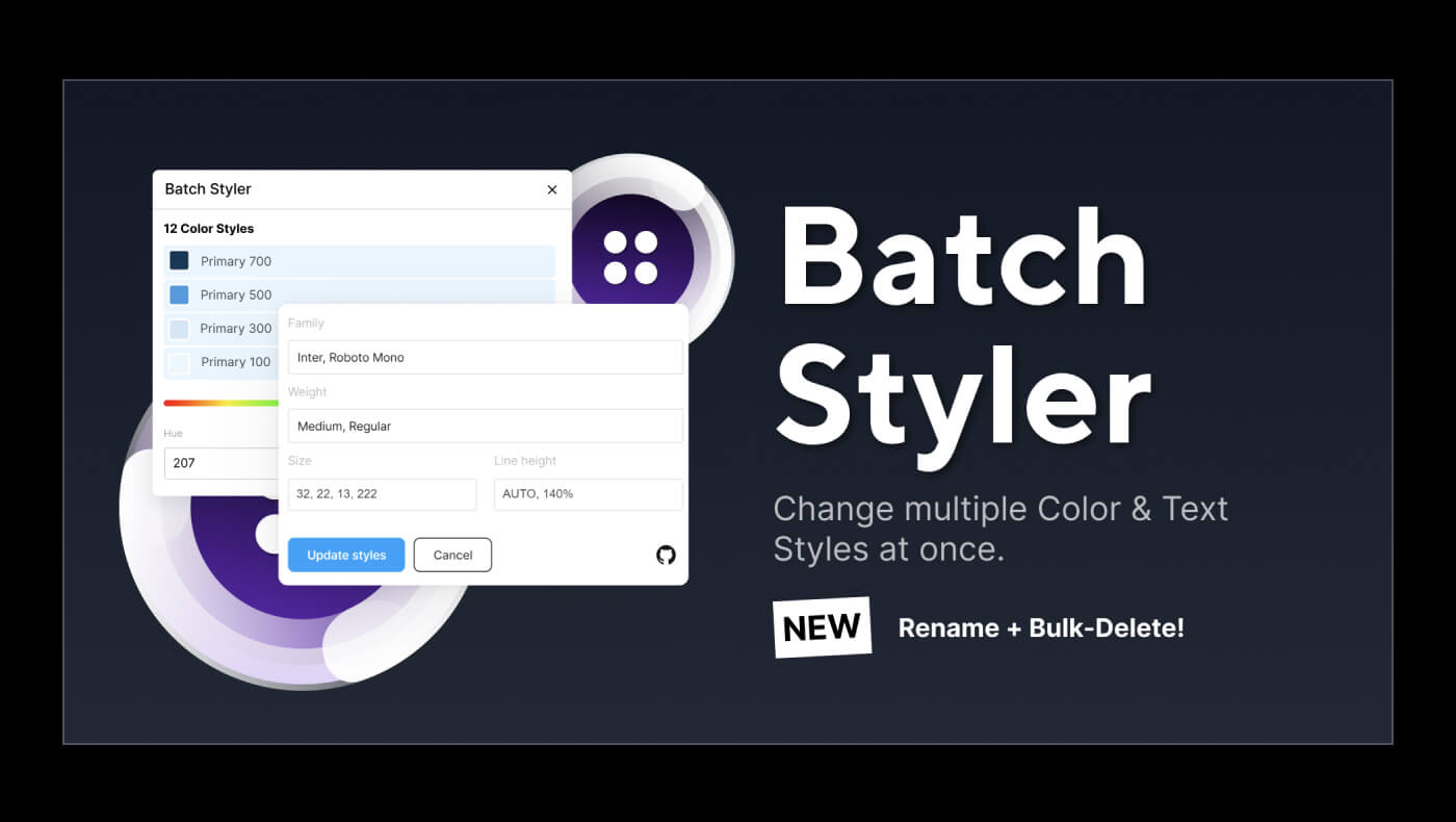
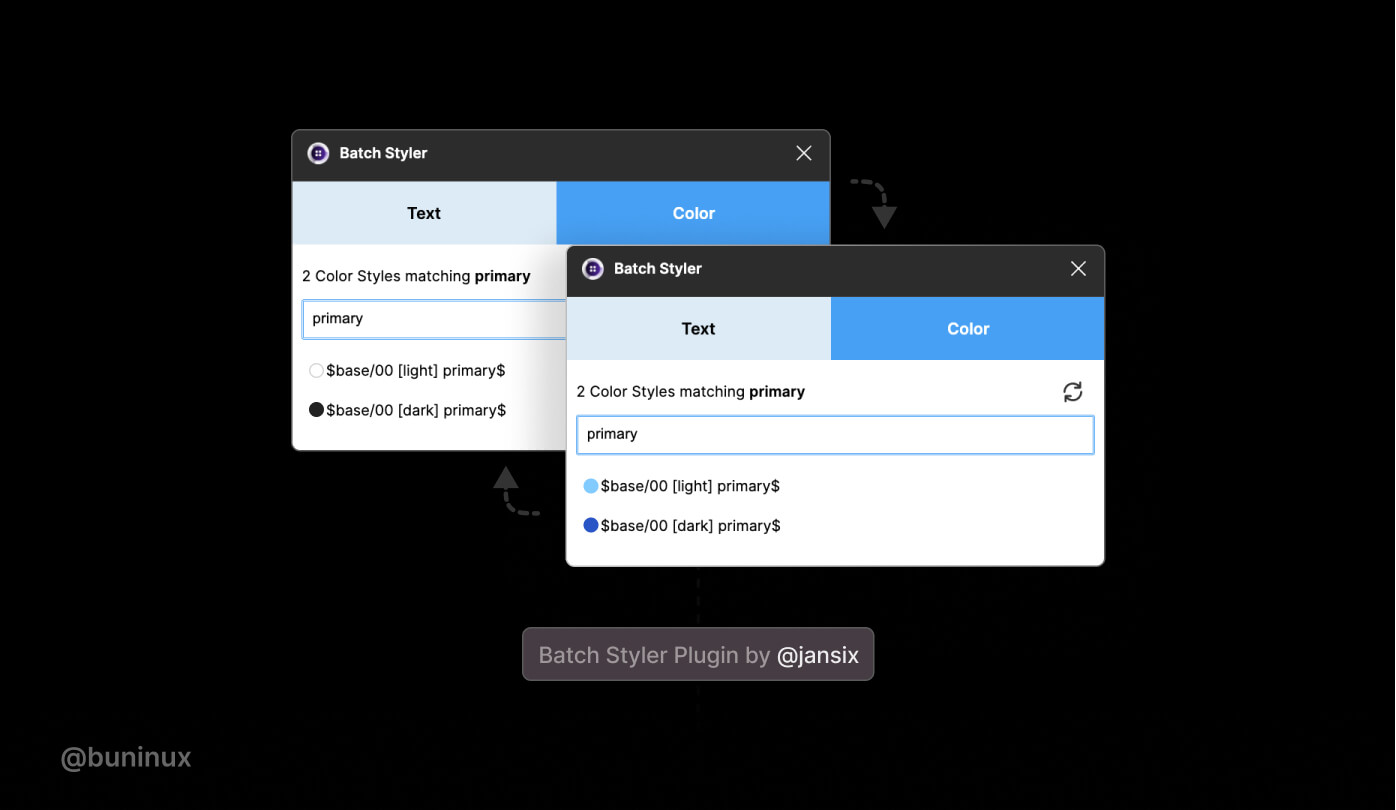
Batch Styler
The Batch Styler plugin fills another missing Figma functionality and lets you modify multiple text and color styles at once. With this plugin's UI, you could easily batch update color and typography, plus delete or rename your file styles.
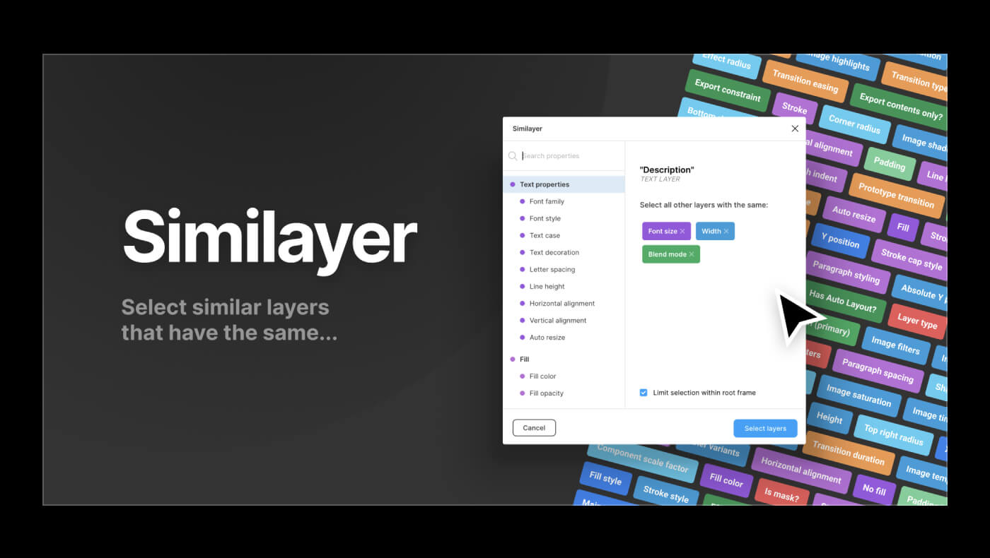
Similayer
Similayer is a crazy powerful extension for selecting objects in Figma.
This plugin comes in handy when changing specific component details or variants. To use it: select a layer, and run the plugin to find and select all other layers based on needed properties.
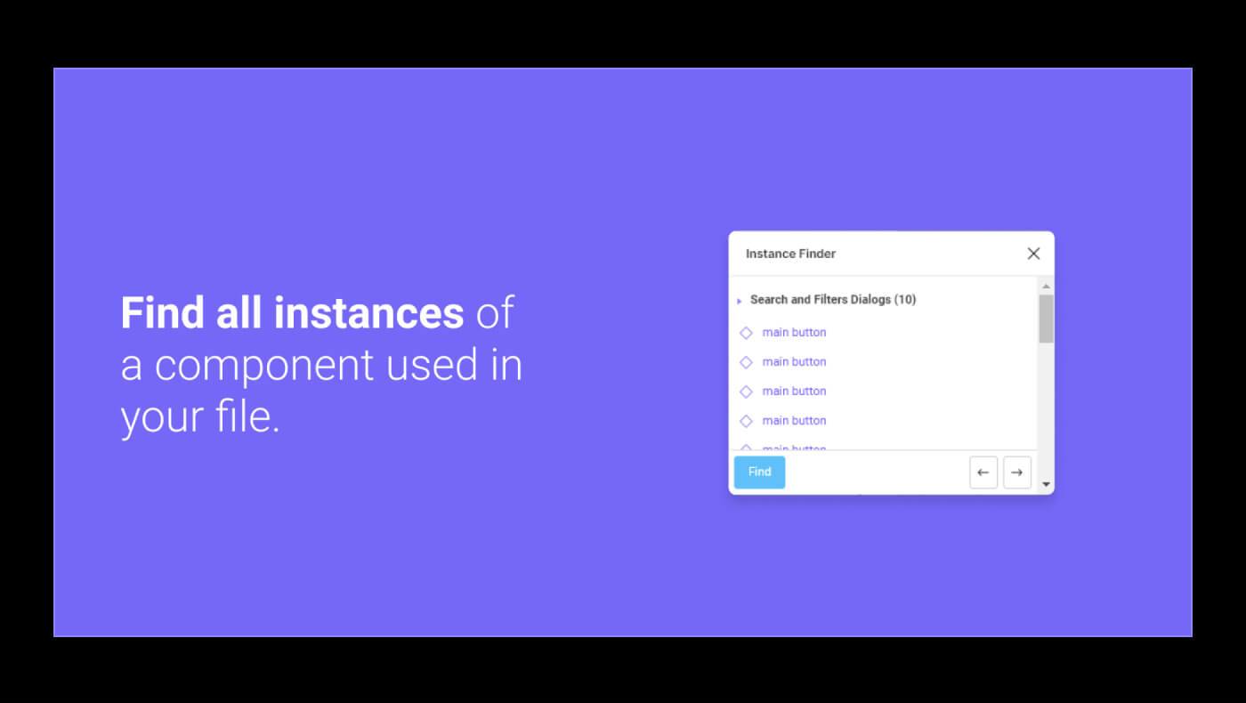
Instance Finder
A true savior when you need to find out where a specific instance of a component is located. Use Instance Finder whenever you need to find an old dusty component linking to an outdated or someone else file.
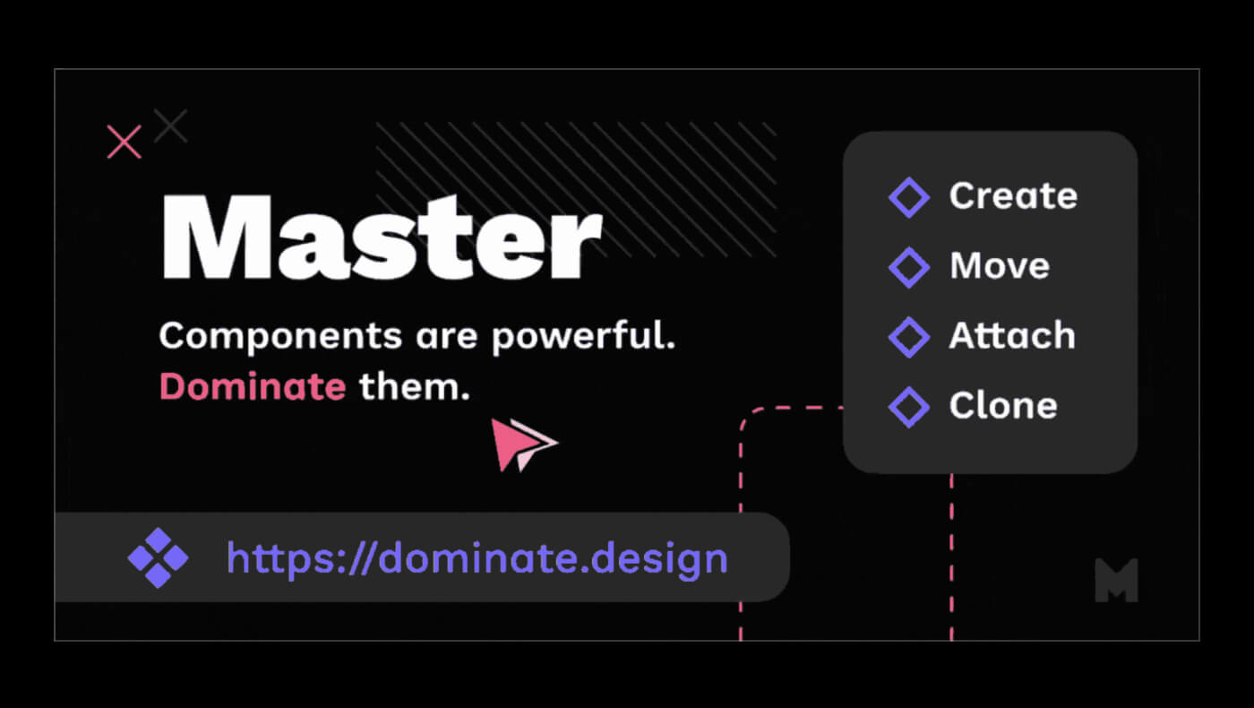
Master
Master is a helpful plugin for moving a design system to a different file/project or migrating your design files from another tool, like Sketch or Adobe XD.
Master can create, clone, and move components between files. Besides that, Master can create a new component from any object on your canvas. This especially comes in handy when you decide to systematize your draft designs into a structured file.
Master is a paid plugin but has a helpful free guide to help you get on board and decide if you need it or not.
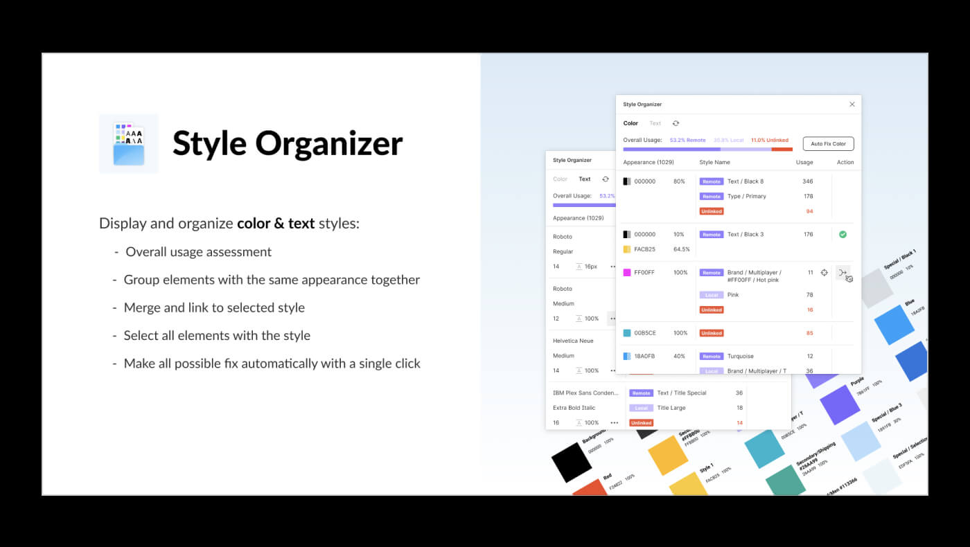
Style Organizer
A plugin to audit your design system. This helpful tool lets you merge similar styles, solve inconsistencies and polish your design styles to perfection.
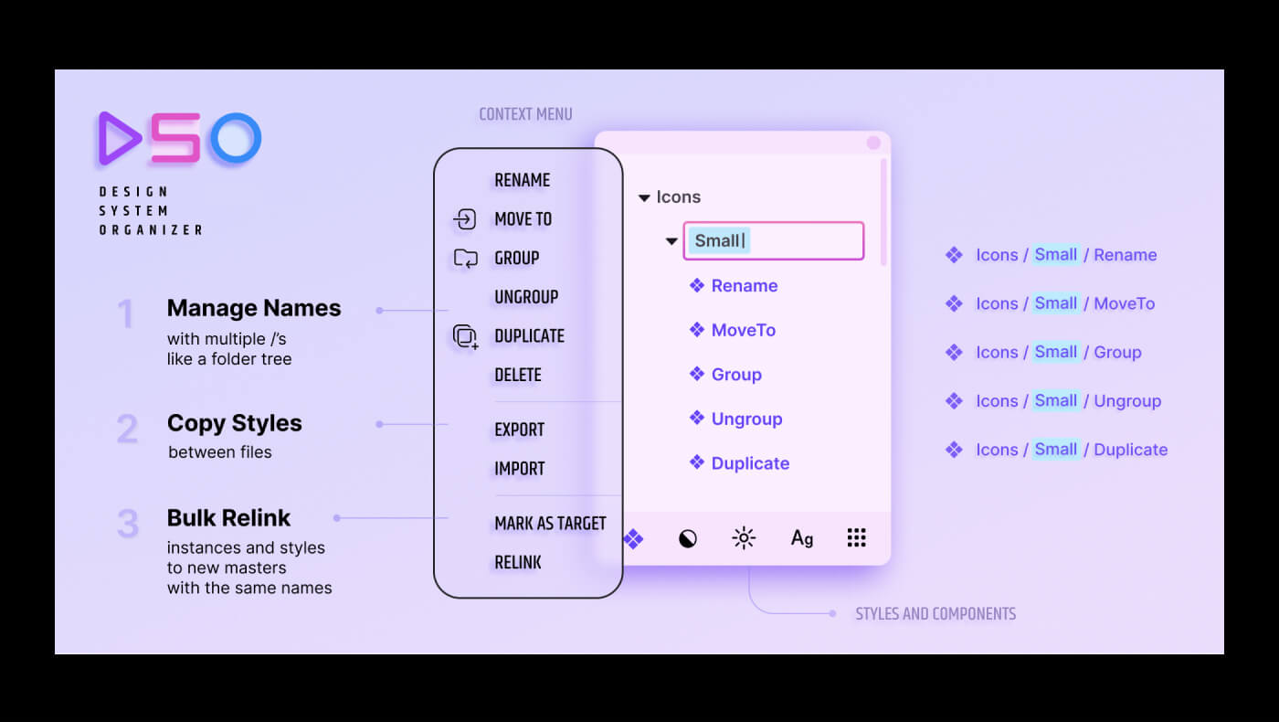
Design System Organizer
Design System Organizer helps to manage your components and styles. With its help, you can easily arrange files, copy styles between files, and bulk update component instances.
The plugin supports working with local and external libraries and has a helpful context menu to help you organize, delete, and group components and styles. DSO is a paid plugin with a 15-day free trial for each new file.
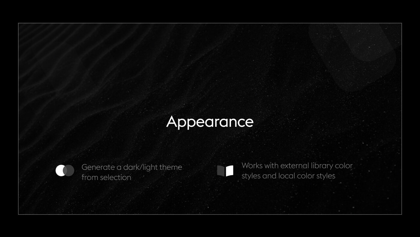
Appearance
The Appearance plugin helps generate a dark/light theme from your UI kit styles. The plugin can apply color themes to your selection and switch styles from one theme to another in real time. The plugin supports external libraries, which makes it extremely helpful when you create multi-themed designs in Figma.
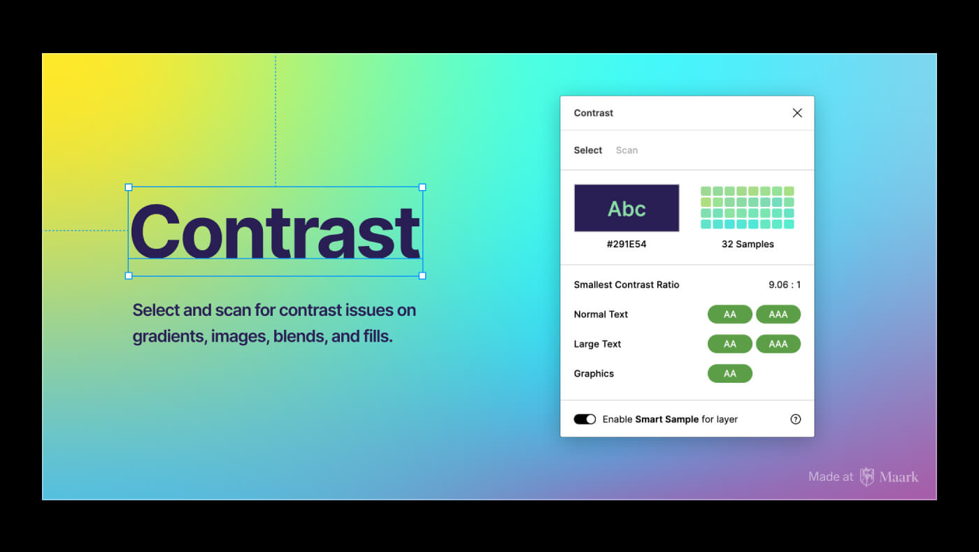
Contrast
The Contrast plugin is a tool to ensure your designs are passing the Web Content Accessibility Guidelines (WCAG).
To use it: select a layer and run the plugin. The plugin will instantly analyze the background behind your selection and display the contrast ratio between foreground and background.
As a bonus, you could use the Contrast plugin to generate a report of all contrast issues in your file, with an option to fix them.
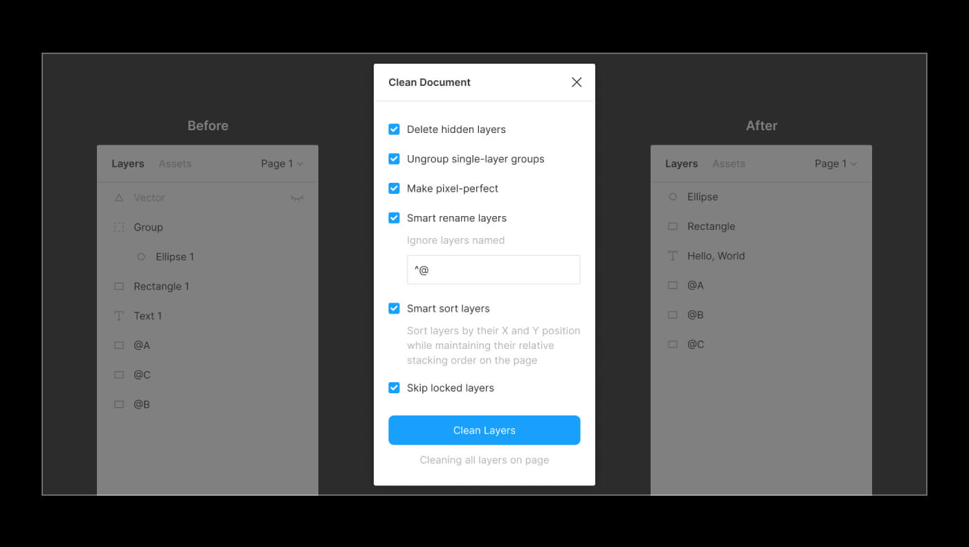
Clean Document
A plugin with a toolset to organize and clean up your files before handing your design system for a review or handoff.
The plugin includes the following features: delete hidden layers, ungroup single-layer groups, make pixel-perfect designs, smart rename, sort layers, and more to help polish your Figma document.
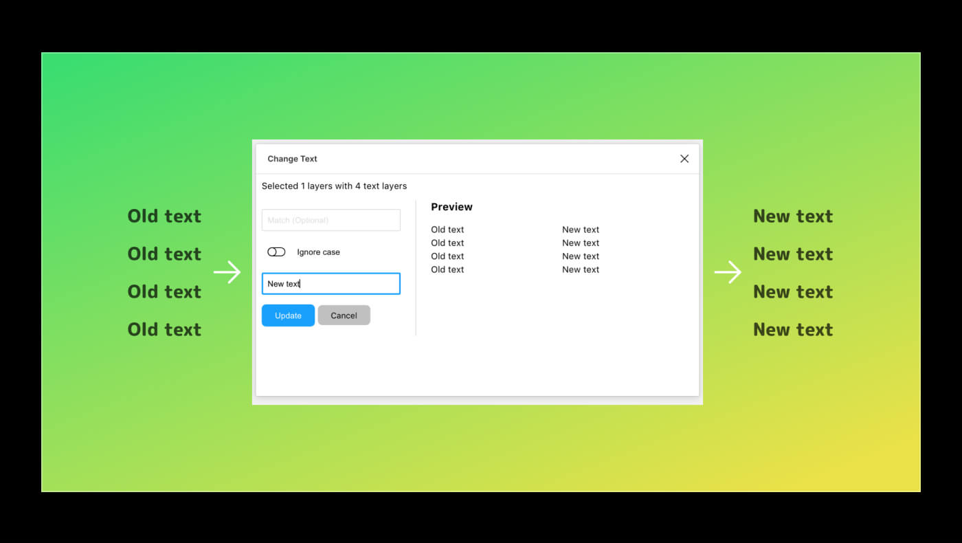
Change Text
Change Text plugin can bulk edit text contents. Select multiple text layers and run the plugin to change their contents. The plugin has a nice results preview to help you avoid typos.
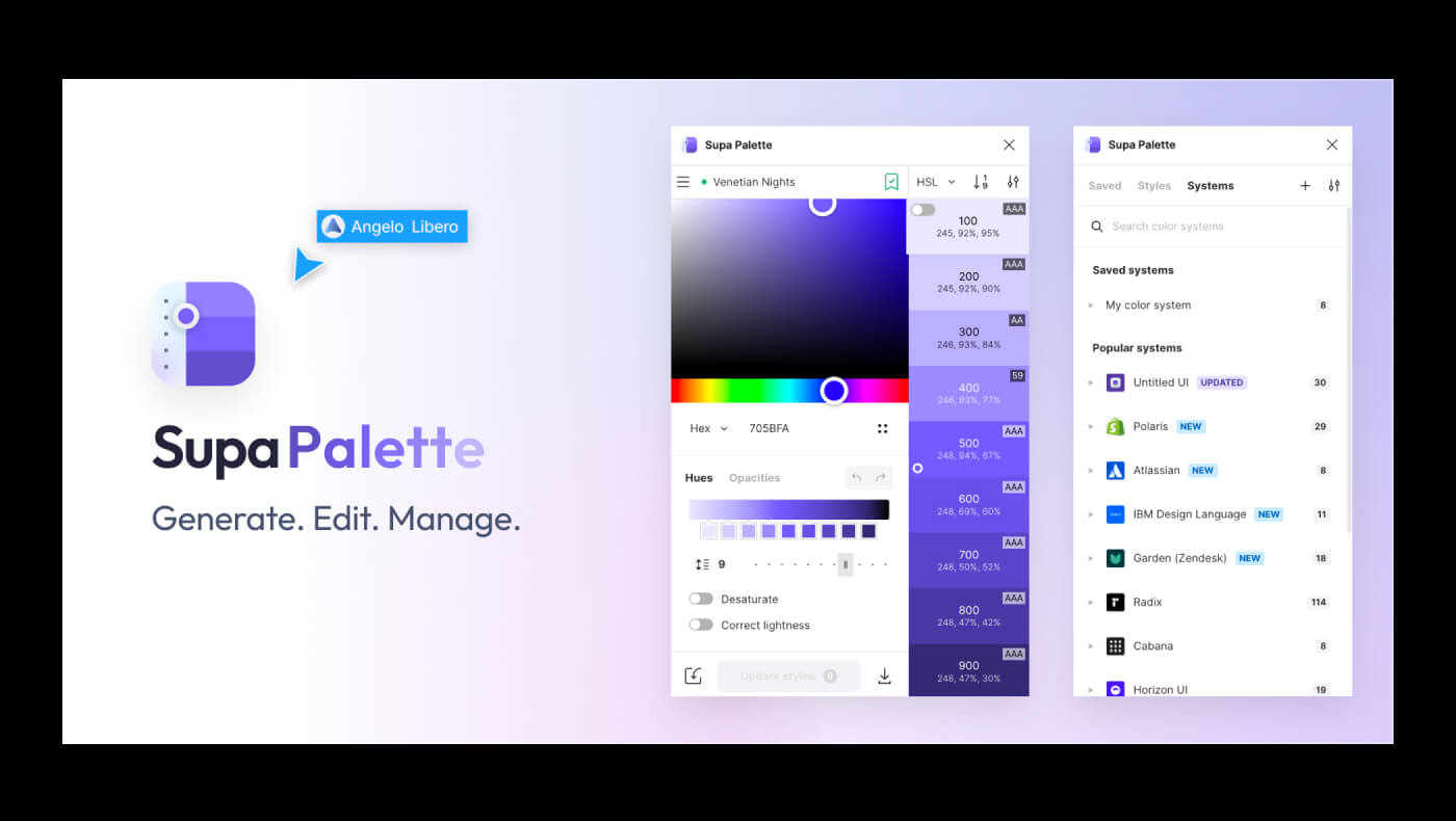
Supa Palette
Supa Palette is a powerful color editor and generator. Use it to create beautiful and accessible-first palettes in no time effortlessly. The plugin has a very friendly UI and a premium plan with more features to control your design system color styles.
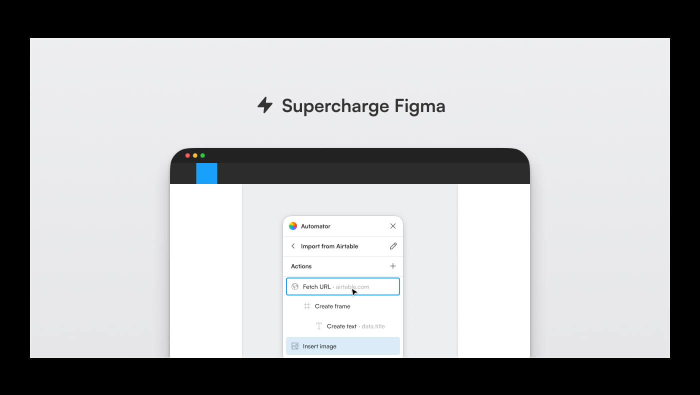
Automator
Automator is the most powerful plugin on the list. Its capabilities are much beyond possible description; it allows you to build plugins right inside Figma. You could choose from over 100 actions (commands) to mix and match them, create automations, and experiment with the Figma Plugin API.
To first test using the plugin, you could explore its growing community and use one of the templates to understand its logic and functionality on a specific task.
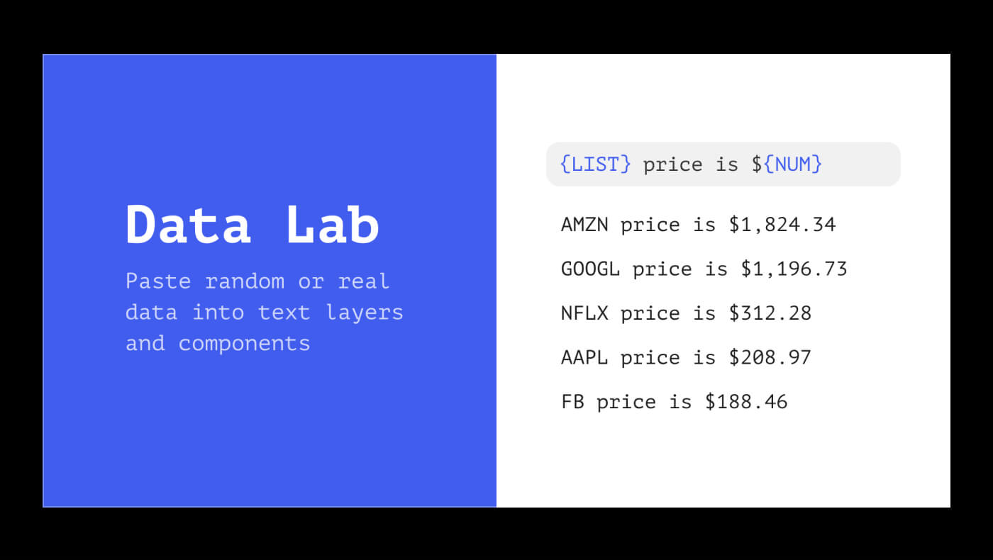
Data Lab
A plugin to help generate random or actual data into your designs. This includes user names, dates, addresses, cities, emails, etc. This plugin works with text layers and components, making it helpful for populating your design system with real data examples.
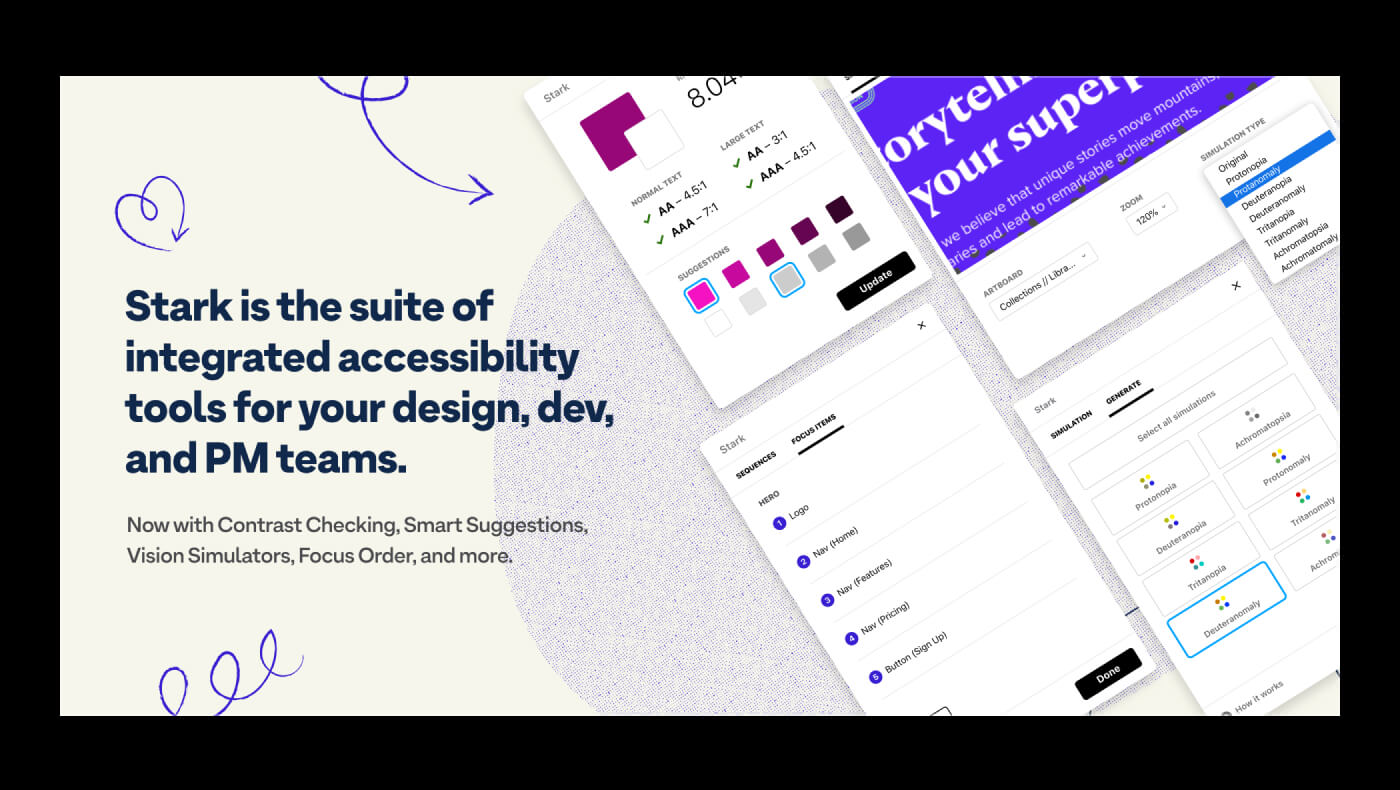
Stark
Stark plugin can check your designs on accessibility standards, including vision impairment and contrast disabilities simulations. If you are designing a product and want to make it accessible for everyone, you could use this plugin to analyze and enhance your designs.
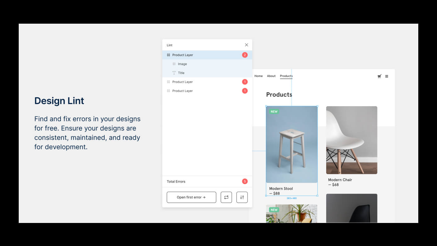
Design Lint
Design lint is an open-source plugin that finds missing or inconsistent use of styles in your design files. The plugin highlights the most common errors before handing your files into development.
You could use it to navigate your work and revise errors by various categories, such as missing fills or text styles, inconsistent shadows or border-radius usage, etc.
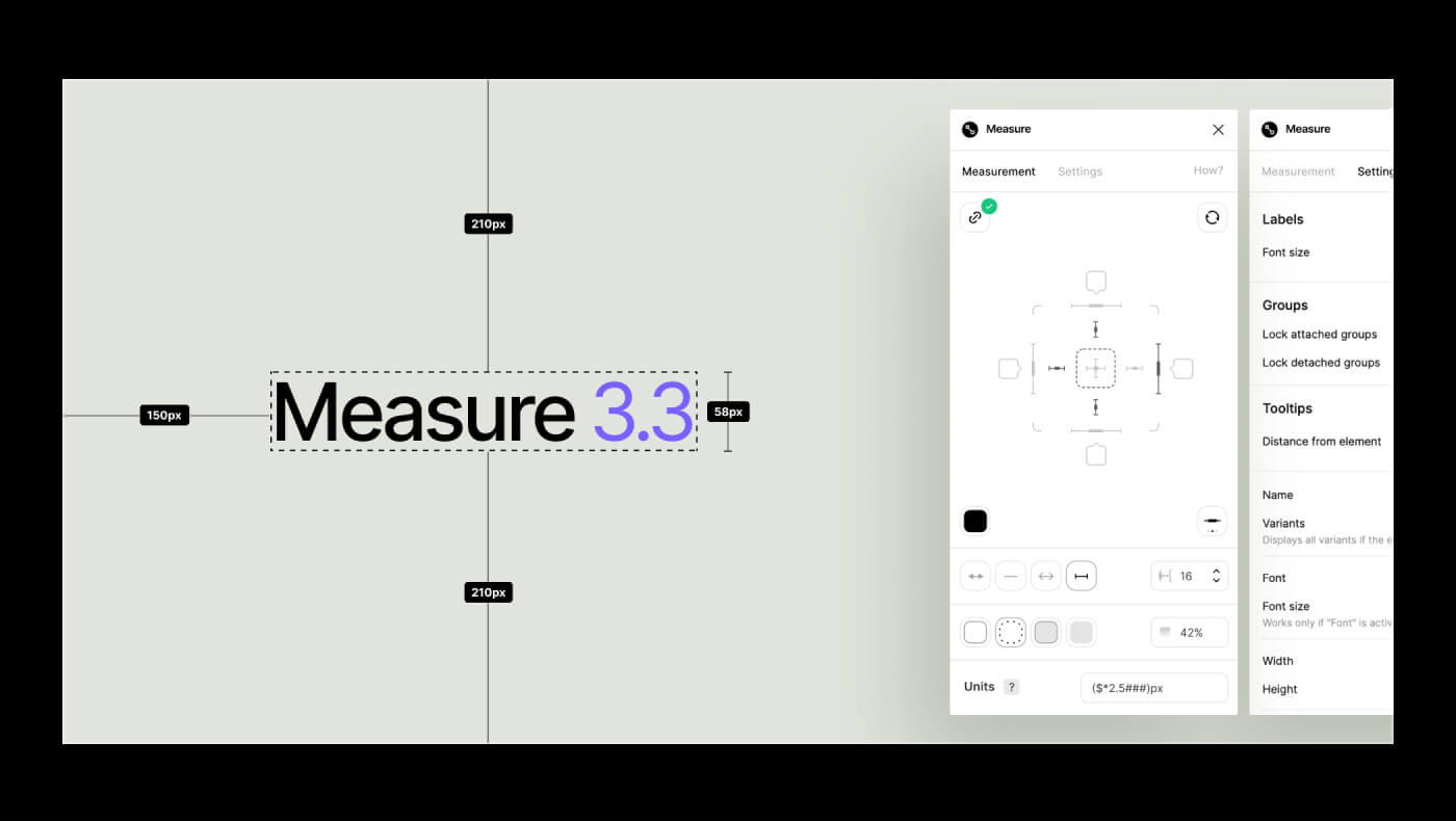
Measure
A plugin to quickly generate redlines and add size measurements to your designs. A lovely plugin to help you better communicate with developers.
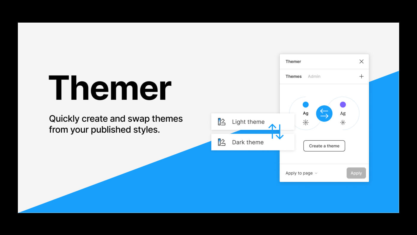
Themer
Themer is another excellent plugin that enables you to make and swap themes from a published team library. You could use it to apply colors, text, and effect styles to the whole page or your selection.
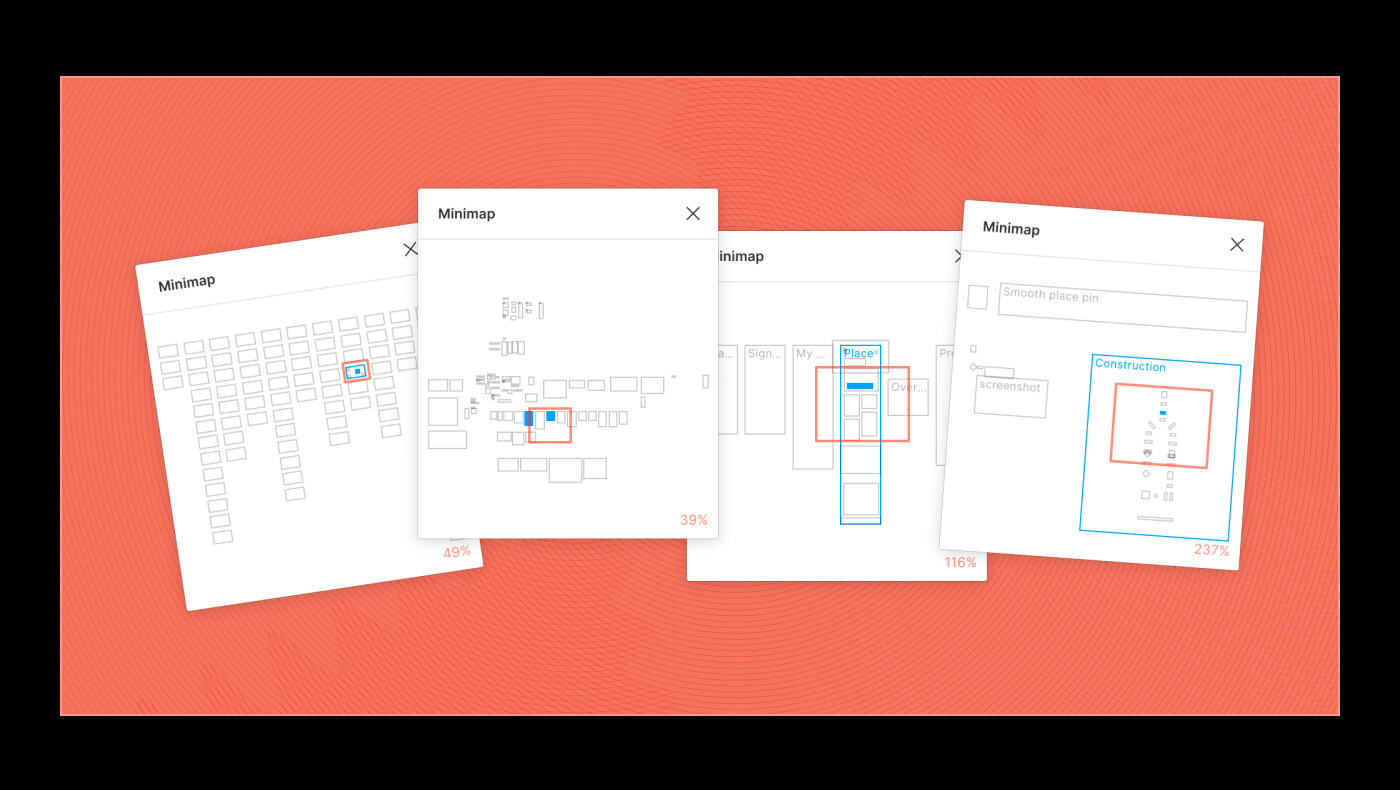
Minimap
Minimap is a beautiful plugin that generates a map from your designs. It creates a preview of the file that you can use to see the whole picture and navigate any distant part of your designs with a click.
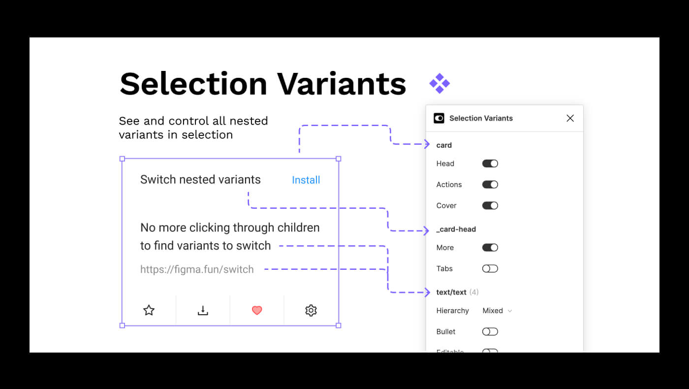
Selection Variants
Selection Variants let you see and control all nested variants instances within your selection. Use it to switch between variants without clicking through components to find all the nested instances.
Use this plugin to help others discover how your components work and remove unnecessary complexity from your design system.
Super Tidy
Super tidy helps to keep your designs neat by efficiently aligning, renaming, and reordering objects based on their canvas position. This plugin is excellent when arranging numerous variants and component examples on the canvas.
Conclusion
These are just a few plugins we think are worthy of your attention. With so many great plugins appearing, we can honestly say that our lives as designers are getting easier each day. Save this list to your favorites and share it with others to help them on their Figma journey.
Find out more awesome and helpful Figma plugins in our handpicked collection of Essential and AI-driven plugins:
Best Figma Plugins for Design and Development in 2025
Visit framesxdesign.com/figma-plugins for more Figma plugins!
If you have a plugin and want to add it to this list, you can DM me on Twitter. Cheers!
.jpg)
UI Colors Tips for Figma
May 17, 2022 - Reading time: 35 minutes
Intro
When designing systems in Figma, reshaping and recycling your previous ideas is always a necessary and ongoing process. So various scenarios are encountered around working with project colors. These include: updating your colors globally, sorting, naming your brand assets, using styles in multiple files, and sharing design props with your team.
How you communicate your color decisions and translate them into development will affect your projects. Beneficial or sometimes maybe not. So being flexible and continually attempting to uncover a "better" approach is rewarding. And I appreciate that a design tool like Figma allows us to do it.
Figma has a few approaches that are beneficial to these scenarios. Let's look at them and methods to better operate your project colors with the help of the Frames X — A headless design system for Figma.
Use colors from a library
When starting a new project, you could add Frames X or any other UI kit as your Team library and save yourself colossal time manually adding colors or using any third-party tools to generate them. Using an extant color palette will allow you to quickly populate your new project with a broad and thoughtful range of colors.
Note that the team library feature will require you to have a proffesional Figma plan.
Is it worth it? Absolutely. A color library will help you communicate your stylistic decisions while staying consistent across more significant projects and teams. Colors and typography could be partitioned into separate libraries your team access without cracking your ongoing work, letting everyone be on the same page regarding the project/file they are currently working on.
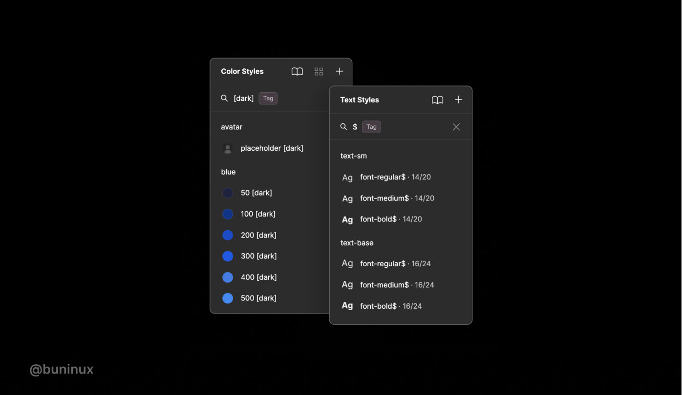
Tag styles to find them faster
Tagging styles is a great practice to speed up your overall workflow in Figma. Not only when working with styles, but this also applies to components. Tagging your styles will allow you to quickly find the needed text, color, or component through Figma menus by typing a name containing a symbol or an included "tag" name.
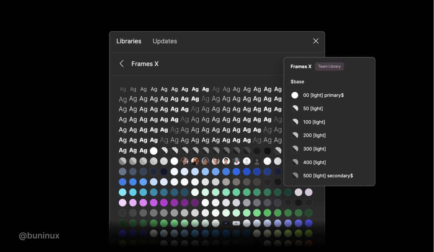
Frames X, by default, uses the following tags:
$ — Is used throughout the system to prioritize some styles with a primary, secondary, or tertiary role. $ helps to prioritize some style groups, such as the "$Base" palette, marked because it is a system's primary palette.
[light], [dark] — Used throughout the system to describe if a color has an alternative color convertible from light to dark mode. Also, enclosing brackets tags ensure styles name identification in plugins, such as the Appearance plugin, which helps to generate a light/dark theme from your selection.
Update colors globally (Batch replace colors)
Global color replacement could help you achieve the needed contrast and unique visual style. You could create an entirely new UI color theme by tweaking global primary, secondary, and tertiary color values. Figma allows you to edit styles and propagate multiple color changes throughout your file. Global color replacement could also help you achieve the proper contrast ratio when working in a more detailed-component level (aka zoom 200%).
You could use Batch Styler Plugin or Figma Tokens plugin to speed up the global color replacement process. You could start tweaking your design system files by selecting multiple color or text values and then batch replace them with new ones without breaking any connections between styles.
Use a proper naming convention
Frames X uses literal or definitive color naming (like red, blue, etc.) and a numeric scale (where 50 is light and 900 is dark) by default. While this is reasonably functional for most tasks, there are good reasons to use other naming conventions to better communicate on different projects and teams. You could also use semantic or contextual naming conventions instead.
A semantic naming convention uses names that describe the intent of the color ("Primary," "Secondary, "Danger," "Background," etc.). Semantic naming allows underlining the value of the color rather than using a combination of name and numeric scale, making it easy to modify the whole theme to any combination of colors we need. Other examples of Semantic names are Brand, Accent, Warning, Alert, and Success, to name a few more.
A contextual naming instead uses names that define a color for an exact type or category of component ("color-primary-button," "color-default-icon-small," "color-error-modal," etc.)
Contextual naming is good when you have your design system in a final state, at that point where you don't add new things or components to the system. With contextual naming, you'll have your project at your fingertips, with every string responding to a particularly assigned color or group of colors.
But using contextual naming from the start could quickly overwhelm and mess up your design process with hundreds of definitions to keep in mind, making it challenging to find and use colors appropriately. And, because it is challenging to resist the urge to define every color, naming things from a contextual perspective will always grow exponentially. So apply it only if needed (usually for more minor projects from personal experience).
Understanding color models
We tend to feel comfortable with the HEX color model as designers. But HEX values are tough to read. It's unlikely you would be able to imagine the color of an element by reading the hex value, except if you are an expert designer.
RGB (red, green, blue) notation is a better alternative to writing and sharing colors, giving us access to the exact scope of colors as hex values in a much more readable format. Colors on the web are made of three values, meaning the higher the proportion of red, green, and blue, the more saturated the resulting color will be.
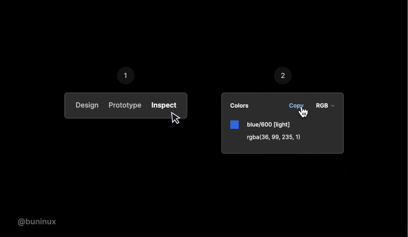
RGB is well known and tends to have a better reputation among developers than HEX. So it may be a good idea to explain how to copy a CSS-friendly color code to your fellow developer friend.
In Figma, you can access the color code on the inspect tab. You could select the RGB color model from the Colors section dropdown. This will let you copy/paste this directly into a stylesheet or code editor without additional formatting hassle.
HSL is another helpful and less known color model (hue, saturation, lightness). This model seems to be the far more intuitive way to adjust color values and is easier to understand, even from a non-tech perspective. HSL can be easily explained thoroughly. For example, we can get darker and lighter variants of the same color by adjusting the lightness parameter or a saturated color with saturation value, etc., which is a convenient way to interpret how our eyes perceive colors.
The advantage of HSL over RGB is that it is far more intuitive: you can guess at the colors you want and then tweak them. It is also easier to create pallets of matching colors by keeping their hue values the same and varying the lightness/darkness and saturation.
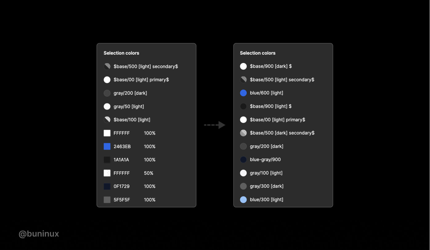
Adjust nested or mixed colors
Figma has a helpful tool you could spot on the right pane under the Selection colors name. Selection Colors allow you to change the appearance of your design without selecting each layer individually and then applying colors to the selected layer. This comes in handy when creating many color variations for your UI. It'st'svealed when you have more than one style in your selection.
You could view, select and alter the Fill/Stroke color if all layers have the same fill or stroke. And you may inspect and alter colors in the Selection colors section if the layers in your selection have different colors applied.
Use the selection colors feature to tidy up styles within a frame or components. Merge duplicated Fill or Stroke and improve the overall consistency of your designs before making the presentation.
Utilize color tokens
Color tokens are a core element of Figma Tokens plugins. A community plugin by @jansix. Color tokens are atoms discreetly connected with styles while also providing choices that Styles don't provide in Figma.
Utilizing Color Tokens will let you access various workflows for updating, creating, and changing Fill/Stroke color globally. You could get more information on using Color Tokens on the official plugin website.
Bonus Tip: Change colors in Figma with keys
You could change the Fill/Stroke colors with the Up/Down on your keyboard and the Shift key for bigger steps between colors. Quite handy when you're looking king for that one color or a particular match for the existing palette.
---
Thank you for scrolling until the end! Senior designers know that it's never too late to learn something new. If you're' wondering where to start or what else to learn, check out our 2022 Handbook and UI kit for Figma — Frames X. With over 4K UI elements and components to learn from.
.jpg)
Dark Mode UI Best Practices
October 28, 2021 - Reading time: 10 minutes
Eight tips for designing dark mode UI
What exactly is a dark theme/mode first?
A dark mode is a night-friendly color theme that mainly focuses on using dimed/grey colors for surface and UI elements. Darker colors reflect less light while still providing a great reading experience. All thanks to the high contrast between sharp elements and subtle surfaces.
As a design pattern, a dark mode is usually living across the user interface as a toggle. The dark mode is designed to be supplemental to the system's default (or light) theme.
Thanks to extra vibrancy, the dark mode has become quite popular, making foreground content stand out against the shaded backgrounds. But besides being fancy, what are the perks?
Dark mode perks
Dark theme is a good marketing move for making your UI stand out among similar brands or products. The deep, heavy backgrounds can become a perfect addition to your brand visuals.
Dark mode as a feature can help reduce eye strain when operating your product. Especially if your product is heavy with text, a dark mode can help enhance your user's retention and focus.
Dark mode can potentially save your phone energy. It's proven that dark mode consumes six times less power on your screen by emitting less light and, as a result, can prolong your app lifespan and usage time.
Please note that energy consumption mostly depends on your phone type and not the colors. So if you want to measure dark mode battery-saving efficiency -- review the developer's guidelines for specific phone types and screens.
The dark mode experts say it is healthier to read against dark surfaces, while other studies arrive at the opposite conclusion. But in my opinion, the dark mode is just a trend that looks sleek and, in theory, can make your brand more comforting.
So without further ado, here are the best practices to help build your dark mode UI.
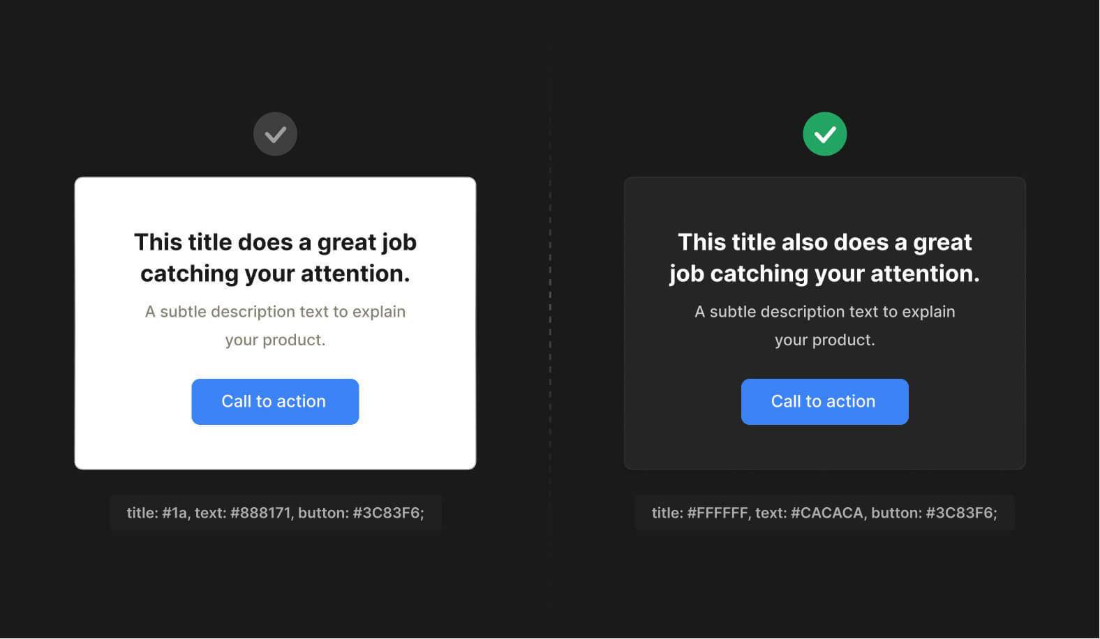
Plan your color use
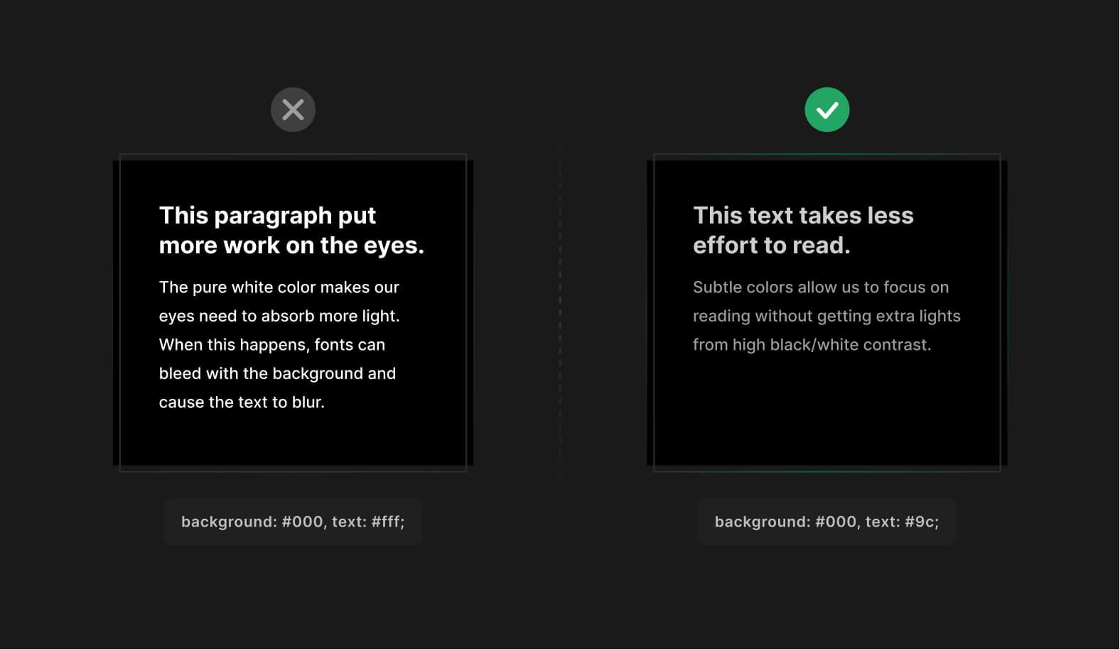
Avoid or limit white on pure black colors. You can use pure black (#000) as a background for dark mode, but make sure you dim your text slightly. Just enough not to cause eyes to bleed from cutting-edge contrast.
Pure white makes our eyes need to absorb more light. When this happens, fonts can bleed with the background and cause the text to blur, especially on older monitor models.
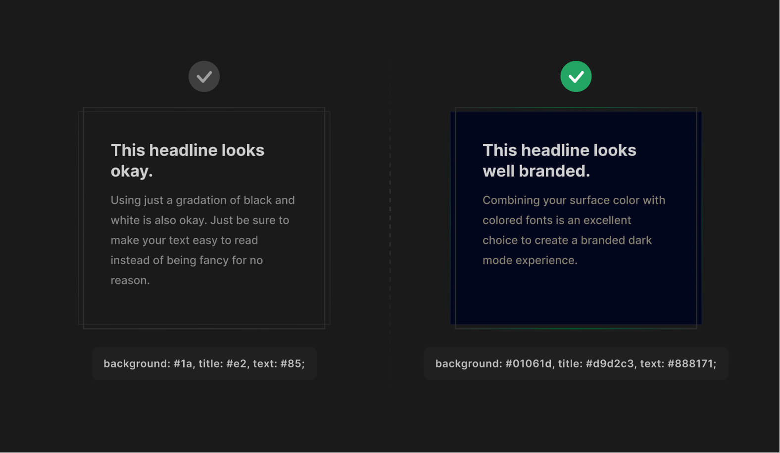
Brand your dark color
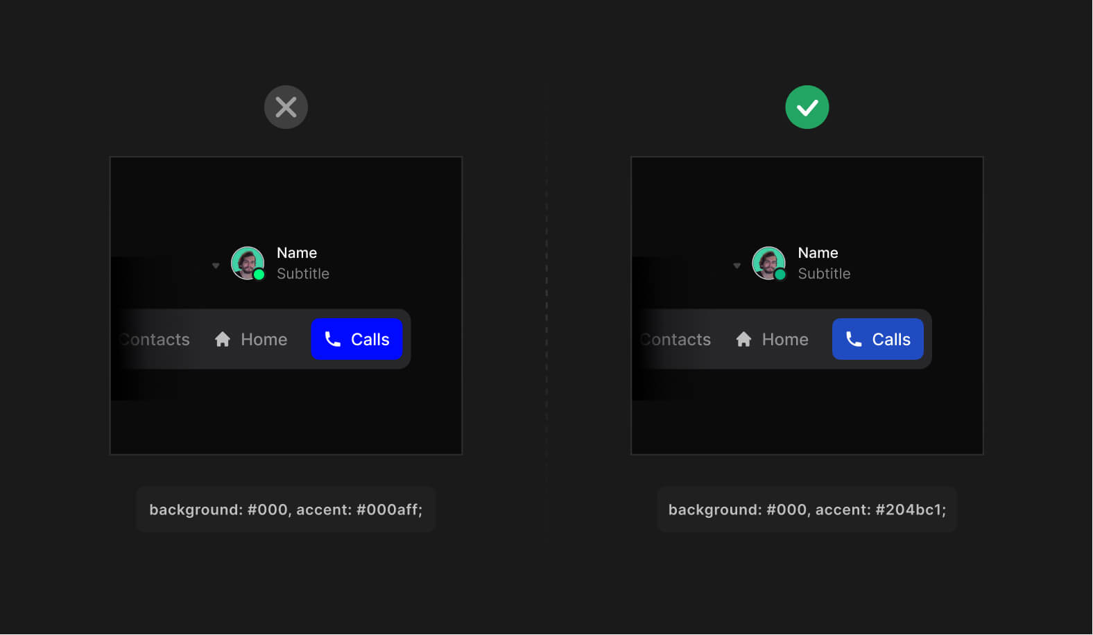
To make your dark mode more unique, use a much darker version of your primary brand color as the surface.
Combine with colored fonts to make it look even more special. ✨
Combining your surface color with colored fonts is an excellent choice to create a branded dark mode experience. Using just a gradation of black and white is also okay. Just be sure to make your text easy to read instead of being fancy for no reason.
Reduce color saturation
Avoid fully saturated colors in dark mode.
High saturation has a visual "shaking" effect when viewed on darker surfaces. Instead, use low saturation or slightly muted versions of your primary colors for best performance.
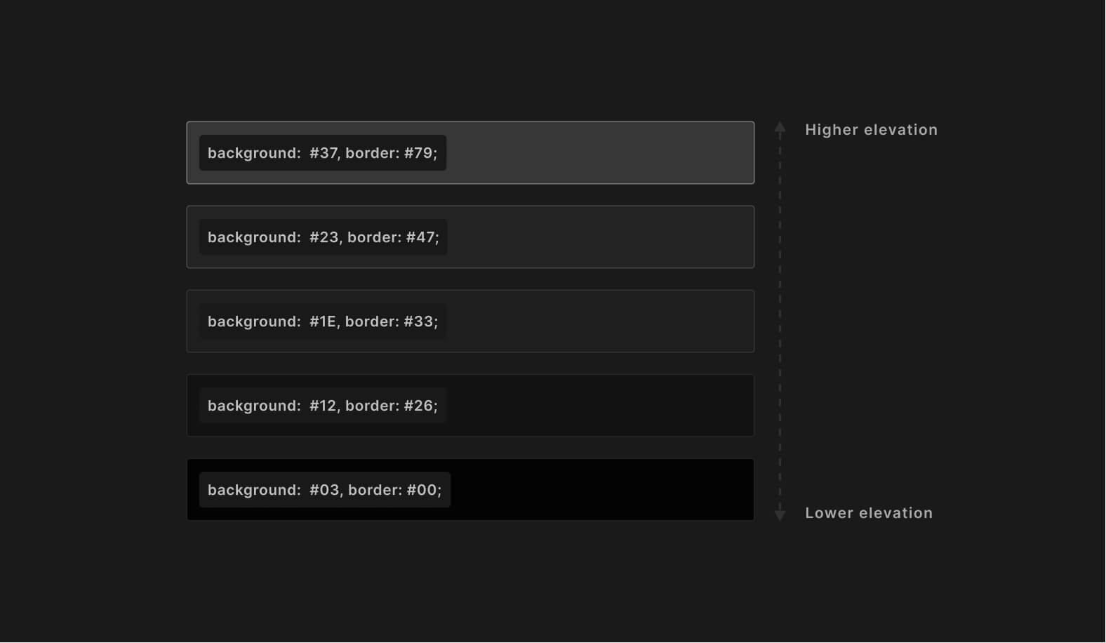
Communicate depth
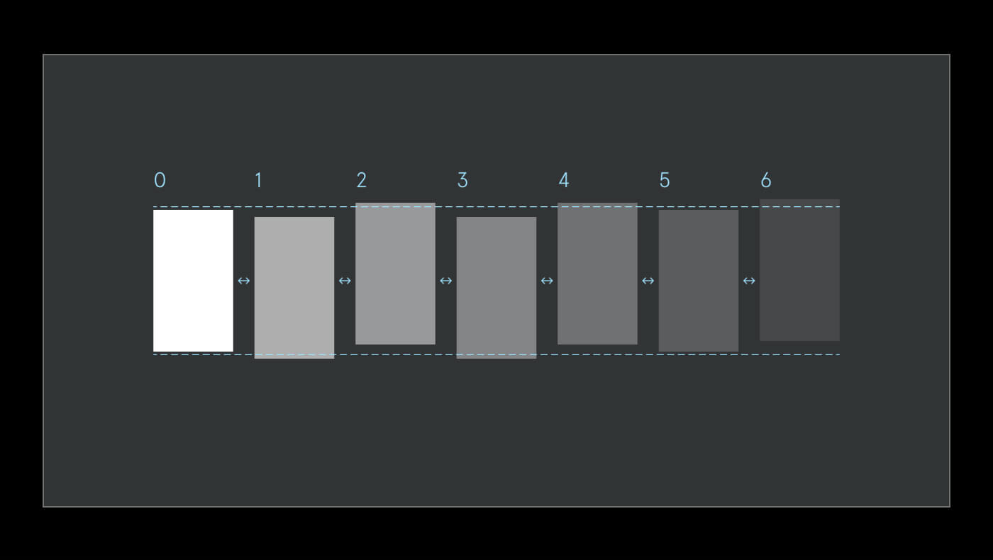
Use a scale of lighter colors to translate the elevation. Avoid using shadows in dark mode. Instead, use border property to emit depth levels for UI elements. Distant elements should still have lower elevation compared to the closer elements.
Avoid using shadows in dark mode. To better communicate depth -- make sure the objects closer to the user are brighter. This will help to build a better visual hierarchy.
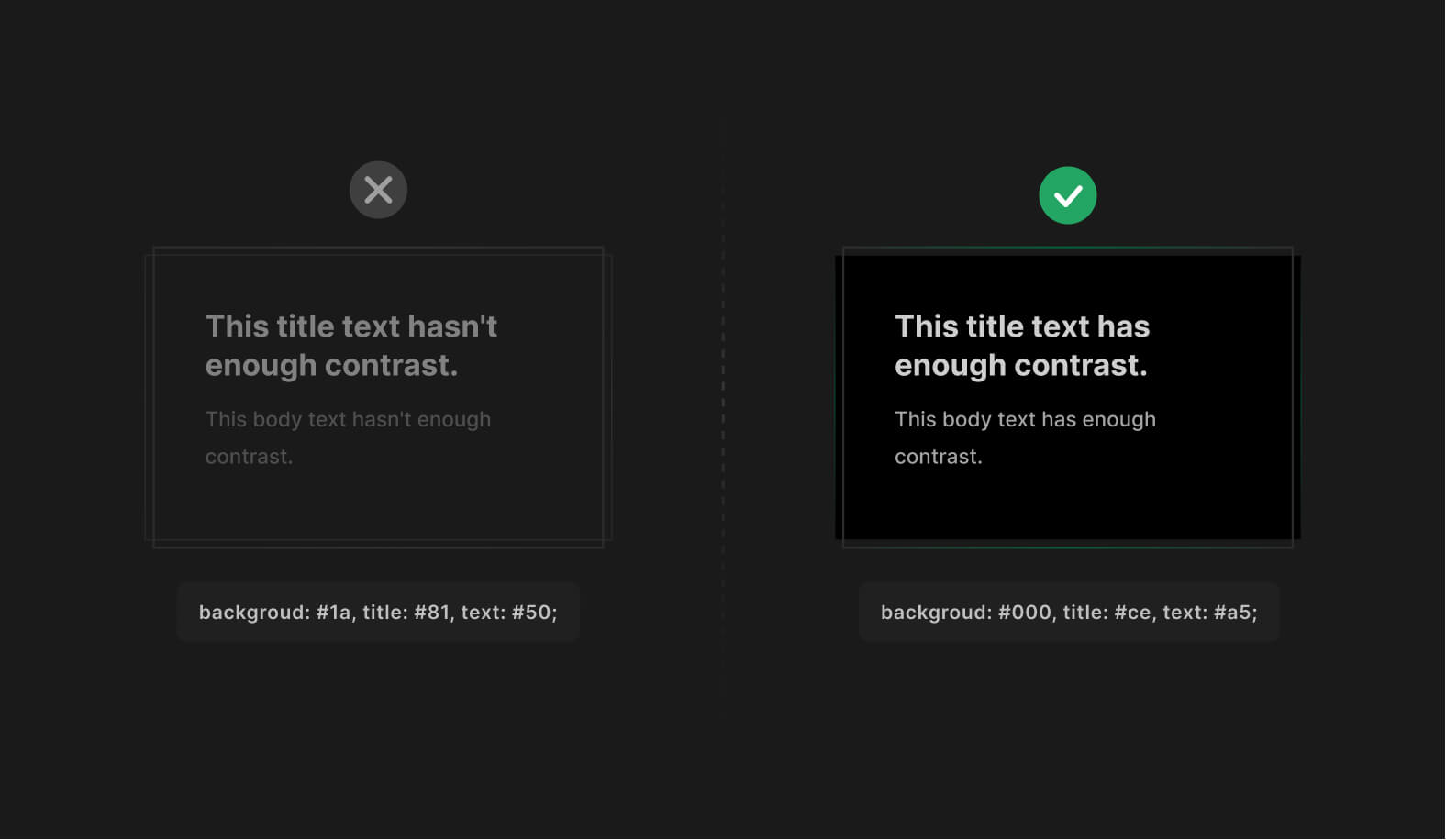
Ensure your dark mode contrast
Dark mode, just as the light should meet the minimum required WCAG standards to ensure all text is legible with enough contrast. You can use plugins to check your contrast design right in place.
Here are our favorite tools to help you double-check the contrast ratio without leaving the tool of your choice:
Design light mode first
While bringing your designs from light to dark mode, keep all the visual cues in place. Don't ignore or remove some colors for the sake of a dark theme not to confuse users.
Instead, prepare a color pallet that focuses on inverting existing colors without UI losing efficiency.
There are plenty of plugins that can help you with this. Here are my favorites:
- Appearance (Figma plugin).
- Dark mode magic (Figma plugin).
- Camilo (Sketch plugin).
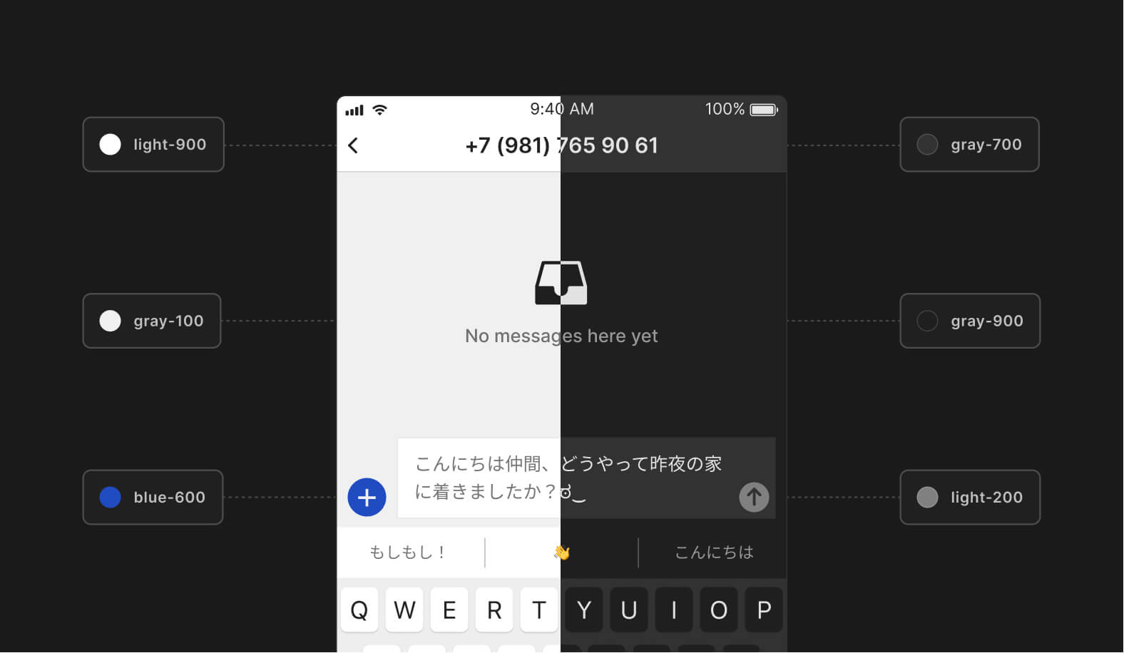
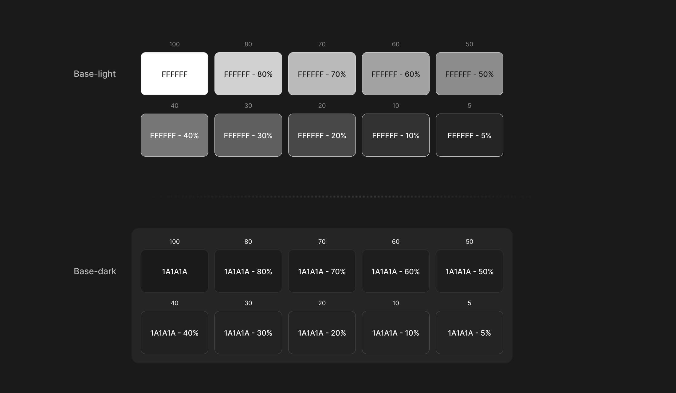
Use base colors to design dark mode
To make it predictable turning your light-themed UI to the dark side. Use a set of base or "neutral" colors with the same transparency values from the very start of your project.
A set of transparent colors can ease your life a lot. Instead of constantly choosing different shades of gray, you can use a set of transparent colors to convert your designs to dark mode predictably.
Don't overuse dark mode
It's a good idea to use dark mode for most things. Yet using a bright, striking background also can do a great job in conveying your design. Dark mode can be perfect for helping focus on a task, but nothing beats the final flash at 2:00 am when surfing eBay or amazon.
The light mode is great for catching your attention. It's popping up, waking up the user, and instantly transitioning his attention to one of the focal points, like a call-to-action headline, button, or form.
Tip: If you are making a product for Mac/Windows uses. It's good to adapt your product theme to sync with the user's current theme automatically. This can help users to feel at home, making a great first impression.
Conclusion
Follow the listed tips when planning the dark mode for your digital product.
Remember, there should be a strong reason behind implementing it into an existing and perfectly working product. Consider the content, context of use, and the device on which the design will appear.
But no matter what. The dark mode can benefit your product, especially when using your phone at night, saving battery, or viewing memes in a dark atmosphere.
Useful resources
- Material dark theme guidelines.
- Darm mode UI inspiration.
- Figma tokens — a plugin to help customize and adapt your design system to multiple themes.
- Contrast — a plugin to help check the contrast ratio of background and foreground elements.
---
That's all. Thanks for the read! 🙌
Enjoyed? Subscribe and share this article with others!
 Updates
 FAQ
FAQ