The Perfect Figma Tabs Component
September 30, 2024 - Reading time: 5 minutes
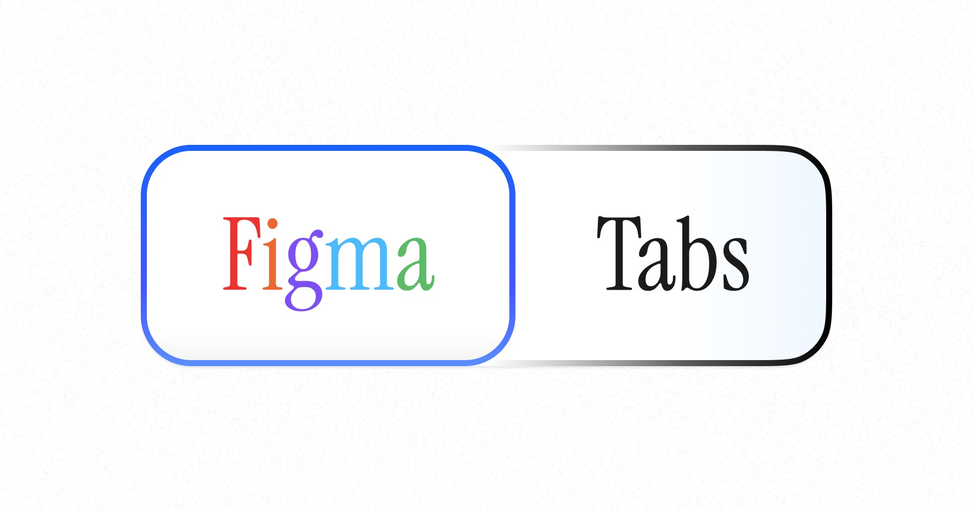
FREE Figma Tabs Component
If you have ever worked in UI design, you would definitely design Tabs. Tabs are a universal term for attached buttons. They organize content, save space, and guide users. But designing them in Figma? That's where things get interesting.
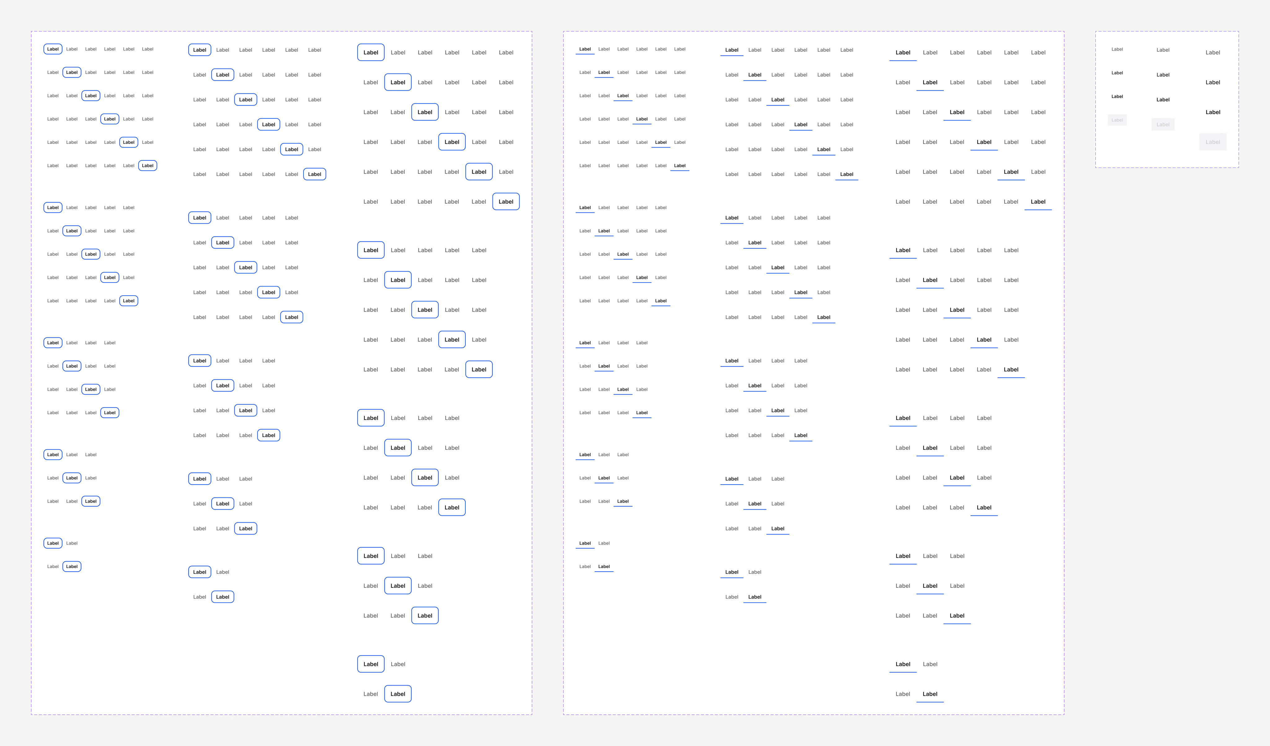
Figma allows you to create flexible components that display different tab states, sizes, and compositions. You can also create variant sets and reuse them as you design your project.
However, tabs are always animated in design and do not exist in a static state. So, you want to animate those Figma tabs you reuse in your projects.
Figma's Power Features:
- Component variants? Check ✓
- Component properties? Check ✓
- Responsive UI? Absolutely ✓
- Animation? Maybe…
The catch? Animation. Figma's prototyping tools are still limited in terms of combining power features with animation. You'll get the job done, but it won't be reusable. And as design engineers and geeks in general, we want our components to reflect actual usage.
You can find examples of animation-first approaches in the Figma community, like this one. However, all those tab examples will only include animation as a power feature.
We've been there — hours spent wrestling with Figma, trying to create the perfect tab component. The result? A choice between organized variants or smooth animations — never both…
But we cracked it ⚡︎ and are ready to present you our solution:
- Pill and line-shaped tab style variants
- Component properties and nested elements
- Animated. Includes interactive states for hover, active, and clicked
- Saves tab position between variants
Download Figma Tabs for Free. Grab it, use it, and thank us later.
▶ Watch Figma Tabs components in Action
The animation could be smoother, but it works like a clock, allowing for an accessible and prominent display of user action. With variants and component properties, you can scale and use these components for multiple screen resolutions and scenarios.
You can use this Tabs UI kit as the starting point for your tabs design, allowing you to have everything Figma has to offer in terms of responsive and interactive Figma Tabs.
Figma is a great tool, but it has limitations.
To overcome them and get the most out of it, check out Frames X — the largest Figma design system and UI kit in the world. It features thousands of functional and practical components to save your day.
Now, design some killer tabs.
▶ Download Figma Tabs UI Component
▶ Explore More Free UI Resources

Best UI Icon Libraries
June 20, 2023 - Reading time: 15 minutes
Iconography plays a crucial role in UI design. Icons convey a message and have a unique brand voice in your designs.
But with so many free and suitable icons available, drawing vectors around could be a waste of time for an already established visual metaphor. Also, icons tend to change in product design, where a design system evolves along the project, requiring numerous revisions and manual scribbling. That's why starting with an established icon library is a good idea for any project.
To help you with that, we've gathered our top picks of high-quality free libraries that can easily be dragged and dropped into your project and save your creative hours.
Update: Check our newly refreshed collection of icons in our guide: Best Free UI Icons for Design and Development.
Free Icon Libraries
Atlas Icons ↗
Open-source icon library, available in variable stroke SVG format, web font, Figma, React, Vue, and Flutter ready-to-use packages.
Icons: 2701
Boxicons ↗
Simple open-source icons are carefully crafted for designers and developers in four styles.
Icons: 1634
Basic Icons ↗
Open-source icon set icons for user interfaces. Based on a 24px grid.
Icons: 326
CSS Icons ↗
Open-source icons in CSS, SVG, Figma, and SVG formats.
Icons: 700
Free Font Awesome Icons ↗
All free Font Awesome icons are in one place.
Icons: 2020
Flagpack ↗
Open-source countries icon flags for Sketch, Figma, React, Vue, and Svetle.
Icons: 250
Flowbite Icons ↗
Free and open-source SVG icons in solid and outline styles with React (JSX) and Figma support.
Icons: 460
Glyph Neue ↗
Free with attribution icon pack by Icons 8 in outline style.
Icons: 1500
Hero Icons ↗
MIT licensed open-source icon library by makers of Tailwind UI in three styles, available for Figma, React, and Vue.
Icons: 292
Humble Icons ↗
Icons in a neutral style, carefully crafted in Figma and code.
Icons: 235
Icon Park by ByteDance ↗
Extensive collection of free open-source icons with a focus on customization and styling.
Icons: 2600
Icon Duck ↗
A vast collection of free icons and illustrations are available for download in SVG and PNG format.
Icons: 306,832
Icon Hub ↗
Collection of free and practical icons designed in multiple sizes and stroke sizes.
Icons: 3328
Iconmonstr ↗
A massive collection of free icons packed into thematic collections.
Icons: 4784
Iconoir ↗
A large-high-quality collection of minimal-styled icons.
Icons: 1356
Remix Icons ↗
Open-source neutral-style icon pack for modern interfaces with a handy Figma plugin.
Icons: 2494
Tabler Icons ↗
Free icon pack designed in a single style for web apps and user interfaces.
Icons: 4300
Material Symbols ↗
Free icon by Google available in font format. Available for customization in three styles and four font variables.
Icons: 2990
Majesticons ↗
A consistent icon pack for UI with free MIT license icons in two styles.
Icons: 6400
Mingcute Icons ↗
A simple and extensive set of minimal-styled icons.
Icons: 2326
Phosphor Icons
An extensive and constantly updated flexible icon pack for user interfaces.
Icons: 7488
Pixelart Icons ↗
Open-source pixel-art style icons made in one color on a 24px grid.
Icons: 480
Premium Icon Libraries
Icons8 ↗
A company focused on producing high-quality icons, graphics, and tools for digital creators.
It is one of the best sources for icon packs and illustration assets. Icons8 provides a wide variety of icons, from the most commonly used user and close icons to extraordinary Adventure Time icons
Icons: 1,345,700
UntitledUI Icons ↗
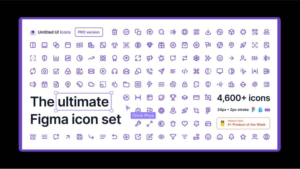
An extensive collection of clean and consistent icons for a modern-looking UI.
Made in 4 styles and carefully crafted in Figma.
Icons: 4600+
Pikaicons ↗
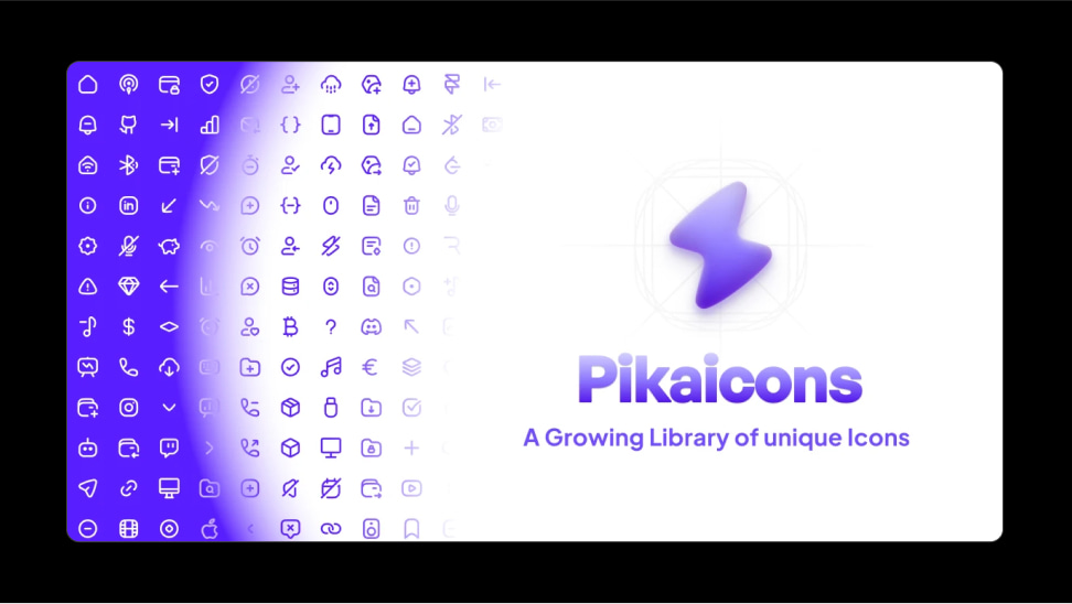
A growing icon pack made with extreme care in a smooth style.
Available in 5 styles. Provides monthly-community-driven updates.
Icons: 3,700+
Central Icon System ↗
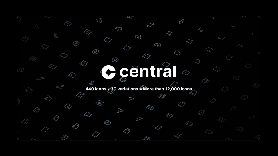
Icon system designed to maximally utilize Figma features to offer a fully customizable icon pack.
Includes 30 styles per single icon.
Icons: 818+
Iconic ↗
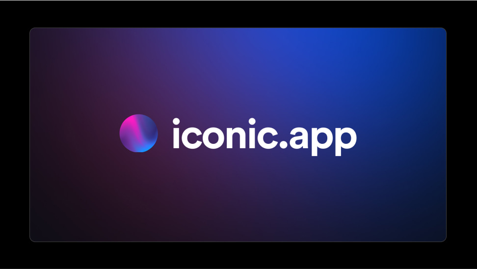
A growing icon pack for modern and minimal-looking UI with weekly updates.
Icons are available in SVG format.
Icons: 1258+
Myicons ↗
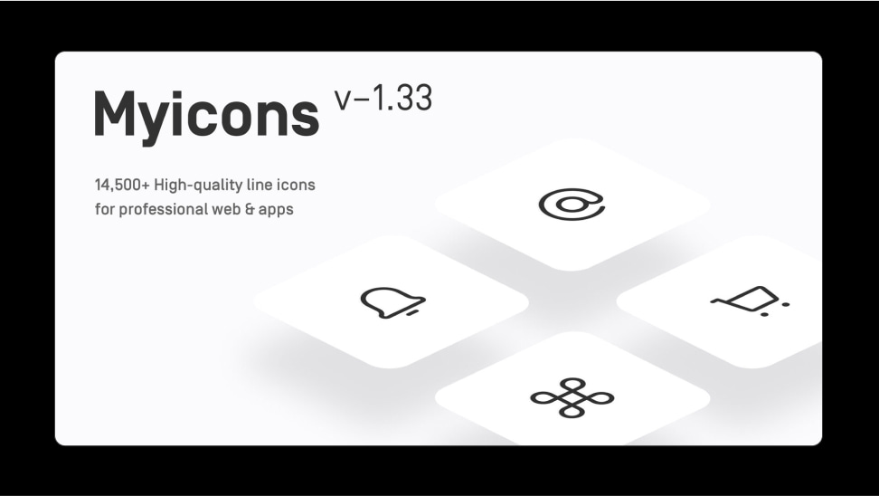
A massive and monthly growing icon pack for a clean-looking UI.
Available for Figma and Sketch.
Icons: 14,500+
Anron Icons ↗
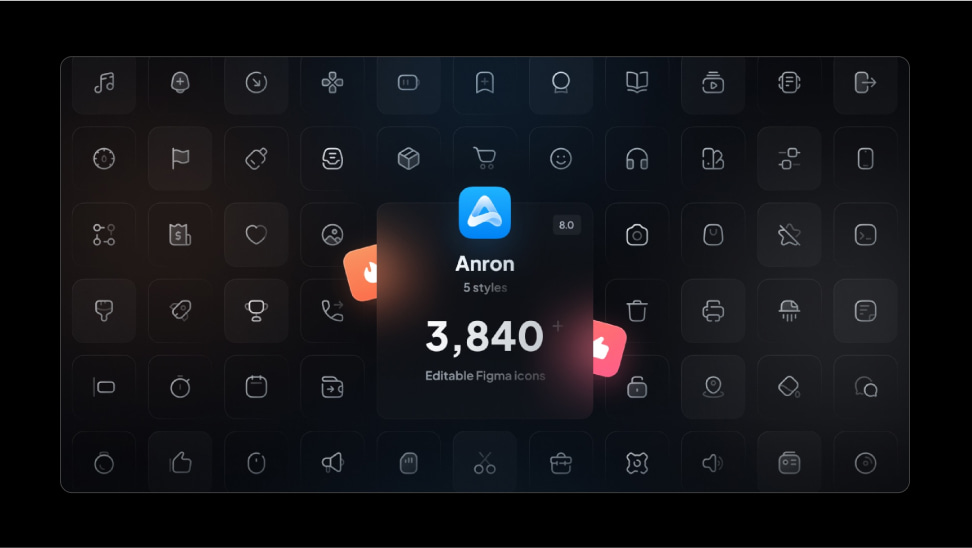
A flexible and clean icon set designed specifically for Figma.
Available in 6 styles.
Icons: 5000+
Dazzle UI Icons ↗
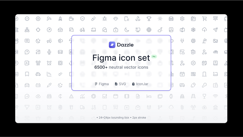
A vast and sharp icon pack in four styles. Specially designed with integrated Figma best practices.
Icons: 6,800+
Conclusion
You might be overwhelmed with how many packs to choose from as a designer or developer. But there is even more to find on the web. That's why we think these free and premium options are worthy of your attention.
Featured premium icon sets are usually designed with extensive customization options, making them an excellent choice for businesses and individuals seeking exclusivity. These sets often come with additional features, such as support and updates, which is valuable for long-term projects.
On the other hand, free icon sets provide a cost-effective solution for those on a budget or looking for a quick fix. They offer a diverse selection of icons that cater to various design styles and purposes. They can also be a great starting point for beginners experimenting with different visual elements.
Update: Check our newly refreshed collection of icons in our guide: Best Free UI Icons for Design and Development.
Thanks for the read!
Figma Tips to Design Faster
October 4, 2022 - Reading time: 14 minutes
Intro
Learning Figma can be challenging but rewarding, especially if you are a professional freelancer or working in a team. Mastering your tool's best practices could save time and help you achieve results much faster!
To help you with that, we've collected our top-tier best practices for designing faster in Figma. This is an evergrowing list, so consider bookmarking and revisiting this page occasionally for new hacks and updated tips.
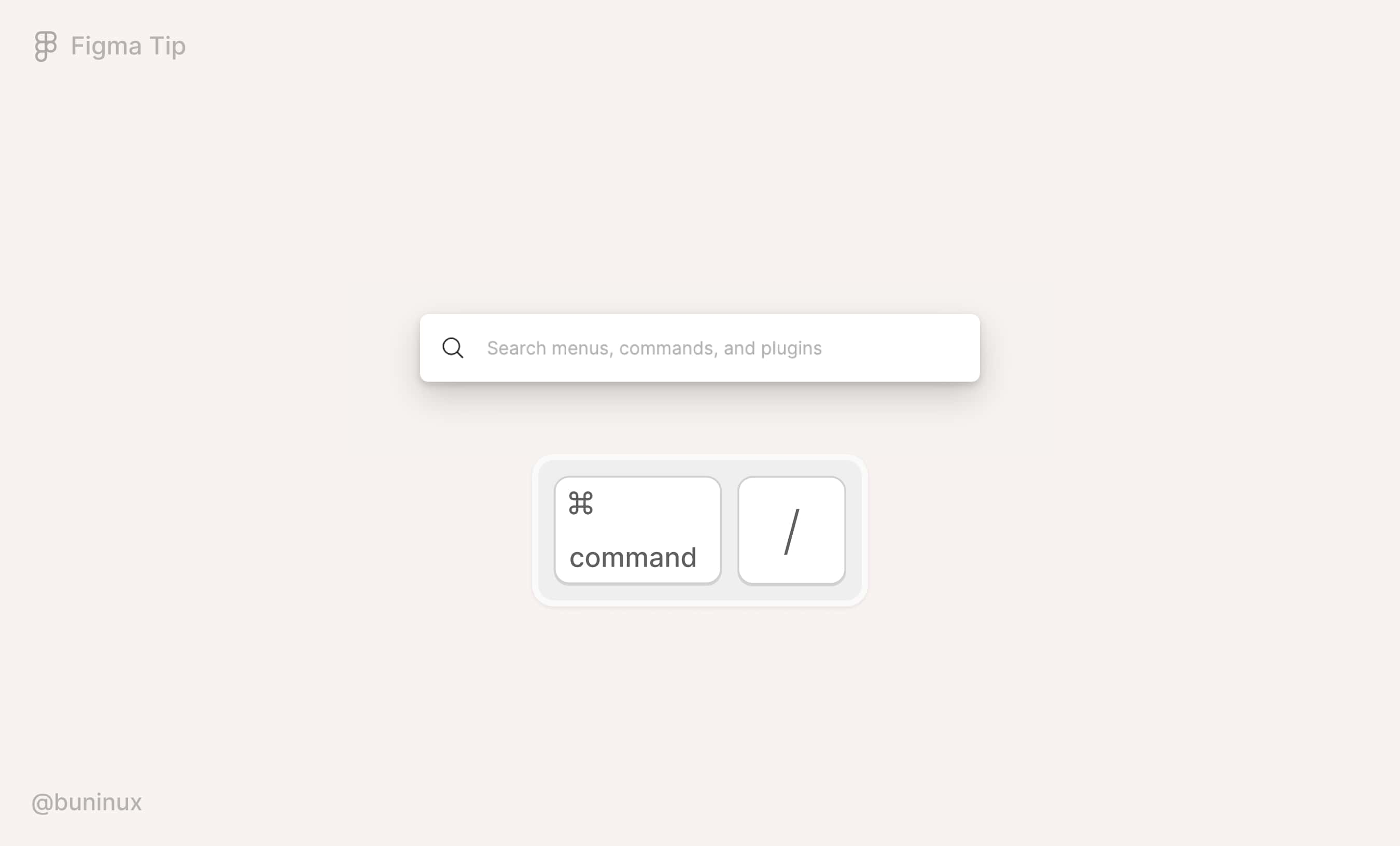
Use the quick actions command
Access your recent actions, plugins, and all available commands in Figma. All from one place.
- Use the shortcut: Mac: ⌘ CMD + / or ⌘ CMD + P. Windows: Control + / or Control + P;
- Navigate the results with ↑ or ↓ on your keyboard;
- Press Enter to execute the desired action;
- Enjoy saving 0.00000000001 of your lifetime.
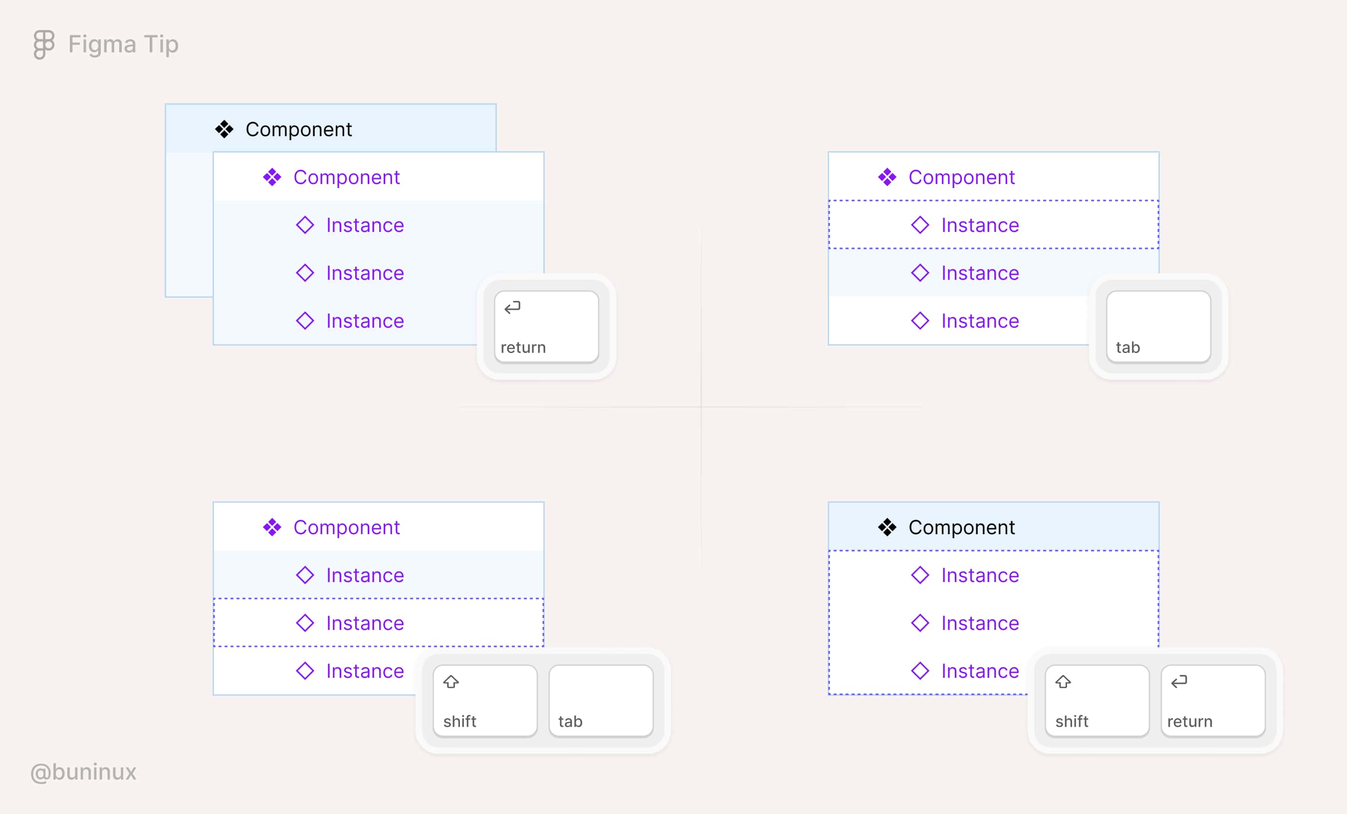
Use shortcuts to navigate components
When trying to dig into a component, the designer must spend time hunting pixels and clicking the correct layer. Instead, it's faster to use the following shortcuts to navigate the component's layers with a mouse-free approach.
- Use Enter to drill down through the Layers panel elements quickly;
- Use the Tab key to jump-navigate the list of layers from up to down;
- Use ⇧ Shift + Tab to return to a previous layer;
- Use ⇧ Shift + Enter to return to an upper level.
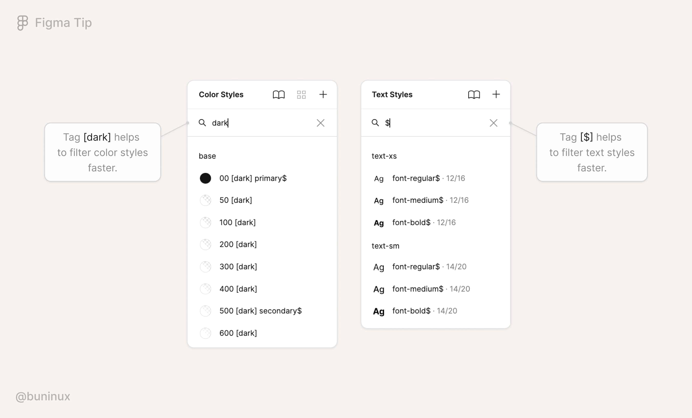
Tag styles to find them faster
When designing an app or website, you'll eventually have a certain number of styles used more frequently. To speed up finding and utilizing those styles in Figma, you could add a special symbol or a [tag] to the style name to filter and find the needed colors, texts, or effects styles much faster.
For example, the Frames X design system uses '$' (a string) as a prefix to all prior elements, marking them and making it easy to find the baseline styles.
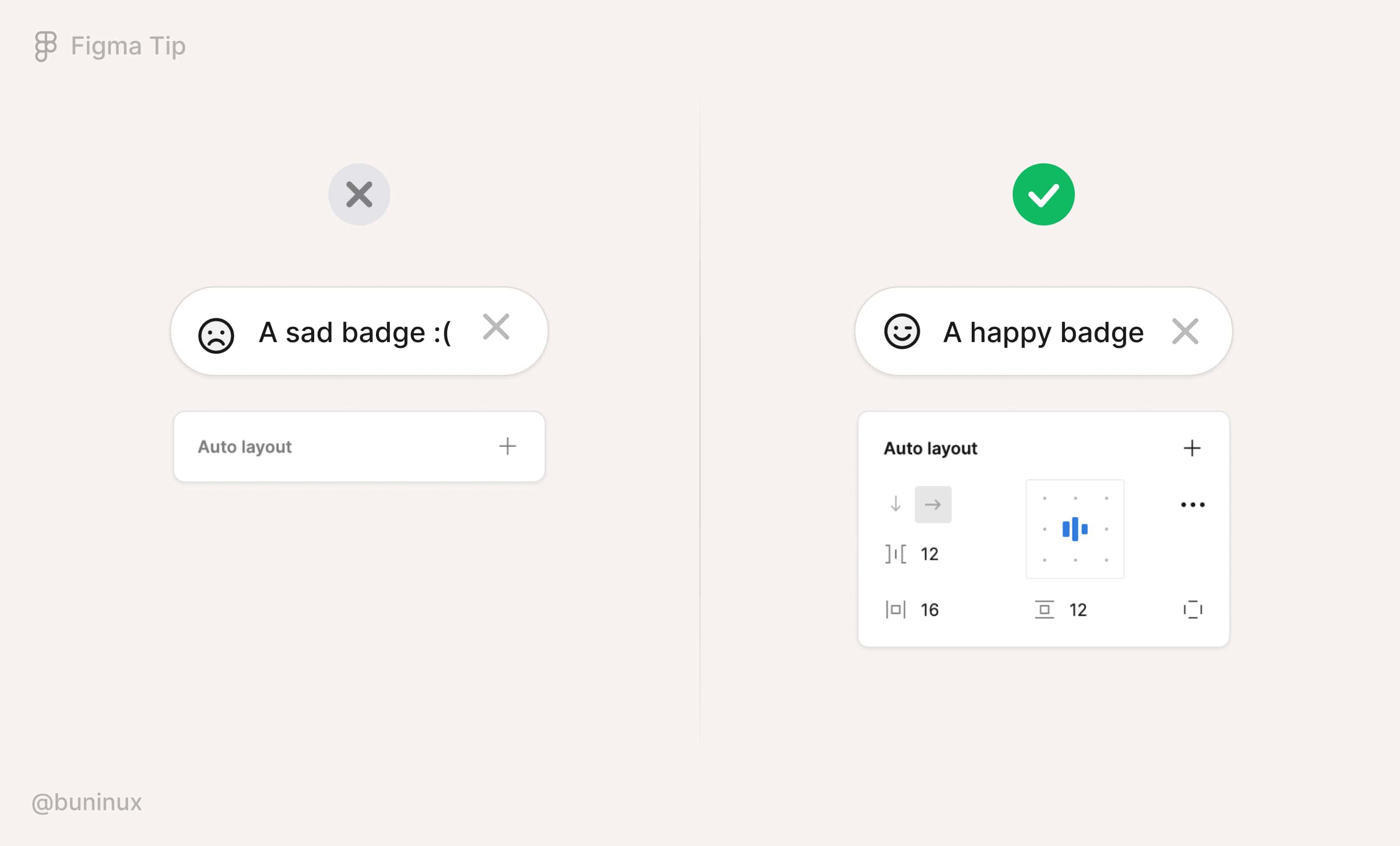
Apply auto layout for flexible containers
Use Auto Layout when needed to remove additional hassles caused when changing the spacings and paddings for your design elements. Adding auto layout to a group or a frame will override its default spacing values and make elements follow a specific direction and adjustable distribution order.
In general, assembling components with AL will provide a solid building block experience and eliminate unnecessary mistakes.
To add the auto layout, select a group or frame, and use the keyboard shortcut ⇧ Shift + A to apply it. Or click ➕ next to the auto layout label in the right panel.
Use variants to have fewer components
Variants in Figma is a feature to outline your component structures to a single "slash" /category (Slash naming method) instead of having a separate component for each subcategory or instance state.
For example, you could create different components for various states and sizes. Or you can use variants to organize all sibling components under a single state or size category. Applying variants is recommended when a component switches between different states or has multiple variations. Elements like buttons, inputs, and toggles are all perfectly fit for variants.
Variants simplify the design system structure, allowing you to find and use needed components in the assets menu faster. And variants reduce the number of components you need to maintain in the long run.
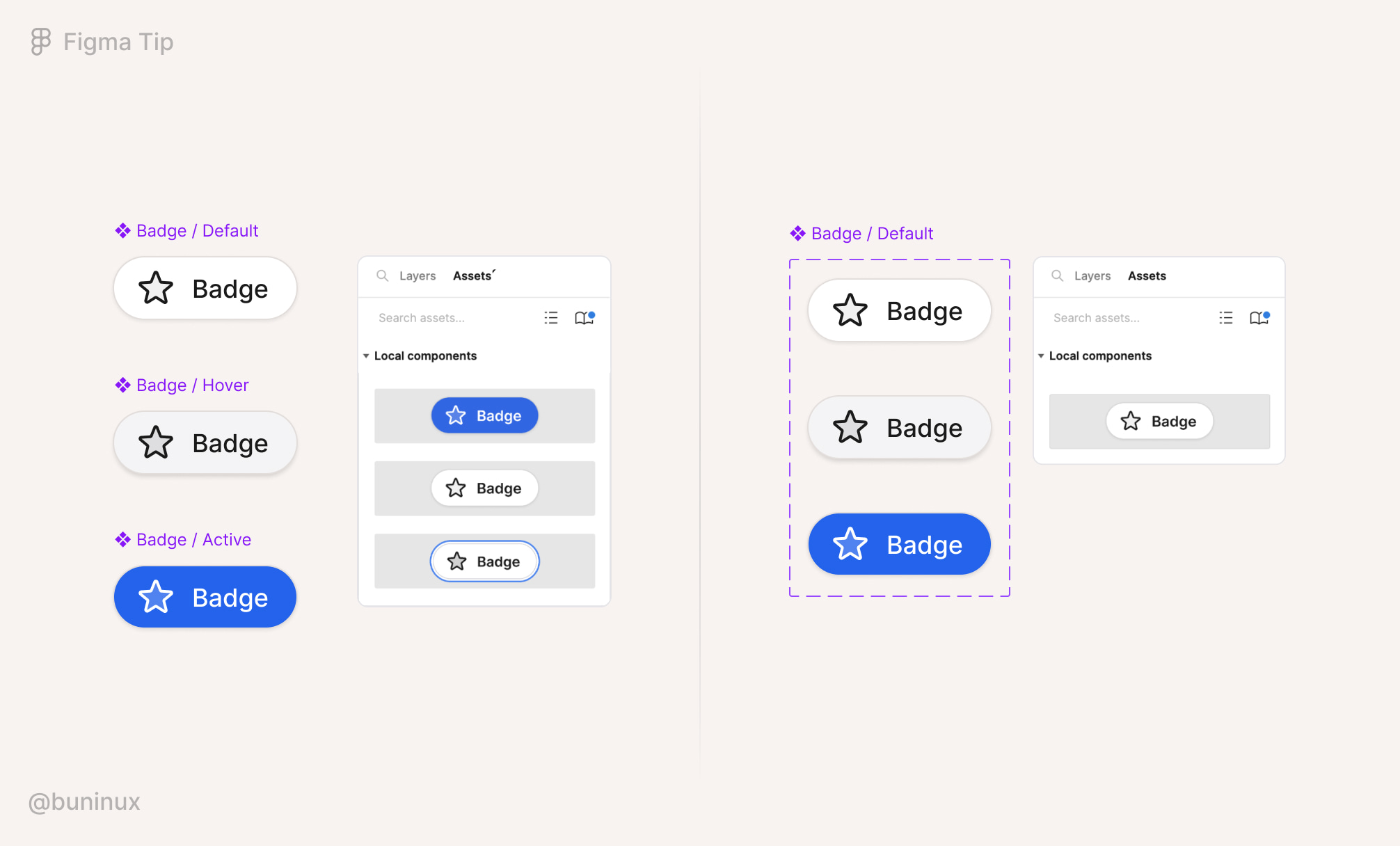
Note: not every component set should have variants. It's up to you to decide whether variants should be involved or not, based on how somebody will operate the component you made. Here is a nicely written article on that particular topic.
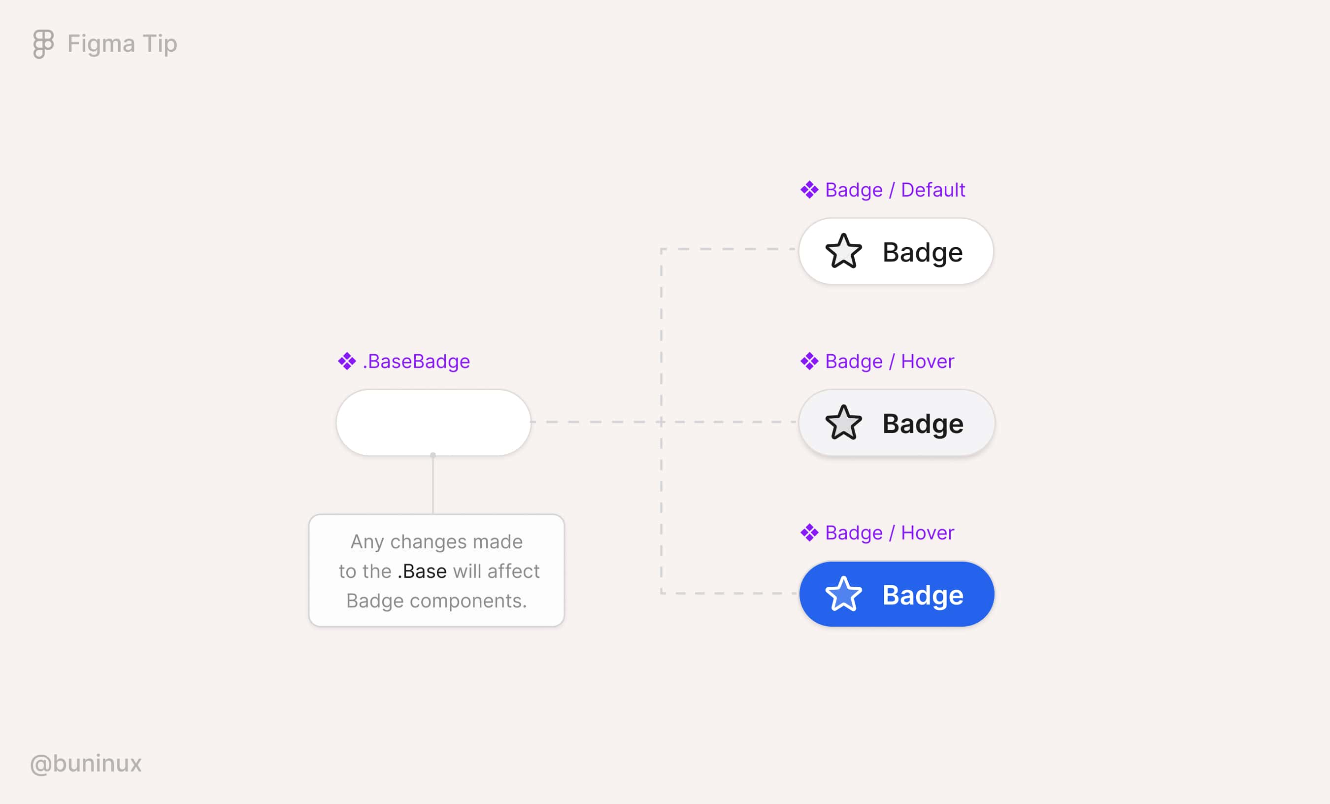
Streamline changes with base components
A base component is a structural element that can help streamline changes to other components. A base component always syncs with its children's instances and saves your day from spending lots of time iterating, testing, and tweaking your designs.
To start using the base, you need to:
- Create a component (A) and nest it into another component (B);
- Duplicate component (B) to create alternative variants or different types/states (C, D, E, etc.);
- Manipulate component (A) to propagate changes to all included variants.
Use component properties
Component properties are unique values assigned to individual component layers.
Properties remove the need to select and override layers manually within the layers menu, saving the time to customize your designs. You can spend time engineering several properties together and have fewer variants and a more versatile component set to fit any design iteration.
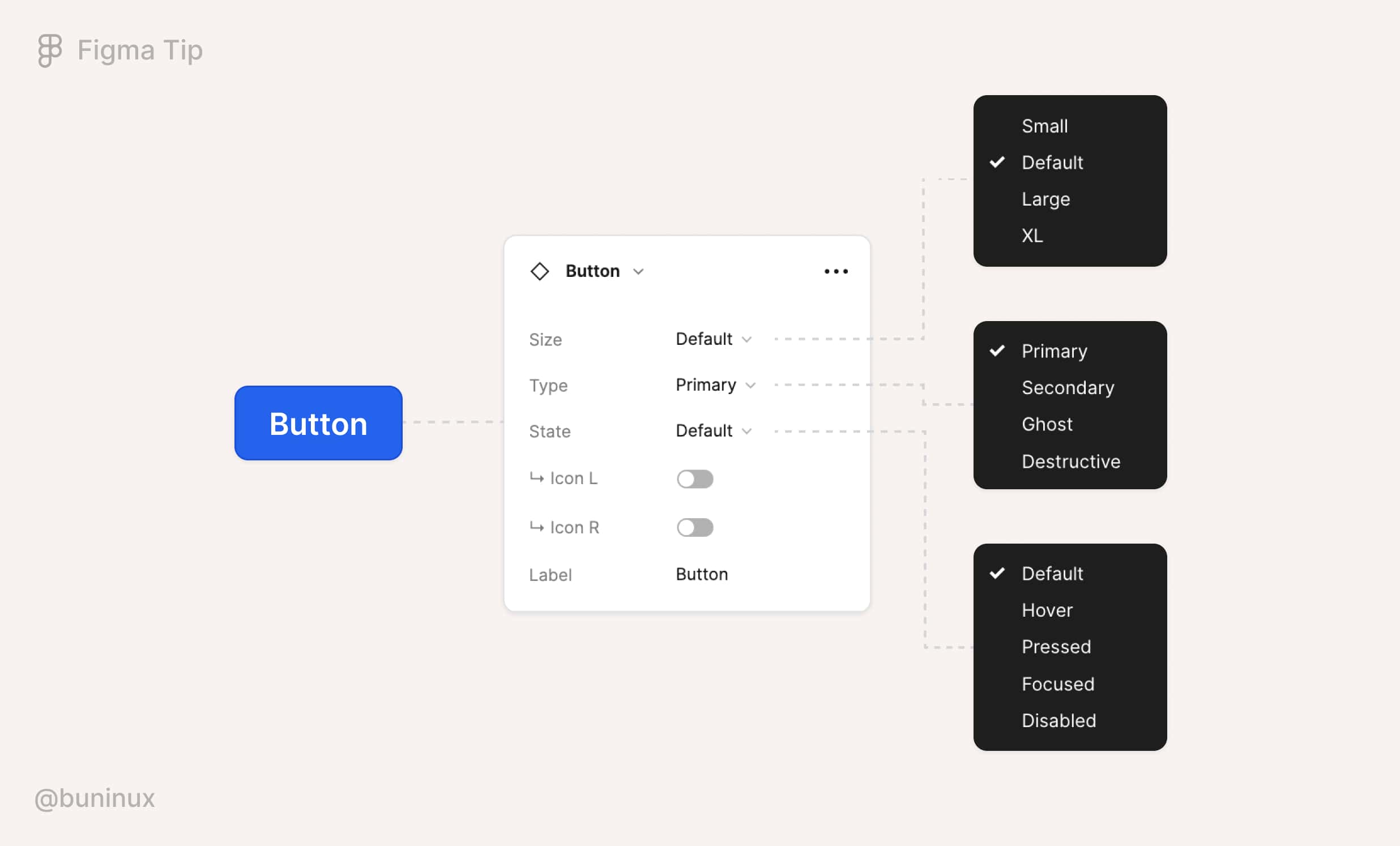
Please visit the official blog to learn more about each property type and how you can use them.
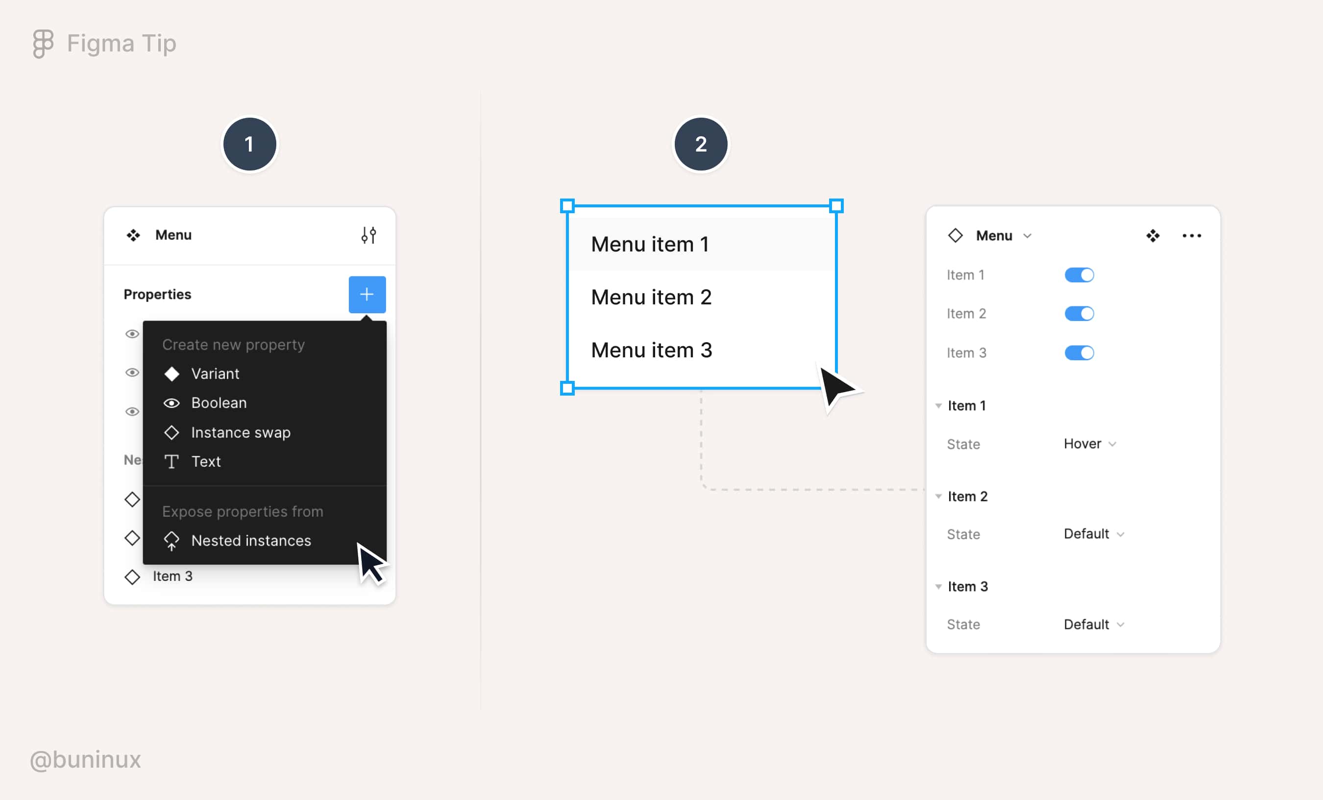
Use nested instances
You can expose nested components' properties within another component to access them faster.
For example, if you have a menu component where each menu item is an instance and has its properties. You can make them visible from the main level of a component. Nested instances let you control nested components without drilling into the layer panel.
To add/expose nested instances, select a variant group, press ➕ next to Properties, and select "Nested instances."
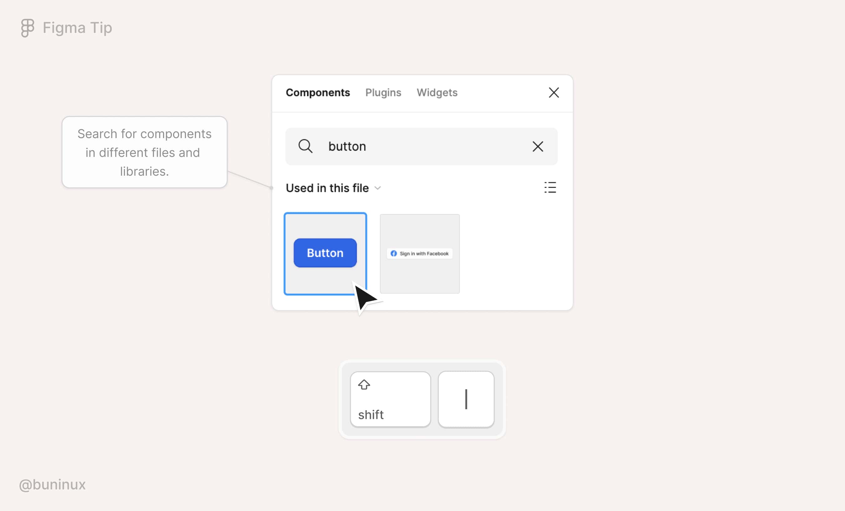
Use the quick insert menu
Insert components with your keyboard. Use the quick insert menu to find and drop available components to your canvas.
Use a shortcut ⇧ Shift + I to open the quick insert menu.
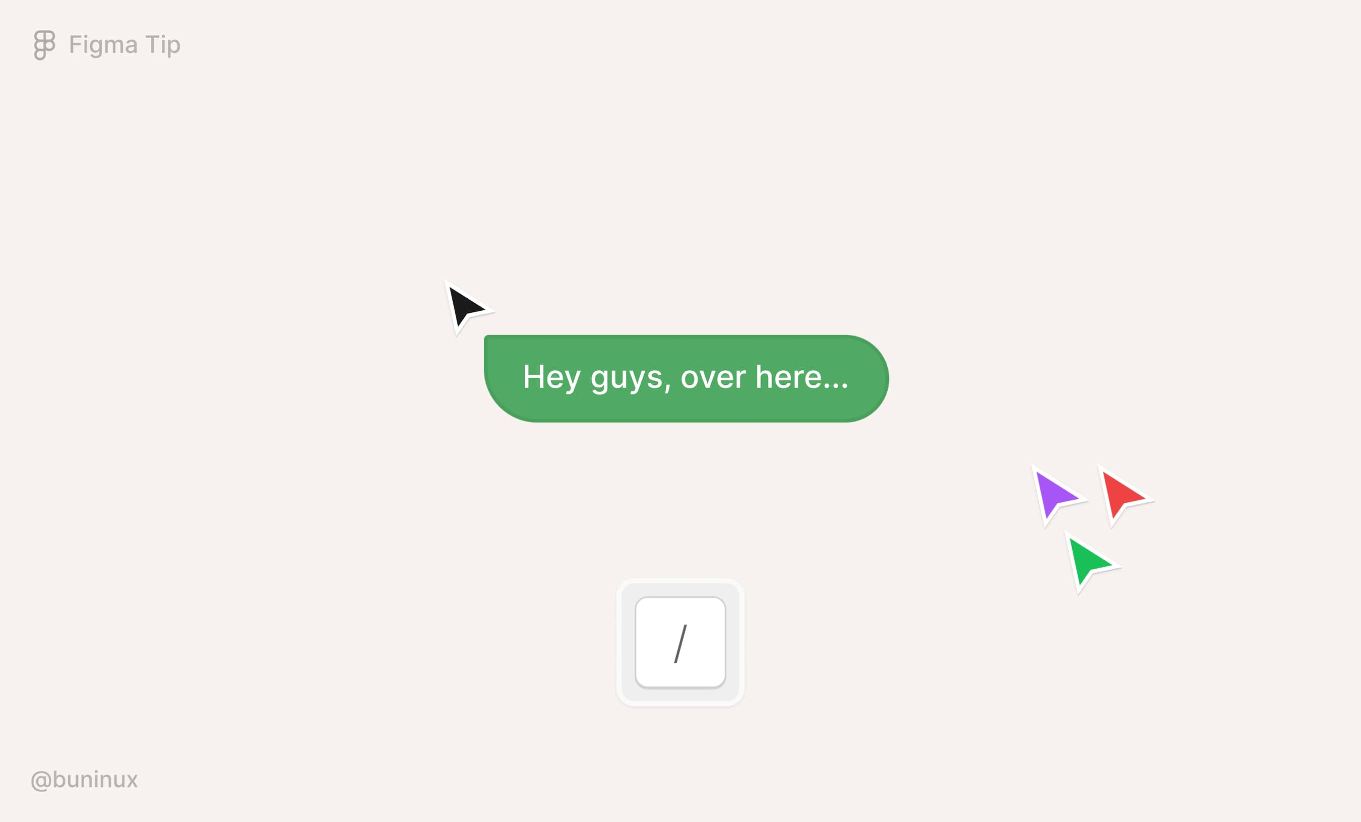
Grab your teammates' attention
You can send a message from your cursor in Figma to quickly grab people's attention when pitching your design ideas.
To enter the cursor chat mode: Deselect everything on the canvas and press / the keyboard. Press Enter/Return to clear the chat and type a new message.
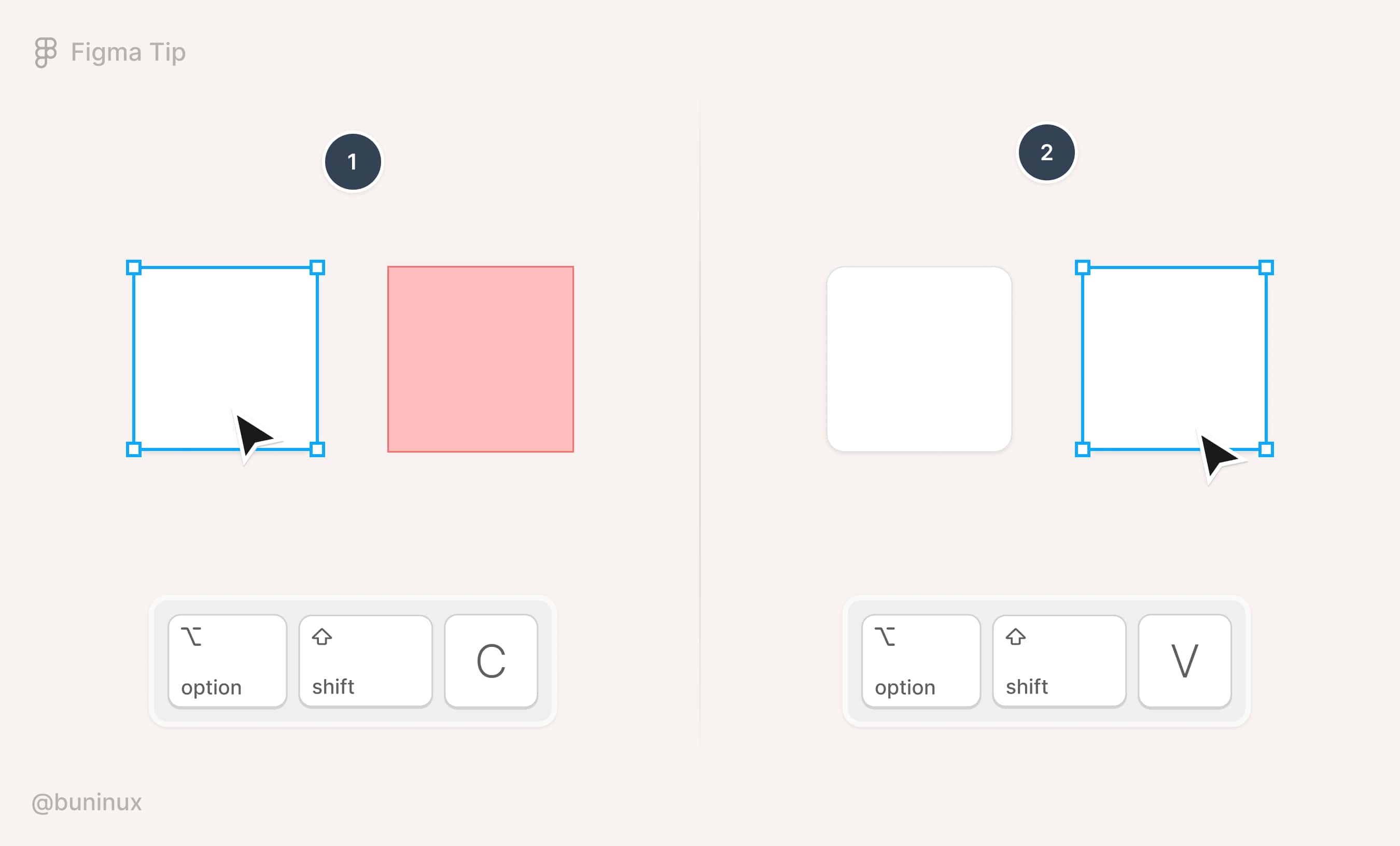
Copy/paste with shortcuts
Use Option ⌥ + ⇧ Shift + C to copy the layer style properties and Option ⌥ + ⇧ Shift + V to paste them into another object.
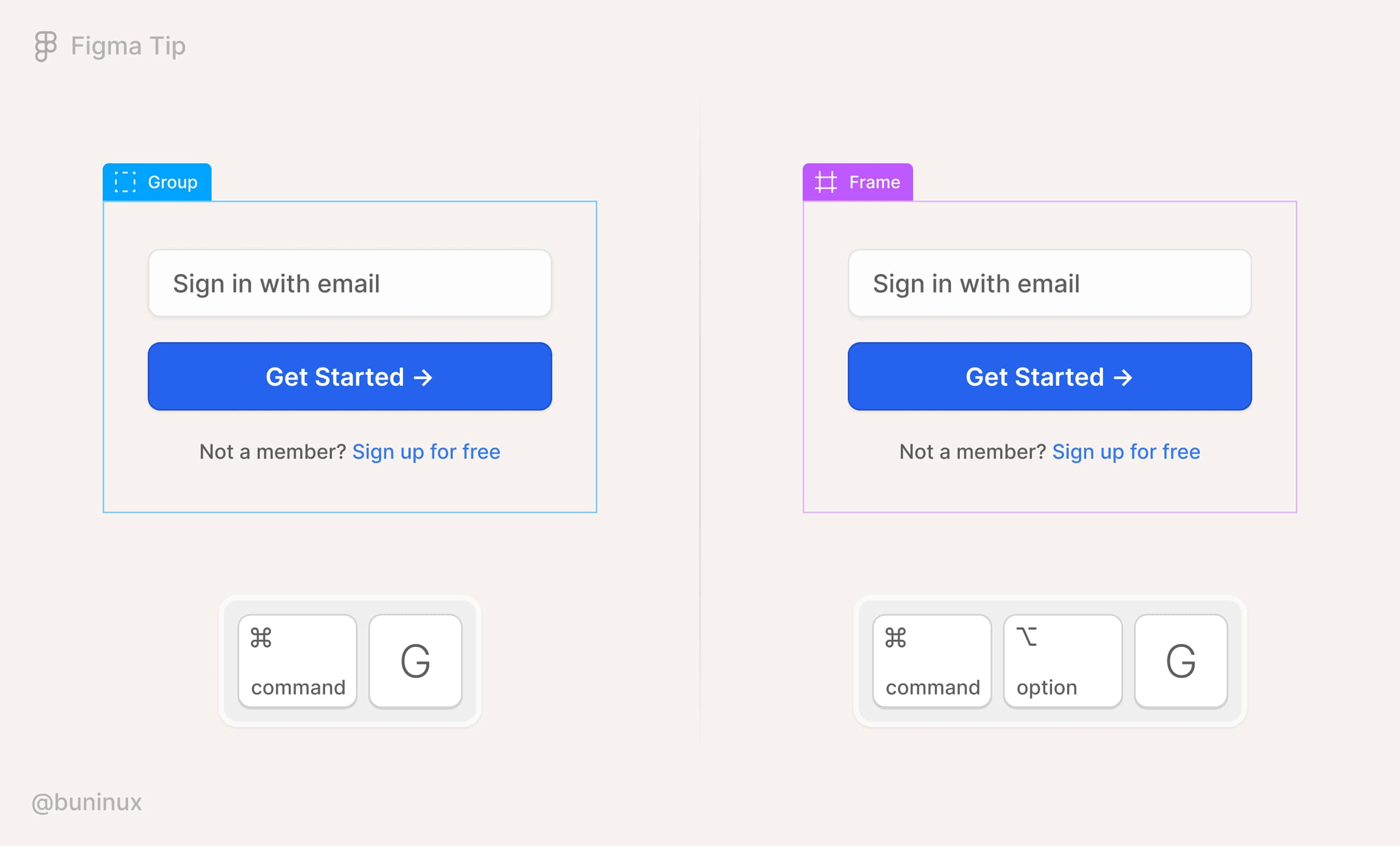
Combine elements into frames
Instead of grouping the elements, you can frame them to have more control over the resizing constraints.
To put elements within a frame, use the following shortcut:
- On Mac: CMD ⌘ + Option ⌥ + G;
- On Windows: CTRL + Alt + G.
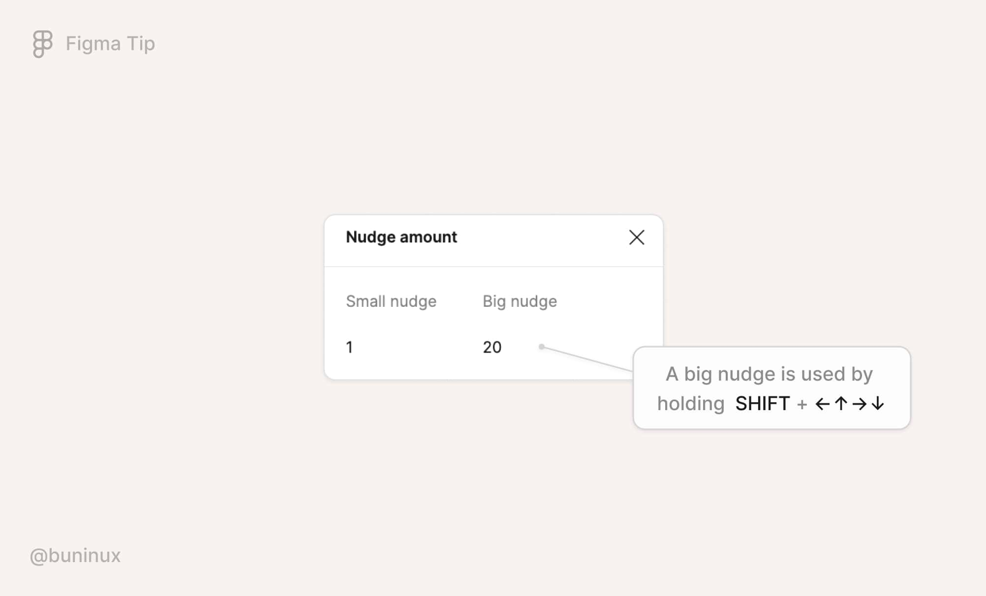
Adjust the nudge amount to your tasks
Set a custom amount for your small or big nudges. It's popular to recommend aligning the nudge with the grid. But I think adapting it to your current routine is much better.
You can change the default nudge by using the Quick Actions (CMD ⌘ + /) menu and typing "nudge." Or from the main Figma menu: Preferences - Nudge amount.
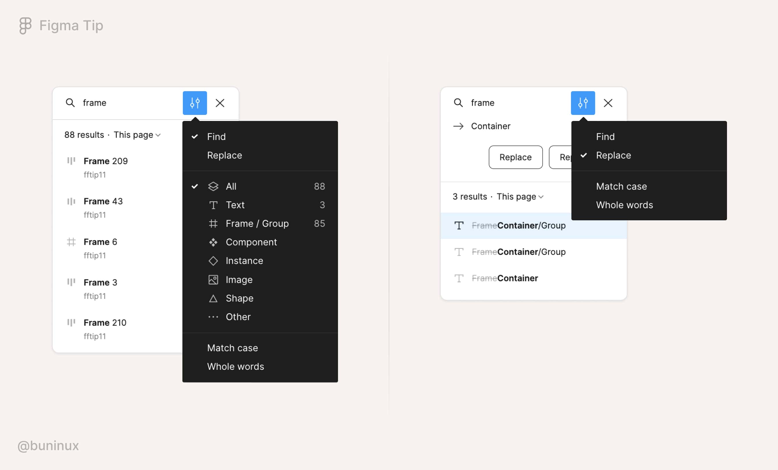
Quickly find and replace text in Figma files
Use the shortcut: Mac: CMD ⌘ + F or Windows: CTRL+ F to trigger the search box UI and search your file for text, layers, objects, and more. Use shortcuts: CMD ⌘ + ⇧ Shift + D to see the previous result, and CMD ⌘ + ⇧ Shift + F to see the following result in the list.
You can replace the located text layer or object name using the Replace commands. You can also use the Find command to find any object in Figma based on its type. This is useful when you've forgotten where a specific object is located and want to spot it faster.
Use a ready-made UI kit to speed up your workflow
Another great way to speed up your design process is to use a pre-designed library, UI kit, or design system. A good UI kit will help you find a solution to your design problems much faster and simplify your team's life. Sounds good, right?
You can build your UI kit. Or use a premium UI kit with all elements and patterns already included. But, a good UI kit is hard to find, with many solutions built solely for decorative or inspirational purposes.
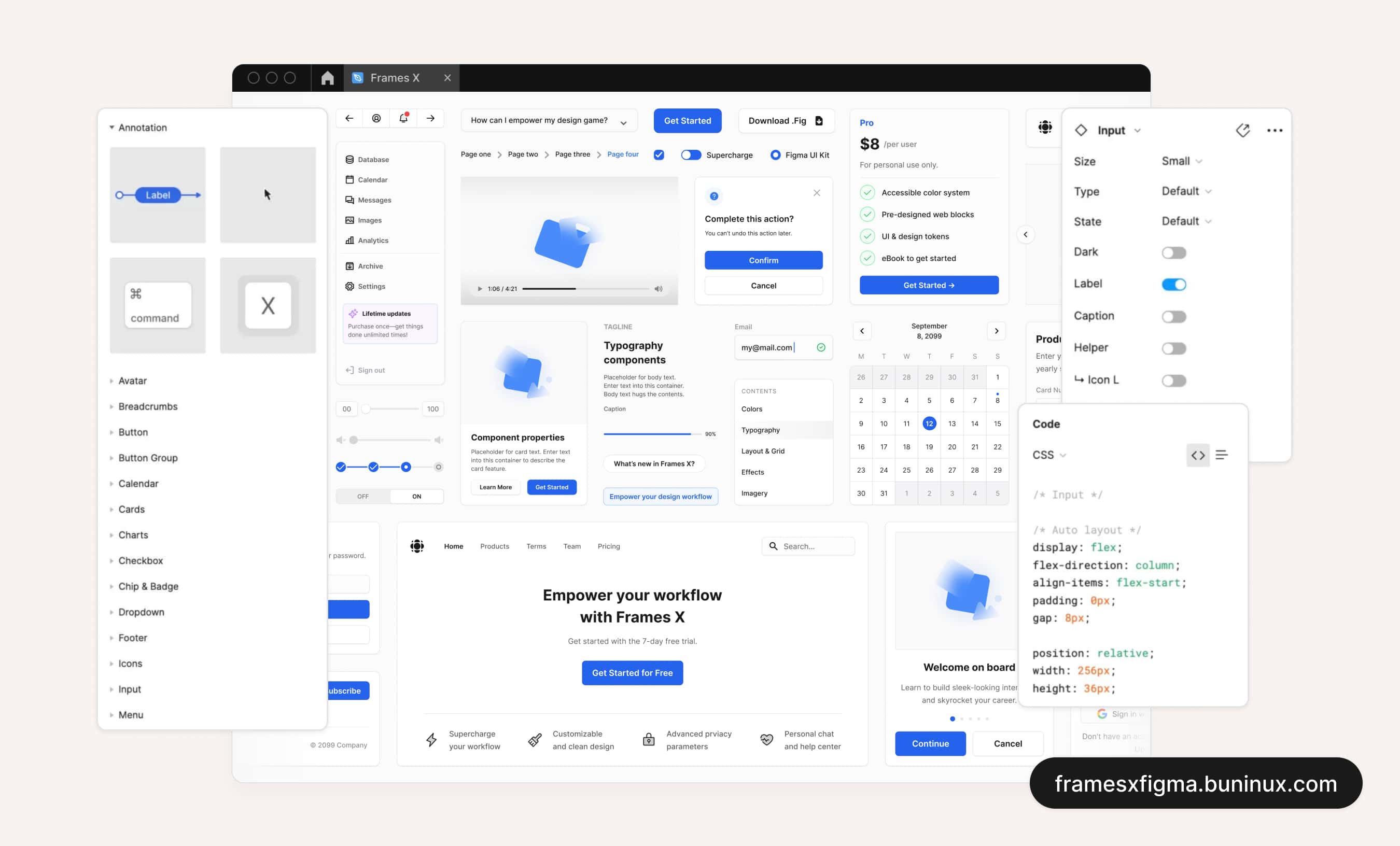
That's why we build Frames X, a universal UI kit and an evergrowing handbook to help you streamline your process with tons of pre-designed content, practical tips, and building blocks to create your project faster. If you are curious to learn more about it, be welcome to visit the official page.
 Updates
 FAQ
FAQ