Best Figma UI Kits in 2025
April 23, 2025 - Reading time: 14 minutes
Why Professionals Use Figma UI Kits — Top 6 UI Kit Examples
Designing at scale is hard. Whether you’re developing a SaaS product or creating websites for clients, speed and consistency are the keys to success.
That’s where Figma UI kits come in. In this comprehensive guide, we’ll explore five core reasons why professional designers and design teams choose and rely on UI kits in their workflow.
Additionally, we’ve picked today’s top-performing UI kits so you can make the best choice for your design team in 2025.
Brought to you by Frames X UI Kit — the most complete Figma UI kit and design system for modern enterprise and startup teams. So why should you use a UI kit?
Let’s dive into the why.
1. Skip wireframes with pre-made Figma components
Wireframing as a standalone stage is dead. With AI tools and apps like Figma and Framer, you can jump straight into high-fidelity layouts using reusable blocks and already responsive components.
Switching between low- and high-fidelity stages requires rework and headaches, but it isn’t worth it. With a professional UI kit, you have a high-fidelity component right from the start.
While Figma might be seen as the middle ground, it’s where ideas are born and iterated. With the Figma UI Kit, you will have a tool to make this idea a reality as quickly as possible.
2. Buy UI Kit once — use unlimited times
Juggling several products or clients? A UI kit can save you days or even weeks, functioning as your single source of truth. A Figma UI Kit allows you and your team to reuse layouts, icons, components, and styles across different projects.
If you run an agency, a UI kit is a must. While each project may require custom design work, a reliable foundation saves time and ensures quality.
Clients come and go, but a battle-tested UI kit gives you a plan and structure for transitioning from one project to another.
Figma UI kits are easy to scale and can help organize work without duplicating effort. If you use it correctly, it will act as a knowledge base for your studio or business.
3. Learn from real-world UI examples
UI kits aren’t just about speed — they’re educational tools organized as systems and packaged like products.
By exploring well-built Figma kits, you’ll discover Figma naming conventions, component structures, and scalable layout systems used by top-tier design teams. They provide valuable industry knowledge as well as a practical blueprint for building your own design system.
A list of the 10 best FREE design systems and Figma UI kits:
- AWS Amplify UI Kit
- Ant Design System
- Amazon Design System
- Atlassian Figma UI Kits
- Uber Design System
- IBM Design System
- Chakra Figma UI Kit
- Elastic UI Kit
- Fluent Design System (Microsoft DS Kit)
4. Better designer and developer collaboration
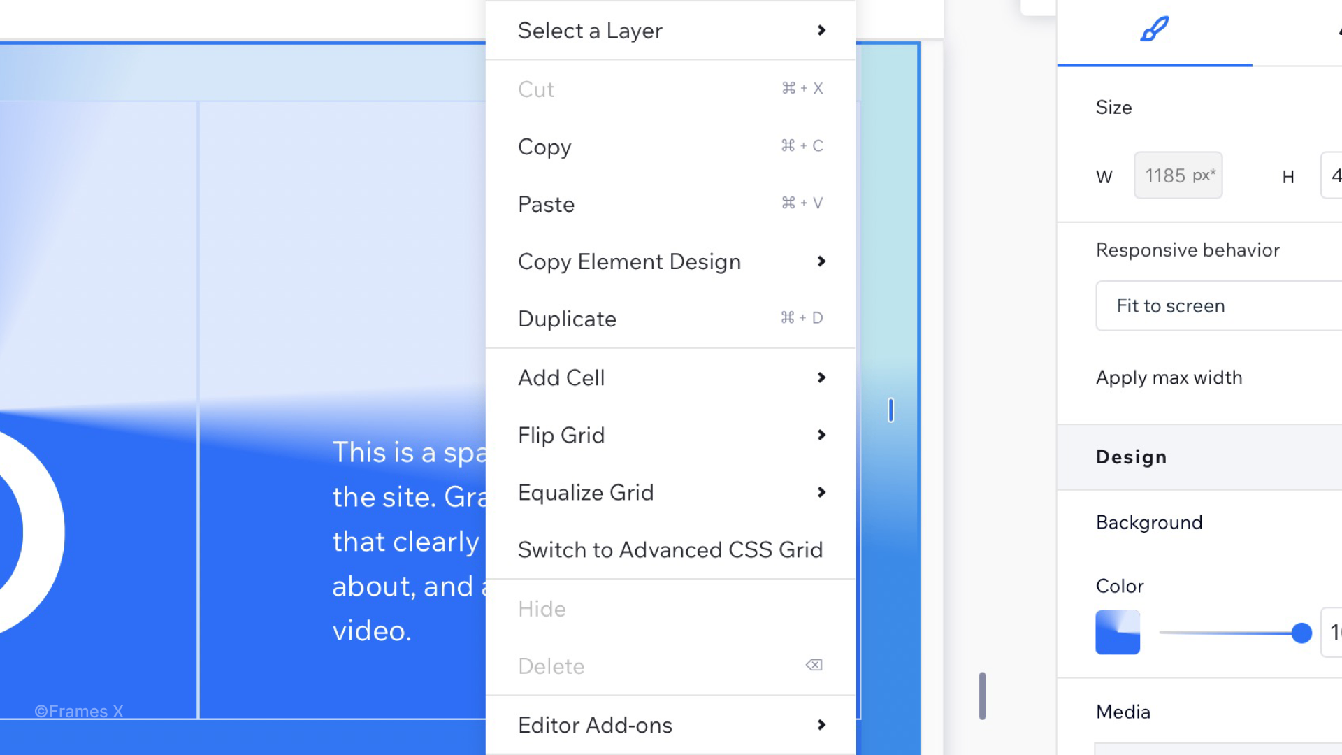
Figma UI kits help bridge the gap between design and development, enabling component inspection, code export, tokenized styles, and, with the latest Figma release, even publishing to code.
This amount of resources from the box reduces miscommunication and speeds up the entire product lifecycle, allowing your teammates to point out and comment on the design from day 1.
5. Better planning and team collaboration
UI kits streamline planning, brainstorming, and reviews.
Instead of building from scratch, a common workflow is to restyle or customize the parts/templates of a pro UI kit you need and add them to your file before inviting your team to collaborate.
You can treat the UI kit as a shared team library, pulling only the components you need without affecting the rest of the project. This keeps your team focused, reduces the need for lengthy explanations, and gives you more time to iterate and improve.
The Guide to Premium Figma UI Kits in 2025
Figma is deeply rooted in the design industry and teams worldwide.
Today, nearly every designer and agency relies on it to create robust websites and apps. UI kits, aka design systems, play a crucial role in this process.
But here’s the truth — very few Figma UI kits are actually worth your time. Building and maintaining a high-quality design system is a demanding task, and many creators (even those behind well-known brands) fall short.
That’s why we’ve carefully analyzed the current Figma UI kit market to highlight only the top-performing options. A premium UI kit can significantly speed up your design process, reduce bugs, and bring consistency across your products.
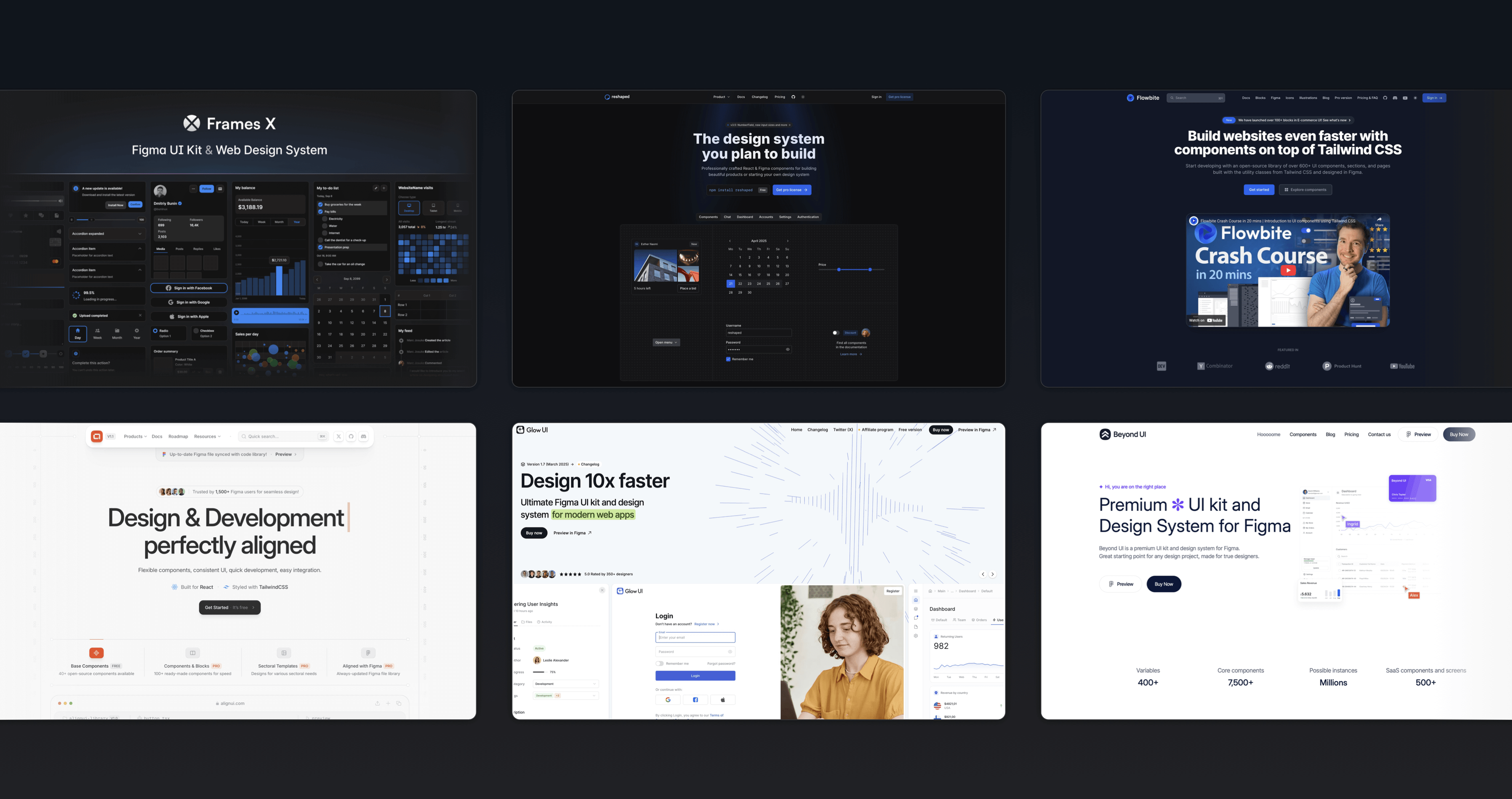
Based on our hands-on testing, here are the top 6 Figma UI kits to consider in 2025.
1. Frames X UI Kit (framesxdesign.com)
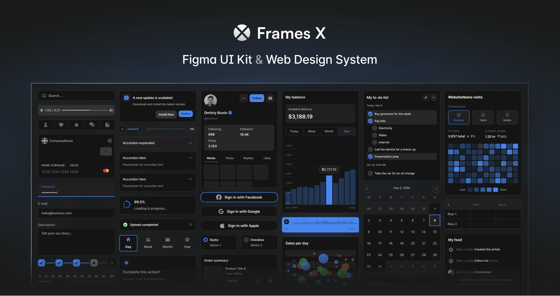
- 3,500+ unstyled UI components with clean naming conventions. The largest collection of responsive Figma components under a single file in the world.
- The UI kit offers deep code integration and is compatible with Angular and React. It provides code equivalents for design components.
- Advanced token and variable architecture built for reusability and multiple themes.
- Includes a dedicated Figma Website Builder to quickly create responsive sites.
- It includes its icons and symbols and integrates well with open-source icon libraries.
- Best for: Enterprises, e-commerce, SaaS, and teams seeking a true Figma-to-code workflow with a high level of design precision.
2. Reshaped (reshaped.so)
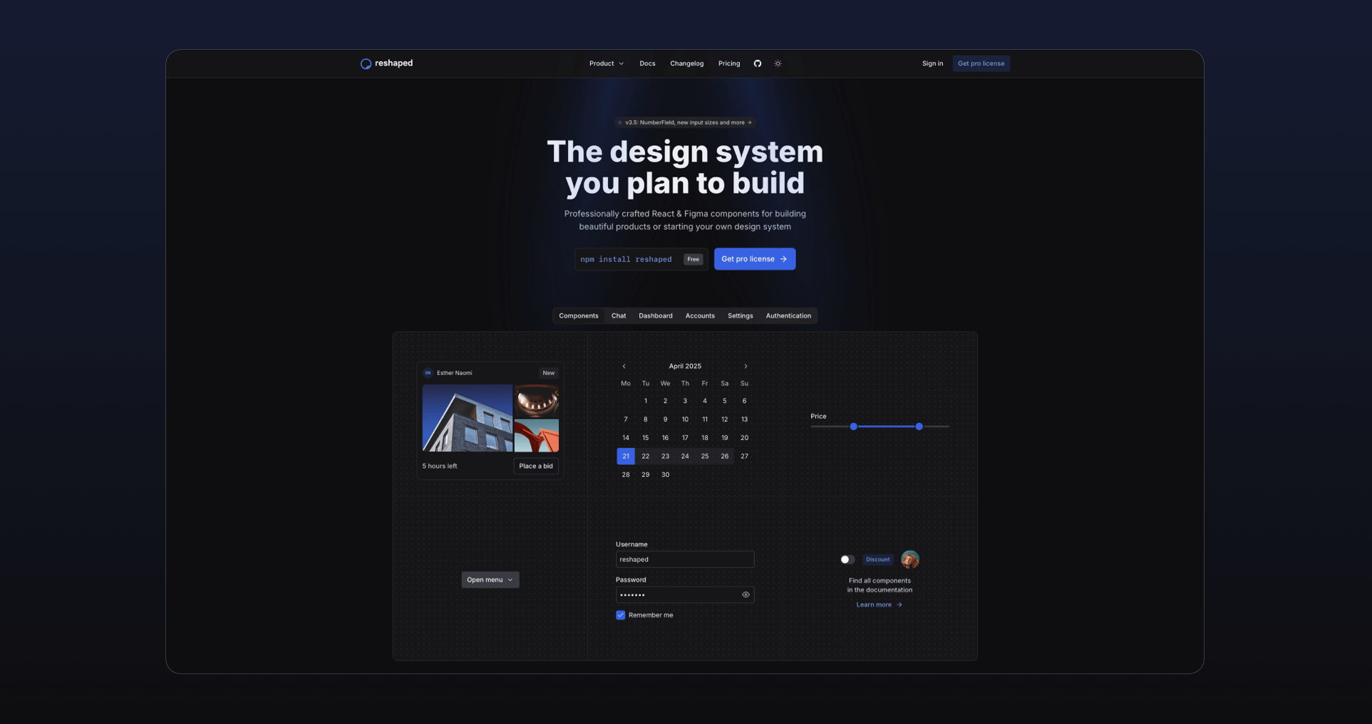
- 500+ Proffesional React and Figma component libraries. Minimal and well-maintained through the years.
- Lightweight yet functional code base, with essential components and utilities.
- Flexible token system supporting multiple color themes.
- Best for: Startups and dev-first teams prioritizing code over design complexity.
3. Flowbite (flowbite.com)

- Built on top of Tailwind CSS with a complete Figma UI kit.
- 1,000+ components, including a custom icon set and section blocks to build a SaaS or a landing page.
- Rich documentation and color system with clear design-to-dev guidelines.
- Best for: Teams using Tailwind CSS as their primary framework.
4. Align UI (align.ui)
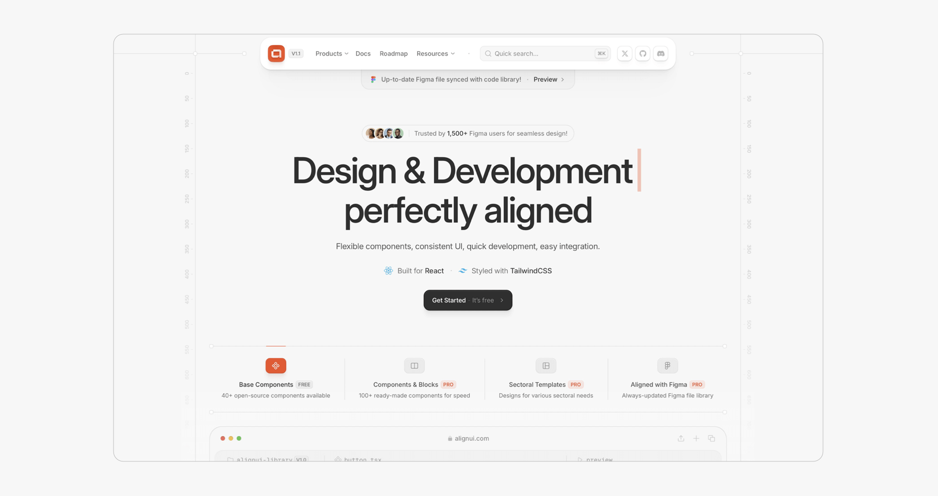
- Rich React and Tailwind CSS-based UI kit with heavily styled Figma components.
- 500+ components with polished Figma files and code.
- The UI kit is well maintained, with regular updates that add missing sections and components.
- Best for: Teams and brands requiring a high level of visual polish, relying on Tailwind and React for product development.
5. Glow UI (glowui.com)
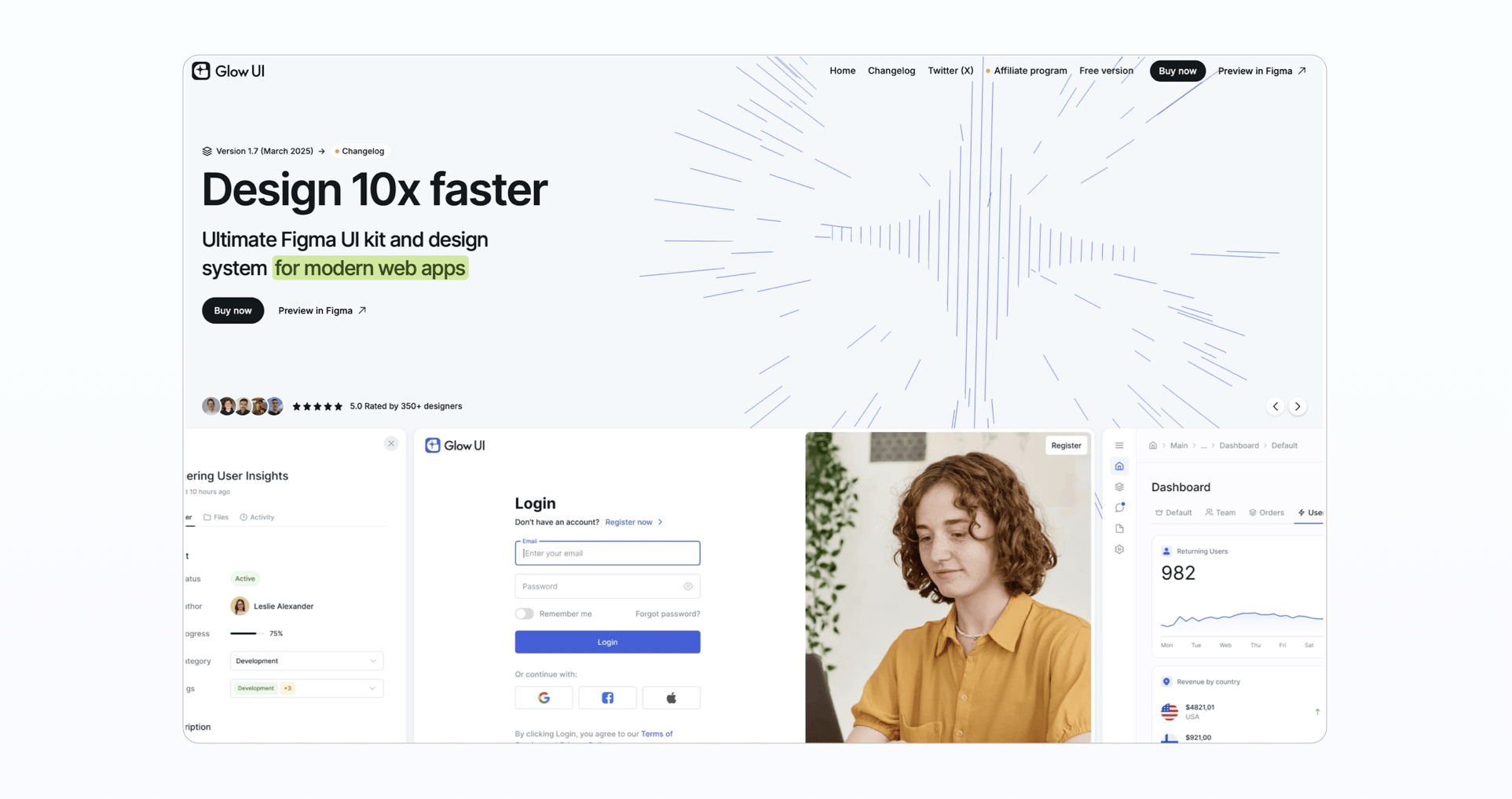
- The Figma-first UI kit is focused on SaaS dashboards and app layouts.
- 1,000+ flexible and well-documented components.
- Includes icon library and bonus materials.
- Best for: Startups looking to launch SaaS apps quickly from Figma.
6. Beyond UI (beyondui.design)
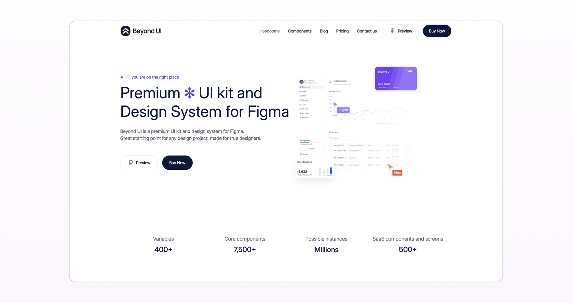
- 1,500+ Figma components and templates for SaaS and marketing.
- Includes ready-to-assemble layouts for landing pages and solid in-Figma onboarding docs for new users.
- Best for: Small teams and freelancers looking for a faster project initiation.
Why Frames X UI Kit Stands Out
1. True design-to-code sync
Every Frames X component maps directly to code and has corresponding Figma variables - something no other UI kit currently offers. This allows designers to build faster and with fewer errors across platforms.
2. Largest library of Figma components
Frames X UI Kit is backed by 15+ years of real-world product design knowledge and has been evolving since 2017. It provides more than 3k versatile Figma components, allowing you to easily customize them to any style you want.
All Frames X components are non-opinionated and integrate well with any brand guidelines, making it a perfect UI Kit for enterprise projects.
3. Website builder and responsive templates
Frames X covers nearly every UI element, component, and use case - from e-commerce dashboards to mobile components.
The UI kit includes a built-in Website Builder for Figma that makes it easy to assemble sites quickly. Here is a quick Video Demo.
4. Faster than other Figma UI kits
While most large kits become sluggish, Frames X is performance-optimized and refined through years of UI kit development practice.
Frames X is built for speed and customization, which is the ideal combination for designers and developers working in enterprises and larger organizations.
Final Thoughts
Choosing the right Figma UI kit is a business decision, not just a design one. For enterprise teams that prioritize speed, structure, and scalability, Frames X UI Kit offers unmatched value.
Explore Frames X - the Ultimate Figma UI Kit for enterprise-grade systems & sites.
iPhone 16 Mockup for Figma
January 3, 2025 - Reading time: 3 minutes
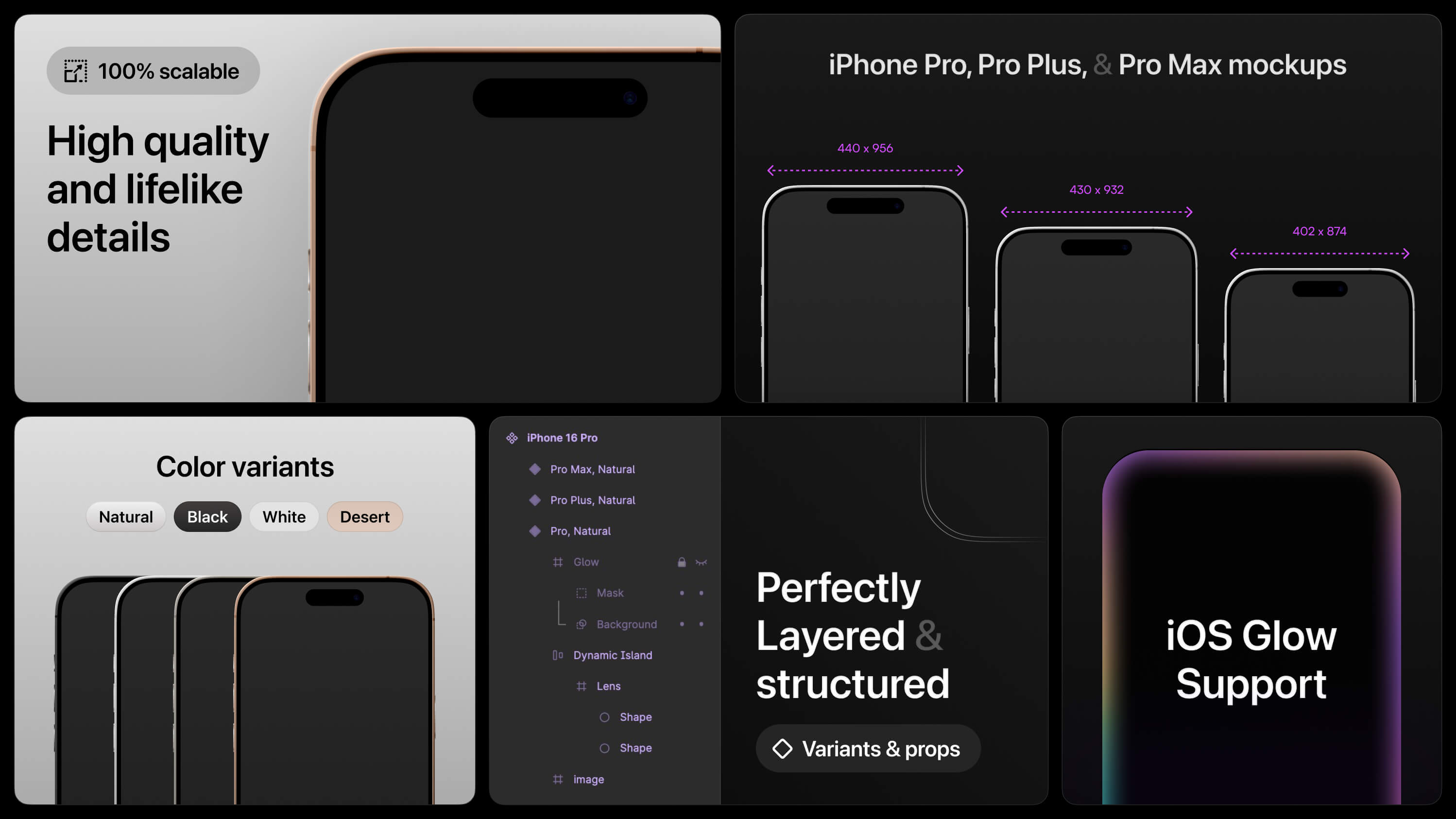
FREE realistic iPhone 16 mockup for Figma
Hello, today I'm happy to share my Figma iPhone 16 mockup. This free file includes realistic, fully responsive, layered, and structured iPhone 16 components for UI design, mockups, and presentations in Figma. Use this file to showcase your app designs with a professional-grade mockup.
The iPhone Mockup file includes:
-
Realistic iPhone Pro, Pro Plus, and Pro Max mockups;
-
Figma variants, as iPhone color models. Includes Natural, Dark, White, and Desert iPhone colors.
-
Support for iOS 18 border glow effect. With our mockup, you can customize glow intensity and colors using the Noise & Texture plugin to update the iOS glow layer.
How to use the Figma iPhone Mockup?
-
Open and duplicate the Figma file.
-
Please navigate to the Assets panel, find the iPhone 16 Pro component, and place it on your canvas.
-
Select your iPhone model (Pro Max, Pro Plus, or Pro).
-
Adjust the mockup's glow effects and iPhone colors.
-
Create stunning UI design in Figma with our iPhone 16 mockup!
→ Download the iPhone 16 Mockup for Figma
→ Explore More Free UI Resources
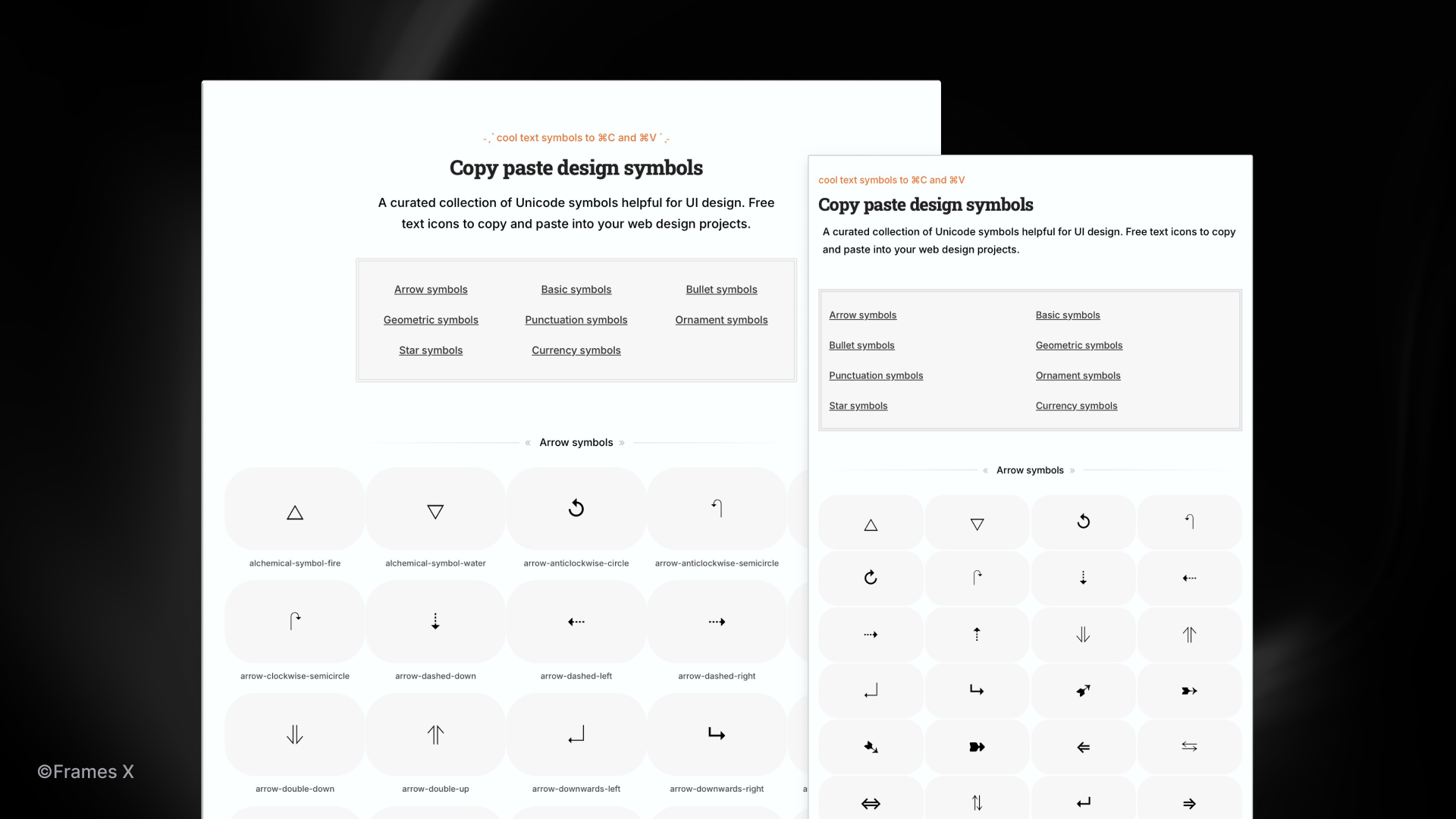
Copy Paste Symbols for UI Design
December 26, 2024 - Reading time: 34 minutes
Copy and paste symbols for a unique UI and web design
In today's fast-moving world, copy-paste design has become the go-to approach for rapid development. Whether searching for icons or components, designers prioritize readily available elements that can be instantly pasted into their canvas or code editor. Text or Unicode symbols are perfect examples of this efficiency-first mindset. They offer instant, scalable solutions that work across all platforms.
Text symbols are often overlooked, yet they can be powerful tools in the hands of capable designers. These typographic symbols, rendered as tiny icons, can offer lightweight solutions for common interface scenarios.
Hidden inside the fonts are thousands of meticulously crafted symbols—from arrows and checkmarks to intricate geometric patterns—ready to enhance your interfaces without the overhead of external assets.
However, like any design element, symbols have advantages and disadvantages. Let's explore how symbols can be a smart alternative to SVG icons in web design.

But before we start, be sure to check Copy Paste Design Symbols—a place where we've collected the best symbols to copy and paste into your UI and web design projects. All symbols are ad-free, categorized, and ready to be pasted into your web projects.
→ Copy and Paste Design Symbols
Symbols to copy and paste by UI categories:
Now that you know what's inside, let's continue with our Symbols vs. Icons beef.
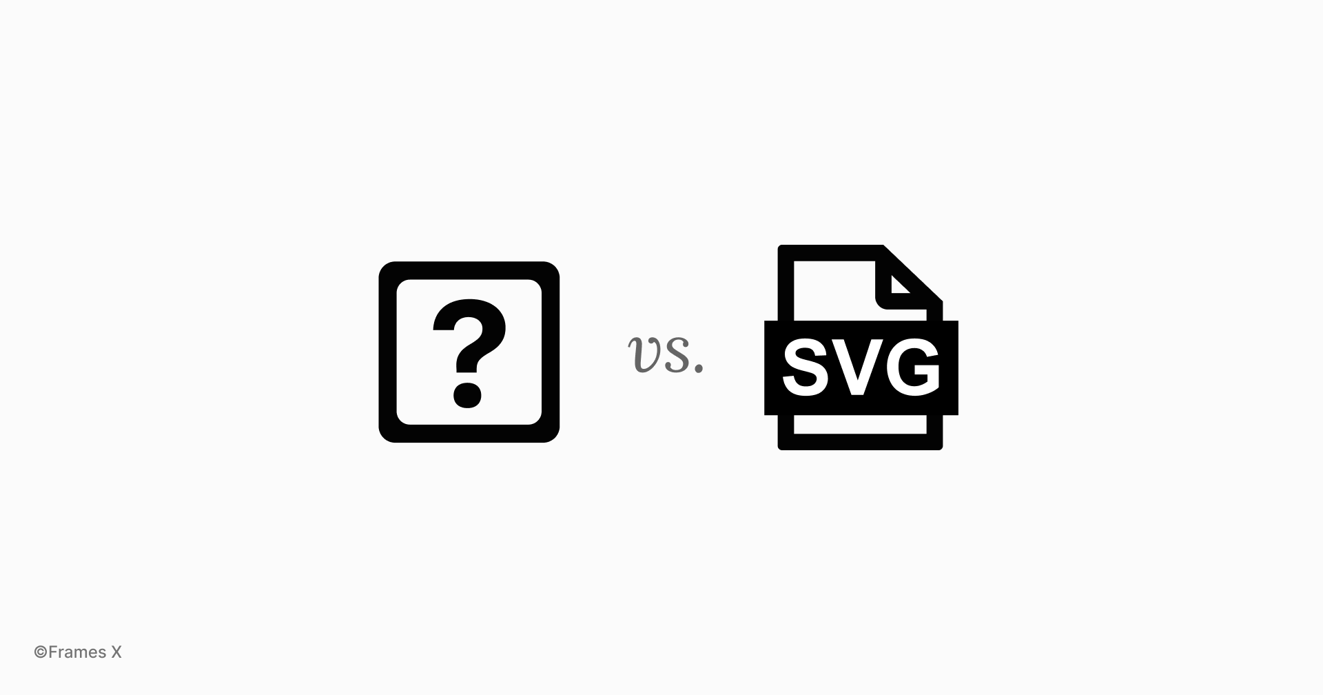
SVG icons vs. Text symbols
Unicode and text symbols pros:
-
Lightweight. No additional HTTP requests as standard SVG icons, better performance, and reduced page load times.
-
Scalable. Symbols scale with the font. While this may not always be an advantage, it helps to maintain baseline alignment between the symbol and the text in 100% of cases, which is very helpful for visual design.
-
Easy to use and customize. Simply copy and paste symbols into your HTML editor or your Figma canvas. Modify symbols as you would do with regular text, apply different weights, and easily add them to headlines and labels.
Unicode symbols cons:
-
A limited selection of unique symbols per typeface.
-
Font dependent. Symbol appearance is 100% based on the font and text size. Symbols may be inconsistent because different browsers will render fonts differently.
-
Lack of outline or monochrome icons. Most Unicode symbols have a single variant.
-
Unfortunately, Unicode icons are not visible If the font doesn’t support text symbols ¯\_(ツ)_/¯
How do you display Unicode symbols across different browsers and devices?
When designing your project with symbols, ensure your project HTML includes UTF-8 encoding using the meta charset tag in the head section: <meta charset="UTF-8">
It's important to set the Content-Type of your website's header to include UTF-8 encoding. When using symbols, choose fonts that support your desired Unicode characters and font families. Google Web fonts like Noto offer a wide variety of symbols, making them a good choice for web design.
SVG Icons Pros and Cons
SVG icons have fewer drawbacks than Unicode symbols and have become the standard for designers and developers for a reason.
SVG icons are font-independent, making it easier to change their size without losing icon quality or thinking about the font dependency. They also support JavaScript and CSS animations, making them incredibly useful for user interfaces.
One of the best things about SVG icons is that there are tons of free icon packs out there. Seriously, you can find pretty much any icon you could ever need. This means you don't have to spend time designing your icons or hunting around for the perfect symbol to fit your idea.
There are SVG icons for every metaphor or idea that are available for free online. That’s why we also created the Best Free UI Icon Packs article to help you find the perfect free icons for your project.
→ Discover the Best Free Icon Packs
However, SVG icons aren't without drawbacks, either. They tend to be larger, and each SVG icon typically needs a separate HTTP request, potentially slowing down site performance.
A deep dive into Unicode symbols for UI design
Neither SVG nor Unicode symbols are perfect, so as smart designers, we can recognize both and use the best of both to create unique and high-performing designs.
While Emojis are also part of the Unicode character set, this article will focus on ASCII symbols. ASCII typography symbols offer a cleaner and more neutral look that's perfect for applications and websites.
Let's explore scenarios where symbols can enhance the user experience.
Unicode symbols for interface design
Using Unicode symbols for designing interfaces sounds weird and may not be the best idea for designing systems or producing UIs.
However, it can be an effective tool if your project font supports Unicode symbols and you are planning to keep it this way. Symbols can also be useful for rapid prototyping and concept exploration.
Using text icons for UI components can be particularly useful when we need to iterate quickly on designs without moving an entire icon pack into our design file.
Let's explore a few examples:
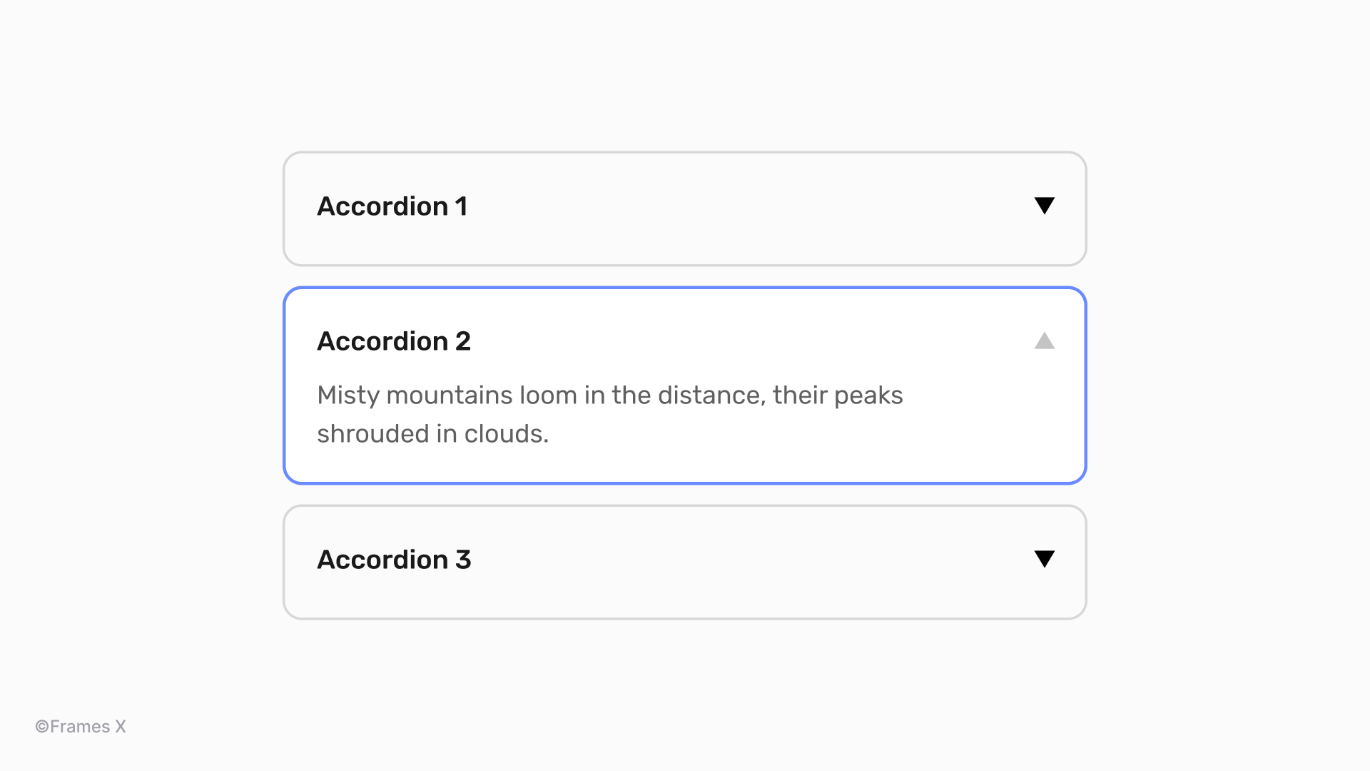
Using geometric symbols instead of chevrons and carets icons
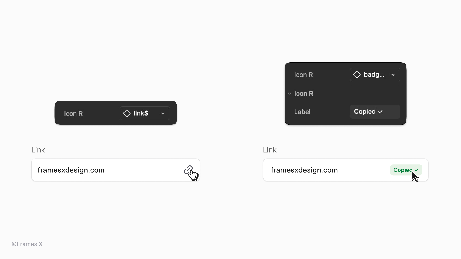
An accordion component with "▼" for closed accordions and "▲" for open ones. It may sound unusual, but it can definitely look striking when the element's sizing is properly aligned with the font.
Use vertical-align: middle; on the Unicode symbol to align it with the surrounding text. For more precise control, you can also adjust the line-height property to match the font's baseline with symbols like line-height: normal;.
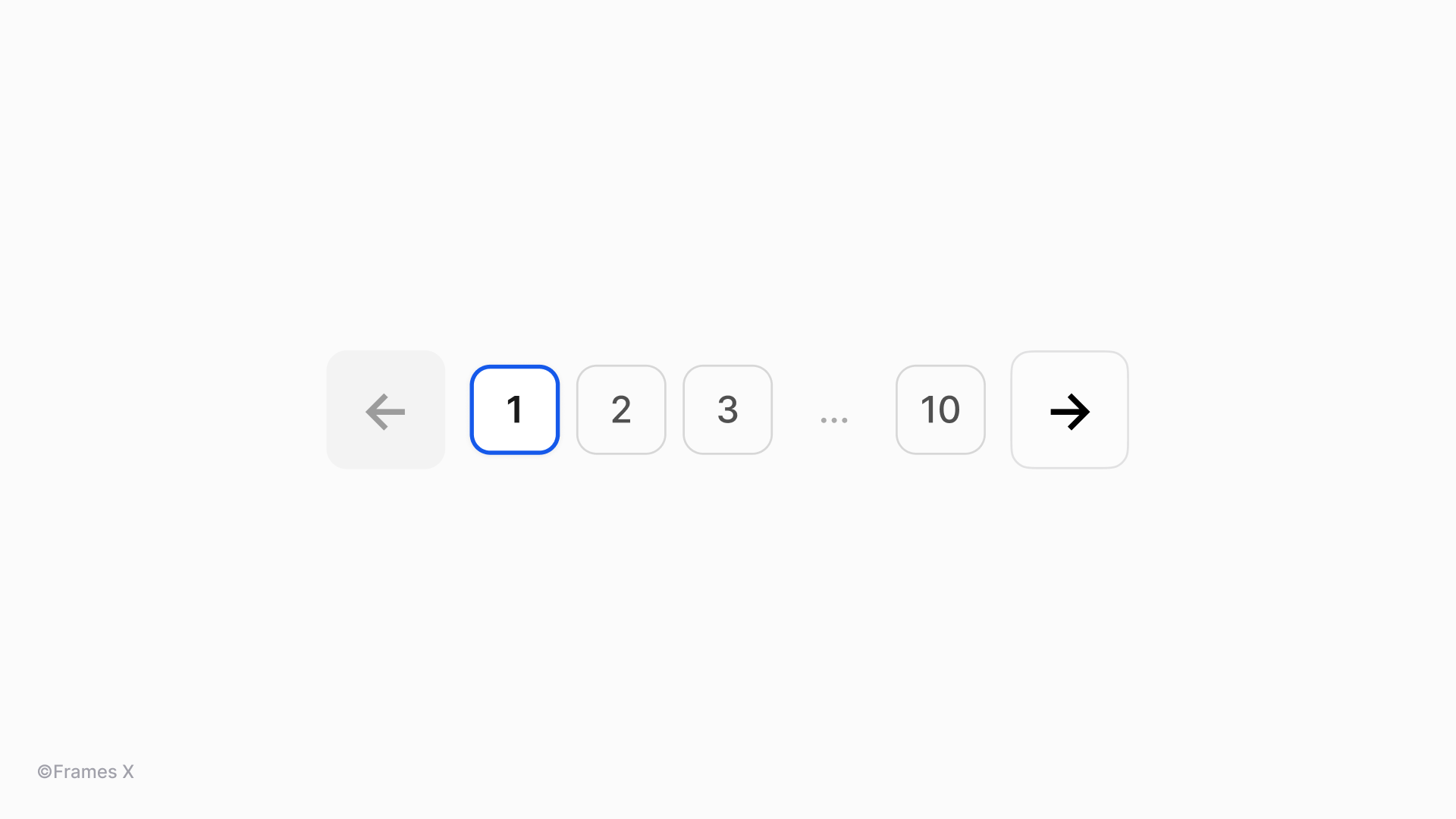
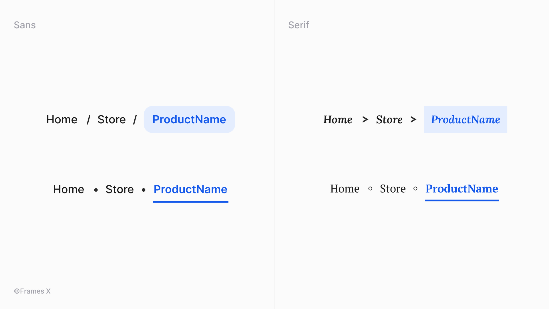
Arrow symbols for pagination design
A pagination or page controls component with "←" and "→" arrows. Arrow symbols are among the most trustworthy text symbols, supported by most fonts and browsers, and can function as navigation buttons and icons.
Arrow symbols (→, ←, ↑, ↓) are essential in web design as they provide intuitive visual cues. They are usually lighter than most SVG arrow icons and screen reader-friendly.
Breadcrumbs component with text symbols
Breadcrumbs component with "•" or "◦" as separator elements for pages. We can also use other symbols for this purpose, such as "/" or">" depending on your UI style. Bullet symbols can enhance content organization and visual hierarchy by effectively breaking up lists, menu items, and key points.
Note: You can better match a symbol with the font if you choose hollow symbols like ◦ to maintain visuals with more decorative typefaces.
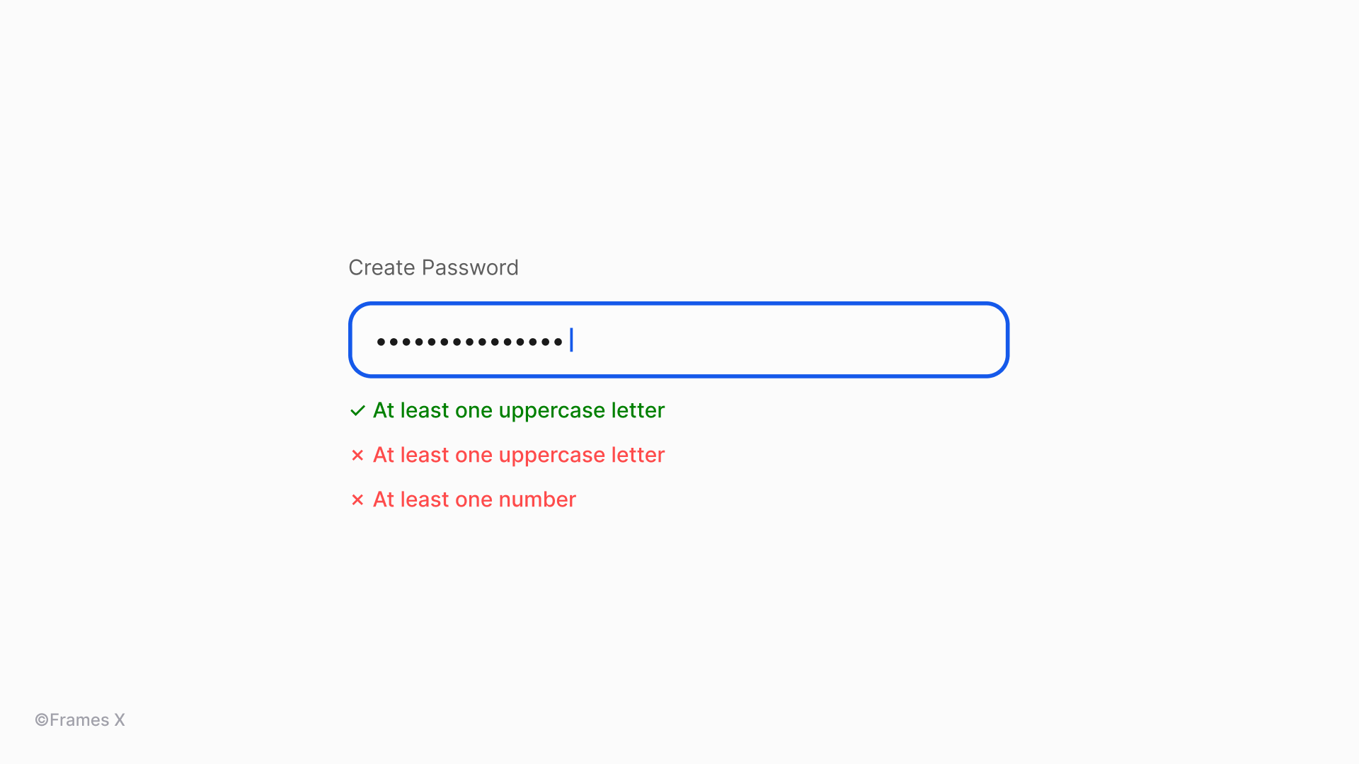
Text field validation with symbols
Unicode symbols like checkmarks (✓), crosses (✗), or exclamation marks (❗) provide instant visual feedback. When combined with text labels or captions, some symbols can provide great visual feedback without any SVG icons added.
For password fields, we could also use a tiny helper "•" symbol instead of SVG circles for hidden password characters.
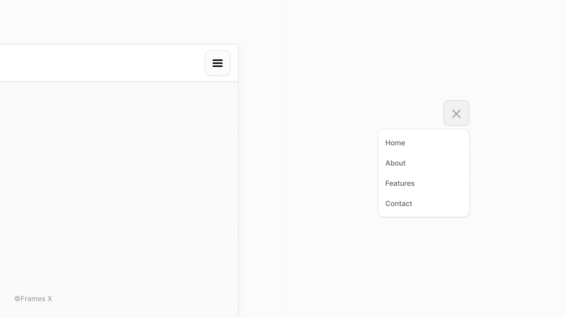
Toggle menu design with symbols
Unicode symbols such as "☰" (hamburger menu), "⋮" (kebab menu), and "⋯" (meatballs menu) provide a simple, accessible, and resource-efficient alternative to toggle buttons or menu icons. However, these symbols may face compatibility issues because menus and buttons are often nested within other components.
To avoid such issues, use a CSS reset specifically for Unicode symbols with font-family: system-ui to ensure consistent rendering across nested components. Always provide fallback symbols using content: "☰" / "\2630" in CSS to handle potential display issues.
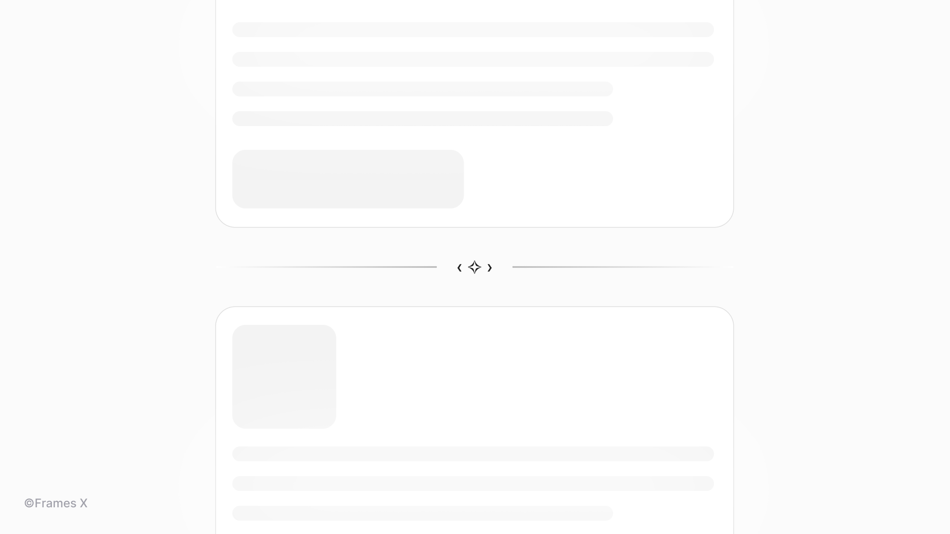
Using text symbols for splitting content
Ornament and line Unicode symbols are great for breaking content into parts or sections, creating logical breaks in your design. Compared to SVG dividers, symbols scale with text, providing excellent flexibility and elegant solutions for your content.
Such decorative symbols can add page breaks with an authentic vibe, making your interfaces stand out.
Text symbols as a Figma icon component
One effective technique for using symbols is to incorporate a "symbol component" into your design system or Figma UI kit, allowing for a swappable icon.
This enables you to easily switch between standard SVG icons and text symbols, providing greater flexibility in component design and access to hidden symbols and characters in your font.
This approach is particularly useful when you want to replace certain icons with labels. By updating the instance, you can transform the icon into a text label or symbol, thereby adding additional meaning or elements to the design.
Using symbols to display common hotkeys and shortcuts
Using copy-and-paste symbols for shortcuts is one of the most common applications for text symbols. Popular software companies such as Figma and Wix Studio utilize Unicode symbols in their products to display common shortcuts and key combinations.
This practice is particularly useful compared to SVG icons, especially in menus and lists. Unicode symbols load faster than image-based icons and scale perfectly with menus and list font sizes.
Using text symbols to create Unique CTAs and Links
You can use symbols to enhance your call-to-actions, emphasize key components, or list items in long-form content.
Include directional arrows or decorative symbols like (→) or (⟶) after link text using CSS ::after pseudo-elements to enhance visual hierarchy and user engagement. For CTAs, you can add attention-grabbing symbols like (✓) or (♥) to create visual emphasis without sacrificing performance or accessibility.
Using Unicode symbols to enhance headlines and titles
Unicode symbols can enhance headlines and email titles, adding an extra punch, strengthening your message, and potentially increasing CTA results. Emojis and Unicode symbols often perform well in marketing contexts. A few researches made on this topic:
A Return Path study found emojis typically increase email open rates. For example, New Year's emails with champagne bottles or confetti emojis saw a 22% open rate compared to 18% without.
However, a Search Engine Journal study found non-emoji subject lines had slightly higher open rates (17.9% vs 16.9% for symbol subject lines).
Despite conflicting data, properly chosen symbols can positively impact CTA effectiveness. Let's explore a few examples of how text symbols can improve our message.
10 Fonts with unique symbols to copy and paste
Some fonts have unique symbols hidden inside them. They are like little secret items in video games, which you can unlock only by digging into each font character set.
We've curated fonts featuring the most practical and distinctive text symbols. These typefaces offer a wide range of unique characters so that you can try them out.
-
Symbola font - Extensive symbols support font.
-
Noto Sans Symbols - Google's font with broad Unicode symbols support
-
DejaVu Sans - Open-source font with many unique symbols.
-
Code2000 - Extensive symbol set.
-
Everson Mono - Monospaced font with rare Unicode characters.
-
STIX font - Scientific and technical symbols.
-
Cambria Math - Mathematical and technical symbols.
-
Asana Math - Font rich in mathematical symbols.
-
Last Resort - Fallback font showing Unicode symbols ranges.
When to avoid Unicode symbols in web design
-
Avoid vague symbols that might be interpreted differently by users. For example, avoid using "@" or "#" unless they're used in their primary contexts (email and hashtag). Always evaluate the potential for misinterpretation when working with symbols.
-
Don't clutter the interface with too many symbols. Use them purposefully to enhance user experience, not to complicate it.
-
Avoid using symbols for critical information. Don't rely on symbols for important messages or warnings. Always accompany symbols with text to ensure the message is understood.
-
Don't use symbols for page names and <h1> tags since this can harm your search engine indexing and make your site less discoverable.
-
Be mindful of cultural sensitivities. Some symbols might have meanings or connotations in different cultures. For example, religious symbols, even in simple ASCII form, should be used cautiously to avoid potential offense.
Conclusion
As we wrap up, it's clear that copy and paste symbols can have both good and bad impacts on the interface. But text icons can certainly level up your UI or even become the star of the show.
The key is to strike a balance where symbols enrich UI or typography without overshadowing the message.
We embrace this philosophy in our work. That's why you can spot Unicode symbols sprinkled throughout our website, each one carefully chosen to add a touch of personality.
We understand the frustration of finding the right symbol. Many sites are cluttered by ads and misleading buttons, making the search even more challenging.
That's why we created Copy and Paste Design Symbols—a curated collection of Unicode symbols for UI and web design. It's a no-fluff, ad-free zone where you can find, copy, and paste Unicode symbols. We've organized everything into intuitive categories so you can quickly find the needed symbol:
Symbols to copy and paste by categories:
→ View all symbols to copy and paste
Thank you for embarking on this symbolic journey with us. We hope our collection of symbols will enhance the beauty of your designs!
 Updates
 FAQ
FAQ