Typography: Spacing
June 17, 2021 - Reading time: 6 minutes
Learn how to create and use vertical rhythm in UI design.
I'm starting a new series of designer tips to cover edge-cutting web design topics, such as typography, colors, layout, components, and design systems.
The first volume is fully dedicated to UI typography. Here you will find all the knowledge to create strong typography for your projects.
Designers use typography as a tool to deliver information pleasantly. Spacing, font size, width, color, and line heights work together to achieve a better user experience.
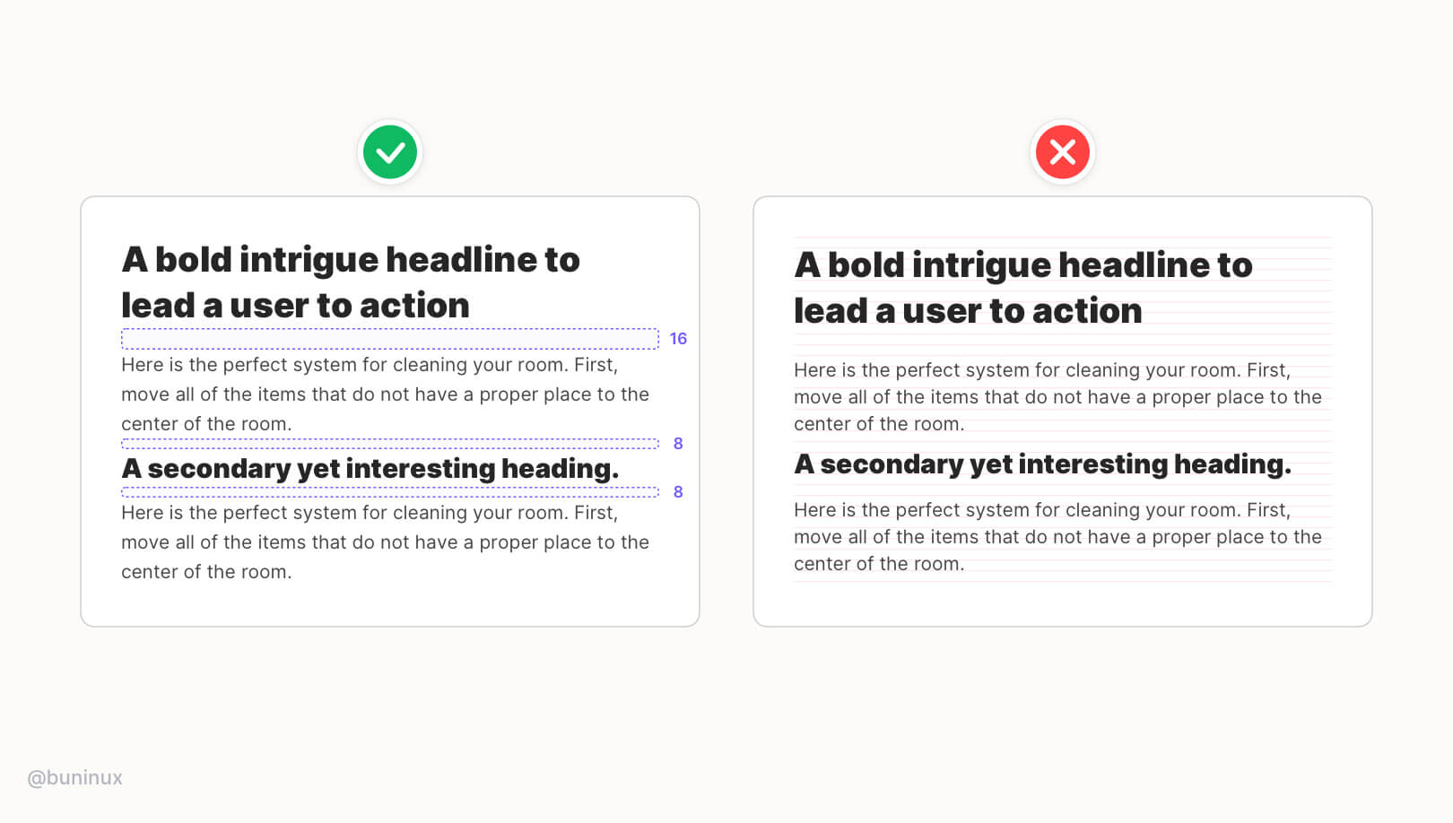
In this episode, we'll discuss Spacing. Spacing helps to establish a vertical rhythm and define the relationship in which your typography elements are present.
A good vertical rhythm is like a good song. It's made with thoughtful pauses and rhythm changes to create an interesting flow a user is happy to follow.
Tip 1—Use more space for larger titles
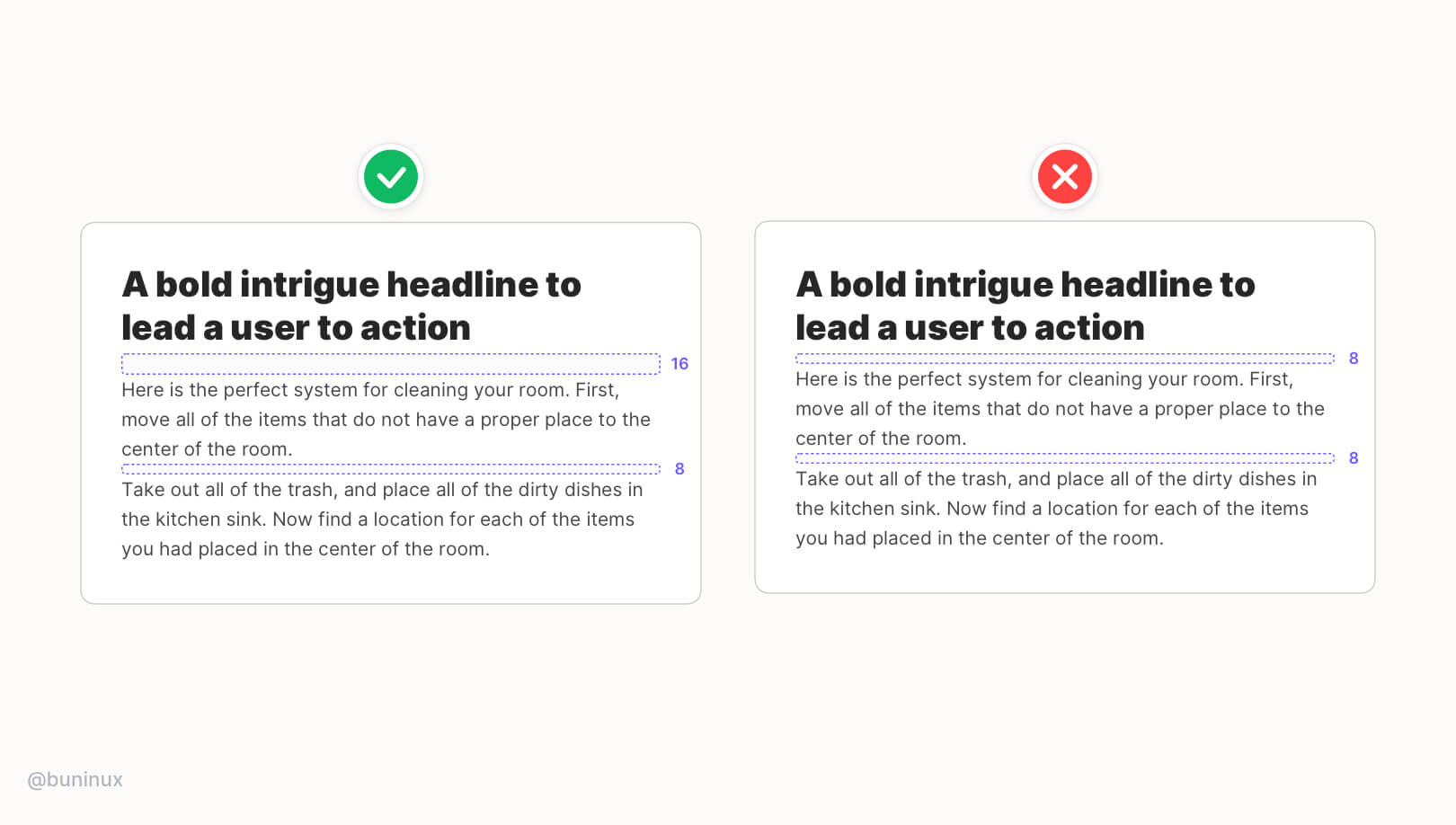 More space will help to create a better contrast between the headline and a tinted text. This results in better visual balance and readability of your main CTA's.
Tip 2—Use less space for smaller titles
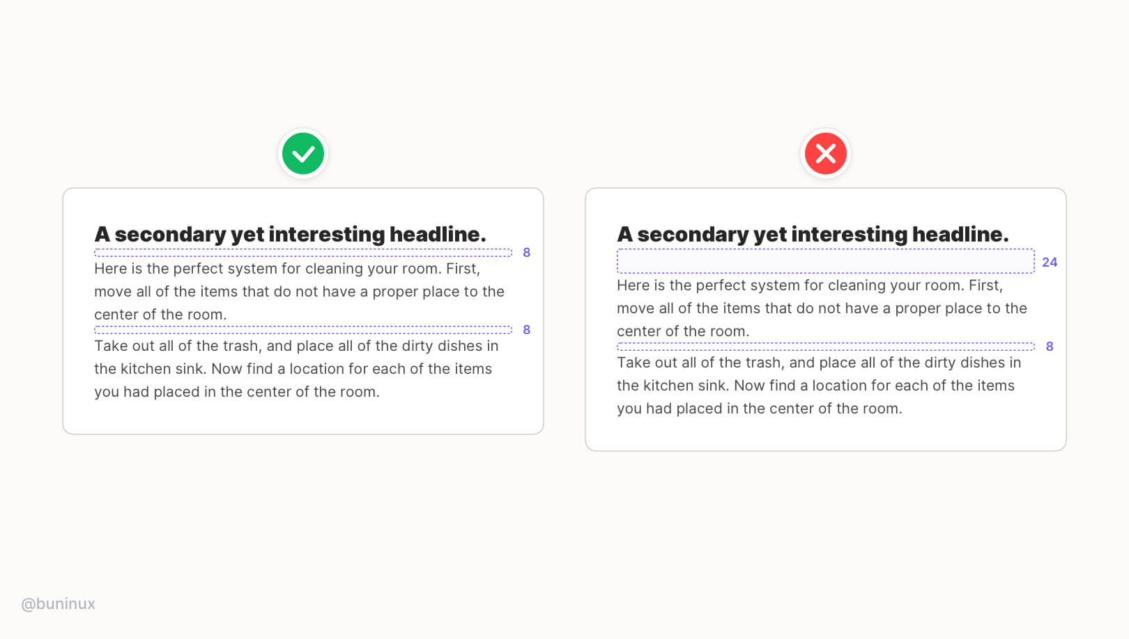 Smaller headlines should be closer to the paragraph text. Using smaller spacing for small headlines helps highlight an important part of the text without breaking the reading flow.
Tip 3—Use more space above the titles
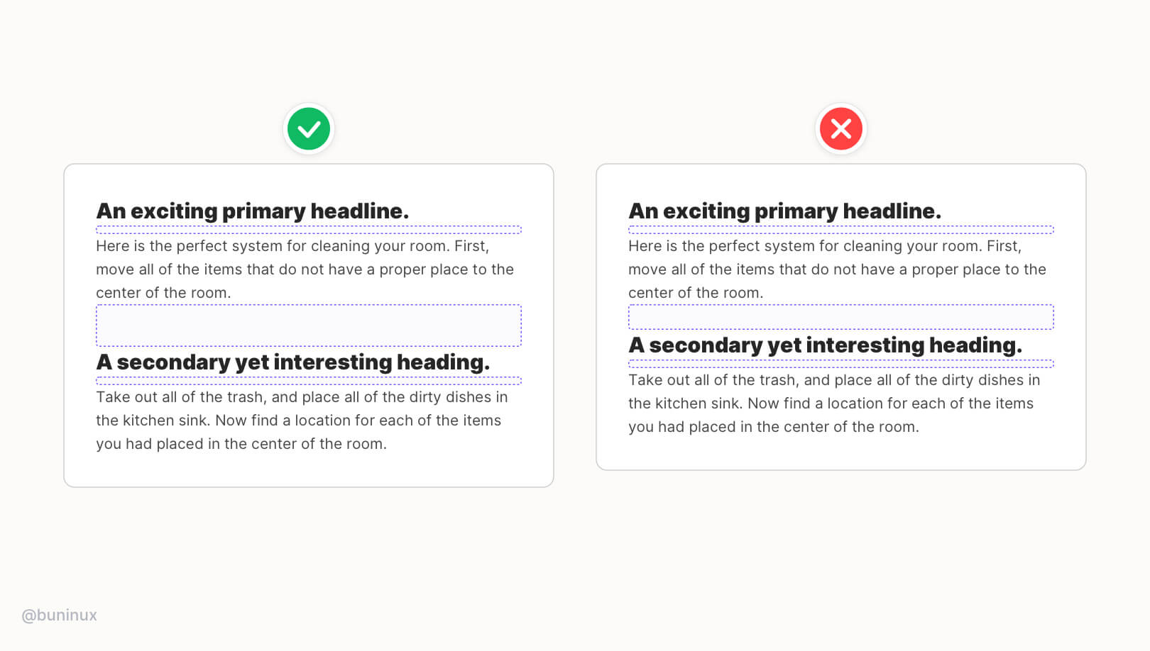 The extra space above the headline will create a pause to separate one piece of text from another. In addition, more space makes the transition from one topic to another more clear.
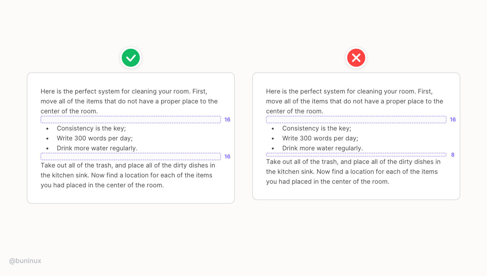
Tip 4—Define your line spacing
 To make your text look consistent — set up a universal spacing you'll use as a default one.
The ideal line spacing for most fonts is 30% - 50% of its line-height. For example, if your text line-height is 24pt, the spacing between paragraphs should be 8, 10, or 12pt.
This method is proven good because:
- The spacing will always match your font choice.
- You can multiply this number and create a spacing system for every typography need.
Tip 5—Cut horizontal space for long titles
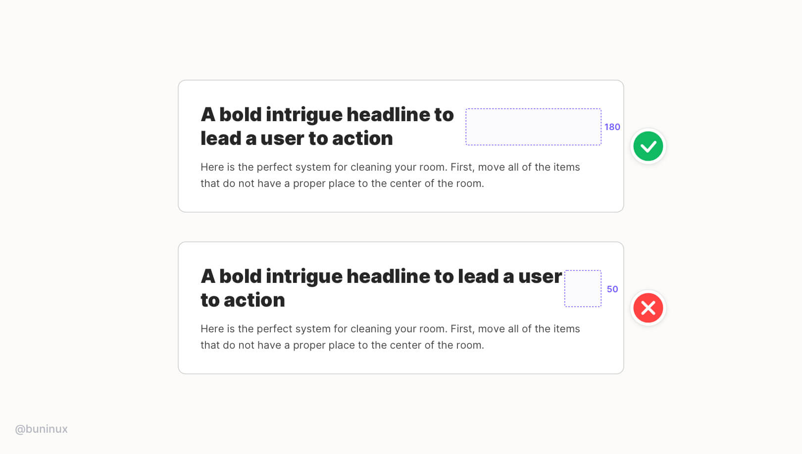 Our eyes are scanning the text in a Z-way pattern. That's why long headlines are so hard to follow until the last word. So don't make users spin their heads to read.
Use less horizontal space, and seek symmetry through logical line breaks to achieve eye-catching CTA’s.
Tip 6—Add more space between text and image
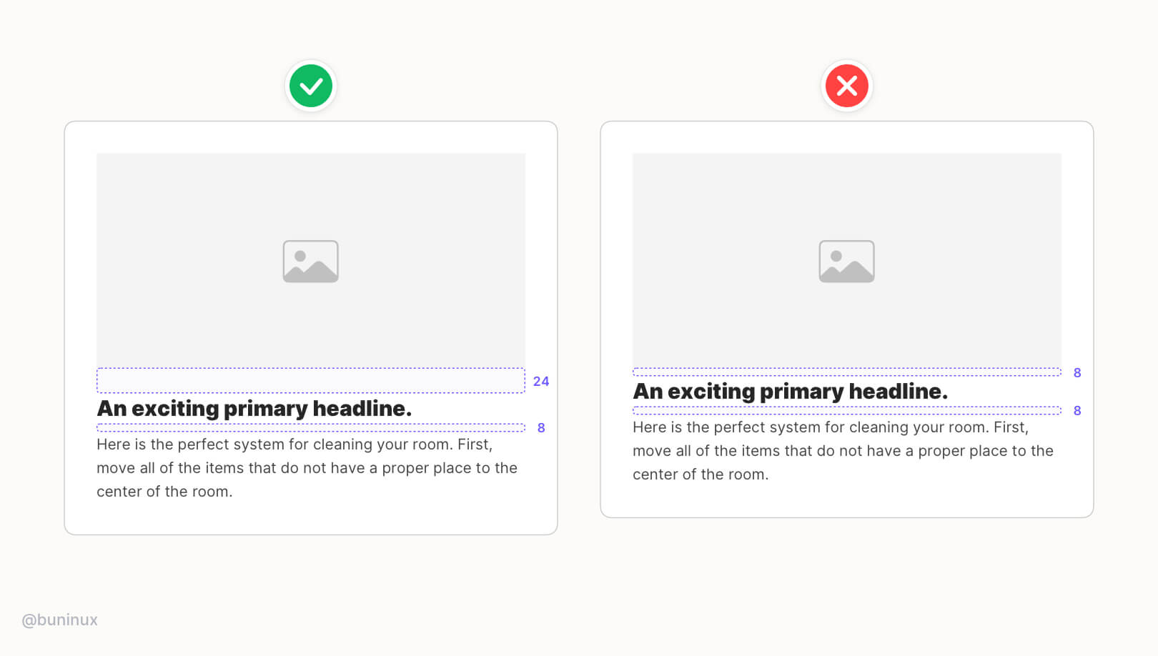 Images are visually heavier than the text. Adding extra space will help create a balance between vibrant imagery and the context, making it easier to read.
This will help the text not be obscured by visually heavy images or graphics.
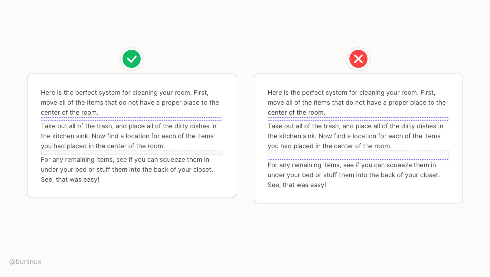
Tip 7—Space inside the paragraph
 Keep a consistent spacing inside your paragraph and between its elements. Use a universal spacing for all elements inside the paragraph, such as lists, quotes, tables, or any decorative elements.
Tip 8—Vertical rhythm vs. layout grid
 When using a grid, it's easy to fall into a trap a solely rely on it to align your text. This will make your text uniformed but not visually appealing.
So f*ck the grid when it comes to typography — use vertical rhythm.
Instead, work with contrast and stay consistent with spacings to create a memorable rythm that will guide your reader.
Useful resources
- Inter - Bold typeface family.
- Modular Scale - Quickly scale the size of a selected font.
- Kern Type - A game where you Kern Type and get scored on your accuracy.
- Typography Handbook - A practical guide on best web typographic practices.
- Google Fonts - Google fonts.
UI Grid Best Practices
May 20, 2021 - Reading time: 6 minutes
Make better designs with layout grid tips & tricks.
Space and grid make the foundation of any design. Once mastered and used correctly, the grid helps you to create solid and visually appealing solutions for your designs.
Therefore, I would like to share my tips for mastering the grid in UI design. In this episode, we talk about layout grids. Let's start ✌️
What is a Grid?
The grid helps establish the foundation of any interface. You can think of it as a framework for your layout. The framework helps to organize your UI elements, guide the reader and identify individual parts of your design.
Terminology
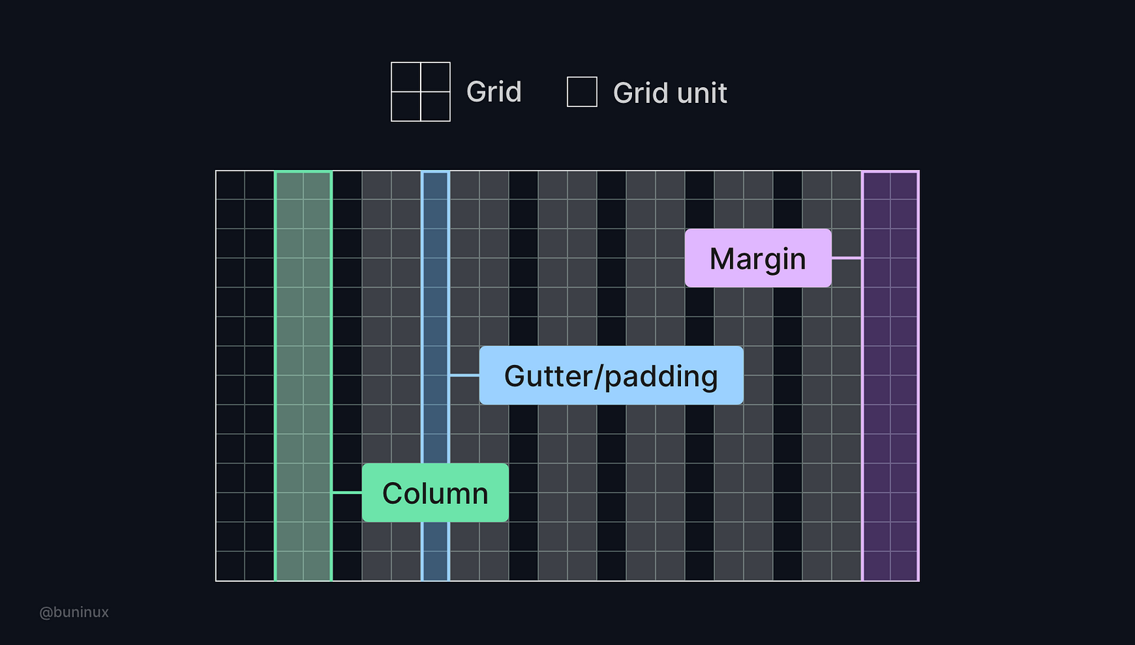 The grid consists of grid units. The layout is placed upon the grid and has a certain amount of columns. Columns have margins on the left and right, as well as paddings between each column.
Tip 1—Choose numbers wisely
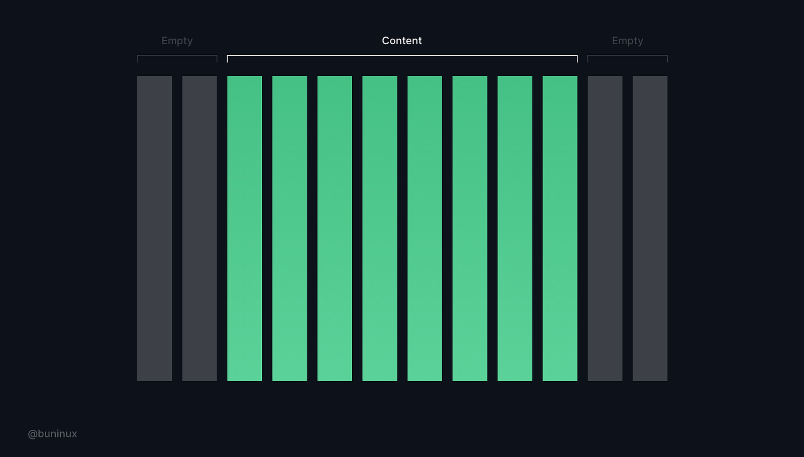 While the 12-column Bootstrap like-grid is the most popular choice, it's not mandatory. When choosing a grid, select the one with a number of columns your design truly needs, no less, no more.
Tip 2—Know your constraints
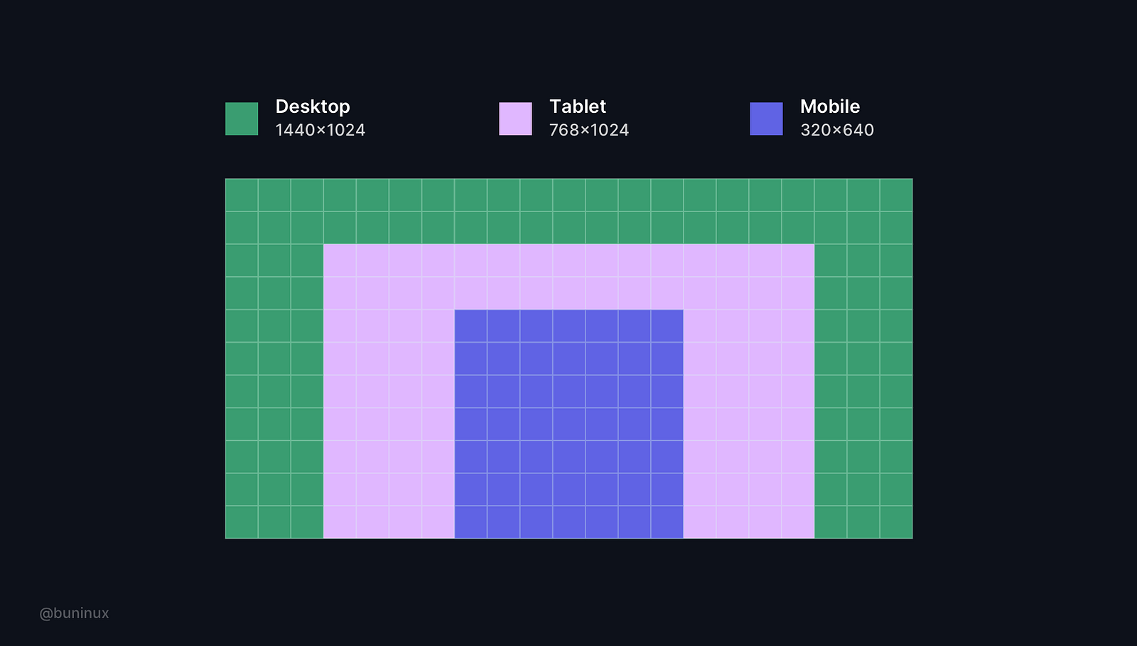 Always consider the screen you are designing for. Know how it is handled and operated by others. Use these limitations to your advantage and learn to design with them.
Most common screen resolutions (px)
- Desktop: 1440x1024
- Tablet: 768x1024
- Mobile: 320x640
 Tip 3— Horizontal and vertical spacing
Consider both vertical and horizontal spacing to make your layout more appealing and consistent.
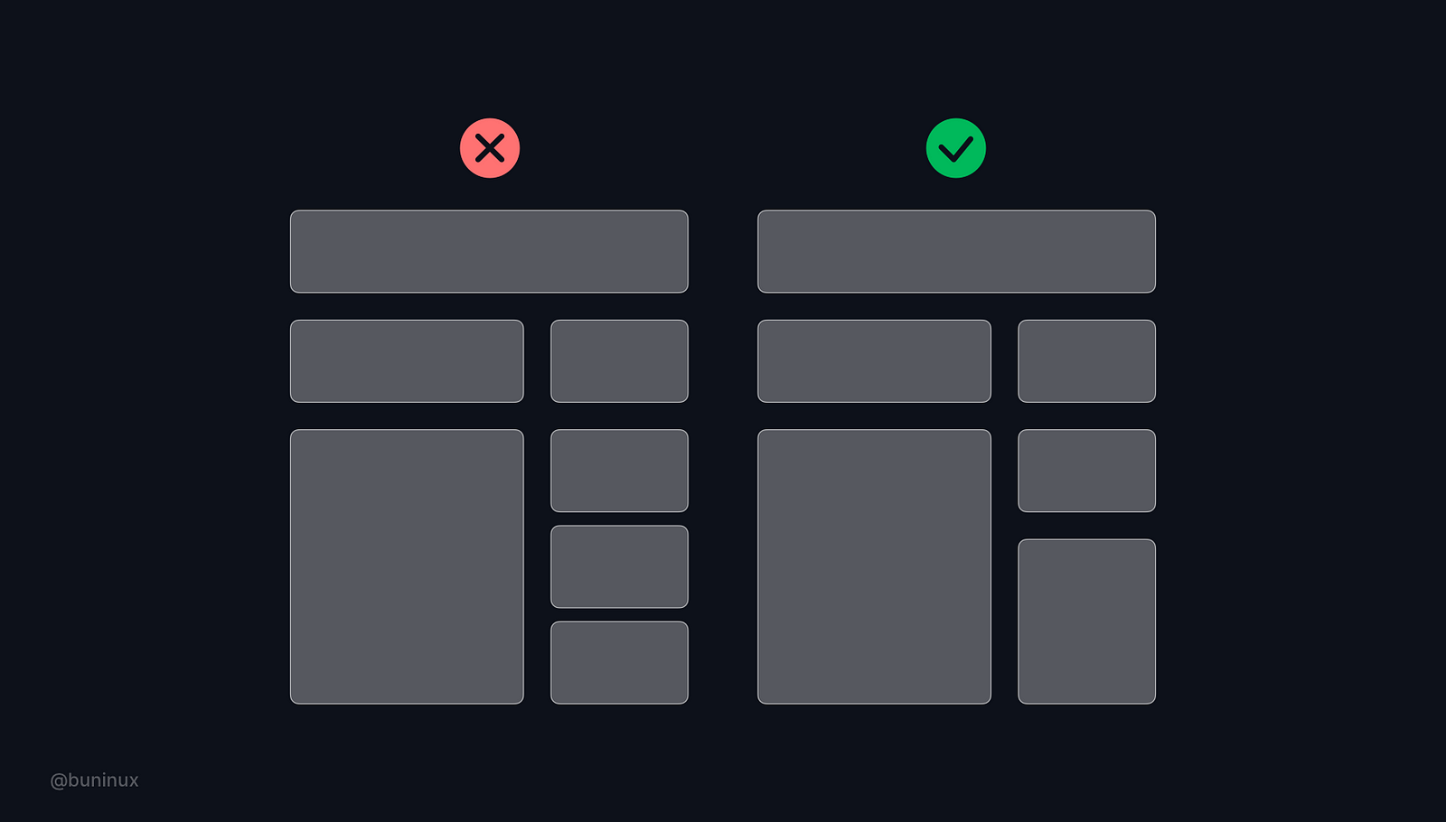
 Tip 4—Shape vertical rhythm
Use the baseline grid to arrange the content and bring visual consistency to your text and layout elements.
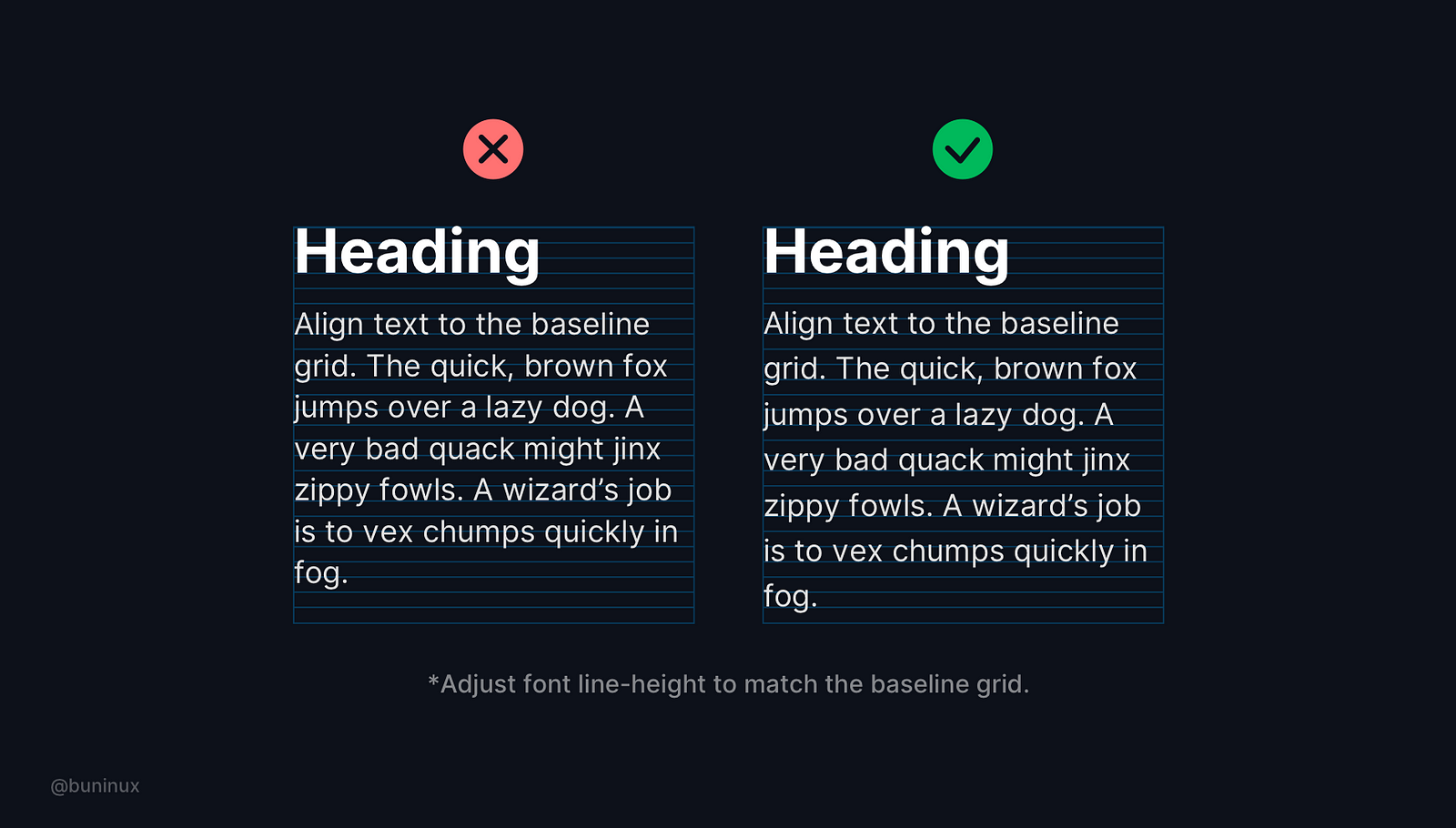
Bonus tip—Adjust font line-height to match the baseline grid.
For example: If you choose 4px as a baseline/grid unit, to align text, you will need to set the line-height of the font to a multiple of the unit, which means the line height should be 4, 12, 32, 64, etc.
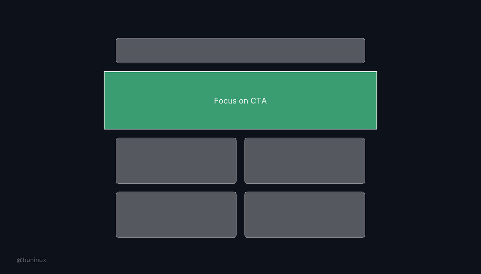
Tip 5—Use power of the frame & color
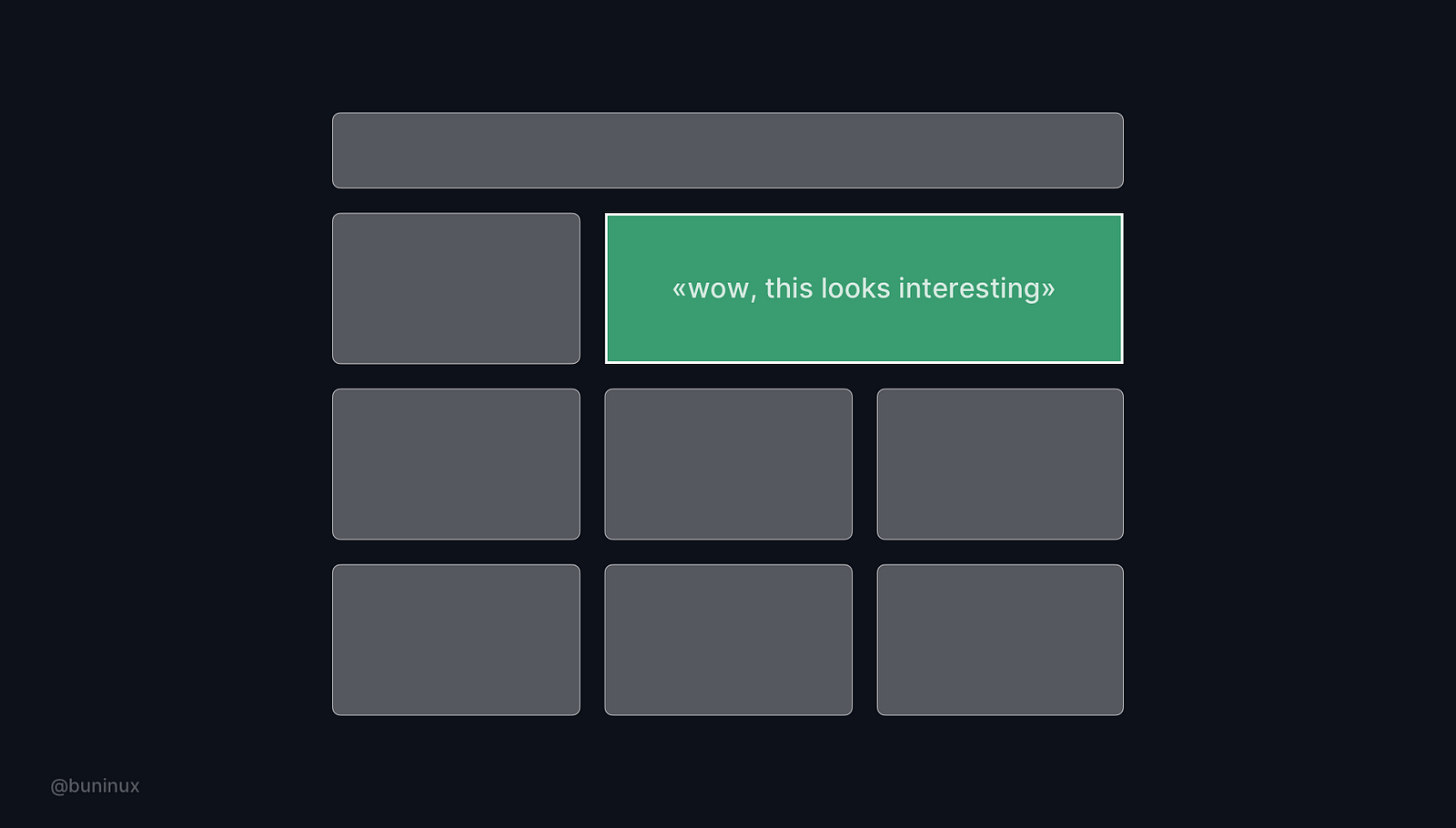 Use framing as a tool to focus your user's attention on a certain layout part. Add additional visual weight in the place where it is needed.
Tip 6—Step out of the grid
 Put certain elements off the grid. Use this breakdown trick to add value and make certain parts of your design stand out.
Tip 7—Adapt your grid
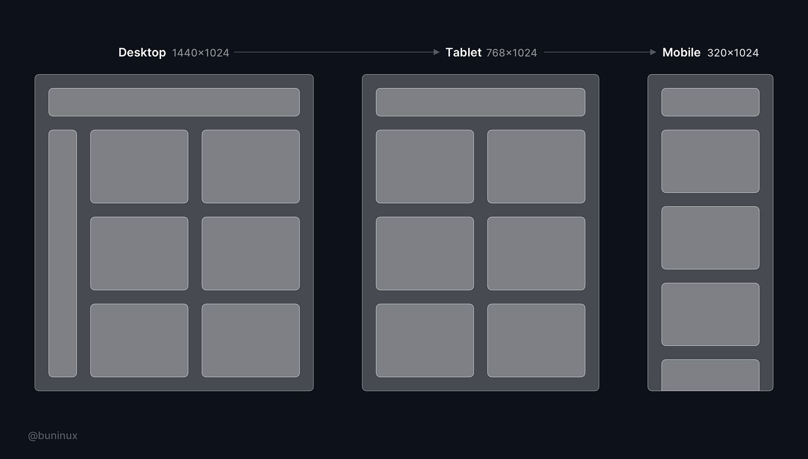 Ensure your layout is adaptable to common screen sizes, breakpoints and provides a good mobile user experience. Make sure to always check your designs on different screens.
Tip 8—Learn to design without a grid
Designing without the grid is okay for a small project indeed, but for scaling projects, it's mandatory.
Learn to design with a grid and without actually bringing it to your canvas. Observe your layout without the "grid glasses" from time to time to find the most creative solutions for your tasks.
Useful resources
Resources
Plugins
- Layout grid vizualizer —Better layout visualization (Figma);
- Grid generator — Generate grids in seconds (Figma);
- Guides—Quickly generate guides for a selected element (Sketch);
- Copy/Paste—Copy-paste layout grids (Sketch).
How to Be a Better Designer
April 16, 2021 - Reading time: 12 minutes
Mindful tips for a creative job journey
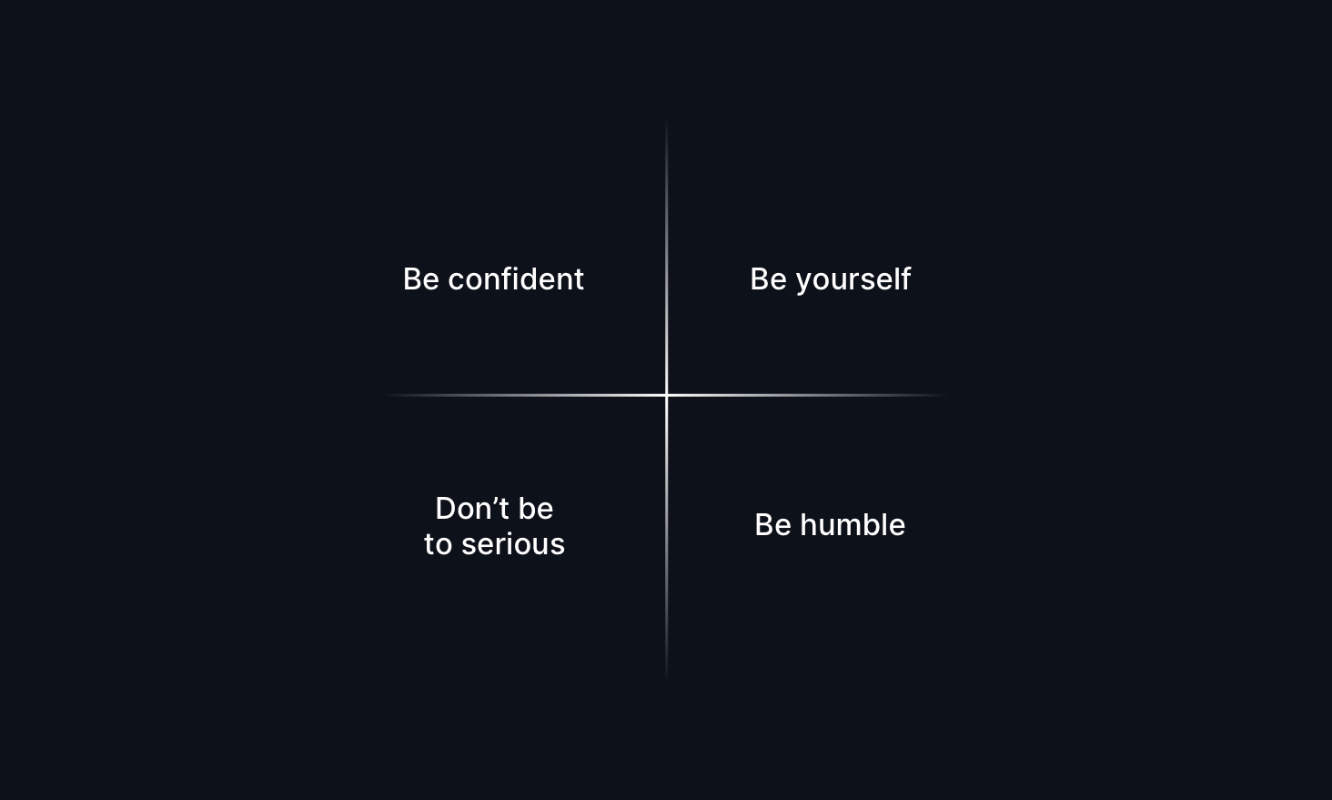
So, what makes a great designer? Everyone says you need to be a magical unicorn who can code, design, manage projects, and probably make coffee while doing handstands. But hey, this isn't about that perfect designer checklist.
Instead, I'm sharing the good stuff I've picked up along my path to becoming a designer. These aren't your typical "10 steps to success" tips—just real insights from someone who's been there.
Think of these as friendly nudges rather than strict rules. They're the kind of things I wish someone had told me when I was starting, minus the intimidating perfectionism.
Have fun. Subscribe if you like the tips!
Tip 1 — Work a lot
Fall in love with the process, not just the end goal.
Learning design is a journey—it's those late-night tweaks, those 'aha!' moments when you finally nail that tricky layout, and even those times when you're stuck figuring out the perfect color palette. These aren't just steps to get through—they're the good stuff.
So, instead of always chasing that perfect result, find joy in the small wins along the way. Each pixel you push, every prototype you test, is part of becoming the designer you want to be.
Tip 2 — Take a break
Take a breather when your mind gets noisy. 💭
Sometimes, the best designs come when you step away from the screen. Stuck on a problem? Instead of force-feeding your creativity, try hitting pause. Go for a walk, make some coffee, or close your eyes for five minutes.
Fun fact: Meditation isn't just for zen masters—it's a secret weapon for clearing creative blocks. Even a quick mindfulness break can reset your design brain and spark fresh ideas.
Tip 3—Master your tool
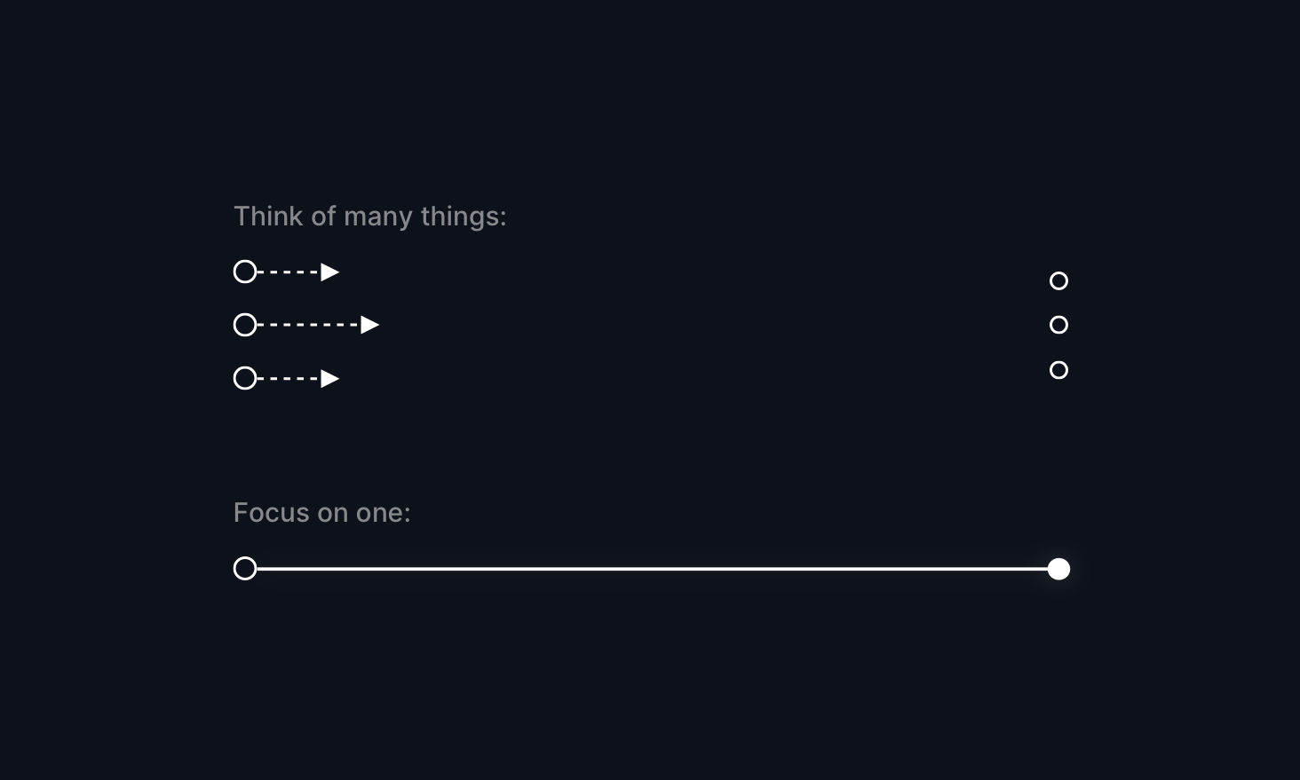
Any tool. Just focus on one at a time and achieve results with it.
Pick a tool and dive deep - any tool will do. Master one thing at a time, and watch the magic happen. Whether it's Figma or even Excel, getting really good at one tool opens up wild possibilities.
The cool part? Once you've mastered one tool, picking up the next one becomes way easier. Your brain starts to recognize patterns, shortcuts, and workflows. Eventually, you realize that learning itself is like a user interface - one that you're getting better at navigating every day.
Tip 4 — Steal like an artist
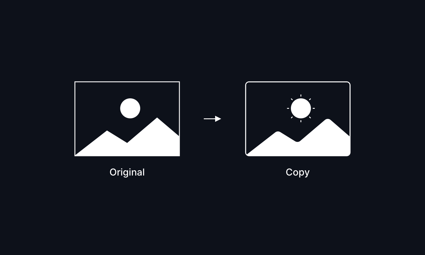
Hey, let's be real - coming up with totally original ideas when you're starting is tough.
Instead of trying to reinvent the wheel, find designs you love and use them as your starting point. It's not about copying—it's about learning through inspiration and making something your own along the way.
Think of it like remixing a song: you start with something great and add your twist. Each iteration teaches you something new, and before you know it, you're creating your unique UI designs.
Tip 5 — Learn to listen
The secret superpower of great designers? Being an amazing listener.
When you really listen to what others say, you're not just being nice—you're building trust and collecting golden insights. Every conversation with teammates or clients is a chance to see your design through fresh eyes.
Think of it as user research in disguise: the more you listen, the more bulletproof your designs become. Plus, people love working with designers who make them feel heard.
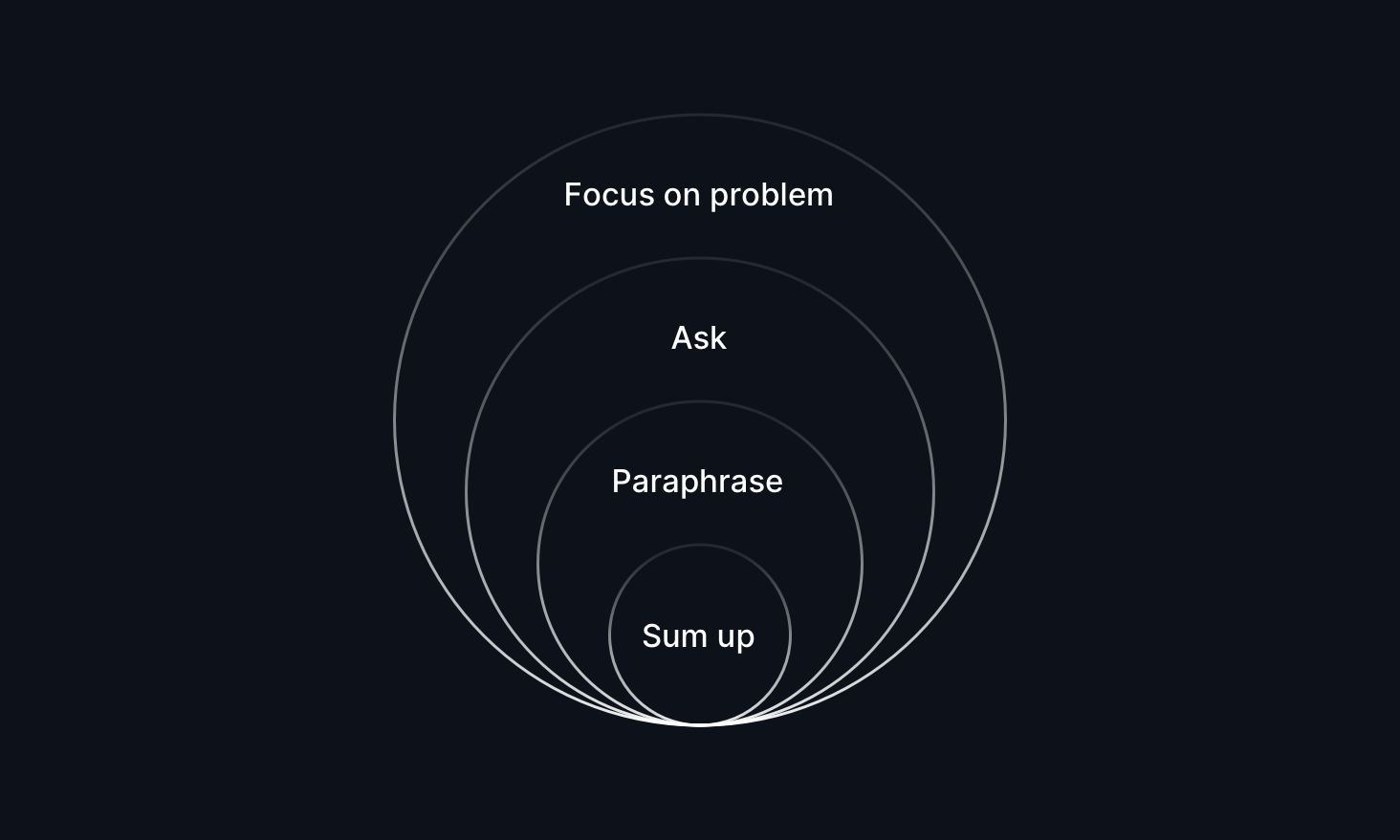
Tip 6 — Articulate your design
Master the art of showing your work - it's just as important as creating it. Learn to tell the story behind your UI decisions, because great design paired with clear communication is unbeatable.
When feedback time comes, check your ego at the door. Think of critiques as golden tickets to make your work even better, not personal attacks. The best designers know that feedback is fuel for growth.
Tip 7 — Learn to lose
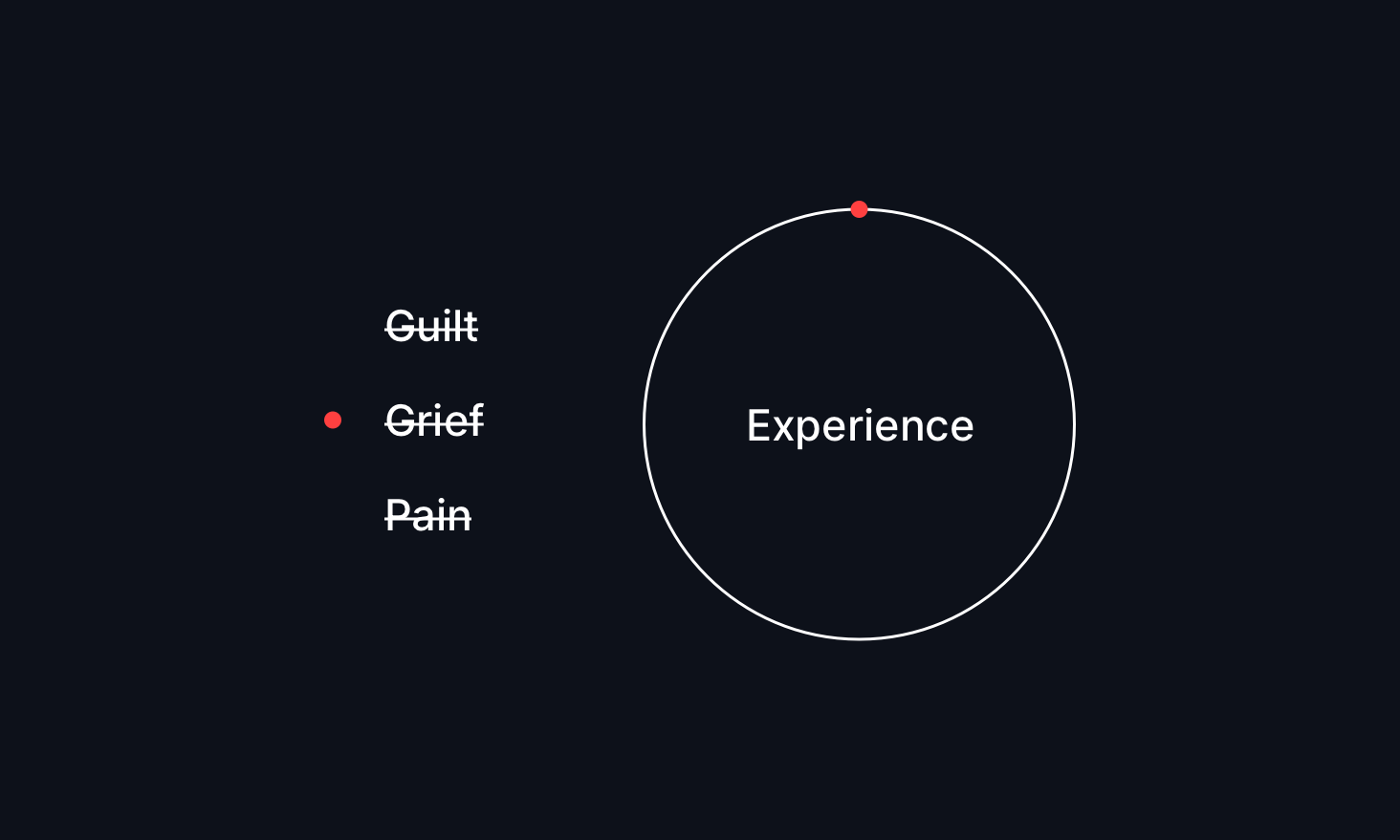
Sometimes, your design won't work, and it's okay.
Instead of beating yourself up over a design that didn't work out, treat it like a plot twist in your design story. Every 'failed' design is actually a goldmine of lessons for your next big win.
Remember: even those designers you look up to have folders full of designs that never made it. It's not about avoiding mistakes - it's about bouncing back stronger each time.
Tip 8 — Optimize your process
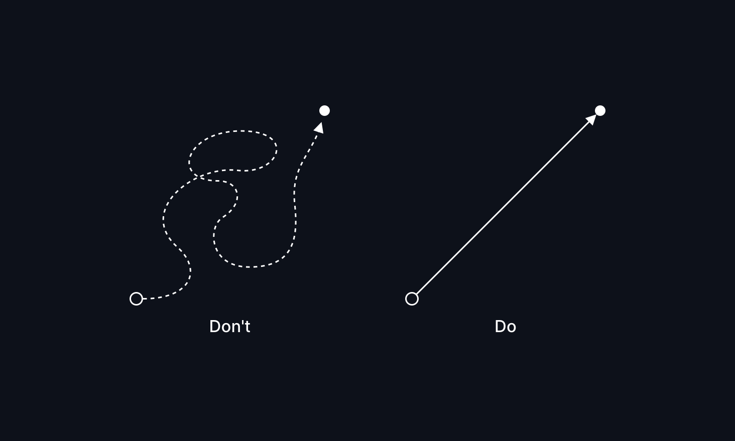
Work smarter, not harder - there's no design trophy for doing everything from scratch.
Take advantage of proven design patterns, templates, and ready-made assets. Think of them as your design shortcuts - they're not cheating. They're your secret weapons for moving fast and staying efficient.
Pro tip: Build your toolkit of go-to resources. Save those components, collect those elements, and watch your workflow transform from sprint to an easy ride.
Tip 9 — Use a ready-made UI kit
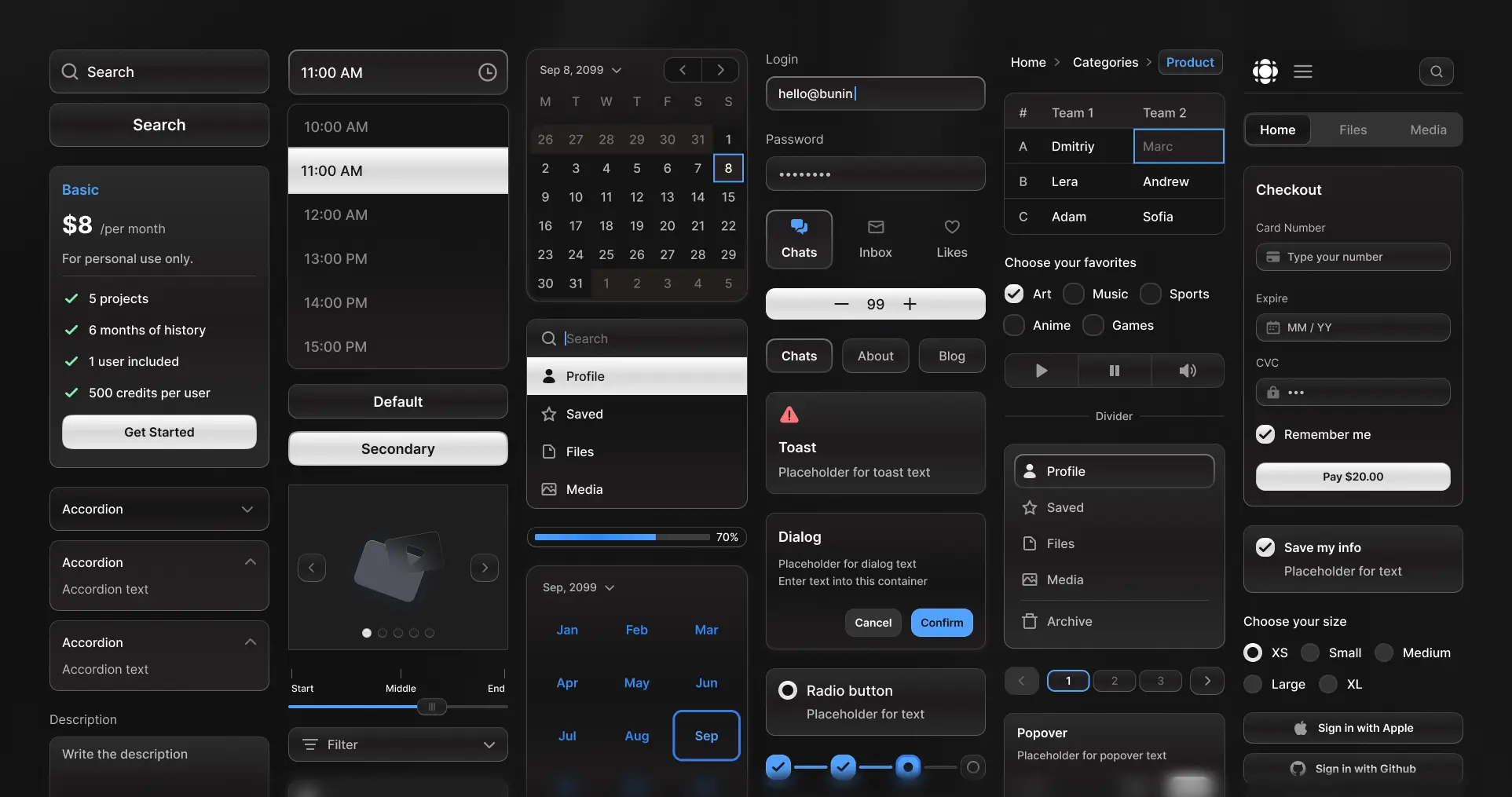
Why use a UI kit?
Think of a UI kit as your secret superpower. Instead of rebuilding the same buttons, cards, and forms for the hundredth time, you can use predesigned components and learn design by using them. A UI kit saves a lot of effort that younger designers should probably avoid for the sake of the craft.
What usually takes weeks of pixel-pushing can be done in hours with a proffesional UI Kit. With a UI Kit, you're not just saving time - you're freeing up your creative energy for the fun stuff, like solving unique design challenges and crafting amazing user experiences.
That's it. Thank you for the read. Before you go, here are some more helpful design resources:
Useful design resources
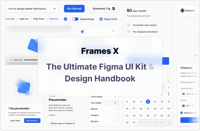
- Frames X - Premium UI Kit and Design System
- Copy and Paste Free SVG Icons
- Copy and Paste Design Symbols
- Free UI Templates and Elements
References
Tools
 Updates
 FAQ
FAQ