.jpg)
Dark Mode UI Best Practices
October 28, 2021 - Reading time: 10 minutes
Eight tips for designing dark mode UI
What exactly is a dark theme/mode first?
A dark mode is a night-friendly color theme that mainly focuses on using dimed/grey colors for surface and UI elements. Darker colors reflect less light while still providing a great reading experience. All thanks to the high contrast between sharp elements and subtle surfaces.
As a design pattern, a dark mode is usually living across the user interface as a toggle. The dark mode is designed to be supplemental to the system's default (or light) theme.
Thanks to extra vibrancy, the dark mode has become quite popular, making foreground content stand out against the shaded backgrounds. But besides being fancy, what are the perks?
Dark mode perks
Dark theme is a good marketing move for making your UI stand out among similar brands or products. The deep, heavy backgrounds can become a perfect addition to your brand visuals.
Dark mode as a feature can help reduce eye strain when operating your product. Especially if your product is heavy with text, a dark mode can help enhance your user's retention and focus.
Dark mode can potentially save your phone energy. It's proven that dark mode consumes six times less power on your screen by emitting less light and, as a result, can prolong your app lifespan and usage time.
Please note that energy consumption mostly depends on your phone type and not the colors. So if you want to measure dark mode battery-saving efficiency -- review the developer's guidelines for specific phone types and screens.
The dark mode experts say it is healthier to read against dark surfaces, while other studies arrive at the opposite conclusion. But in my opinion, the dark mode is just a trend that looks sleek and, in theory, can make your brand more comforting.
So without further ado, here are the best practices to help build your dark mode UI.
Plan your color use
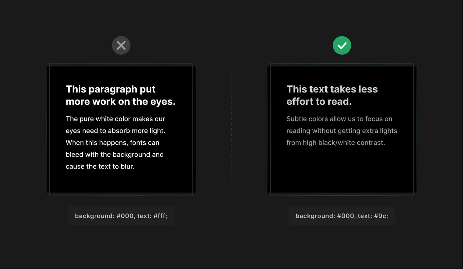
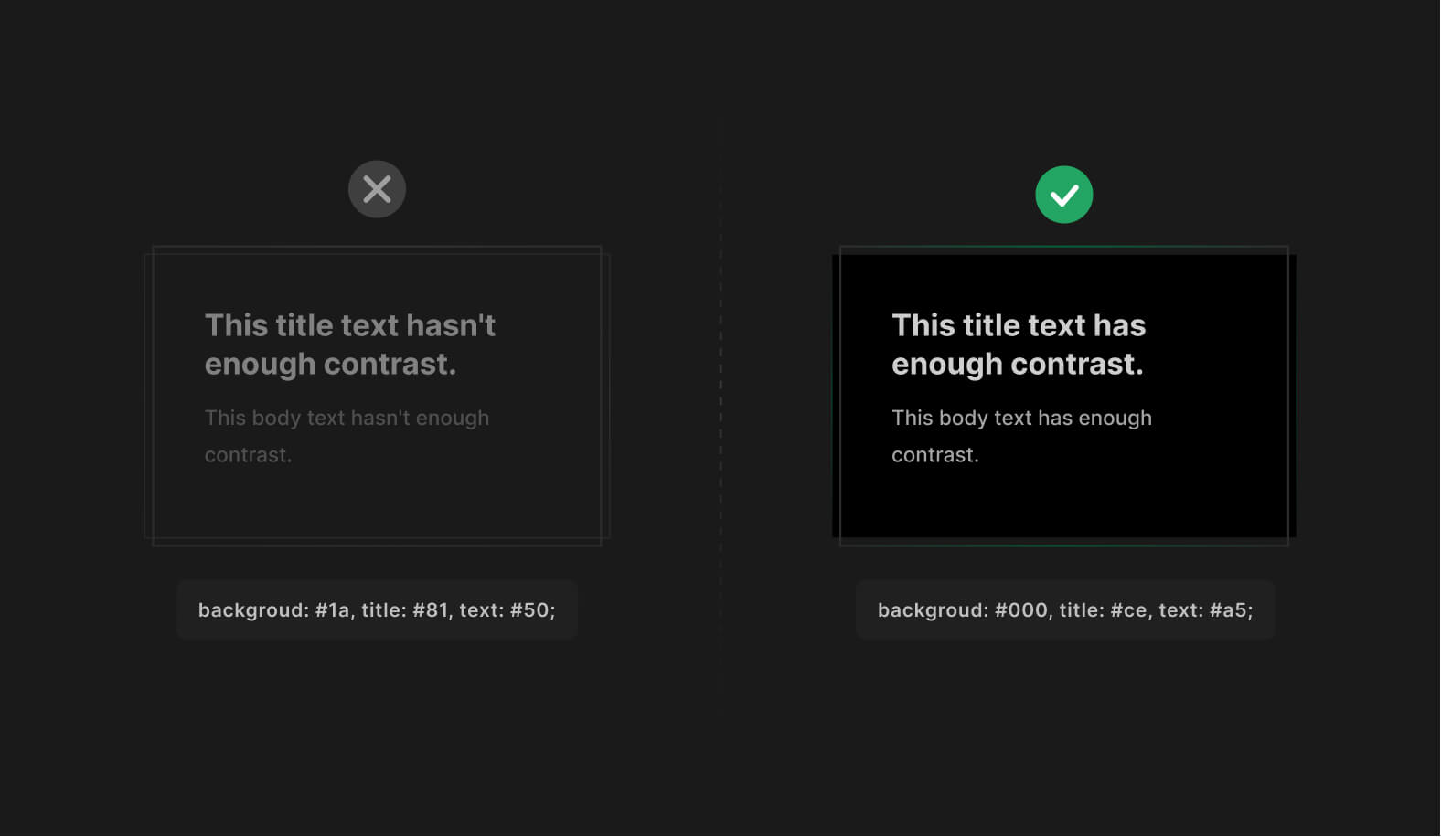
Avoid or limit white on pure black colors. You can use pure black (#000) as a background for dark mode, but make sure you dim your text slightly. Just enough not to cause eyes to bleed from cutting-edge contrast.
Pure white makes our eyes need to absorb more light. When this happens, fonts can bleed with the background and cause the text to blur, especially on older monitor models.
Brand your dark color
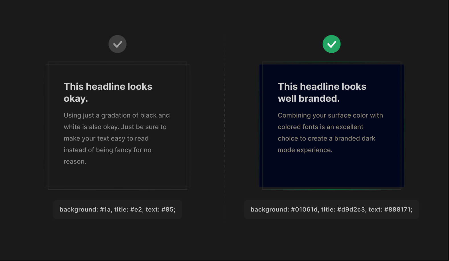
To make your dark mode more unique, use a much darker version of your primary brand color as the surface.
Combine with colored fonts to make it look even more special. ✨
Combining your surface color with colored fonts is an excellent choice to create a branded dark mode experience. Using just a gradation of black and white is also okay. Just be sure to make your text easy to read instead of being fancy for no reason.
Reduce color saturation
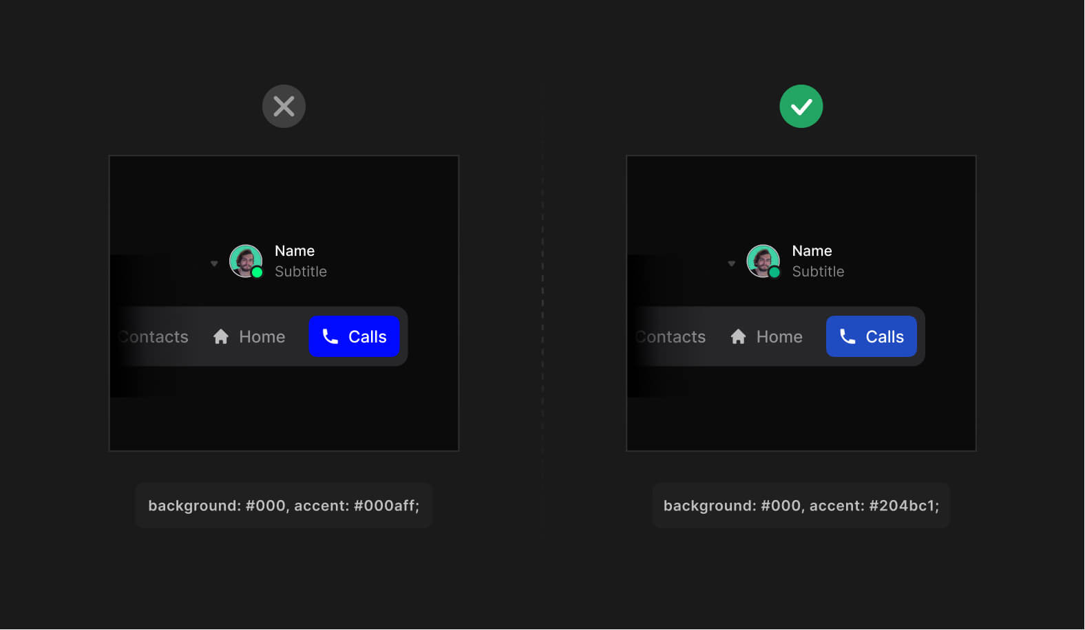
Avoid fully saturated colors in dark mode.
High saturation has a visual "shaking" effect when viewed on darker surfaces. Instead, use low saturation or slightly muted versions of your primary colors for best performance.
Communicate depth
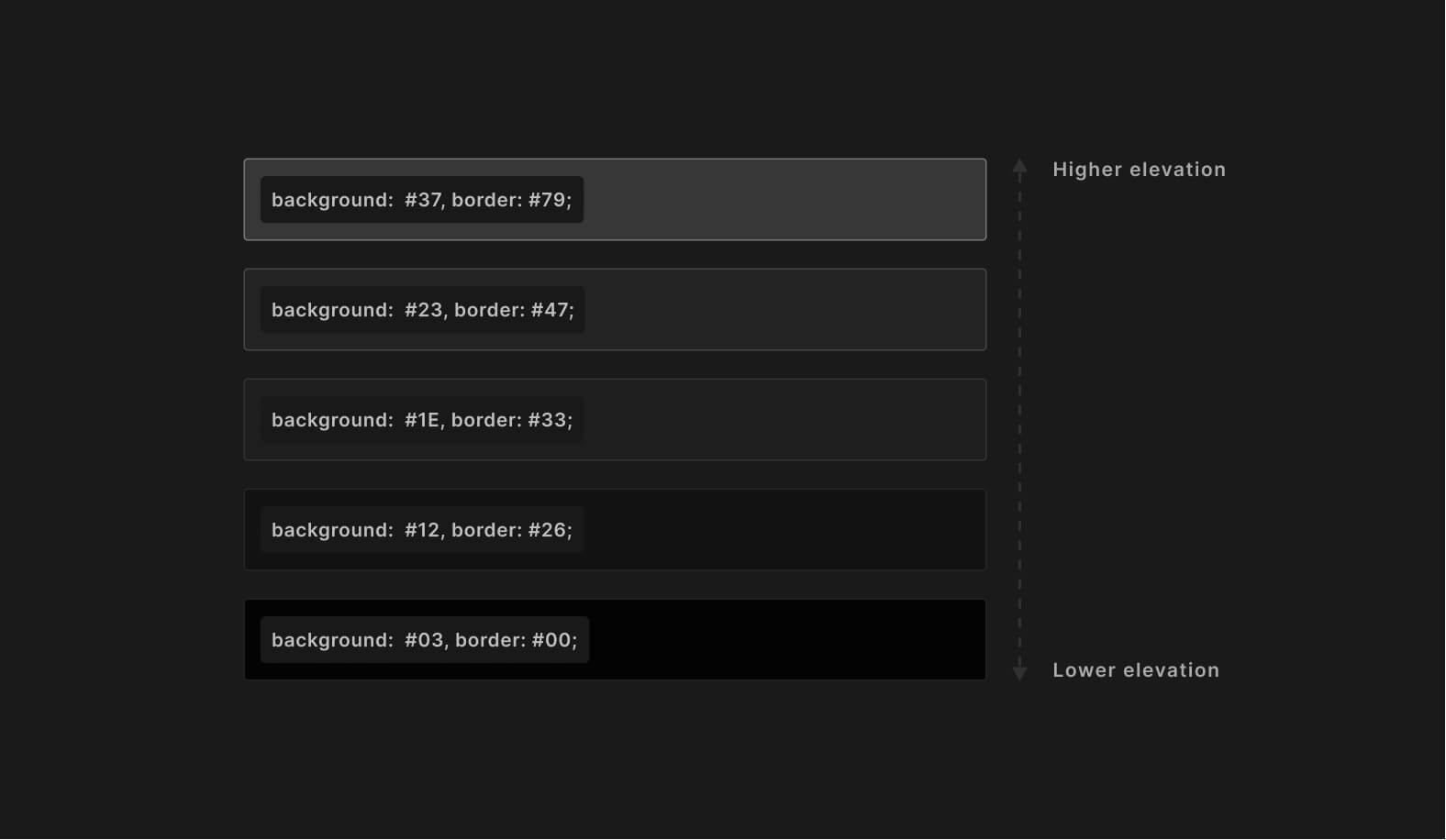
Use a scale of lighter colors to translate the elevation. Avoid using shadows in dark mode. Instead, use border property to emit depth levels for UI elements. Distant elements should still have lower elevation compared to the closer elements.
Avoid using shadows in dark mode. To better communicate depth -- make sure the objects closer to the user are brighter. This will help to build a better visual hierarchy.
Ensure your dark mode contrast
Dark mode, just as the light should meet the minimum required WCAG standards to ensure all text is legible with enough contrast. You can use plugins to check your contrast design right in place.
Here are our favorite tools to help you double-check the contrast ratio without leaving the tool of your choice:
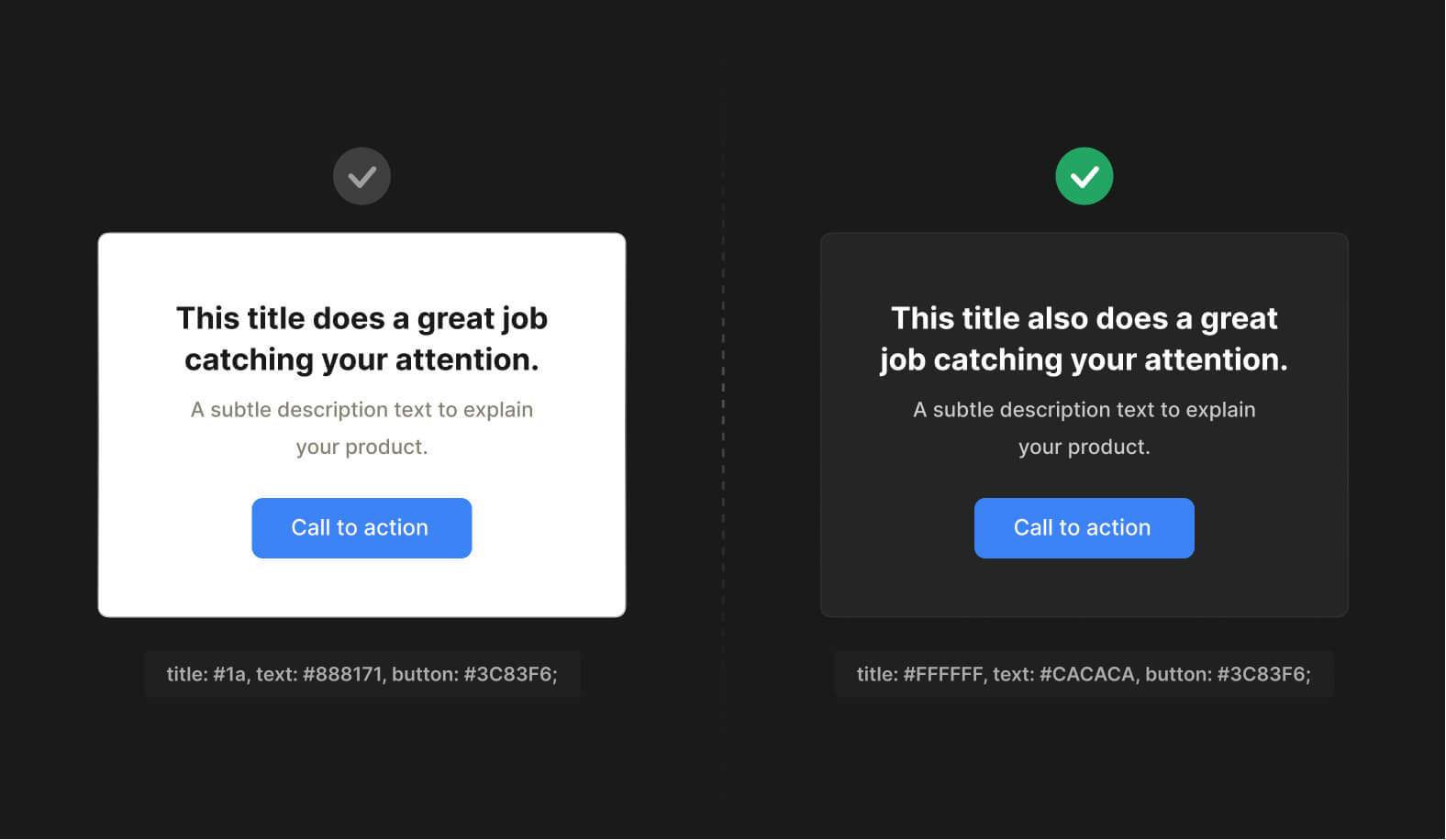
Design light mode first
While bringing your designs from light to dark mode, keep all the visual cues in place. Don't ignore or remove some colors for the sake of a dark theme not to confuse users.
Instead, prepare a color pallet that focuses on inverting existing colors without UI losing efficiency.
There are plenty of plugins that can help you with this. Here are my favorites:
- Appearance (Figma plugin).
- Dark mode magic (Figma plugin).
- Camilo (Sketch plugin).
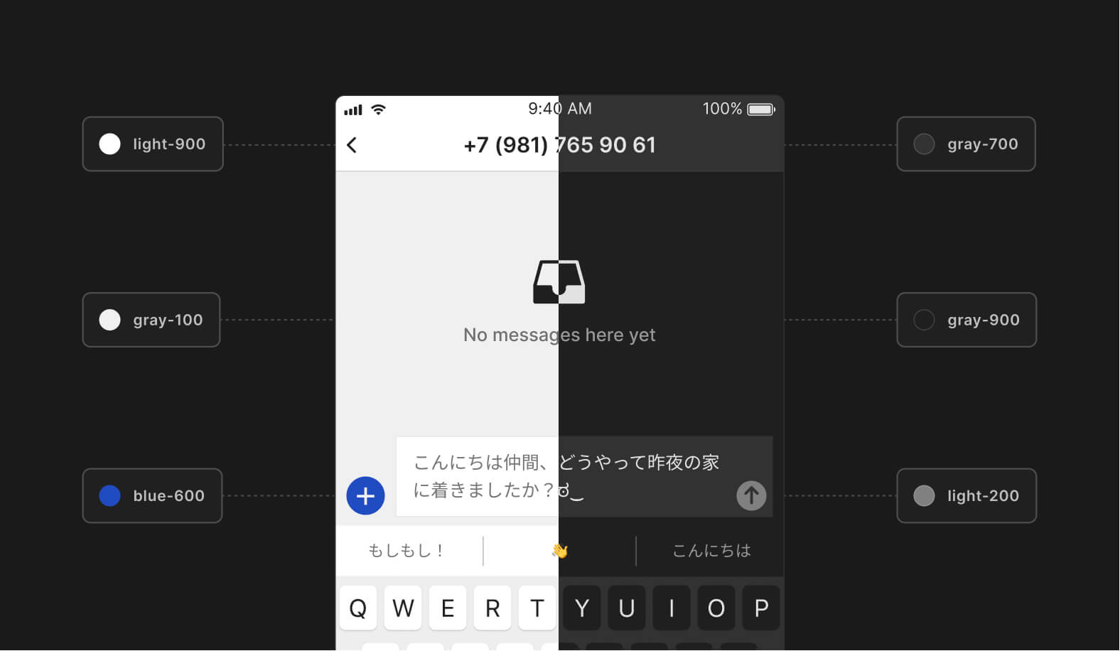
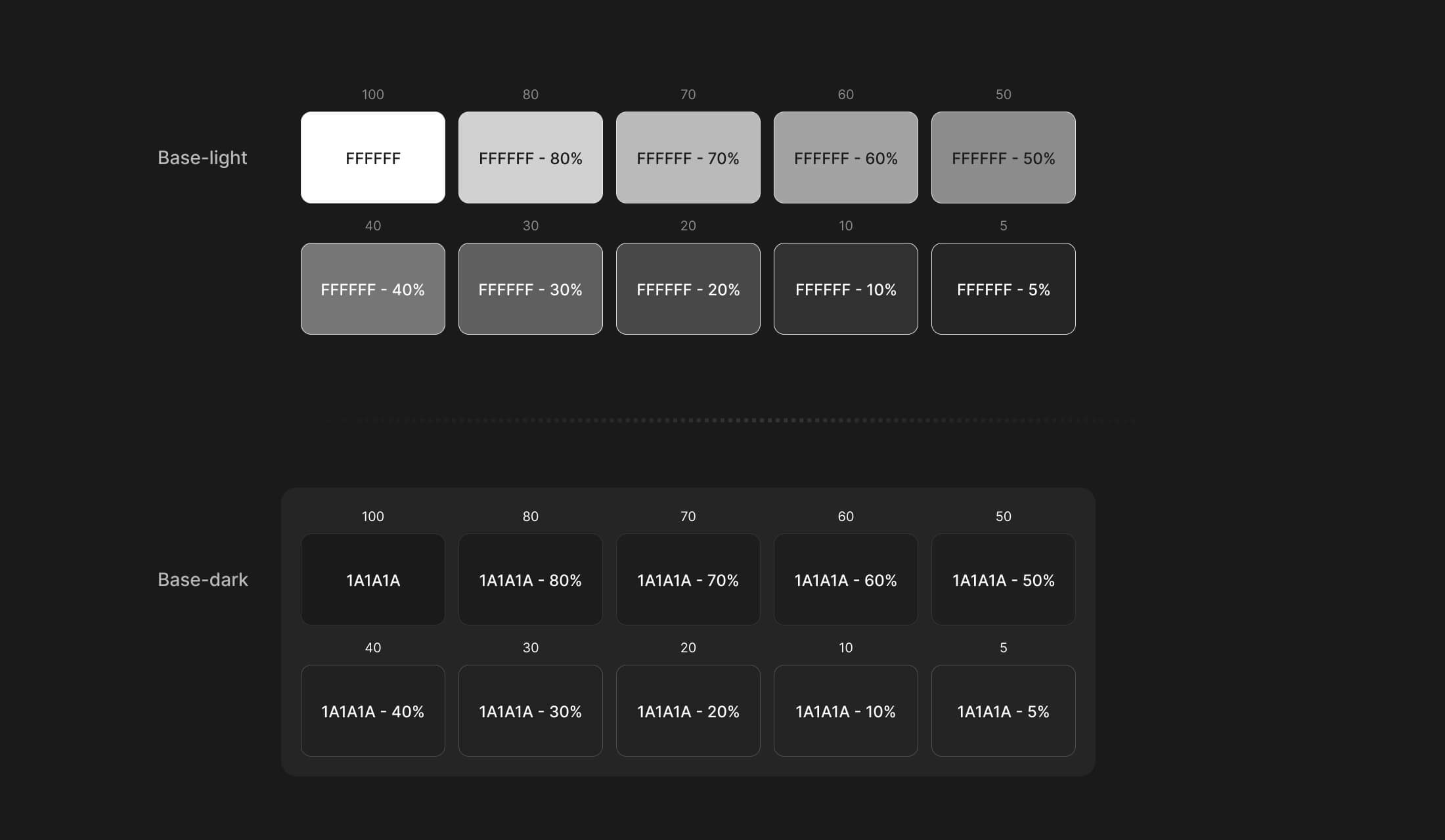
Use base colors to design dark mode
To make it predictable turning your light-themed UI to the dark side. Use a set of base or "neutral" colors with the same transparency values from the very start of your project.
A set of transparent colors can ease your life a lot. Instead of constantly choosing different shades of gray, you can use a set of transparent colors to convert your designs to dark mode predictably.
Don't overuse dark mode
It's a good idea to use dark mode for most things. Yet using a bright, striking background also can do a great job in conveying your design. Dark mode can be perfect for helping focus on a task, but nothing beats the final flash at 2:00 am when surfing eBay or amazon.
The light mode is great for catching your attention. It's popping up, waking up the user, and instantly transitioning his attention to one of the focal points, like a call-to-action headline, button, or form.
Tip: If you are making a product for Mac/Windows uses. It's good to adapt your product theme to sync with the user's current theme automatically. This can help users to feel at home, making a great first impression.
Conclusion
Follow the listed tips when planning the dark mode for your digital product.
Remember, there should be a strong reason behind implementing it into an existing and perfectly working product. Consider the content, context of use, and the device on which the design will appear.
But no matter what. The dark mode can benefit your product, especially when using your phone at night, saving battery, or viewing memes in a dark atmosphere.
Useful resources
- Material dark theme guidelines.
- Darm mode UI inspiration.
- Figma tokens — a plugin to help customize and adapt your design system to multiple themes.
- Contrast — a plugin to help check the contrast ratio of background and foreground elements.
---
That's all. Thanks for the read! 🙌
Enjoyed? Subscribe and share this article with others!

 Updates
 FAQ
FAQ