GTC design tokens: a source of truth for scalable design systems
GTC tokens model for product teams and AI agents
10 min read ·
Design tokens are the building blocks of every design system. But most token systems were built for a different era, and now that AI is in the workflow, their flaws pile up, making products harder to maintain and work with.
When a token system isn't structured well, every visual update and redesign ends up reinventing it, adding complexity, and turning every visual change into an abstraction problem.
After 10+ years of building, refining, and rebuilding enterprise token systems, I've designed the GTC model (Global, Theme, and Component), a bulletproof semantic layer, fluent for both people and agents.
Dmitrii Bunin
GTC solves three problems every token system faces:
Naming: how to name tokens so they stay consistent as the system grows.
Composition: how to group tokens so they're easy to work with for both humans and machines.
Scope control: how far a token update should go — globally, per theme, or per component, making unpredictable changes impossible.
In this article I'll walk you through the GTC model: what design tokens actually are, why they matter, and how to structure them so they hold up as the product grows.
Table of contents
TL;DR design tokens explained
Design tokens are reusable design values—such as colors, spacing, and typography—that build a visual language in large-scale design systems.
People use tokens in place of hard-coded values like hex colors (#ffffff) or font sizes (16px) in design. In code these map to CSS variables, so one token controls every place it's used, and the UI stays consistent.
TL;DR GTC model explained
GTC (Global, Theme, Component) is a design token framework for large-scale UI systems. Install the /gtc-tokens skill to teach AI to audit, create, and manage design system tokens.
Design tokens are standardized design decisions. They're not just a technical choice, but a product decision that shapes how your product scales over time.
Design tokens let you make big transformations to a product's UI and propagate changes in an instant.
When people refer to a design token, they typically mean a design decision that unifies multiple UI elements across the product. To make that decision reusable, every token is built from two key elements:
Design Token Structure
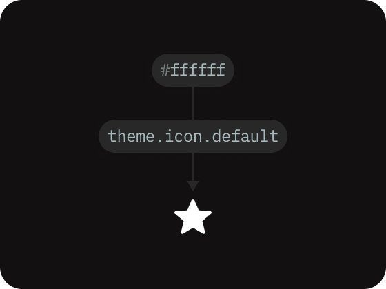
Value, such as #ffffff
Name, such as theme.icon.default
Every token name is a unique identifier for a specific value. The same value can sit under more than one name, which lets tokens reference each other and form a hierarchy.
These references between tokens are called ‘token aliases’.
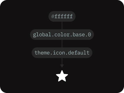
Aliases are what make tokens reusable. Instead of storing its own copy of a value, a token aliases another token, so the underlying value lives in exactly one place: a Global token. Change it there once, and every token that aliases it updates too.
Aliased this way, tokens form a hierarchy: a Global token holds the raw value at the base, and a Theme token on top aliases it to an element, like this:
design token hierarchy
#ffffff · Raw value
global.color.base.0 · Global token
theme.icon.default · Theme token
Why design tokens are so important
Design tokenization is what allows large enterprise systems to preserve consistent UI across multiple domains and sub-products.
Design tokens create a strong contract between the product and design-system teams. The design system owns tokens, and tokens own styling, semantics, and connections to components, while feature teams can focus solely on business logic.
This clear split of domains is valuable during redesigns. Tokens help move to new designs faster, as any global UI change, such as style updates or component improvements, can be rolled out by updating specific token values.
Design tokens Use case
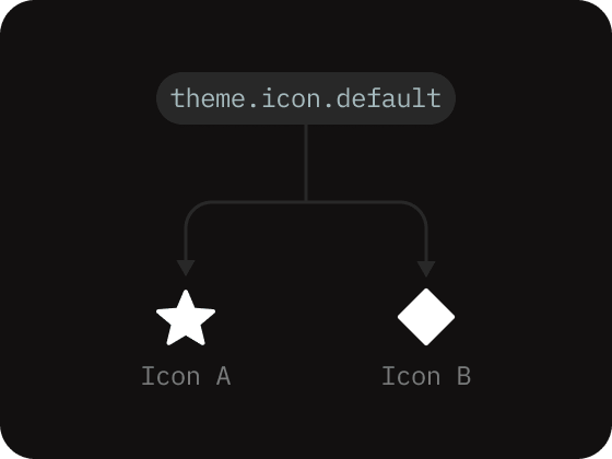
A token ties one value to multiple elements, so changing the value updates all connected elements.
Design token types
A token type is a category of value that the product reuses in more than one place: a brand palette, a font scale, a spacing sequence, etc. Each token type holds the full range of values for that one aspect of the design.
To structure design tokens effectively, we need to identify the types of tokens our product will actually use. If our product won't need a particular type, it's better to leave it outside the system.
Grouping tokens by type makes it easy to add new tokens without the list getting out of hand.
In GTC, none of the token types are invented. They mirror the types from the Design Tokens Community Group (DTCG), a shared format that design tools and codebases can all read.
The GTC model defines the following token types by default:
size-unit
Unit tokens define consistent scale values, like spacing, gaps and sizes.
color
Brand color token palettes that communicate UI hierarchy.
opacity
Opacity tokens set consistent transparency and dims for UI elements.
font-family
Font-family tokens define the fonts used in the system.
font-size
Font-size tokens keep font scaling and text-size values consistent.
line-height
Line-height tokens define consistent vertical rhythm across the UI.
font-weight
Font-weight tokens set consistent weight scaling across all text elements.
letter-spacing
Letter-spacing tokens set consistent spacing between letters.
radius
Radius tokens set a consistent border radius for UI surfaces and elements.
border
Border tokens set a border thickness and stroke styles for UI elements.
shadow
Shadow tokens keep shadow appearance and elevation styles consistent.
blur
Blur tokens set a consistent background-blur effect for UI surfaces.
motion
Motion tokens set transition easings and animation timings.
z-index
Z-index tokens set consistent stacking order for overlays and floating elements.
Design tokens groups
With the token types defined, we can organize them into more detailed semantic groups. The always-open question in the design systems field is how to name those groups so tokens stay legible to both large teams and machines as the product grows.
Across every enterprise project I've worked on, I've narrowed this down to three groups: Global, Theme, and Component (GTC), which held up consistently every time. The model is framework agnostic, so it's possible to use it with any UI component library of your choice.
Sets how elements look based on the active theme, including: colors, surfaces, elements, and states.
Component
Per-component structural values: spacing, gaps, sizes, and radius, scoped to one component.
Global tokens rarely change in the product.
Theme tokens change more often as the design system grows.
Component tokens rarely change once UI elements are established in code.
Grouping tokens this way turns a flat list of tokens into a readable semantics layer, a structure where every token has a home and purpose, and every change is easy to track.
In GTC, each value can be updated globally across domains, narrowed to a single theme, or isolated to a specific component, making it possible to push changes exactly as far as it needs to go.
If you've used Material Design's token classes, GTC grouping will feel familiar. Material's reference, system, and component tiers line up closely with Global, Theme, and Component. The core difference is in the naming and hierarchy. Material Design applies one rigid grammar to every token, so each name becomes a long, segmented chain, e.g.:
GTC avoids the rigid grammar. Every token belongs to a group: Global, Theme, or Component. But past that group, each name is free to take whatever best fits what the token expresses.
Names stay short where they can be and specific where they need to be. That's what keeps the system readable and easy to maintain, e.g.:
global.size-unit.8
theme.button.primary.hover
component.input.spacing-gap
Global tokens
Global tokens (also called primitive tokens) include the full set of raw values sorted into types the rest of the system is built from. They're never applied to components directly. Instead, Theme and Component tokens reference them.
Inside the Global group, values are organized into subgroups, each covering one or more token types, for example:
Typography: font-size, line-height, weight, letter-spacing, and every other font token type.
Color: the color palettes, plus the opacity tokens.
Effects: blur and shadow spread tokens.
Each Theme and Component token resolves to whichever Global subgroups they need. Subgroups give every primitive type a predictable place, so a human, or an AI agent, goes straight to it instead of scanning one flat list.
Global token values and their connections to other design token groups.
Theme tokens
Theme tokens hold the UI's visual modes: how everything looks in a given context, including surfaces, icons, text, borders, and component visual states. Theme is the layer that shifts when that context changes, for example when the user switches from light to dark mode.
The Theme group is where "how should this look right now" is decided.
Theme resolves by mode: light and dark are the two most common color-scheme modes, and a product can add more, such as brand or high-contrast modes.
A theme token changes surface theme when the mode switches.
A single theme token points to a different Global token in each mode, one Global for light, another for dark. The raw values still live in Global, so attached to an element once, it restyles itself on mode changes.
Component tokens
The Component group is where "how this component should be built" is decided.
Instead of storing their own raw values, component tokens link to the Global group for structural values like radius, size, motion, and typography.
Edge case: a token that changes with visual mode can route through Theme first. Font-weight, for example: the same weight looks heavier on a dark background than on a light one, so we can set it thinner in dark mode. Robin Rendle walks through this technique in Dark mode and variable fonts.
Component tokens define a component's structure and resizing behavior.
Each component is a sub-folder inside the Component group, with its own structural tokens across one or more size modes, just as a Theme token resolves across its modes. One token holds a value for each size, so resizing a component means selecting a different mode (medium or small).
Design tokens modes
Modes (or "contexts" in Material Design) are a token's ability to store multiple values and pick the right one based on the current UI conditions.
In practice, a mode is a property assigned to a token that tells it which value to use in a given context: dark mode, high-contrast mode like in Theme, or a size-specific mode like in the Component token group.
In GTC, modes are selected by scope, so you can change a mode for a single component or the whole page at once. A token can answer to more than one mode, for example, a brand theme and specific component size, which can be activated independently.
When a token includes a mode-specific value, it's applied automatically when that mode is active. For example, a color token with a dark-mode value becomes active the moment the interface switches from light to dark.
Modes let a token hold multiple values, one for each UI context.
Design tokens naming convention
All GTC tokens follow a level-based naming convention: where each level of the name tells you one thing about the token's final value.
In production code, tokens can have different numbers of levels depending on how much they need to express. For example, let's take the global.color.base.0 token: global says which group it belongs to, color says which subgroup it sits in, and base.0 points to the exact value.
Global tokens stay short, as they hold primitive values, but Theme and Component tokens run longer, as they carry more specific design decisions and values:
global.color.base.0
theme.button.primary.alpha.hover
component.button.font-size
Design token taxonomy rules
A design token taxonomy is the set of rules that governs how tokens are named in the design system.
Each token name has two parts:
The name-path: a dot-separated chain of levels that shows where the token belongs.
The value: the final level, holding the actual reference used in code.
Token name example
A basic global color token with 3 levels of naming hierarchy:
global.color.base.1
Each level narrows what the token means, so the number of levels equals token's specificity. A good taxonomy comes down to one best practice: balance clarity against simplicity.
GTC uses the minimum number of levels required to describe a token, and adds a level only when removing it would leave the token ambiguous.
The opposite is a linear grammar, where one fixed chain is applied to every token, so each name carries unnecessary levels, whether it needs them or not.
Overly specific names grow longer and pull more rules in behind them, which is what makes a linear approach much harder to maintain over time. A single button hover color ends up spelling out levels that say the same thing:
button.primary.color.background.state.hover
Most of those levels are filler: they exist to satisfy the grammar, not to narrow the value. GTC names the same token in just four levels:
theme.button.primary.hover
The way to hold that balance in the GTC model is a lightweight set of rules for identifying each token level. The taxonomy levels below are guidelines for naming and arranging those levels.
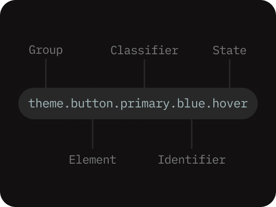
Every name follows one fixed order: Group, then any of Element, Classifier, Identifier, and State. Only Group is a mandatory level, and other levels never appear out of order. They can be ignored if not present in a token's intent.
taxonomy naming levels
1.Group: always the first level, determines the group the token belongs to.
2.Element: the UI thing the token styles (e.g. button, input, icon, text). In Global, which has no UI element, the parameter type fills this slot (e.g. color, radius).
3.Classifier: defines alternative token variants or categories of tokens (e.g., secondary, tertiary). Can be used only after the Group or Element levels.
4.Identifier: helps recognize a particular token inside the group, classifier, or element level (e.g., blue, red, dark).
5.State: the interaction or condition the value applies to, always last (e.g., default, hover, active, disabled).
Token name example
Theme token with 5 levels of taxonomy hierarchy:
theme.button.primary.blue.hover
Complex tokens like the one above don't include a value, as the final State level carries a token aliased to the Global value.
The GTC taxonomy rests on three principles:
1.A token's name must always reflect why a token exists before where it's used, encoding the full path down to its value.
2.Naming levels follows a clear order, with no missing semantic groups.
Do
Group → Element/Classifier/Identifier → Value
Group → Value
Don't
Value → ... [no group]
Element/Classifier/Identifier → Value
3.Name tokens and modes by design role, never by screen, feature, or layout specification. Keep the abstraction level high.
Do
Tokens
color.
typography.
spacing.
button.
badge.
Modes
ios.
android.
small.
large.
dark.
Don't
Tokens
badge-color.
ios-typography.
sidebar-text.
login-spacing.
card-badge.
Modes
phone.
tablet.
expanded.
marketing.
dashboard.
Why design token taxonomy is important?
On their own, design tokens are just words. The taxonomy is what turns them into a shared language: each token gets meaning in the UI, and people and AI agents can make better design decisions and write better code.
This shared language works only when the names stay consistent. When each level signals what a token is for, designers and developers can find the token they need instead of adding a near-duplicate that clogs the set. Consistency matters more, the larger the system grows.
While the naming convention can and should be tailored to a team's workflow, it must be defined at the foundation. Once a token set grows, changing token groups and taxonomy becomes disruptive to product teams and at enterprise level it can quickly become unmanageable.
The GTC token taxonomy is a tool to scale design system's tokens consistently.
Global → {theme, component} → leaf sub-groups, organized by specificity.
Why GTC model holds up for teams and AI agents
The same naming that keeps the system clear for people makes it legible to AI agents. A rigid linear grammar forces machines to reason through each level that exists to satisfy the grammar. GTC keeps naming and scope purposeful, so an AI can learn how your system works, suggest improvements and even create new tokens that integrate with your design.
The real payoff: the token names become your AI's design vocabulary.
Example GTC prompts:
“Make a card. For the surface use theme.surface.page, for the text use theme.text.default, and round the corners with global.radius.12.”
“Update an overlay surface: alias theme.surface.overlay to global.color.base.0 in light mode and global.color.base.8 in dark mode.”
“Dim the sidebar in dark mode: point theme.surface.container at global.color.base.2.”
FAQ
What are design tokens?
Design tokens are reusable design values, such as colors, spacing, and typography, that build a visual language in design systems. They are used in place of hard-coded values like hex codes for color in design, and in code they map to CSS variables, allowing a single token/variable to control multiple elements in the system.
Why are design tokens important?
Design tokens help large enterprise systems keep a consistent UI across multiple domains and sub-products, because a global UI change, such as a style update or a component improvement, can be rolled out everywhere at once instead of requiring every screen to be redesigned by hand.
What is the GTC token model?
GTC is a non-linear three-group token model: Global, Theme, and Component. Global tokens hold the primitive raw values, Theme decides how things look across modes like light and dark, and Component decides how a component is built and sized.
What is a GTC token taxonomy?
A design token taxonomy is the set of rules that governs how each token is named. Every token name allows both the product team and AI agents to reason about tokens and their purpose in the system. The GTC model makes sure each token is readable and expresses its own role in the system.
How do GTC tokens help AI agents?
When each token name is purposeful, an AI agent can read a token's role off its name, trace an aliased value it points at, and create new tokens that fit the existing token structure instead of creating duplicates. The real payoff of the GTC model is that token names become the AI's design vocabulary.
How to use GTC design tokens
Teach AI the GTC model, audit, create and manage GTC and DTCG tokens with AI. Install the /gtc-tokens skill to get started.
 Dmitrii Bunin